[RFC] Reduce size of Level 1 headings and increase left padding on page titles
ClosedPublic

Authored by ngraham on Feb 6 2020, 6:45 PM.

Details

Summary

Level 1 headings are humongous. The degree of humongousness is maybe a bit excessive,
especially on page titles with toolbars, where it looks like it's positively trying
to burst from its bounds! Also, the left padding could stand to be increased, which
would make the titles align with the content for most views. This was brought up in
T12631.

If this patch is approved, I will submit companion patches to make the same changes in
the PlasmaExtras Heading and KTitleWidget.
Test Plan

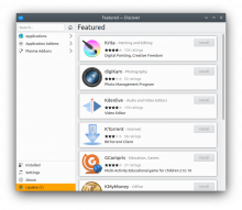
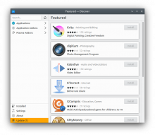
Discover, before:

Discover, after:

Kirigami Gallery, after:

Diff Detail

Repository
R169 Kirigami
Lint
Automatic diff as part of commit; lint not applicable.
Unit
Automatic diff as part of commit; unit tests not applicable.
ngraham created this revision.Feb 6 2020, 6:45 PM
Restricted Application added a project: Kirigami. · View Herald TranscriptFeb 6 2020, 6:45 PM
Restricted Application added a subscriber: plasma-devel. · View Herald Transcript
ngraham requested review of this revision.Feb 6 2020, 6:45 PM
manueljlin accepted this revision.Feb 6 2020, 6:52 PM

Looks significantly better in my opinion

This revision is now accepted and ready to land.Feb 6 2020, 6:52 PM
ngraham added a reviewer: mart.Feb 6 2020, 6:54 PM
ahiemstra added inline comments.
src/controls/private/globaltoolbar/TitlesPageHeader.qml
37

Shouldn't this be Units.gridUnit if you actually want to match the default Page margins?

ngraham updated this revision to Diff 75127.Feb 6 2020, 7:01 PM
ngraham marked an inline comment as done.

Use gridUnit to match the page margins correctly (it's the same width anyway)

alexde added a subscriber: alexde.Feb 6 2020, 8:00 PM

Looks way better, thanks Nate!

Since case 1 to 3 are steps of 0.1 and from case 3 to 4 is a step of 0.2, how would it looke like with 1.40 instead of 1.50?
Would it be too small? Would you like attach another screenshot please? :-)

alexde awarded a token.Feb 6 2020, 8:00 PM
ndavis awarded a token.Feb 6 2020, 8:22 PM

I tried 1.4 but it looked a bit too small to me, and not sufficiently differentiated from the level 2 and 3 headings in content areas:

alexde added a comment.EditedFeb 6 2020, 8:50 PM

I tried 1.4 but it looked a bit too small to me, and not sufficiently differentiated from the level 2 and 3 headings in content areas:

When looking at the screenshots, 1.4 looks fine to me, but go with whatever you guys think is better. :)
Interesting that a difference < 7% is visually is spotted so easily.

manueljlin added a comment.EditedFeb 6 2020, 8:53 PM

Edit: actually, checking with a computer screen both look good, but I still prefer the screenshots from the Details section

manueljlin accepted this revision.Feb 6 2020, 8:58 PM
mart accepted this revision.Feb 12 2020, 2:47 PM
This revision was automatically updated to reflect the committed changes.