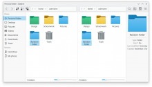
Move URL Navigator into toolbar
Closed, ResolvedPublic

Description

VDG is proposing to make Dolphin look more like this mockup:

One of the most prominent things you can see here is that we've given the URL Navigator a more Breeze-like style (Tracked with T11662) and moved it URL Navigator into the toolbar. The reasons are as follows:

  • This makes it more obvious, and reduces (and hopefully) eliminates the desire to add an "Up" button to the default toolbar
  • Consistency with the general design of other file managers which have their Breadcrumbs bar/URL input field in the toolbar

As far as I am aware, the only challenge here is handling split views. Currently, each pane of a split view gets its own URL Navigator. With this proposed redesign, we have the following options when using split mode:

  1. Remove the URL Navigator from the toolbar and display one in each pane, as with the status quo
  2. As 1, but disable the one in the toolbar rather than removing it entirely
  3. Keep a single URL Navigator in the toolbar, but change it dynamically to show the path for the active split view
  4. Other ideas?
ngraham created this task.Sep 15 2019, 5:42 PM
ngraham triaged this task as Normal priority.

Couple of questions:

  1. Can we keep the URL navigator left-aligned or make it filling width? Unclear what jumps and resizes will happen when a user enters or leaves a subdirectory.
  2. How will you handle tabs? They are not a very discoverable feature now (sadly), and with this change integrating them looks even less promising.
  1. Sure, we could do that.
  2. The location displayed in the URL bar would change when the active tab changes. This is what other file managers already do and it's fine IMO.

It seems to me that making the URL navigator buttons more discoverable and moving the URL navigator to the toolbar are two orthogonal things.

I'm pretty sure we can fix the discoverability problem without having to move the URL navigator to the toolbar.

  1. Cool :)
  2. Just to make sure, do you imagine tab bar placed above the toolbar? That is a familiar browser-like presentation.

I agree, we don't have to do this to make the buttons more discoverable. That's mostly tracked by https://phabricator.kde.org/T11662 anyway.

The big reason IMO is aesthetics. I think the main window just looks better with the URL Navigator in the toolbar. It gives Dolphin a nice clean appearance, and allows everything below the toolbar to share the same horizontal plane. I think this is one of the things that makes Nautilus subconsciously feel better than Dolphin even though Dolphin is much more usable and powerful

Just to make sure, do you imagine tab bar placed above the toolbar? That is a familiar browser-like presentation.

I actually had not thought about that at all, but it's definitely an interesting idea.

Would it be too noisy if we did something like [ ... > dir1 ] | [ ... > dir2 ] for split views?

If the URL Navigator is moved into the toolbar, isn't it more likely to observe a shortened URL Navigator when the path is barely more than two levels deep?
Would such a move allow people to partially restore the old behavior by creating a separate toolbar? (partially because it won't be possible to have the URL Navigator at the same level of the Places panel as it is now)

joricke added a subscriber: joricke.Dec 3 2019, 9:31 PM

Picking up the discussions taken place on Reddit, on T12308 and on T11662, I'd like to show a revised mockup and would love some input on it:


I was also toying with the idea of having the tabs use a minimum width to increase their overall wideness and to prevent really small tabs when users are in directories such as /usr, maybe even auto fill the width available to use the space completely.
This mockup is not using any new QStyles, so it may look different on a proper redesign, but it takes into account a lot of information gathered from the talks as such:

  1. When putting the URL Navigator into the toolbar, it can become quite inconsistent in terms of visual appearance. This is mainly caused by the unknown factor of what a user would put in their toolbar on the left of the URL Navigator:
  1. Gnome and Apple have their HIG set up to define a window as starting with a title- or headerbar, then showing a toolbar, then moving on to possible tab bars. It is considered generally good practice and can be used to create a more "sorted" look for Dolphin and other applications using this style of layout. This still allows the user to freely position and construct their toolbars as needed without interfering with the placement of the URL Navigator.
alexde added a subscriber: alexde.Dec 4 2019, 10:31 AM

+1 to tabs having a minimum width size
I kind of like that tab location but it probably shouldn't extend to the sidebar too.

About having the URL navigation in the toolbar, maybe we should use ome of the things from the task description

As far as I am aware, the only challenge here is handling split views. Currently, each pane of a split view gets its own URL Navigator. With this proposed redesign, we have the following options when using split mode:

Remove the URL Navigator from the toolbar and display one in each pane, as with the status quo
As 1, but disable the one in the toolbar rather than removing it entirely
Keep a single URL Navigator in the toolbar, but change it dynamically to show the path for the active split view
Other ideas?

"Keep a single URL Navigator in the toolbar, but change it dynamically to show the path for the active split view" is probably the best option

"Keep a single URL Navigator in the toolbar, but change it dynamically to show the path for the active split view" is probably the best option

The issue with that approach is that you can never be 100% sure you're in the right directory on your inactive split view. A minor issue, yes, but an issue nonetheless.

I kind of like that tab location but it probably shouldn't extend to the sidebar too.

It does increase clarity of structure though. If the tab bar would only extend to the edge of the left most pane, the sidebar would consequently feel "disconnected" to what's going on on the right of it, even though it has direct influence.

"Keep a single URL Navigator in the toolbar, but change it dynamically to show the path for the active split view" is probably the best option

The issue with that approach is that you can never be 100% sure you're in the right directory on your inactive split view. A minor issue, yes, but an issue nonetheless.

You have a lot more room to work with if you want to put the full path into the split title.

You have a lot more room to work with if you want to put the full path into the split title.

This is everything I want from Split View! Giving each view a big obvious close button would make it so much easier to close the desired pane.

You have a lot more room to work with if you want to put the full path into the split title.

Yes! This is a very good idea! Can we please ship it like that holy moly.

tvshtr added a subscriber: tvshtr.Apr 16 2020, 2:32 PM

What happens when user moves toolbar to the left or right? Personally, mine is always on the left side

joricke removed a subscriber: joricke.Apr 17 2020, 5:09 AM
ngraham closed this task as Resolved.Nov 10 2020, 3:00 PM
ngraham moved this task from Backlog/Planned to Done on the VDG board.

Not that it worths anything but here's my two cents

I must i don't like much of this "improvement"...

I have a few concerns:
1 - The buttons on my toolbar have text!
2 - I also added buttons to to the toolbar (which make the space available for the breadcrumbs much smaller)
3 - I don't get the "tabs bellow URL" logic... from my point of view tabs should always be above URL!
4 - could Bug #343690 ( https://bugs.kde.org/show_bug.cgi?id=343690 ) be considered to help solve 3?
5 - even forgetting all the above I find the layout very confusing (but it probably is just a question of time/getting used to it)
6 - Is there going to be an option to keep it as it is?

thank you

FWIW we have a merge request open which will make it optional and re-enable the old behavior/location for people who don't like the new stuff: https://invent.kde.org/system/dolphin/-/merge_requests/114

Hi

I read a lot about these changes and related critics

If you're interested in evaluating it, long time ago I proposed something related that, IMHO, still would be a great enhancement for Dolphin and its users. You can view it here: https://forum.kde.org/viewtopic.php?t=111042

FWIW we have a merge request open which will make it optional and re-enable the old behavior/location for people who don't like the new stuff: https://invent.kde.org/system/dolphin/-/merge_requests/114

This is gold. A few words on reasoning about it:
Considering how windows explorer, macos finder, gnome files do the url bar - having it in the toolbar is a very sane idea for most users.
That said, nither of those (to the best of my knowledge) have ability to split screen out of the box, neither do they offer an option to move toolbar to left/right/bottom. Thus, if dolphin is to keep those options, which will primarily be used buy power users (imho) - we should keep the option to have UrlBar in its old place.
This way "normal/most" users get something familiar and "power users" have a way of setting it up the way they need.

"http://phabricator.kde.org/T11663#212651" is my favourite, because which path is for which tab is obvious. Having the bar dynamically adjust is not intuitive, and if many tabs are present, is able to inhibit productivity if the user is duplicating multiple paths to their clipboard.