In D20797#455651, @ngraham wrote:Why doesn't mouse wheel scrolling with with ScrollView?
Feed Advanced Search
Apr 24 2019
Apr 24 2019
filipf added a comment to D20797: [dict] Modernize configuration window.
filipf updated the task description for T10586: Modernize widget configuration settings.
filipf requested review of D20797: [dict] Modernize configuration window.
filipf updated the task description for T10586: Modernize widget configuration settings.
Apr 23 2019
Apr 23 2019
filipf added a comment to D20747: [FifteenPuzzle] Port configuration window to QQC2 and Kirigami.FormLayout and improve UI.
Tried it out, looks good and is efficient.
filipf added a comment to D19797: [fifteen-puzzle] Modernize settings window.
filipf added inline comments to D20747: [FifteenPuzzle] Port configuration window to QQC2 and Kirigami.FormLayout and improve UI.
Apr 19 2019
Apr 19 2019
filipf committed R119:1c6644a42b7a: Hook up the main form layout with child form layouts (authored by filipf).
Hook up the main form layout with child form layouts
filipf added a comment to D20689: Elide tab titles left so key information at the end of the string doesn't get cut off.
Seems to make more sense for when the full path is shown, but my intuition is that right elision is more useful when it's just the folder name being shown.
Apr 18 2019
Apr 18 2019
filipf committed R119:60181eca4414: [Kickoff] Make the tabbar separator width consistent with tab selection line (authored by filipf).
[Kickoff] Make the tabbar separator width consistent with tab selection line
filipf added a comment to D20676: [Kickoff] Make the tabbar separator width consistent with tab selection line.
Sidenote: units.smallSpacing wasn't a good solution, it ended up being 5 pixels wide on my laptop and 4 pixels wide on my PC. 4 pixels works consistently on both machines, and with various resolutions and scaling.
filipf added reviewers for D20676: [Kickoff] Make the tabbar separator width consistent with tab selection line: VDG, ngraham.
filipf added a comment to D20313: Hook up the main form layout with child form layouts.
I'll land this tomorrow night (in 24hrs) since it's a prerequisite for fixing the PoTD plugin.
Makes more sense.
filipf added inline comments to D20612: [Kickoff] Modernize settings window layout.
Nice! The last label is getting cut off for me with the default window size, but not sure what could be done about it.
filipf added a comment to D20612: [Kickoff] Modernize settings window layout.
Some other comments:
filipf added a comment to D20612: [Kickoff] Modernize settings window layout.
Apr 17 2019
Apr 17 2019
Redesign the theme preview window
Apr 16 2019
Apr 16 2019
filipf requested changes to D20598: Port kcm energy info to kirigami 2, fix colors issues.
Here's what works:
filipf added a comment to D20598: Port kcm energy info to kirigami 2, fix colors issues.
Looks like you'll need to use twinFormLayouts. One unfortunate thing is you can't go "ha, I'll have all the layouts adjust to this specific one (with the longest label)". You'll need to have them all interlinked with one another because label length can change based on translation.
Apr 15 2019
Apr 15 2019
filipf added reviewers for D20585: [FormLayout] Use even top and bottom spacing for separator: mart, Kirigami, ngraham.
filipf requested review of D20585: [FormLayout] Use even top and bottom spacing for separator.
filipf added a comment to D20577: Don't adjust the sidebar size with the window size, and reduce the text size a bit.
filipf updated the diff for D19077: Redesign the theme preview window.
add authorship info, @GB_2 you can do the same
filipf updated the diff for D19077: Redesign the theme preview window.
set sourceSize width and height (wow that's even better than mipmap)
filipf added a comment to D19077: Redesign the theme preview window.
Also the scaled down image quality isn't that great, can I use mipmap?
filipf updated the diff for D19077: Redesign the theme preview window.
somewhat smarter code
filipf added a comment to D20577: Don't adjust the sidebar size with the window size, and reduce the text size a bit.
I don't think it's my place to review this, but wanted to say I've been testing out Elisa these past few days and also felt like the sidebar text size would be better if it were smaller. Looks really nice in the screenshot!
filipf added a comment to D19077: Redesign the theme preview window.
No preview thumbnail looks like this:
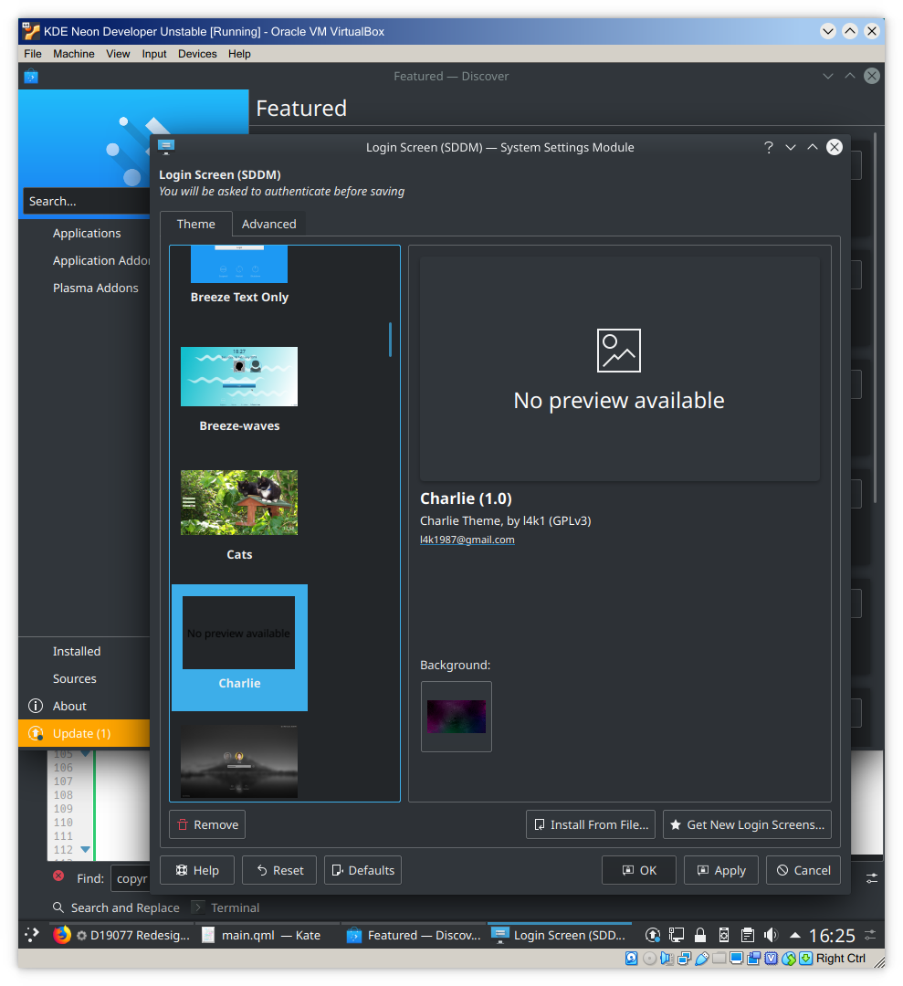
filipf updated the diff for D19077: Redesign the theme preview window.
- add a dummy "No preview available" rectangle when there is no preview image
- adjust shadows to mimick GridDelegate
filipf added a comment to D20569: Use more compact OSD.
+1 on making the OSD more efficient, I think it's the right direction to be going in.
Apr 9 2019
Apr 9 2019
filipf added a comment to D20313: Hook up the main form layout with child form layouts.
@mart before you suggested we should do something like:
Huge improvement, Nate, and an excellent find. The rest of the reviewers can also have a look at my before and after photos for more proof:
Works as desired and is more efficient than anchoring to parent.right and then adding symmetrical units.smallSpacing * 6 right margin (since that's how the arrow is already anchored).
Apr 8 2019
Apr 8 2019
Looks good to me.
filipf added a comment to D20342: Update KDE logo to be closer to original.
So what I'm seeing is that the gradient has been toned down, which also results in a slight color change in general. FWIW I like the older version more because the new one seems flat(ter) in comparison. Not too long ago someone in VDG actually remarked that the official logo is kind of flat so if possible it would be cool IMO if we could add a gradient to it and keep these icons the way they are.
Apr 6 2019
Apr 6 2019
filipf updated the diff for D20313: Hook up the main form layout with child form layouts.
Figured it out. We'll just export a formLayout alias property in all the individual plugins and everything will work.
filipf planned changes to D20313: Hook up the main form layout with child form layouts.
twinFormLayouts: main.currentItem will stop working as soon as the wallpaper plugin in anything more complicated than having a single form layout. How do I specify that, yes, I want the currentItem, but only the form layout in that file?
filipf added reviewers for D20313: Hook up the main form layout with child form layouts: Plasma, ngraham.
filipf requested review of D20313: Hook up the main form layout with child form layouts.
Apr 5 2019
Apr 5 2019
filipf committed R119:230ac60a3195: Fix incorrect vertical spacing between main layout and individual wallpaper… (authored by filipf).
Fix incorrect vertical spacing between main layout and individual wallpaper…
filipf added a comment to D19874: [Kickoff] Reduce the margins of KickoffItem, KickoffHighlight and use smallSpacing.
This makes Kickoff even a bit more more left-centered = looking like it's wasting horizontal space. That's why I prefer the way it was before, but I tested the patch and everything seems symmetric at least.
filipf added a comment to D20249: Make the Configuration button more understandable.
Hey @trmdi rooty's not participating in KDE at this point so he won't be able to do the review.
filipf awarded D20266: Add new notification plasmoid a Burninate token.
filipf updated subscribers of D19874: [Kickoff] Reduce the margins of KickoffItem, KickoffHighlight and use smallSpacing.
@hein what's your opinion on reducing the margins?
filipf added a comment to D20257: Fix incorrect vertical spacing between main layout and individual wallpaper plugins.
Apr 4 2019
Apr 4 2019
filipf updated the summary of D20257: Fix incorrect vertical spacing between main layout and individual wallpaper plugins.
filipf updated the diff for D20257: Fix incorrect vertical spacing between main layout and individual wallpaper plugins.
apparently anchoring the stack view wasn't the only solution; settings spacing to 0 achieves the same result and doesn't spew out an "anchors in a layout" error
filipf added a comment to D20257: Fix incorrect vertical spacing between main layout and individual wallpaper plugins.
I know I'm not supposed to anchor items in a layout but this was the only solution I could find for now.
filipf updated the test plan for D20257: Fix incorrect vertical spacing between main layout and individual wallpaper plugins.
filipf added a comment to D15872: Fix Oxygen background gradient for QML modules.
Is this actually what's been causing the following problem?
filipf updated the diff for D19209: [sddm-kcm] Adjust Background label and button.
attempt to allow for commandeering of the revision
filipf added a comment to D19209: [sddm-kcm] Adjust Background label and button.
Apr 3 2019
Apr 3 2019
filipf committed R120:4516ab53726c: [image-wallpaper] Port to Kirigami.FormLayout and use twinFormLayouts (authored by filipf).
[image-wallpaper] Port to Kirigami.FormLayout and use twinFormLayouts
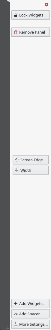
filipf added a comment to D20144: Make location of "Lock Widgets" and "Remove Panel" buttons more obvious.
filipf added a comment to D19591: Add Compression Quality slider for lossy formats.
Apr 2 2019
Apr 2 2019
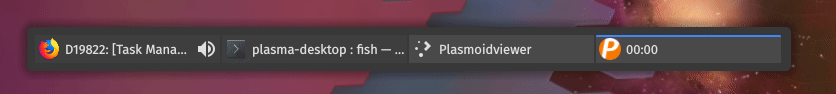
filipf added a comment to D19822: [Task Manager] Toggle mute when the audio indicator is clicked.
Just throwing out another possible solution: the PlasmaComponents Highlight thingy:
filipf added a comment to D19873: [image-wallpaper] Port to Kirigami.FormLayout and use twinFormLayouts.
filipf added a comment to D19822: [Task Manager] Toggle mute when the audio indicator is clicked.
filipf added a comment to D19873: [image-wallpaper] Port to Kirigami.FormLayout and use twinFormLayouts.
I think it would be good if someone from Plasma could have a look if this is okay, I did do a lot of modifications.
filipf updated the diff for D19873: [image-wallpaper] Port to Kirigami.FormLayout and use twinFormLayouts.
.
filipf updated the diff for D19873: [image-wallpaper] Port to Kirigami.FormLayout and use twinFormLayouts.
git...
filipf updated the diff for D19873: [image-wallpaper] Port to Kirigami.FormLayout and use twinFormLayouts.
rebase
filipf committed R120:b40dabdc27e4: [color-wallpaper] Align with the master FormLayout (authored by filipf).
[color-wallpaper] Align with the master FormLayout
Highlight color is nice, but in my tests I really like having red for the muting because it gets the point across that a disabling action will be triggered. Therefore the code I have now is:
Mar 28 2019
Mar 28 2019
filipf added a comment to D20086: Fix window height of Screen Locking KCM.
Good fix, the lack of implicitHeight was leading to confusion before if there are even any wallpapers present.
filipf added a comment to D19822: [Task Manager] Toggle mute when the audio indicator is clicked.
"We had so many options we went from one page to two pages, so now we can add more options!" :-)
Mar 27 2019
Mar 27 2019
filipf added a comment to D19822: [Task Manager] Toggle mute when the audio indicator is clicked.
Would something like this work?
filipf added a comment to D19822: [Task Manager] Toggle mute when the audio indicator is clicked.
filipf committed R119:dd1840f0496f: [application-dashboard] Use appropriate search string (authored by filipf).
[application-dashboard] Use appropriate search string
filipf added a comment to D19994: Add microphone indicator.
Yeah you want to ignore virtual devices or I guess this audio effects for eaxmple app would trigger the indicator?
filipf added a comment to D19822: [Task Manager] Toggle mute when the audio indicator is clicked.
I made the suggestion to have an option not because there might be something wrong with the feature, but because there is a subset of users who have a harder time finding their way around the UI - the non-tech say people and/or (now that I think of it) perhaps those with impaired vision who might not register the changed icon.