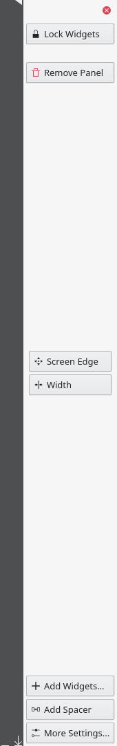
BUG: 406079
Move these two buttons to the left/top of the panel edit mode toolbar.
Horizontal:

Vertical:
| ngraham |
| Plasma | |
| VDG |
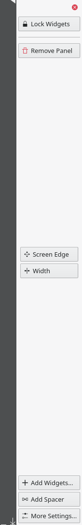
BUG: 406079
Move these two buttons to the left/top of the panel edit mode toolbar.
Horizontal:
Vertical:
Open the panel edit mode.
| Automatic diff as part of commit; lint not applicable. |
| Automatic diff as part of commit; unit tests not applicable. |
+1 for moving out out from under the More Settings... button; this isn't a setting so that was clearly wrong. However I'm not sure I like the new placement of the button. Now it's right next to Lock Widgets, which is non-destructive. Seems like it would be easy to mis-click and accidentally blow away your panel--especially on touch. At a minimum I would recommend adding some padding between it and adjacent non-destructive buttons. And maybe Lock Widgets should be moved over to the right side. Thoughts?
I'm not sure about moving Lock Widgets to the other side. When horizontal, the 4 buttons on the right/bottom will take up a lot of space, especially in wordy languages or when using a small screen resolution, causing them to be changed into icons only buttons, which we should avoid. 4 buttons on one side and 1 on the other side would also look quite unbalanced.
I can try putting a spacer or seperator between the 2 buttons, but if I switch the positions of those 2 buttons, you can accidentally remove the panel when trying to close the panel edit mode (vertical) or trying to resize the panel (horizontal).
One thing to note though, you can always click undo after removing the panel ;-)
Hmm, the separator line feels like a bit much to me. How about just units.largeSpacing or units.gridUnit between them?
This is it without separator, I personally think it looks weird with that gap:
+1 for the idea of the patch
Gap - looks weird to me as well
Separator - it's okay IMO
If we really wanted to be sure we could have a confirmation dialog for deleting the panel, although the Undo button you get in a notification somewhat lessens the need for it.