If you want you can also look at the ones I tried to add here https://phabricator.kde.org/D18078
Feed Advanced Search
May 16 2023
May 16 2023
filipf added a comment to T10220: Improve the default selection of photographic wallpapers.
Jul 31 2021
Jul 31 2021
filipf added a comment to T14211: Unify sidebar color in Kirigami apps.
Jul 7 2021
Jul 7 2021
filipf added a comment to T11930: Rethink Lock, Login and Logout Screen's Color Modularity.
Mar 14 2021
Mar 14 2021
filipf awarded T14125: Create a New Sound Theme for Plasma a 100 token.
Feb 18 2021
Feb 18 2021
filipf added inline comments to D23257: Allow for easier syncing of Plasma font.
filipf added a comment to D23257: Allow for easier syncing of Plasma font.
Feb 17 2021
Feb 17 2021
filipf added a comment to D23257: Allow for easier syncing of Plasma font.
I think it should work same as when I submitted the patch. It would be good to add a comment though that this feature is only supported for for SDDM 0.19 and above.
Feb 16 2021
Feb 16 2021
filipf added a comment to T12724: Default Wallpapers.
| Crystalline: | -1 |
| Grand Canyon: | -1 |
| Vera: | 0 |
| Beach: | +1 |
| Altai: | +2 |
| Rainy Morning: | -1 |
| Slant: | -1 |
| Kay: | -1 |
| New Contest: | 0 |
Oct 21 2020
Oct 21 2020
filipf added a comment to T11661: Replace framed views with single-pixel separator lines.
Oct 20 2020
Oct 20 2020
filipf added a comment to T8187: Single click vs double-click.
Michael's made a good point about the longevity of this default setting. If it's been set to single click for 20 years and the majority (?) of the users still use double-click then it's ultimately a failure, regardless of whether or not the engineer arguments are valid.
filipf added a comment to T8187: Single click vs double-click.
Some simple statements applicable here and in other discussions:
Oct 19 2020
Oct 19 2020
Jun 24 2020
Jun 24 2020
filipf abandoned D29741: [Logout] Port to QQC2 and PC3.
May 22 2020
May 22 2020
May 20 2020
May 20 2020
May 17 2020
May 17 2020
May 15 2020
May 15 2020
filipf abandoned D29765: Add a blurless SDDM theme.
Yeah on second thought this is ugly from a maintenance POV. We'd need a GUI sheet that exposes theme.conf and then blur would be one option.
May 14 2020
May 14 2020
filipf requested review of D29765: Add a blurless SDDM theme.
filipf added a comment to D29740: [PC3 Button] Don't remain in a pressed state after press.
The more I think about this the more it feels like a workaround. Presuming QQC2's behavior of leaving a pressed button focused after press is correct, perhaps we are at fault for providing the same svg for focus-background and pressed.
filipf added a dependent revision for D29740: [PC3 Button] Don't remain in a pressed state after press: D29741: [Logout] Port to QQC2 and PC3.
filipf added a dependency for D29741: [Logout] Port to QQC2 and PC3: D29740: [PC3 Button] Don't remain in a pressed state after press.
filipf requested review of D29741: [Logout] Port to QQC2 and PC3.
filipf added reviewers for D29740: [PC3 Button] Don't remain in a pressed state after press: davidedmundson, mart, Plasma.
filipf requested review of D29740: [PC3 Button] Don't remain in a pressed state after press.
May 13 2020
May 13 2020
Merge branch 'Plasma/5.18'
filipf committed R120:68601675d13b: [sddm-theme] Prevent the logo from leaking in after a fadeout (authored by filipf).
[sddm-theme] Prevent the logo from leaking in after a fadeout
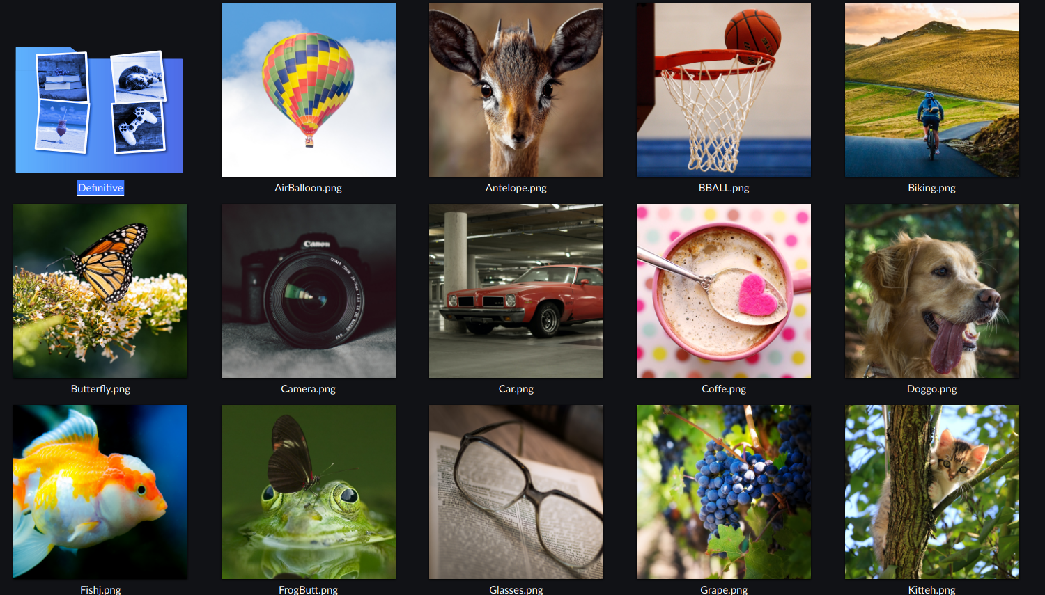
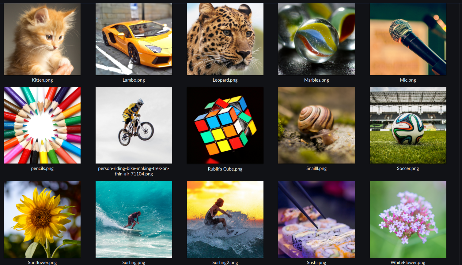
Add photographic user avatars
filipf closed T9910: Revisit user avatar gallery images as Resolved by committing R128:13e73011b1ac: Add photographic user avatars.
filipf updated the diff for D29394: Add photographic user avatars.
don't delete user_manager.kdev4
filipf updated the diff for D29394: Add photographic user avatars.
Make as REUSE compliant as possible
filipf updated the test plan for D29394: Add photographic user avatars.
filipf updated the diff for D29394: Add photographic user avatars.
rework licensing stucture due to a flaw in user_manager (it shows every single file in the avatar gallery and the .license files break it)
May 12 2020
May 12 2020
filipf updated the summary of D29394: Add photographic user avatars.
filipf updated the diff for D29394: Add photographic user avatars.
Use this format https://reuse.software/tutorial/ making a LICENCE/ directory with the licence text in it and cat.jpg.license with the SPDX header
filipf updated the diff for D29394: Add photographic user avatars.
actually remove Chip and Gecko(due to rename)
filipf updated the diff for D29394: Add photographic user avatars.
- rename Gecko to Chameleon because that wasn't a gecko
- remove Chip
- add Air Balloon, Dog, Fish, Owl, Pencils, Sushi
- WIP: licence files
Works well and looks good.
filipf added a comment to D29394: Add photographic user avatars.
Some pictures I didn't include in case people like them:
filipf updated the diff for D29394: Add photographic user avatars.
- Remove all Unsplash and Pexels licensed photos to avoid complications.
- Use CC0 pictures from Pexels instead
- Licence files to be added
filipf added a comment to D29351: [sddm-theme] Prevent the logo from leaking in after a fadeout.
Is this okay now @mart and okay to land on 5.18?
May 7 2020
May 7 2020
filipf added a comment to D29394: Add photographic user avatars.
IANAL but the Pexels and Unsplash licence look the same to me: free to distribute, free to modify, no attribution needed, but don't use it to make a Pexels/Unsplash clone. Someone once noted that neither exists in some FOSS licence database. I'll just ask everyone to do CC0 but we'll still credit them. Thanks @ognarb and @jriddell.
filipf added a comment to D29501: Use left-aligned thickened panel with IOTM populated with some apps by default.
If user data would show low vertical panel usage, what are we really fixing and for who? Extrapolating from that and presuming that a fair share of them are content with the current default, why do we go against that? And if it's just a matter of not touching defaults, can you guarantee users are going to be equally content with a left panel as a default?
filipf added a comment to D29394: Add photographic user avatars.
After additional consideration, I'm not too happy with the car avatar but I did find this:
filipf added a comment to D29501: Use left-aligned thickened panel with IOTM populated with some apps by default.
I'd also be interested if KDE Promo has any insights here. It doesn't seem (?) like we advertise it too much, but I know reviews often praise Plasma for its familiarity for Windows users. Given our major competitor does the opposite and that the majority of our new users are going to be Windows converts (and keeping in mind that the less technologically able people tend to not like unfamiliarity), it seems like a good market share to grab. Changing the layout could mean a boost for other competitors such as Zorin. Thoughts?
filipf requested changes to D29501: Use left-aligned thickened panel with IOTM populated with some apps by default.
This is a major identity change better suited for Plasma 6. We've never had a vertical panel and are moreover defined by offering a layout familiar to Windows users.
May 5 2020
May 5 2020
filipf requested changes to D29448: Add "Volna" wallpaper.
We only use the biggest size in this repo.
May 4 2020
May 4 2020
filipf committed R119:52d3389f7495: [Wallpaper Configuration] Reword inline message concerning widget locking (authored by filipf).
[Wallpaper Configuration] Reword inline message concerning widget locking
filipf added a comment to D29351: [sddm-theme] Prevent the logo from leaking in after a fadeout.
Should I also land this for 5.18 (do I have to create a bug report first)?
filipf updated the summary of D29351: [sddm-theme] Prevent the logo from leaking in after a fadeout.
filipf updated the diff for D29394: Add photographic user avatars.
Drop:
- Air Balloon
- Gamepad
filipf updated the summary of D29366: [Wallpaper Configuration] Reword inline message concerning widget locking.
filipf updated the diff for D29366: [Wallpaper Configuration] Reword inline message concerning widget locking.
restore the inline message but change its text to note that layout changes have been restricted by the sysadmin
filipf updated the diff for D29351: [sddm-theme] Prevent the logo from leaking in after a fadeout.
Replace PropertyAnimation with NumberAnimation
filipf updated the diff for D29394: Add photographic user avatars.
probably don't want to include the .directory file
filipf updated the diff for D29394: Add photographic user avatars.
Better file naming
filipf added a comment to D29394: Add photographic user avatars.
Alright, I believe the issue is with the fact that the avatar gallery is coded to always look for avatars in the system /usr/share dir as opposed to adjusting to testing conditions and using the local /usr/share dir.
May 3 2020
May 3 2020
filipf added a comment to D29394: Add photographic user avatars.
The permissions are wrong if we do sudo make install (the photos folder ends up being root owned). But it doesn't show up with make install either. Will investigate more in the morning.
filipf added a comment to T9910: Revisit user avatar gallery images.
I've proposed some avatars in D29394.
filipf added a revision to T9910: Revisit user avatar gallery images: D29394: Add photographic user avatars.
filipf added a comment to D29394: Add photographic user avatars.
Basketball: https://www.pexels.com/photo/basketball-net-2169302/ (Pexels licence)
Brushes: https://www.pexels.com/photo/abstract-art-artist-artistic-262034/ (CC0 licence)
Car: https://www.pexels.com/photo/action-asphalt-auto-racing-automobile-274974 (CC0 licence)
Cocktail: https://www.pexels.com/photo/sea-sky-beach-holiday-68672/ (CC0)
HotAirBalloon: https://www.pexels.com/photo/hot-air-balloon-on-mid-air-above-rock-formation-2893960/ (Pexels licence)
Joystick: https://www.pexels.com/photo/game-controller-159204/ (CC0 licence)
Keyboard: https://unsplash.com/photos/WzKPT0IuUrU (Unsplash licence)
Leopard: https://unsplash.com/photos/wYy3rvvgjAU (Unsplash licence)
Parrot: https://unsplash.com/photos/V9VDd-2s3aE (Unsplash licence)
RubikCube: https://unsplash.com/photos/liMvhbUq4Xg (Unsplash licence)
Sunflower: https://unsplash.com/photos/XtXdHH-Ib7c (Unsplash licence)
Shuttle: https://www.pexels.com/photo/flight-sky-earth-space-2159/ (CC0 licence)
filipf requested review of D29394: Add photographic user avatars.
l10n daemon script <scripty@kde.org> committed R242:29404ef10bd0: [Plasmoid Heading] Draw the heading only when there is an SVG in the theme (authored by filipf).
[Plasmoid Heading] Draw the heading only when there is an SVG in the theme
filipf committed R120:3f06349549c1: [System Tray] Always draw the highlight behind the icon (authored by filipf).
[System Tray] Always draw the highlight behind the icon
filipf committed R242:1b1018e68703: [Plasmoid Heading] Draw the heading only when there is an SVG in the theme (authored by filipf).
[Plasmoid Heading] Draw the heading only when there is an SVG in the theme
filipf updated the diff for D29380: [System Tray] Always draw the highlight behind the icon.
move the code change to CurrentItemHighlight.qml
filipf added reviewers for D29380: [System Tray] Always draw the highlight behind the icon: kmaterka, Plasma.
filipf requested review of D29380: [System Tray] Always draw the highlight behind the icon.
Set minimum window size
filipf added a comment to D29366: [Wallpaper Configuration] Reword inline message concerning widget locking.
Ok, so the message can indeed still be turned on.
May 2 2020
May 2 2020
filipf added a comment to D29366: [Wallpaper Configuration] Reword inline message concerning widget locking.
filipf requested review of D29366: [Wallpaper Configuration] Reword inline message concerning widget locking.
filipf added a comment to T13075: Move all things in Plasma to PC3, and then to QQC2.
Generally I think we can all agree on doing away with QQC1 and PC2, however...
filipf added a comment to D27688: Set minimum window size.
I can't land this at all, do I have to clone from Invent?
May 1 2020
May 1 2020
filipf added reviewers for D29352: [Plasmoid Heading] Draw the heading only when there is an SVG in the theme: VDG, Plasma.
filipf requested review of D29352: [Plasmoid Heading] Draw the heading only when there is an SVG in the theme.
filipf added a comment to D29111: [applet] Port to Kirigami.PlaceholderMessage.
Yeah we shouldn't be mixing Kirigami with Plasma.
filipf updated the summary of D29351: [sddm-theme] Prevent the logo from leaking in after a fadeout.
filipf updated the diff for D29351: [sddm-theme] Prevent the logo from leaking in after a fadeout.
Ditch OpacityAnimator and use PropertyAnimation
filipf added a comment to D29351: [sddm-theme] Prevent the logo from leaking in after a fadeout.
This kills the animation though... I found this comment in other code:
"//OpacityAnimator when starting from 0 is buggy (it shows one frame with opacity 1)"
filipf added reviewers for D29351: [sddm-theme] Prevent the logo from leaking in after a fadeout: ngraham, cblack, Plasma.