Use more compact OSD
ClosedPublic

Authored by ngraham on Apr 15 2019, 8:06 AM.

Details

Summary

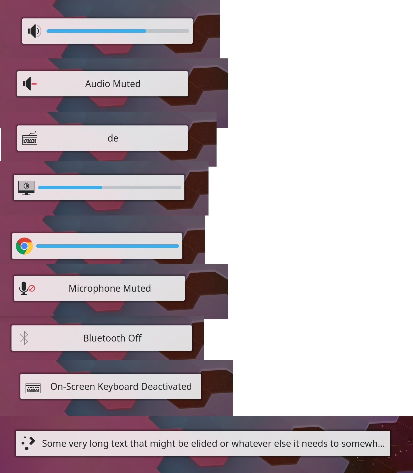
A frequent complaint over the years is the size of the OSD. It was tried to alleviate that by having it start fading out slowly immediately but the way it was done wasn't ideal, didn't work on Wayland, and also causes flickering issues in recent Qt versions.
This changes the OSD to a bar-like design similar to the one used in Plasma 4.

BUG: 344393
BUG: 372665
FIXED-IN: 5.20.0

Depends on D29263

Test Plan

Various OSD messages


It can grow, if necccessary, to accomodate translations, up to half the screen width.
With Air theme

Full desktop screenshot for some context

Diff Detail

Repository
R120 Plasma Workspace
Branch
arcpatch-D20569_2
Lint
No Linters Available
Unit
No Unit Test Coverage
Build Status
Buildable 27028
Build 27046: arc lint + arc unit
broulik created this revision.Apr 15 2019, 8:06 AM
Restricted Application added a project: Plasma. · View Herald TranscriptApr 15 2019, 8:06 AM
Restricted Application added a subscriber: plasma-devel. · View Herald Transcript
broulik requested review of this revision.Apr 15 2019, 8:06 AM
filipf added a subscriber: filipf.Apr 15 2019, 8:30 AM

+1 on making the OSD more efficient, I think it's the right direction to be going in.

Looking at the positioning though, it feels a bit weird to have an elongated shape more or less in the center of the screen. What about the idea to have OSDs spawn as notification events or at least identical in appearance? Example:

  • they wouldn't get in the way
  • it looks good IMO
  • their positioning would be configurable

Seems like that was what they had in Unity: https://wiki.ubuntu.com/NotifyOSD#Treatment_of_hotkeys

Fuchs added a subscriber: Fuchs.Apr 15 2019, 8:36 AM

I like the first, small but centered variant.

But I can see how people might want it differently: most of the time I use my PC for work. I assume if you are watching movies on it, a centered design is more of a bother than a corner one, whilst for work the center one is easier to spot.

Center also is rather sure to not clash with regular notifications, and I would not treat the OSD the same as notifications. No matter where you place it, given that you can e.g. press the volume button multiple times whilst notifications are incoming, placement will be tricky and, depending on how it is solved, jumpy.

No matter where you place it, given that you can e.g. press the volume button multiple times whilst notifications are incoming, placement will be tricky and, depending on how it is solved, jumpy.

With the new system shouldn't it be too bad. I can stick the OSD at the position closest to the panel so it never moves as notifications come and go, they would just be positioned above/below the sticky OSD. That's what I'm doing with critical notifications and job progress there and it works well. Changing the sort order to prioritize "OSDs" even more than critical notifications is easy. The OSD will not jump, the notifications that are shifted ouf of the way might move, yes, but I don't think that's gonna be too awful.

Great i hope we can make notifications more compact too
because its too big now

Great i hope we can make notifications more compact too

They will be, see D20266, but that's not the point of this discussion

Fuchs added a comment.Apr 15 2019, 8:57 AM
No matter where you place it, given that you can e.g. press the volume button multiple times whilst notifications are incoming, placement will be tricky and, depending on how it is solved, jumpy.

With the new system shouldn't it be too bad. I can stick the OSD at the position closest to the panel so it never moves as notifications come and go, they would just be positioned above/below the sticky OSD. That's what I'm doing with critical notifications and job progress there and it works well. Changing the sort order to prioritize "OSDs" even more than critical notifications is easy. The OSD will not jump, the notifications that are shifted ouf of the way might move, yes, but I don't think that's gonna be too awful.

I consider things with clickable controls (notifications, in this case) jumping to rather be awful, so personally I'd prefer to keep notifications and OSD seperate, as they have separate purposes, lifetime and behaviour.
Especially as notifications are something you can only click on (touch or pointer device). It's already not 100% reliable as new notifications can pop in, but I'd like to not make this worse by also moving OSDs in there, if possible.

I prefer the first, more centered approach for that.

hein added a subscriber: hein.Apr 15 2019, 9:01 AM

Personally I'm not a big fan. I think the square OSD has more character and visual flair. The change proposed here looks rather cramped and removes some identity from the system.

I'd like us to get in the habbit of putting new designs of theme changes on the store before we change defaults.

lookandfeel/contents/osd/OsdItem.qml
31–32

Screen.desktopAvailableWidth is all screens. Do you mean that?


Dialog should understand Layout attached properties of mainItem, so you can write the slightly more semantic:

Layout.max screen.width/2
Layout.min: units * 15

Though it's Dialog, so who knows....

broulik added inline comments.Apr 15 2019, 9:13 AM
lookandfeel/contents/osd/OsdItem.qml
31–32

Do you mean that?

Umm, just took that from the old code. What's the alternative? I guess I can just do width then without taking into acount panels

Though it's Dialog, so who knows....

I tried that, it didn't work reliably :)

In general I feel like I have to agree with Eike that this might reduce the visual distinctiveness of the system. I think the current square one has character, though I don't hate the proposed new one.

However I'm not sure this design would actually solve the most common problem that people have with it, which is "the OSD gets in the way when I change the volume while playing a video." This proposed new one one it still centered about a third of the way up, which means it'll still overlap actors' faces, subtitles, and so on.

I don't think store.kde.org is a solution here because we have no standalone category for OSD themes since they're built into the Plasma theme. Having to replace the whole Plasma theme just to change the OSD style is a rather poor user experience that will cause you to use a 3rd-part fork of the Breeze theme that no longer receives official KDE updates. I think ultimately we will have to bite the bullet and make it configurable within the same Plasma theme, offering an option for a compact and non-centered OSD as a non-default setting.

Alternatively, we can make the default non-centered but emotionally I don't like those as much as the big centered square ones.

Umm, just took that from the old code. What's the alternative? I guess I can just do width then without taking into acount panels

Can do. We're in a layer above panels so it's fine to overlap if it ever does come up.

I don't think store.kde.org is a solution here because we have no standalone category for OSD themes since they're built into the Plasma theme

There's *currently* no standalone category.

There's *currently* no standalone category.

If we create one, I could see that being an adequate solution, and then this could go there.

abetts added a subscriber: abetts.Apr 15 2019, 2:54 PM

I like the way that this is going. I also like the way that mobile does volume. Very understated. I think this is going the right direction.

I've been thinking about this OSD themes thing and I can't say I like it. I don't like the fact that you now need a different LnF to change them either, but to have another configurable theme thing seems like overkill.

Although it's not without a solution without drawbacks, visually and functionally I'd love to have the OSDs spawned as notifications. It would also make it super easy to just turn them off for DnD mode, which can be super easily turned on for when playing games or watching video.

I don't think it would work with the current screen layout chooser OSD though.

Then if that's not possible I'd keep them the way they are but include the option to disable them for full-screen apps.

Using notifications for the OSD is an interesting idea.

broulik abandoned this revision.Sep 16 2019, 10:29 AM

The current design seems amazing, how hard would it be to put it as an option? Even it may be better to use the notification system in the long run, accepting this patch or a modified version of it would be better than to wait for a long time still.

Also, most users wanting to configure the OSD want to 1) use a more compact OSD layout, 2) choose the position it appears, 3) a way to not display them on top of full screen applications. There are no other obvious and popular demands for OSD configuration, as far as I know. So I don’t think it’s worth creating a whole theme section on the KDE Store for at most three options.

Being able to put the OSD at the top of the screen or in a corner would make it appear not above subtitles, in the top black strip of videos when they do have strips, and not above whatever you’re doing if you’re not watching a video. So by implementing 1) and 2), 3) is probably not even necessary.

alexde added a subscriber: alexde.Dec 22 2019, 5:11 PM

Since the most common problem that people have is "the OSD gets in the way when I change the volume while playing a video", how about only changing those OSD styles for the "volume" and "brightness" and leave the rest as it is with their characteristic appearance and visual distinctiveness?

The volume/brightness OSDs could be displayed horizontally like in the OT or vertically as I posted in another Diff:

As Roman already suggested, the compact version could be used by default in full screen apps (only).
Though, I personally would not mind to have options exposed in the systemsettings.


P.S. Should this and the other discussion probably summed up in a Task for further discussions?

Yeah a Phab task would probably be a good place for this.

Another idea that's periodically come up is using the Notifications system to display these kinds of status messages, instead of a dedicated and different-looking OSD element.

https://bugs.kde.org/show_bug.cgi?id=344393 now has two duplicates. I would like to propose reconsidering this.

the solution that @broulik is the ideal. Simply reposition it to a location that is not the center of the screen.
Please reconsider adding that.

I still like osds as notifications but I agree with @alexde, a vertical osd in the corner opposite (?) to where notifications spawn would be visually more pleasing than what is proposed in this patch and should even get in the way less.

kori added a subscriber: kori.Apr 28 2020, 4:39 PM

Why was this abandoned? The arguments in favor of not changing are mostly on a personal level ignoring the complaints that the current big square behaviour affects usability (I went more in detail about this in another comment).

Several options were discussed here, and I have a few questions:

Do we want to keep the current design?

I don’t really understand why the OSD has to be so huge, because it contains so few information compared to a notification:

  • It’s triggered by the user so it’s not a big event that should distract (could be a big deal with attention disorder) or be specially put forward to the user (it should only be a confirmation of what’s happening)
  • Only a short sight is necessary to understand what’s happening because it’s only telling a change between:
    • an on/off state (e.g. mute/unmute sound or microphone)
    • a choice in a limited list (e.g. keyboard layout)
    • an increase or decrease of a value (e.g. sound or brightness)
  • Things appearing on-screen should (in my opinion) try to not cover what’s the user is working on (e.g. changing the music’s volume should not hide what the user is working on)

If we want to keep the current design, how should we handle the switch between compact and large OSD? (I would personally prefer compact OSD at all time)

Should it use the notification system?

I don’t think I know any platform with a unified notification/OSD system (at least it’s not the case on Windows, macOS, Android, and GNOME Shell). Also, it’s not straightforward because we may want OSD to continue behaving differently than notifications, so it may actually be counter-productive in terms of code complexity etc. (and obviously this would be a much larger change than an alternative compact layout and/or place on screen for OSD) So except if we have a strong case for unifying notifications and OSD, I don’t think it’s something we should do.

How to configure it?

We might want two things: compact OSD, and be able to put it where we want (because people have different layouts of panel, Krunner in a different place, etc.).

  • There could several options for e.g.: large mode/compact mode/automatic (= large usually, compact in fullscreen).
  • There are already several places where we could chose a place on the screen or a screen edge: kcm_notifications, kwinscreenedges and kwintouchscreen. This might not be a big deal to have another screen like that for OSD.

What do we agree on?

So this comment is mostly my views on the issue, and if we want to go forward with this, we have to agree on whether and how we want to do it.

Note: I’m using a hack found on Reddit and I’ve noticed the sound OSD reports a different value than the applet, because it doesn’t take into account that the sound maximum value might be more than 100% (e.g. applets reports 50%, OSD reports 33; applets reports 150%, OSD reports 100). This is not a problem with the current design because it doesn’t display any value (only a bar), but this needs to be taken into account for a compact version displaying a number.

Yeah, I'm in favor of revisiting this. Sorry I helped kill it with bikeshedding earlier. :(

Personally I appreciate the conceptual elegance of re-using the notification pop-ups, and this gains configurability with respect to location on screen, but code-wise it's a huge can of worms and is probably not easily doable.

I think the style proposed here is a reasonable compromise. I've submitted a KWin patch to hopefully improve the positioning a bit more with this style: D29263

broulik reclaimed this revision.May 19 2020, 5:46 PM
ngraham commandeered this revision.May 19 2020, 5:46 PM
ngraham added a reviewer: broulik.

Yoink.

ngraham retitled this revision from RFC: Use more compact OSD to Use more compact OSD.May 19 2020, 5:46 PM
ngraham edited the summary of this revision. (Show Details)

I would like to formally re-submit this for consideration.

ngraham updated this revision to Diff 83067.May 19 2020, 5:50 PM
ngraham edited the test plan for this revision. (Show Details)

Rebase

Fuchs removed a subscriber: Fuchs.May 19 2020, 5:51 PM
niccolove accepted this revision as: niccolove.May 19 2020, 5:53 PM
This revision is now accepted and ready to land.May 19 2020, 5:53 PM
ndavis accepted this revision.May 19 2020, 6:31 PM
ndavis added a subscriber: ndavis.

I have no problem with this.

ngraham closed this revision.May 19 2020, 8:04 PM

I’m so happy that it has finally been merged! I wish I could express more often how glad I am of the work being done on KDE, but it would be quite annoying to spam every patch/bug report I care about. ^^

I hope my contribution to the discussion was valuable BTW, as I’m often not able to contribute code-wise to KDE.