User Details
- User Since
- Apr 16 2016, 9:34 PM (477 w, 16 h)
- Availability
- Available
May 19 2022
| Wallpaper | Vote |
| Dark Flow | +1 |
| Safe Landing | +1 |
| Blue Ocean | 0 |
| Hearth v.2 | 0 |
| Liquid Glass | +2 |
| Unnamed | -2 |
| No New Wallpaper | +1 |
Jul 1 2020
One potential problem is that the IRC side limits the amount of connections allowed from a single IP to combat abuse. If a separate bridge is used, chances are that this one might hit limits at one point if it spawns an IRC connection per user.
Jun 18 2020
we spell ourselves freenode, lowercase f, and in general we would want that bridge to be used, not the matrix one. (due to both limits and lag)
Why a rainbow for kde-chat? Is that a temporary thing due to it being June, or is there some association rainbow <> chat that I miss?
Jun 17 2020
We recently upped the iline for the KDE Matrix bridge (not the regular Matrix bridge, please note that this is a completely separate thing) and whilst due to me being involved with KDE I'd like my colleagues to decide on that one, I'm pretty positive we should be able to raise limits for a cause such as adding a Telegram bridge.
Feb 7 2020
Kate and Kwrite use, as far as I am aware, the same kpart, so they already are sort of merged. It makes sense to have a simple text editor to edit text files (kwrite), and a feature rich one for developers (kate)
Jan 23 2020
Looks good to me, thank you very much for the work :-)
Dec 27 2019
Good for me, hopefully the upstream bug will be fixed, too :)
Dec 14 2019
Then as soon as you actually run the app there will be a duplicate, the launcher and the entry in the task manager. If I understood correctly, pinned tabs in browsers avoid that. You have a small, icon only variant when not open and a full variant (at the same position) when open.
If I remember correctly, the main argument against the launcher was that pinned apps should be pinned and thus not change their location / order, but exactly that would happen with a launcher once you open the app (that, or a duplicate entry in the window list)
Dec 11 2019
Sidenote, maybe an upstream bug / wish can be added about
Dec 5 2019
As I wrote, "I'd like to, again last time I gave up, this time I want to at least mention it." so personally I still hope we can add such a filter. But if we can't: shame, then indeed I won't read it, and I'm afraid others won't, too. But I won't fight a majority decision.
It's getting a bit tiresome with these accusations, so to clarify:
my reasoning, stated in the very chat you mention, is and was, unedited,
Could we please focus on the proposed solution.
Political and non-controversial might be difficult, KDE or non-KDE I think should be feasible.
I agree with Lazlo that there are other systems that seem to be doing fine, so I think we should be able to do it, too.
However, I trust less in machines and automations and rather in common sense, as in: bloggers are mature enough to know if a blog post is about something KDE or something less related, but personally important.
May I suggest an alternative solution of differentiating between KDE topics and personal topics? Then we could add a filter, same as we do for languages.
Jun 13 2019
sounds good to me, yeah. Note that I only created this following a discussion after I forwarded complaint from a 5.16 article in the news, I don't think I will be a good owner
Apr 15 2019
I like the first, small but centered variant.
Feb 23 2019
One minor nitpick: if it is on all virtual desktops there is no text shown, related to virtual desktops, maybe some "is on all virtual desktops" or so would be nice, for consistency.
Yep, that works here, even with groups spanning multiple desktops. Thanks for the quick fix!
Dec 19 2018
I'm in favour of having a different colour for the active window title bar, as this is also what controls like buttons do.
Having the same colour for the inactive title as the rest of the window is imho fine.
Jul 15 2018
if it falls back then all is perfect :)
Jul 14 2018
Ah, great, so it would not be any regression for non-PA users, thanks for the info
What happens to supported systems that do not have pulse audio?
The *BSDs we do support come to mind.
Also Linux distributions that do not use PA or offer to not use PA.
Jul 2 2018
Jun 24 2018
Personally I don't think that we should ship changes that rely on hard-coded theme names like
Jun 22 2018
as written on Telegram, added here per your request:
Jun 19 2018
Maybe add the technical term in brackets though, for those people who search for the technical term and don't find it otherwise?
Jun 14 2018
I think it makes it a lot harder to see though, depending on what the background is.
Taken from VDG discussion:
Jun 10 2018
Personally I am very much in favour, even to tech-savy people who had to deal with systems like the Atlassian Stack (Jira, BitBucket etc.), Redmine and GitLab, Phab can sometimes be very confusing and it's not entirely sure if a button will do what you expect it to.
I also assume that for people who don't feel terribly comfortable with English yet, it might make it even harder.
Jun 6 2018
Task Switcher > Alternative (https://phabricator.kde.org/M112/390/) - What does this actually do?
Jun 1 2018
In an ideal world I'd agree with you. But if the changes can only be done by few people (or not at all), it would not hurt to safely check beforehand whether a) it is possible b) someone with the needed knowledge and skill is willing to do it, because we can neither force people nor make things happen by magic, so that might safe some time and frustration. Not saying it should be the default for every minor change.
Personally I'd be okay with no borders without rounded boarders by default, even though I'd consider it a UX setback to have a less visible resize area just for the sake of a more thin look. To me form follows function.
Plus, personally I don't think we should switch defaults too often during a major release cycle, but rather decide something and then go with it for a while. This would lead to fewer inconsistencies where some areas are adapted to the new look and others are not, and give us a more polished look. (I am fully aware that we don't major release that often)
May 22 2018
Maybe we need to discuss things, especially also with https://phabricator.kde.org/D12463 where I have an interest in, on a broader scale.
May 21 2018
Highlighting them in the menu is a good idea and it also is what Windows does (since quite a few versions)
May 15 2018
Well, I think I mentioned my arguments about not wanting to override what other applications do by force. Applications where we have no control over what they do and, more important, why they do it.
Against 3) because the window manager will modify window content which apps are not designed or prepared for.
The rest is fine, with my usual "keep in mind that changing a default, in KDE, does override what existing users had and might have liked, please change as few defaults as possible and only where really needed".
May 8 2018
Personally I prefer the group boxes as they add some vertical separation when multiple radio groups follow.
May 7 2018
I like the idea in general, I agree though that, despite the severity, it is technically not an error and should not be shown as such, but rather a warning indeed.
May 2 2018
Apr 26 2018
Apr 24 2018
Apr 23 2018
On the existing bug: it's related to the TODO at line 1513, changing that to
Apr 22 2018
Also needs https://phabricator.kde.org/D12463
Apr 12 2018
happy fox now happy, says thanks :)
Mar 22 2018
Mar 19 2018
Mar 16 2018
Personal opinions, based on discussions here and on TG
Mar 15 2018
+1, looks great to me.
Bit of duplicate control, but given there can be one at most, that seems fine to me.
Mar 14 2018
Sorry, but clear -1 from me for the reasons outlined in the Telegram channel.
Mar 12 2018
Please definitely no hover. Whilst I agree that some things get way too tailored for other form factors, this is not one of them. I just very recently discovered that the plasma theme chooser has a preview button that magically appears on hover, so I agree with that being hard to discover and user hostile.
Yes, I very much like the overflow and the usage you describe, as per the discussion on Telegram and https://phabricator.kde.org/D11231, I think mixer is however not an example where it should be used, because in the mixer it's not an overflow of functionality, but rather a menu on its own.
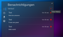
New screenshot with fixes
- Better hack for placement
- Change the layout import according to kbroulik
- Use Math.round() as per discussion
- Capitalized History in the tooltip label as per discussion
Screenshot:
Updated, I didn't see that old community wiki entry, that is of course way better. Linked until it gets ported, which also fixes the second comment as side effect.
- Link to the community wiki as per phab comment
Mar 11 2018
Whilst I like the labeled one more than the current one, I can't say I'm a huge fan of either.


