Settle on a single style for radio buttons with a title
Closed, ResolvedPublic

Description

This came up in D12571. KDE software currently uses three distinct styles for radio buttons with a title:

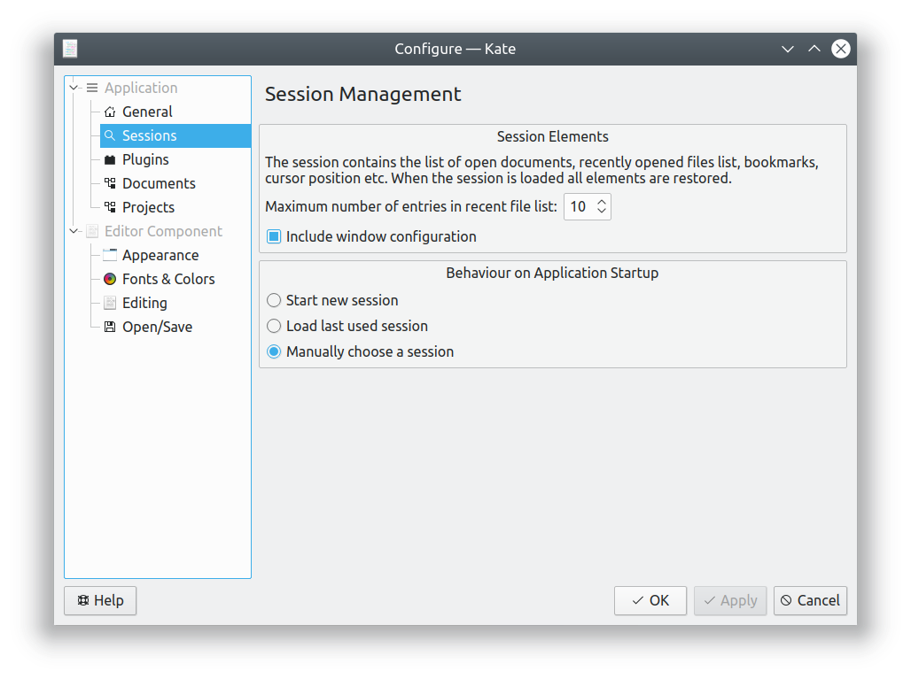
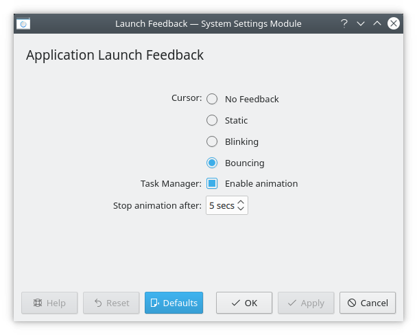
Title and buttons left aligned, with buttons below title


Drawbacks:

  • Titles can get lost in busy layouts
  • Without indenting the buttons a bit, it can be hard to connect them with the title--but if you do, they're not aligned with any checkboxes in the layout
  • With an even somewhat wide window, there's a huge amount of unbalanced whitespace on the right side

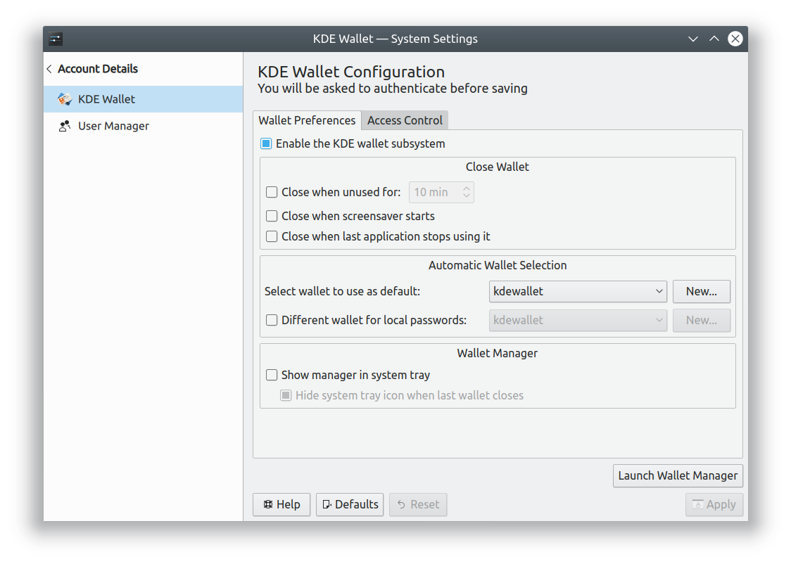
Centered title, with radio buttons left-aligned inside a group box
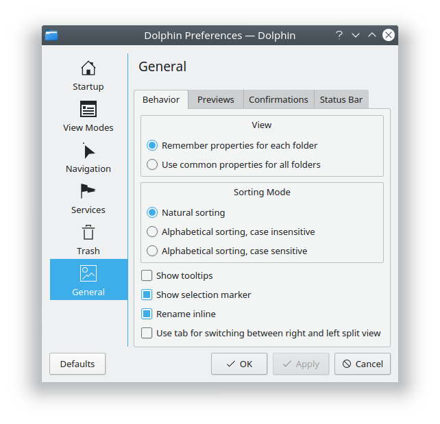
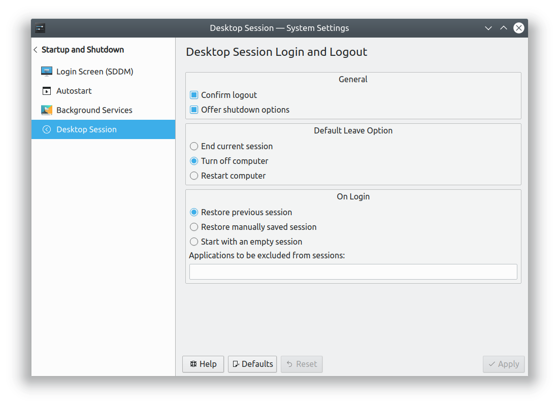
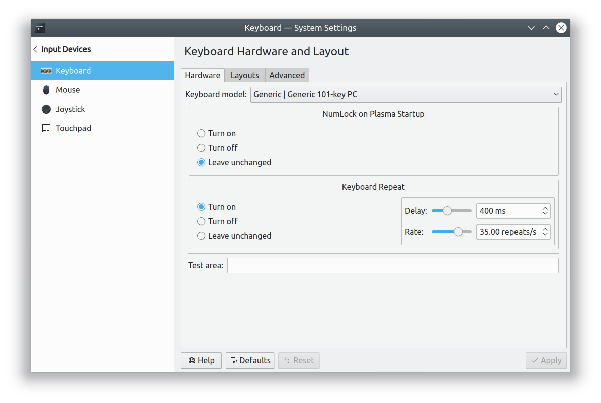


Drawbacks:

  • Heavyweight appearance, especially when there are also tabs, tables, or other group boxes in the UI. Contributes to "frame overload"
  • With an even somewhat wide window, the title is far away from the radio buttons

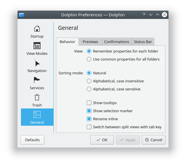
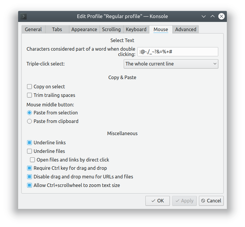
Radio buttons left-aligned, with title to the left of the top radio button
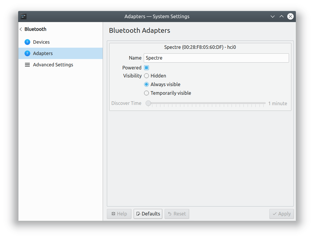


Drawbacks:

  • Limiting and not very space efficient for long radio button text
  • The only way to make checkboxes look good is to also vertically align them with the radio buttons and put header text on the left, but this is awkward when there's only a single checkbox, and makes it hard to have long text

The HIG is inconsistent on the matter. It shows examples of the first two styles as "good". It makes no direct mention of the third style, but recommends the use of QFormLayout, which implements the third style!

We should decide on a single style as the official one so that work can commence on adjusting examples of the other styles to conform.

I am particularly interested in keeping the left title and right control idea. I think what we probably need to do more of is to use better language that is more concise and to the point. Sometimes our titles are really paragraphs in disguise. Maybe we can review these, condense them. If a piece of setting needs more explanation, we can work a better method to explain them in line or some other way. However, titles are generally shorter.

For example:

  • NumLock on Plasma Startup

Could read:

  • NumLock Behavior

Or

  • Characters Considered as Part of a Word when Double Clicking

Could Read

  • Double Click Selected Characters
  • Double Clicks Selects

Does that help?

rizzitello added a subscriber: rizzitello.EditedMay 7 2018, 10:33 PM

With number three we have some challenge since we have only so much horizontal space to work within before our windows become very wide. Adjusting the wording used for both the labels and options will be a requirement. I think we should start looking into what strings we can improve and what ones we are stuck with. I would like us to go with number 3 if we can make it work. I'm just not sure we can get most translations to fit in our allotted space. We might find that number three is just not a useable solution. If that is the case I would like number one. The main issue with number one is that it becomes to easy to miss. Maybe we can remedy this by using a larger or bold or underlined text for the titles. I think keeping the controls inline is also important.

With number three we have some challenge since we have only so much horizontal space to work within before our windows become very wide. Adjusting the wording used for both the labels and options will be a requirement. I think we should start looking into what strings we can improve and what ones we are stuck with. I would like us to go with number 3 if we can make it work. I'm just not sure we can get most translations to fit in our alloted space. We might find that number three is just not a useable solution. If that is the case I would like number one. The main issue with number one is that it becomes to easy to miss. Maybe we can remedy this by using a larger or bold or underlined text for the titles. I think keeping the controls inline is also important.

I agree here, maybe another part of a contingency plan would be to design a method, like the 3rd method but that accounts for multiple lines of text on the left title.

I also prefer number 3, and agree that we'd need to re-word a lot of strings that are really long. That's a good idea just in general though. Shorter strings are always better, where possible.

rizzitello added a comment.EditedMay 7 2018, 10:41 PM

Heres one From the first dialog.

When clicking a file in an archive or pressing the Return Key

When opening files in an archive

  • Internal browser
  • External application
Fuchs added a subscriber: Fuchs.May 8 2018, 7:36 AM

Personally I prefer the group boxes as they add some vertical separation when multiple radio groups follow.

Label on the left suffers from the well known "might fail badly with translation", as translators do not know how much space is available, which did lead to cut off text and similar quite a couple of times in the past.

In T8655#141054, @Fuchs wrote:

Personally I prefer the group boxes as they add some vertical separation when multiple radio groups follow.

The problem with encouraging the use of group boxes for radio buttons isis that they contribute quite strongly to frame overload:


I don't think using them within any other layout tool like a tabbed view is ever a good idea and radio buttons are often in tabbed views. Also, the HIG specifically discourages nesting group boxes, so this would amount to prohibiting radio buttons in existing group box layouts.

In T8655#141054, @Fuchs wrote:

Label on the left suffers from the well known "might fail badly with translation", as translators do not know how much space is available, which did lead to cut off text and similar quite a couple of times in the past.

This is true, and why the labels on the left should always be as short as possible (one or two words mad, ideally).

Label-on-the-left also complicates RTL design, unless the formLayout widget handles this automatically.

Label-on-the-left also complicates RTL design, unless the formLayout widget handles this automatically.

Isn't this true for both one and three? Both are use the QFormlayout.

markg added a subscriber: markg.May 8 2018, 10:37 PM

I prefer with groupboxes, but not the breeze and oxygen groupbox style.
The styles with the groupbox title embedded within the top horizontal line strikes me as really fancy.
For reference: http://www.beginning-kdevelop-programming.co.uk/Chapter%20Four/BKPChapterFour_html_46b5f46a.png

Or just search for QGroupBox in google images :)

fabianr updated the task description. (Show Details)May 9 2018, 7:03 AM
In T8655#141054, @Fuchs wrote:

Personally I prefer the group boxes as they add some vertical separation when multiple radio groups follow.

Label on the left suffers from the well known "might fail badly with translation", as translators do not know how much space is available, which did lead to cut off text and similar quite a couple of times in the past.

But wouldn't that also apply for other input controls (line edit, dropdowns, ...) where the label are placed to the left?

To me the the third proposal are actually two different proposals in in one?

  • The first is "Radio buttons centered with title to the left of the top radio button", as in screen shoot 1
  • The second one is "Put a label on left of the first radio button, and align left like other form elements", as in screen shoot 2 & 3
ngraham updated the task description. (Show Details)May 9 2018, 4:16 PM

You're right, @fabianr. This is really a left-aligned layout, with the title to the left of the top button. I've edited the original post for clarity.

ngraham updated the task description. (Show Details)May 9 2018, 4:19 PM
abetts added a comment.May 9 2018, 4:27 PM

To close out the definitions, we will proceed with option 3 and work alternatively with some use cases to polish option 3.

ngraham closed this task as Resolved.May 9 2018, 5:22 PM

[This was the result of discussions in the VDG room]

Sounds good to me. That's what the FormLayout already prescribes. @fabianr, can you make sure the HIG is updated?

Imho option 3 just looks bad when you only have a long sequence of radio buttons and cheboxes, like here:

In the screenshot above, the problem is that's not a form in the first place. A form usually has many input fields and only few checkboxes, while here we have just a random list of mostly unrelated options.

I feel like the problem here is not the style, is the number of options. But if it helps any, I think we can also use horizontal separating lines for different sections.