Don't worry: After many years working as a usability consultant and UX designer, I know that I have to distinguish between my own needs and user needs.
Feed Advanced Search
Sep 21 2017
Sep 21 2017
colomar added a comment to D7905: Remove launch feature from hamburger button and restore to the toolbar.
colomar added a comment to D7905: Remove launch feature from hamburger button and restore to the toolbar.
Sep 13 2017
Sep 13 2017
colomar added a comment to D7714: Show dialog to ask when closing when more than tab open.
Why don't we simply copy the Firefox dialog?
Firefox has a big userbase and with the default settings, the vast majority of users will see this dialog at some point. Therefore if their wording was problematic, it's very likely someone would have flamed them for it.
So I'd consider their dialog "real-world tested".
Sep 6 2017
Sep 6 2017
Aug 31 2017
Aug 31 2017
colomar updated the task description for T6895: Making KDE software the #1 choice for research and academia.
Aug 30 2017
Aug 30 2017
colomar updated the task description for T6895: Making KDE software the #1 choice for research and academia.
Aug 29 2017
Aug 29 2017
Aug 21 2017
Aug 21 2017
colomar added a comment to T6842: Kde.org overhaul.
colomar added a comment to T5940: [Content] Promote Project Halium.
@bshah The "Halium Unifies Mobile Linux" section of the article "Plasma rocks Akademy" [1] seems to cover the things you mentioned above.
Do you feel that what should be said about Halium has now been said, or are there more things that should be promoted about Halium?
colomar added a comment to T6842: Kde.org overhaul.
Aug 9 2017
Aug 9 2017
aaronhoneycutt awarded M43: Plasma Desktop and Panel Layout Editing UI a Love token.
Aug 8 2017
Aug 8 2017
Aug 7 2017
Aug 7 2017
colomar added a comment to T6733: where should we store the files the initiative will generate?.
The answer to that is share.kde.org (our Nextcloud installation).
The cleanest way to do that is to ask sysadmin to create a shared folder there along with an Identity group that gets access to it and contains everyone in this project.
Jul 26 2017
Jul 26 2017
Jul 11 2017
Jul 11 2017
colomar added a comment to T6481: [Analytics] Find tools to collect data from social media accounts.
Since Piwik can already track if people come to our articles from social networks, I'm not sure if URL shorteners provide us with any additional information. They don't track things like number of followers or number of likes or reshares anyway.
Jul 5 2017
Jul 5 2017
colomar added a comment to T2070: Agree Plasma Vision.
Final edit from my side:
colomar added a comment to T2070: Agree Plasma Vision.
Final tiny nitpick:
Jun 13 2017
Jun 13 2017
colomar added a comment to T2070: Agree Plasma Vision.
Sounds really good!
May 13 2017
May 13 2017
May 3 2017
May 3 2017
colomar added a comment to D5682: Creates keyboard shortcuts for Present Windows Effects actions.
Okay, to be honest: I don't fully understand what you guys are talking about ;)
- Is the mouse-driven workflow mentioned here new in Plasma 5.10, or is it so hidden in 5.9 that I simply cannot find it?
- Where do these shortcuts come from, where do they already exist?
Apr 13 2017
Apr 13 2017
colomar added a comment to D5429: Add option to focus some widgets only on keyboard input.
It definitely should not be an option. Either it's better, then it goes in, or it isn't, then it doesn't.
colomar added a comment to D5429: Add option to focus some widgets only on keyboard input.
Who has complained about this? Can we see the reports?
colomar added a comment to D5428: Add option to disable hover effects..
If it's most likely to be decided only on the distribution level, we don't necessarily need a GUI for switching it, do we? We could also just have it as an unexposed parameter in the config file.
Apr 9 2017
Apr 9 2017
colomar added a comment to T5817: Akademy Sponsorship Brochure -- Design.
2.1 MB, much better! :)
The cover page looks like has some compression artifacts in the text. Is it a bitmap which has been compressed?
If so: Would it perhaps be possible to use a different format for it which can be shrunk to a usable size without any loss?
colomar added a comment to T5817: Akademy Sponsorship Brochure -- Design.
Looks good, but why is the PDF 55MB big? There must be some gigantic images in there...
That would make it quite heavy to send via email or for people to download...
Apr 8 2017
Apr 8 2017
colomar added a comment to D5339: Include a bottom toolbar for the application page.
Version 2 (top toolbar, no colors) looks the best to me, with the downside that the install button does not stick out. If we go without colors, we'd probably at least need an icon for the install button to not make it totally blend with the rest.
Apr 4 2017
Apr 4 2017
colomar added a comment to T5778: Revise/edit Sponsorship Brochure.
Mar 29 2017
Mar 29 2017
Mar 1 2017
Mar 1 2017
colomar added a comment to D4838: [Notifications] Add context menu for thumbnail.
Final comment: Do whatever makes sense, keep only the context menu if you like. I'm out.
colomar added a comment to D4838: [Notifications] Add context menu for thumbnail.
colomar added a comment to D4838: [Notifications] Add context menu for thumbnail.
colomar added a comment to D4838: [Notifications] Add context menu for thumbnail.
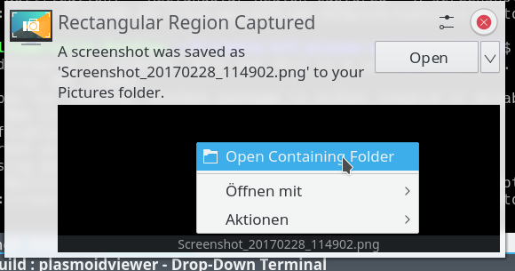
Okay, personal opinion on why split buttons are among the most horrible things related to UX:
(And whilst some of these points might not apply to this very specific use case here: they will elsewhere, and once one component users this button, others will too, see e.g. spectacle)
- They are very prone to accidental clicks. If you want to click the (little) arrow but hit the button instead, worst case you get an undoable, destructive action. This gets a lot worse with touch.
Feb 28 2017
Feb 28 2017
colomar added a comment to D4838: [Notifications] Add context menu for thumbnail.
colomar added a comment to D4838: [Notifications] Add context menu for thumbnail.
colomar added a comment to D4838: [Notifications] Add context menu for thumbnail.
colomar added a comment to D4838: [Notifications] Add context menu for thumbnail.
You don't have that in a file manager, either, and this thing represents a file.
Feb 25 2017
Feb 25 2017
colomar added a comment to D4663: Allow setting the timeout value..
even Windows and Mac have deprecated them in favor of persistent notifications!
Not only it's already implemented, but also it is what every major desktop and phone OS out there already use!
Feb 22 2017
Feb 22 2017
colomar added a comment to D4663: Allow setting the timeout value..
I agree that what Android does makes a lot of sense. What they have is
- a permanent icon in the top bar for each application that still has an open notification - basically an SNI, minus the direct interactivity (which makes sense given that tiny icons are not much fun to interact with on a touchscreen)
- a drawer that shows all notifications that are still valid (plus the same on the lockscreen if enabled)
Feb 20 2017
Feb 20 2017
Feb 11 2017
Feb 11 2017
colomar added a comment to D4563: Replace warps-slider checkbox with radio buttons.
I'm all for the change, obviously ;)
Feb 1 2017
Feb 1 2017
Jan 24 2017
Jan 24 2017
colomar added a comment to D4215: Make notifications execute the "default" action on click..
+1 from me, with clicking on a notification that does not define a default action doing nothing
Jan 21 2017
Jan 21 2017
colomar added a comment to D4215: Make notifications execute the "default" action on click..
Since there does not seem a clear "best solution", isn't this something that should be decided on a cross-desktop level?
After all, it's not just about what users expect, but also what app developers can expect to happen with their notifications.
Jan 20 2017
Jan 20 2017
colomar added a comment to D4215: Make notifications execute the "default" action on click..
Jan 16 2017
Jan 16 2017
colomar added a comment to D4142: Support "default actions", as specified in [1]..
>>>! In D4142#77861, @colomar wrote:
Hm, that's not easy to decide. Whether one likes the "click to make go away" behavior or not is highly subjective. I, for one, find it very annoying on e.g. OS when a notification covers something I want to see on the screen and there is no way to make it go away other than waiting. Others find it annoying to have to explicitly click a button to execute the default action.
Same thing: the framework giving access to this feature doesn't mean your app has to use it. Even more: it doesn't even change the behaviour in Plasma! In Plasma the default action will still appear as a button unless we change the plasmoid. This will, however, make it possible to use this feature on desktops that do support default actions.
colomar added a comment to D4142: Support "default actions", as specified in [1]..
Hm, that's not easy to decide. Whether one likes the "click to make go away" behavior or not is highly subjective. I, for one, find it very annoying on e.g. OS when a notification covers something I want to see on the screen and there is no way to make it go away other than waiting. Others find it annoying to have to explicitly click a button to execute the default action.
Dec 27 2016
Dec 27 2016
colomar added a comment to D3815: [Task Manager] Add "Places" for entries belonging to a file manager.
Yes, that is certainly a downside. One idea could be to move it into a submenu if there are more than X entries (though I'm not sure yet which number to choose). The downside of that would be that people who often add and remove places might get confused by the context menus jumping between submenu and no submenu
colomar added a comment to D3815: [Task Manager] Add "Places" for entries belonging to a file manager.
To solve the problem of the context menu getting very long: How about putting the places in a submenu?
Dec 22 2016
Dec 22 2016
colomar added a comment to D3790: RFC: [Lock Screen] Indicate keyboard layout when unlocking failed.
We always have to keep in mind that usind multiple layouts is an advanced feature used by a minority of users. Therefore, as long as a feature only becomes active when there are multiple layouts (and in this case only when multiple layouts are used _and_ the login failed), we do not need to worry too much about UI clutter.
For that reason, I don't see mich of an issue with the patch.
Dec 21 2016
Dec 21 2016
colomar added a comment to D3602: Cycle between windows of the same desktop on switch.
Sorry for not replying earlier.
While this proposed behavior might indeed not be expected by everyone, this is not really a problem: Those who would not expect the wrap-around behavior would not expect anything to happen at all, and therefore not even press the shortcut if they are at the left-/rightmost window. If they do press it anyway (maybe by accident), they might be surprised at first, but it will be easy to them to get back to where they were before, and then they can still decide whether or not they want to use the shortcut in such situations in the future.
So, long story short: The benefits clearly outweigh the risks here, so +1 for the patch from the usability side.
colomar added a comment to D3756: [Folder View] Add "Restore" from trash option.
Yup, makes sense!
Dec 19 2016
Dec 19 2016
colomar added a comment to D3738: [Task Manager] Tooltips redesign.
Great improvements!
Is the desktop / Activity only shown if
- there are multiple ones and
- the task manager shows tasks from different ones?
Dec 10 2016
Dec 10 2016
colomar added a comment to D3616: [Lock Screen / Login] Add "reveal password button".
+1 for the patch (I don't think the icon is close enough to the login button to be problematic)
colomar added a comment to D3573: Implement search function.
I'm sorry that I have not commented earlier, I blame it on an overflowing inbox :-/
Nov 29 2016
Nov 29 2016
colomar added a comment to D3538: Drop resize animation when adding pages.
+1, definitely looks better to me (and Jens will love any killed animation, anyway ;) )
colomar added a comment to D3539: [Notifications] Show interactive thumbnails on notifications.
Really nice!
The single thumbnail might be a bit too large, as having large notification windows pop up could be irritating. Maybe half the size would be big enough?
Nov 16 2016
Nov 16 2016
colomar added a comment to D3210: make scrollbar size configurable.
I haven't had the chance to play with it and I think we should still have a plan B if we get negative feedback on it during beta tests, but the concept as it is described in the latest comments makes sense to me.
Nov 10 2016
Nov 10 2016
Nov 7 2016
Nov 7 2016
colomar added a comment to D3210: make scrollbar size configurable.
Whoa okay, that is complex...
Given that I failed to understand what the proposed checkboxes were supposed to mean, I fear it will be the same for users.
Therefore maybe not gibing the option at all is indeed the better solution, and your suggestion to turn the feature off when animations are turned off makes sense to me as well.
colomar added a comment to D3268: Applet: Show device icons and active port name.
Great feature!
I just fear that the naming scheme might make it look like the device name is the name for the port, like "A microphone called Audio Adapter".
Maybe naming
Port (device name)
would make it more clear?
colomar added a comment to D3302: [Task Manager] Indicate applications playing audio.
Very useful patch!
Nov 6 2016
Nov 6 2016
colomar added a comment to D3210: make scrollbar size configurable.
in this latest version there are 2 checkboxes: "show scrollbar only on mouse over" and "small scrollbar" which both defautls to true
Nov 4 2016
Nov 4 2016
colomar added a comment to D3210: make scrollbar size configurable.
If I understood it correctly (that there is only a checkbox "Only show full scrollbar on mouse over" added to the config) then that is exactly what I had in mind.
Nov 2 2016
Nov 2 2016
colomar added a comment to D3210: make scrollbar size configurable.
It does make sense to me to give the option to turn the slim scroll bar as such on and off. I can imagine some people being uncomfortable with the animation on mouseover.
Being able to configure individual parameters is probably overkill, however.
Oct 30 2016
Oct 30 2016
colomar added a comment to D3156: WIP: Application Menu applet.
Our users will be very happy about this being back!
I agree that there needs to be some way to access it via keyboard. Pressing alt to shift keyboard focus to the menu bar sounds like a good idea, if pressing alt again shifts it back to the window content again.
colomar added a comment to D2314: Context Menu to Mute, Set Default Sink/Source, Active Port.
Sorry for not replying earlier.
There is nothing that speaks against offering this context menu. However, all the actions in the context menu must be available in the main UI as well. Due to discoverability reasons, context menus must never be the only way to access an action.
So, this patch is good to go, but there needs to be a way to do these things without the context menu as well.
Oct 15 2016
Oct 15 2016
colomar moved T3464: KScreen user interface redesign from Work in Progress to Sent to dev on the VDG board.
colomar moved T3220: Plasma Logo Design Contest from Work in Progress to Sent to dev on the VDG board.
Oct 10 2016
Oct 10 2016
colomar added a comment to D3011: [SDDM Theme] Show caps lock warning.
+1 for the change!
I think the string for failed unlock while capslock is on should be "Login failed (Caps lock is on)" though, as the "login failed" part is the more important one.
Oct 6 2016
Oct 6 2016
colomar updated subscribers of D2957: [SDDM Theme] Offer switching to the user's session if there is one.
Also it really needs to be a config option somewhere. People do multiple login. We made LightDM reuse sessions and got tonnes of comments.
colomar added a comment to D2957: [SDDM Theme] Offer switching to the user's session if there is one.
Definitely a good change!
Oct 5 2016
Oct 5 2016
colomar added a comment to D2944: [TabBox] Switch between windows with mouse wheel.
Behavior sounds sensible, wrapping around would make sense, though.
Sep 28 2016
Sep 28 2016
colomar added a comment to M71: Display KCM Redesign.
On the other hand, we could open in the overlay mode for the single connected display when there's only one screen. When another screen gets attached, we remove the overlay and show the overview with positioning. I haven't made up my mind about that, but maybe it's a viable option down the road, so that's just a first shot.
Sep 21 2016
Sep 21 2016
colomar updated subscribers of M71: Display KCM Redesign.
@mart The upside of that would certainly be a clean appearance, but the downside would be that what sebas described as a typical usecase - You only have one screen and want to change its resolution - would then be two clicks instead of one.
Sep 19 2016
Sep 19 2016
colomar added a comment to M71: Display KCM Redesign.
I've updated the main mock.
Changes:
- Disabled displays are now in a separate box. Rationale: A disabled screen cannot ever be part of the screen setup anyway
- Rotation is now done via rotate left/right buttons
- Setting Primary display is done via positioning it in a box in the center. Rationale is that in most cases, the primary display will be in the center of the physical setup as well. Of course one can decide to e.g. only put further screens to the right of the primary screen if one does not want the center screen to be the primary one
- Advanced section removed
- Refresh rate setting removed, is now integrated in resolution
colomar updated images of M71: Display KCM Redesign.
colomar updated images of M71: Display KCM Redesign.
colomar added a comment to M71: Display KCM Redesign.
Perhaps the best is to show all resolutions, pick the max refresh rate for a given resolution (the current "auto" setting), but warn the user that this mode has a low refresh rate and advise to pick a lower res with a higher refresh rate? This would allow users to shoot themselves in the foot, but makes it a bit more intuitive to pick what's sensible for the eyes.
colomar added a comment to M71: Display KCM Redesign.
That could work, but it needs a conscious choice if we allow the user to set up a sore eyes config (high res at low refresh rate).
colomar added a comment to M71: Display KCM Redesign.
You say it matches the mental model, but I don't think that's actually the case: you normally drag the screens in the KCM to match how they're on your desk, not "create a large virtual display". To me, the fact that I could even put displays on top of each other wasn't evident until I fixed bugs where this case happened.
colomar added a comment to M71: Display KCM Redesign.
On the top of resolution vs. refresh: Yes, there's a clear case where this matters. Graphics cards support a maximum resolution at a specific refresh rate. If you lower the refresh rate, you can get higher resolutions (and sore eyes), if you decrease resolution (possibly below the display's native res), you can get higher refresh rates. They're really inter-dependent. (Think of the product of number of pixels and refresh rate, that's the maximum bandwidth the graphics card can push to the display.)
colomar added a comment to M71: Display KCM Redesign.
As to scaling the kscreen kcm ui live while dragging ... I'm not so sure about it. It does sound neat, but it also bears the risk of UI bits falling outside of the screen (and thus input area), window being repositioned (if we choose to do so), and at the very least the slider control slipping away under the mouse. Sounds like a nice idea in theory, but it has so many problems attached to it, I'm not sure we want to go down that route.
colomar added a comment to M71: Display KCM Redesign.
displays on top of each other is a perfectly valid case, also with different resolutions, so I'm not sure this would
- work well
- be discoverable by users
colomar added a comment to M71: Display KCM Redesign.
Thank you for the feedback! Let's see...
colomar added a comment to T3464: KScreen user interface redesign.
I have added a mock of a redesign proposal (wireframe status).
Sep 13 2016
Sep 13 2016
colomar added a comment to D2741: [Window Switcher] Cleanup.
I've just asked the other VDG members for their take on the font size.
Since this is not a big issue either way, the patch is fine to go in anyway.
If the VDG decides we'd like the font to be smaller, it would be nice if it could be changed in another patch.
Sep 12 2016
Sep 12 2016
colomar added inline comments to D2584: Introduce a config option whether applications are allowed to block compositing.
colomar added a comment to D2753: [Screen Locker KCM] Put Wallpaper in a separate tab.
colomar added a comment to D2753: [Screen Locker KCM] Put Wallpaper in a separate tab.
colomar added a comment to D2580: possible to use OverlaySheet with ListView.
There is always still the possibility to use one of the Action Buttons as a close button (as shown in the Gallery) if it gets too long to easily swipe away.
colomar added a comment to D2580: possible to use OverlaySheet with ListView.
There is always still the possibility to use one of the Action Buttons as a close button (as shown in the Gallery) if it gets too long to easily swipe away.
Sep 11 2016
Sep 11 2016
colomar added a comment to D2383: [Notifications] Add "Clear Notifications" context menu entry.
colomar added a comment to D1771: [Workspace Options] Add option to disable OSD.