KScreen user interface redesign
Closed, InvalidPublic

Description

The system settings module for (multi-) screen configuration is a bit dated, and it shows a number of problems in ui that can be solved more elegantly.

I've described the current function and user interface in detail here https://community.kde.org/Solid/Projects/ScreenManagement/Design . This gives the basic understanding of what and how kscreen does its job: screen management.

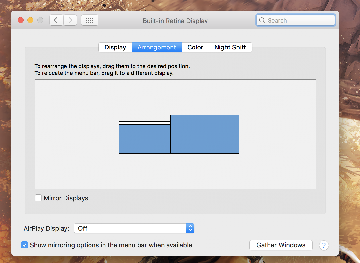
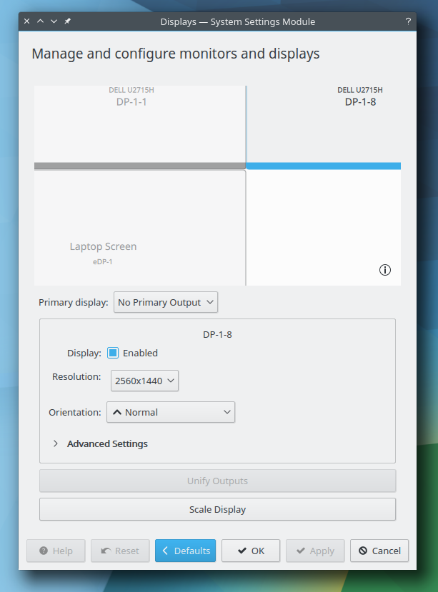
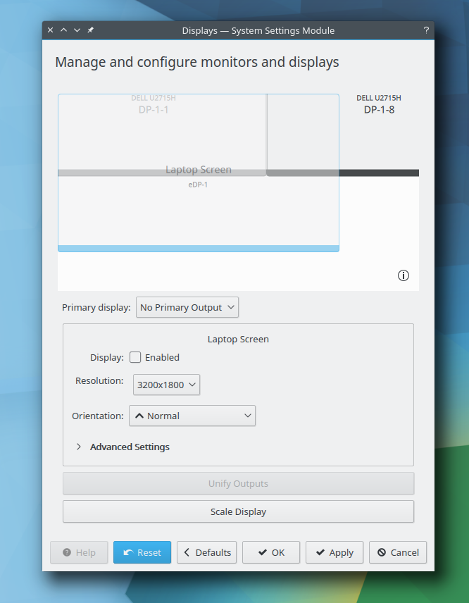
The "Display and Monitor" systemsettings module currently works and pretty much gets the job done, but it doesn't do so in a visually pleasing way. Some issues:

  • It's not immediately clear that selecting one of the outputs in the upper drag and drop area selects the output to configure in the lower section
  • There's an advanced section, which only shows one setting (refresh rate)
  • The ui produces scrollbars in the lower section quite often, especially when the advanced
  • The drag and drop previews aren't very sexy (1)
  • The wide unify output and scaling buttons at the bottom are pretty ugly
  • The window opened for scaling setting and preview is modal, the window grows automatically, but doesn't shrink. (2)
  • The on-screen display for output identification isn't plasma-themed like the other osds
  • There's no visual feedback or quick way to get to the configuration module when screens are plugged in

(1) I think some kind of drag and drop system works pretty well in general, at least for me, the positioning and snapping that's currently done works pretty well. I'm open for discourse or suggestions here, of course. I think nice artwork and rethinking how they should be displayed/themed could go a long way.

(2) I think in general, this looks a bit "tacked onto it", rather than really thought through from a design and presentation perspective.

What would be needed for this task is:

  • Interaction design how these tasks can be done
  • Mockups that solve the above problems and look good
  • Icons / SVGs for common screen setups
  • SVG artwork for the new ui

I'd like to implement the new design in the development cycle leading to Plasma 5.9.

sebas created this task.Aug 16 2016, 1:09 AM
sebas updated the task description. (Show Details)Aug 16 2016, 1:17 AM
sebas updated the task description. (Show Details)Aug 16 2016, 1:48 AM
sebas updated the task description. (Show Details)Aug 16 2016, 3:37 AM
colomar added a subscriber: colomar.

I have added a mock of a redesign proposal (wireframe status).

colomar moved this task from Work in Progress to Sent to dev on the VDG board.Oct 15 2016, 3:04 PM

I'd like to add a proposal for how could not only the visuals change but also the behaviour of the screen management settings.

I know this may not be a popular opinion, but I'd really like you to consider how macOS handles display management.
First of all when display management is called, it shows a separate window on every available and enabled screen. I think this is really good option. You can never go wrong with changing configuration of one screen. You know that the screen on which you see and change the configuration is the one that will have this config applied.
This could also be helpful if one of the displays goes missing or does not display anything. As long at least one display is active, you could try and recover your setup. It sometimes happens to me when I change my daisy-chained displays (along with built-in) that the last display in the chain goes to sleep mode, even though the system pushes pixels to it and, what's more, my screen management window stays there. Only reenabling the display helps, but you still need to have the settings in visible space.

The following picture shows an example of how the user sees a single screen options, including resolution/scale management:
http://notebooks.wpengine.netdna-cdn.com/wp-content/uploads/2016/02/macbook-screen-resolution-settings-1024x657.png

The screenshot below shows a second tab that provides screen arrangement options:

The arrangement options would of course be accessible in each individual screen's settings window. Since changes are done automatically, the currently applied layout is synchronized within all windows. This is optional and does not have to be considered here. I presume that it would require each window to listen for changes or pull frequently. Also new displays coming into configuration could make this harder. But the view is already being refreshed when a new display is connected so we should be fine here.

Also, please have a look how other options are bound to the screen's options - color and Night Shift. A nice touch to making things usable by explicitly dividing options for every screen.

And last, but not least: when we would have the "When connecting new display: open this configuration module" option, it would be amazing to have those setting windows opened at every screen.

Beside aforementioned macOS inspirations, I'd like to point out some glitches that make multidisplay life harder now:


This bascially my view of all my displays when KCM is opened (as standalone, within systemsettings it would depend on how big the window was previously). The previews are simply too big. Those displays are 2560x1440 and 3200x1600.

Those big previews have one huge disadvantage. When one of the display is disabled (let's say manually in the UI) and then enabled again it's moved out of position on the layout view. With such big display representation, restoring a layout that was used previously is harder. Mostly because the left and the upper edges are blocking any movement. This requires the user to do much tinkering in order to get things sorted: either move everything to right in order to get your leftmost edge in place, or resize the window entirely. But again, this is really bad for user experience.

The following picture shows a disabled laptop screen that cannot be put to the left anymore with such window size.

There is the notion of a "primary" screen. I do wonder if it makes any sense to allow selecting "no primary screen". What does that do? I'd propose making one screen primary. I see the panel is usually showing up on the primary screen. With two display port screens that are both acting a bit weird, for me the panel keeps on appearing on different screens randomly (I think it's based on which screen is detected first, one likes to power of more/quicker). It would be great to be consistent here.

I'd propose to move the whole bottom dialog to UI files to make moving things around faster. Working with the layouting code that's handwritten is not much fun imho. I'd be willing to nudge things a bit (if I find the time).

https://phabricator.kde.org/D14025 is a small step (in the right direction I hope :))

Shall we merge this with T7254? Seems a bit redundant to have two tasks open about essentially the same thing.

ngraham closed this task as Invalid.Jul 24 2018, 3:35 PM

Let's centralize the discussion in T7254.