BUG: 384914
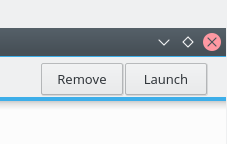
Make the Launch feature a button on the toolbar rather than an item in a single-element menu under a hamburger button, where normal users will never see it
| apol |
| Discover Software Store |
BUG: 384914
Make the Launch feature a button on the toolbar rather than an item in a single-element menu under a hamburger button, where normal users will never see it
Tested in KDE Neon. Works:
| Lint Skipped |
| Unit Tests Skipped |
The hamburger menu was my suggestion so I should probably say something about it - for me the "launch" option is completely meaningless fluff. Another button to nothing. That being said, if this is something critical in normal usage then it should be in there - and as we have no chance to do a proper test of it doing what everyone else is doing might be preferred.
And obviously enough people care about it for it to be in there, I am outnumbered.
so I grudgingly say go for it but that IF the taskbar is too cramped in teh future it should be the first thing to get the axe
All the launch button is is a shortcut. If we hide a shortcut in a menu, it loses any value it might have had and thus the assumption that it's useless becomes self-fulfilling.
So it should be either accessible directly, or be completely removed. I'm okay with either. It's not a critical function, it's more of a "Everyone else does it, so we might as well do it too" kind of feature.
I strongly believe that having a visible launch button is critical. The launch button may be meaningless fluff for me, and you, and other developers, but developers don't need to use GUI software center apps. We're not the intended audience.
Discover targets non-technical users, and believe it or not, non-technical users often have difficulty launching programs. Once you've installed a new program, the most natural next step is to want to launch it. If the Launch button is hidden, then there isn't an obvious method to do this if you aren't very familiar with other methods of launching programs. And even if you do know, it's nice to have the button right there so you can launch it with only one click.
The toolbar isn't crowded at the moment so there's really no reason to hide this in a space-saving hamburger menu. If it ever gets super crowded, then yeah, we could revisit item placement then.
Don't worry: After many years working as a usability consultant and UX designer, I know that I have to distinguish between my own needs and user needs.
If our users have trouble launching applications, then placing a launch button in Discover is _not_ the solution.
We do not want users to return to Discover, find the application again and click "Launch" there every time they want to launch it. That would be terrible UX.
For users who do not know how to launch an application from the regular launcher, the Launch button in Discover would actually be exacerbate the problem because it might give them the idea that this is the main way to launch an application.
So no, this is not a good argument for the button.
As I said: The Launch button is a handy shortcut for people to start the application they just installed right away without having to go through the regular launcher first.
They've installed something, they're itching to use it, so having a Launch button right there can make the whole experience nicer.
That's why I am not against the button per se, but only think it's useful if it can serve its purpose as a shortcut.
I quite agree that we should make launching programs more discoverable in other ways--especially launching new programs ("I just installed this thingy; now where is it!?"). I've recently been thinking about that myself, in fact. In Ubuntu Unity, newly-installed programs get added right to the Dock. In Windows, they appears at the top of the Start Menu. GNOME and macOS have sub-optimal UX here.
Application Dashboard in Plasma initially shows recent applications by default (which makes a ton of sense!).
Maybe it could make sense to insert newly-installed applications in there?
Yes, I think that makes sense, but it wouldn't be quite enough, since Plasma ships with three UI options for the launcher button, and Application Dashboard is only one of them. Each one I think needs to prominently highlight recently-installed applications.
Excellent. Let's continue that discussion in a bug report I just filed to avoid losing it once I can commit the patch (hopefully later tonight):