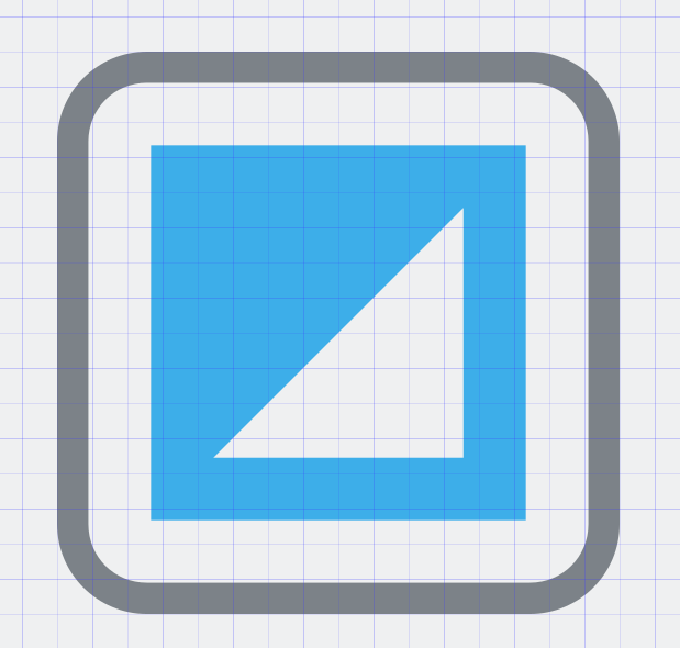
Here, this is a pixel perfect version.
Feed Advanced Search
Aug 28 2019
Aug 28 2019
ndavis added a comment to D23547: [GTK3] Have checkboxes and radiobuttons respect the user's color scheme..
ndavis added a comment to D23547: [GTK3] Have checkboxes and radiobuttons respect the user's color scheme..
These SVGs don't quite line up with the grid, which causes the inner part to have slightly blurry edges.
ndavis requested changes to D23547: [GTK3] Have checkboxes and radiobuttons respect the user's color scheme..
I've already said this to you in the VDG chat, but just to prevent confusion for other people, I'll repeat it here.
ndavis added a comment to D23542: Promote KCM to top level and rename accordingly.
+1
Aug 26 2019
Aug 26 2019
Remove applets/22/computer
ndavis committed R119:9705414e3ec3: Revert "[showdesktop][minimizeall] Reduce the maximum panel icon size" (authored by ndavis).
Revert "[showdesktop][minimizeall] Reduce the maximum panel icon size"
ndavis added a comment to D22359: Revert "[showdesktop][minimizeall] Reduce the maximum panel icon size".
Seems like people still complain about the patch, so I'll go ahead and land this.
Aug 25 2019
Aug 25 2019
ndavis added a comment to D23415: Improve comprehensibility and consistency of window placement mode names.
ndavis updated the summary of D23444: Remove applets/22/computer.
ndavis updated the summary of D23444: Remove applets/22/computer.
ndavis requested review of D23444: Remove applets/22/computer.
ndavis added a comment to D23415: Improve comprehensibility and consistency of window placement mode names.
ndavis added a comment to D23415: Improve comprehensibility and consistency of window placement mode names.
Add view-barcode-qr icons
ndavis updated the diff for D22653: Add view-barcode-qr icons.
- Make 32px be 32px
ndavis commandeered D22653: Add view-barcode-qr icons.
ndavis added a comment to D23415: Improve comprehensibility and consistency of window placement mode names.
ndavis updated the task description for T11074: Make KDE more Accessible for Everybody.
ndavis added a comment to D23389: Use visible buttons to switch the default device.
I think this looks pretty good, but why are the bottom margins on the first item different from the second item?
ndavis added a comment to D13405: Added page about the switch component.
One way to avoid the localization problem would be to use the standard symbols for On/Off, 1/0. The only problem with that is a significant portion of the results for "on off symbols" on search engines are questions about which one is which. I also remember wondering why 0 was off as a kid when it made sense in my head that 0 should mean On because it looks like an O.
ndavis added a comment to D23415: Improve comprehensibility and consistency of window placement mode names.
+1, especially changing "Smart"
ndavis added a comment to D23389: Use visible buttons to switch the default device.

Aug 24 2019
Aug 24 2019
ndavis added a comment to D23389: Use visible buttons to switch the default device.
Maybe we can add another line to the device item for the button to go on? Seems like it might just add visual bloat, but I can't actually think of a concrete reason why it would be bad. It could contain some small amount of useful info too, or maybe more controls from the hamburger menu.
ndavis added a comment to D23389: Use visible buttons to switch the default device.
Maybe we should just keep the "Make Default" button in the hamburger menu? It's less visible, but we don't have much space and it's usually not as important as the device name and volume slider. We can keep the "Make Default" button in the audio KCM.
ndavis added a comment to D23389: Use visible buttons to switch the default device.

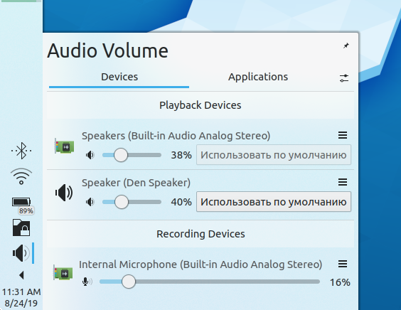
ndavis added a comment to D23389: Use visible buttons to switch the default device.
Not a fan of icon only buttons for uncommon tasks, but if saving space ever becomes absolutely necessary, we could use the star icon for "Make Default" instead of having text.
ndavis added inline comments to D23389: Use visible buttons to switch the default device.
ndavis added a comment to D23389: Use visible buttons to switch the default device.
Aug 22 2019
Aug 22 2019
ndavis updated the task description for T11081: Finalize the transition to Wayland and embrace the future of desktop.
ndavis updated the task description for T11051: Reorganize the KDE ecosystem.
ndavis added a comment to D23300: Add FictionBook 2 icons.
Much better. There is only one thing left that I think should be done for 32 and 64 px. Rather than having a black "fb" for Breeze and and a white "fb" for Breeze Dark, use either white for both with a drop shadow under the "fb" or just black for both and no drop shadow. I only used different colors on the 16 and 22 px icons because they don't have a background.
ndavis requested changes to D23300: Add FictionBook 2 icons.
Upon closer inspection, I found a few issues that need to be fixed.
Aug 21 2019
Aug 21 2019
ndavis added a comment to D23300: Add FictionBook 2 icons.
Reduce the size of the SVGs by optimizing them with one of these tools: https://community.kde.org/Guidelines_and_HOWTOs/Icon_Workflow_Tips#SVG_optimization
Add dark theme icons
ndavis requested review of D23319: Add dark theme icons.
Change icon colors, add disabled icons
ndavis updated the summary of D23317: Change icon colors, add disabled icons.
ndavis updated the diff for D23317: Change icon colors, add disabled icons.
rename svgs
ndavis updated the diff for D23317: Change icon colors, add disabled icons.
undo rename
ndavis requested review of D23317: Change icon colors, add disabled icons.
ndavis added a comment to D23296: Simplify rendering of raised toolbuttons with menu.
Let's abandon it for now. We can always come back if we change our minds.
ndavis added a comment to D23296: Simplify rendering of raised toolbuttons with menu.
Hmm. I was thinking about using the button background of the dropdown menu for something like this mockup:
Aug 19 2019
Aug 19 2019
ndavis added a comment to T11124: Unify highlight effect style.
ndavis added a comment to D23232: [dolphin] Add an action to toggle the searchbar.
I also think that using toggle for search makes more sense. It would be nice to have a general pattern of using toggle buttons in the toolbar for things that can be opened and closed, especially when they're activated via the toolbar in the first place.
ndavis committed R266:5637b119d95d: Change radio to device icon, add more sizes (authored by ndavis).
Change radio to device icon, add more sizes
Aug 18 2019
Aug 18 2019
ndavis updated the summary of D23249: Change radio to device icon, add more sizes.
ndavis updated the test plan for D23249: Change radio to device icon, add more sizes.
ndavis updated the test plan for D23249: Change radio to device icon, add more sizes.
ndavis requested review of D23249: Change radio to device icon, add more sizes.
Aug 17 2019
Aug 17 2019
ndavis committed R31:f803a89e2443: Fix colors from KStatefulBrushes not using application colorschemes (authored by ndavis).
Fix colors from KStatefulBrushes not using application colorschemes
ndavis updated the summary of D23170: Fix colors from KStatefulBrushes not using application colorschemes.
ndavis added a comment to D23170: Fix colors from KStatefulBrushes not using application colorschemes.
Considering the changes were already agreed upon before I made this diff, it seem safe to land without further review.
Aug 16 2019
Aug 16 2019
ndavis added a comment to T11124: Unify highlight effect style.

ndavis added a comment to D23170: Fix colors from KStatefulBrushes not using application colorschemes.
Anyone want to accept this?
ndavis added a comment to T11124: Unify highlight effect style.
I think I'm going to continue using the outline/sideline+fainter background style. With simple solid highlights, there is a contrast issue where the highlight color either doesn't contrast well with the text or doesn't contrast well with the window background. With a strong highlight outline/sideline and weaker highlight background, we can have good text contrast and good window background contrast.
ndavis abandoned D23169: Fix width and separator of ToolButtonComplexControl outline w/ dropdown menu.
Alright, problem fixed.
ndavis committed R31:6b63429fa9e5: Move drawIndicatorButtonDropDownPrimitive separator when sunken (authored by ndavis).
Move drawIndicatorButtonDropDownPrimitive separator when sunken
ndavis committed R31:a98d21b567f4: Fix width and separator of ToolButtonComplexControl outline w/ dropdown menu (authored by ndavis).
Fix width and separator of ToolButtonComplexControl outline w/ dropdown menu
ndavis committed R31:b5af1e947d25: Revert "Fix width and separator of ToolButtonComplexControl outline w/ dropdown… (authored by ndavis).
Revert "Fix width and separator of ToolButtonComplexControl outline w/ dropdown…
ndavis added a comment to D23169: Fix width and separator of ToolButtonComplexControl outline w/ dropdown menu.
Aug 15 2019
Aug 15 2019
ndavis added a comment to D23170: Fix colors from KStatefulBrushes not using application colorschemes.
ndavis committed R31:b43e19e3e13c: Fix width and separator of ToolButtonComplexControl outline w/ dropdown menu (authored by ndavis).
Fix width and separator of ToolButtonComplexControl outline w/ dropdown menu
ndavis added a comment to D23170: Fix colors from KStatefulBrushes not using application colorschemes.
I thought the hex values were used because it's also supposed to be possible to compile Breeze for Qt 4? I remember reading that Qt 4 needs hex numbers for some reason.
ndavis updated the diff for D23170: Fix colors from KStatefulBrushes not using application colorschemes.
Add event filter for Qt < 5.13
ndavis added a comment to D23170: Fix colors from KStatefulBrushes not using application colorschemes.
ndavis updated the summary of D23170: Fix colors from KStatefulBrushes not using application colorschemes.
ndavis updated the test plan for D23170: Fix colors from KStatefulBrushes not using application colorschemes.
ndavis added a comment to D23170: Fix colors from KStatefulBrushes not using application colorschemes.
How likely is it for distros using Qt < 5.13 to receive an update to Breeze that isn't a backport?
ndavis updated the summary of D23170: Fix colors from KStatefulBrushes not using application colorschemes.
ndavis requested review of D23170: Fix colors from KStatefulBrushes not using application colorschemes.
ndavis updated the summary of D23169: Fix width and separator of ToolButtonComplexControl outline w/ dropdown menu.
ndavis updated the test plan for D23169: Fix width and separator of ToolButtonComplexControl outline w/ dropdown menu.
ndavis updated the test plan for D23169: Fix width and separator of ToolButtonComplexControl outline w/ dropdown menu.
ndavis added a comment to D23075: Change default Dolphin toolbar layout.
Aug 14 2019
Aug 14 2019
ndavis requested changes to D23161: Make media control icons outline style instead of solid style.
We don't strictly adhere to outline or filled style (for better or worse), sometimes making use of both styles in the same icon (e.g., view-list-icons). I think the general idea is that we normally use the line/outline style unless that puts the designer at a disadvantage. Icons can look messy with the outline style sometimes.
ndavis added a comment to T11124: Unify highlight effect style.
Aug 13 2019
Aug 13 2019
ndavis requested changes to D23116: Fix missing digit and pixel-perfect alignment of depth action icons.
Not having id="current-color-scheme" causes stylesheets to not work correctly. Other than that, +1.
Aug 12 2019
Aug 12 2019
ndavis added a comment to D23075: Change default Dolphin toolbar layout.

ndavis added a comment to D23075: Change default Dolphin toolbar layout.

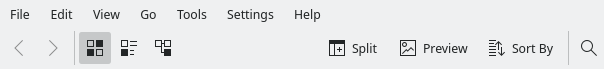
ndavis added a comment to D23075: Change default Dolphin toolbar layout.
ndavis added a comment to D23075: Change default Dolphin toolbar layout.
ndavis added a comment to D23075: Change default Dolphin toolbar layout.