In progress. If others think this is the correct way to do it, I can continue with other media control icons and all sizes.
From my understanding of KDE HIG, the icon should be outline style whenever possible.
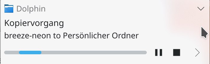
Before:

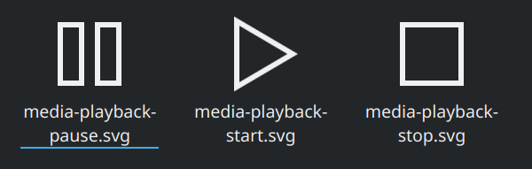
After:
| No Linters Available |
| No Unit Test Coverage |
| Buildable 15114 | |
| Build 15132: arc lint + arc unit |
Hmm, not sure how I feel about this. I kind of like the filled-in versions.
Regardless, please re-add id="current-color-scheme" to the CSS, or else the icons will no longer change their colors to reflect the color scheme.
Also, if we want to do this, we'll need a companion patch for plasma-frameworks to adjust the equivalent icons in the Breeze Plasma theme too.
We don't strictly adhere to outline or filled style (for better or worse), sometimes making use of both styles in the same icon (e.g., view-list-icons). I think the general idea is that we normally use the line/outline style unless that puts the designer at a disadvantage. Icons can look messy with the outline style sometimes.
The standard media control symbols are rarely seen with an outline style in real graphical user interfaces. As far as I know, that style is never seen on physical media control buttons. I think changing the style would be more likely to make the icons look odd.
Yes, I did a search on the internet and almost all popular music app use solid play/pause/stop icon.
The outline icon will look like this in JuK: