Thanks a lot. I submitted the merge request: https://invent.kde.org/plasma/systemsettings/-/merge_requests/67
Feed Advanced Search
Jun 1 2021
Jun 1 2021
endlesswaterfall renamed T14537: Improve the consistency of the buttons placement in app headers from Improve the consistency of the System Settings header to Improve the consistency of the System Settings header and of the KInfoCenter.
May 30 2021
May 30 2021
endlesswaterfall added a comment to T14509: Inconsistent placement of some settings.
May 28 2021
May 28 2021
mikeljohnson removed a subtask for T11124: Unify highlight effect style: T11132: Revisit Panel highlight effects .
mikeljohnson added a parent task for T13393: T13071 About Page and Window Mock Up: T10891: Breeze theme evolution.
mikeljohnson removed a parent task for T13393: T13071 About Page and Window Mock Up: T12420: Redesign/tweak applications.
ngraham added a comment to T14509: Inconsistent placement of some settings.
Understood. In this case, I want to propose a merge request to rename "System administration" to "System" because viewing system information isn't actually administrating the system, unlike the Updates section. Can I submit the merge request with just the "name" variable changed and leave the rest (name[ar], name[ast], etc.) unchanged?
endlesswaterfall added a comment to T14509: Inconsistent placement of some settings.
Understood. In this case, I want to propose a merge request to rename "System administration" to "System" because viewing system information isn't actually administrating the system, unlike the Updates section. Can I submit the merge request with just the "name" variable changed and leave the rest (name[ar], name[ast], etc.) unchanged?
May 27 2021
May 27 2021
ngraham added a comment to T14509: Inconsistent placement of some settings.
KDE has its own translation teams who translate the strings from English into other languages automatically.
May 26 2021
May 26 2021
endlesswaterfall added a comment to T14509: Inconsistent placement of some settings.
Thanks! What about the other languages? I think it wouldn't be appropriate to use Google translator. Some translation might be wrong.
endlesswaterfall added a comment to T14512: Inconsistent spacement between the tab panel and the toolbar.
But that's what I'm actually telling about, this header line:
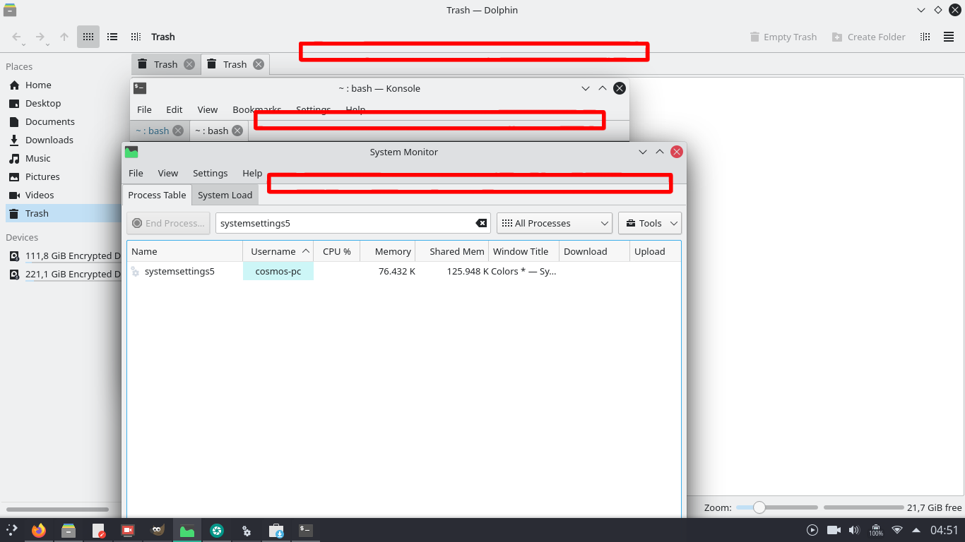
ngraham added a comment to T14512: Inconsistent spacement between the tab panel and the toolbar.
No, the Breeze Evolution task is about making the whole header area visually distinct from the rest of the window. We moved *away* from the "unibody" look. See T10201.
endlesswaterfall added a comment to T14511: Modal dialogs from System Add-Ons Installer needs a more intuitive design.
Ok, thanks!
May 25 2021
May 25 2021
endlesswaterfall added a comment to T14512: Inconsistent spacement between the tab panel and the toolbar.
Ah, I didn't know D: Is that slated for Breeze Evolution?
ngraham added a comment to T14509: Inconsistent placement of some settings.
That could work. Changing text is super simple; here's where it lives: https://invent.kde.org/plasma/systemsettings/-/blob/master/categories/settings-system-administration.desktop#L9
endlesswaterfall added a comment to T14509: Inconsistent placement of some settings.
Maybe System Administration could be renamed to System. It would fit better for the " System Information" issue.
Boot Splash Screen is already in Appearance in Plasma 5.22.
ngraham closed T14511: Modal dialogs from System Add-Ons Installer needs a more intuitive design as Invalid.
This is a bug only in the GHNS dialog; please use Bugzilla and file a bug on it: https://bugs.kde.org/enter_bug.cgi?product=frameworks-knewstuff&component=general
ngraham added a comment to T14512: Inconsistent spacement between the tab panel and the toolbar.
The titlebar and toolbar could have the same background as the rest of the window (as it is in Arc KDE):
pinaraf added a comment to T12837: Modernize the Calligra UI.
I come a bit late in the discussion, sorry about that :/
@manueljlin I kindly disagree with the proposed UI for words because it reproduces the same mistake as every other word processor (MS Word, LibreOffice Writer, probably Corel WordPerfect).
There is a very deep flaw in the WISIWYG world. When you set a piece of text in bold, this is 99% of the time not what you want to do. What you wanted to do is an emphasis of this text. The difference is subtle but major in user interface. I think there is a place in the word processor landscape for a style first word processor. No bold button, but emphasis style. Numbered list being harder to reach than a title style…
I'm not good at UX and UI design, but do you think there is a way to do that? Getting out of the Word box most UIs are in?
endlesswaterfall updated the task description for T14513: Inconsistent tab view.
endlesswaterfall updated the task description for T14513: Inconsistent tab view.
endlesswaterfall updated the task description for T14513: Inconsistent tab view.
endlesswaterfall updated the task description for T14512: Inconsistent spacement between the tab panel and the toolbar.
manueljlin added a comment to T14431: Separators in headerbars need an updated design.
endlesswaterfall added a comment to T14431: Separators in headerbars need an updated design.
Could this be possible?

endlesswaterfall added a comment to T14502: In System Settings, the placement of the "add" button is not a standard.
I know very little programming and nothing about QML or Kirigami D:
endlesswaterfall updated the task description for T14511: Modal dialogs from System Add-Ons Installer needs a more intuitive design.
endlesswaterfall updated the task description for T14511: Modal dialogs from System Add-Ons Installer needs a more intuitive design.
endlesswaterfall renamed T14511: Modal dialogs from System Add-Ons Installer needs a more intuitive design from Modal dialogs needs a more intuitive design to Modal dialogs from System Add-Ons Installer needs a more intuitive design.
endlesswaterfall updated the task description for T14511: Modal dialogs from System Add-Ons Installer needs a more intuitive design.
ngraham added a comment to T14502: In System Settings, the placement of the "add" button is not a standard.
Yeah, I mean you can fix it. :) Would you like to? I can show you how.
endlesswaterfall added a comment to T14502: In System Settings, the placement of the "add" button is not a standard.
ahhn, oops? I understood the meaning of merge request wrongly...
endlesswaterfall added a project to T14510: Inconsistent placement of some settings: Goal: Consistency.
endlesswaterfall updated the task description for T14509: Inconsistent placement of some settings.
endlesswaterfall updated the task description for T14509: Inconsistent placement of some settings.
endlesswaterfall updated the task description for T14509: Inconsistent placement of some settings.
endlesswaterfall updated the task description for T14509: Inconsistent placement of some settings.
endlesswaterfall updated the task description for T14509: Inconsistent placement of some settings.
endlesswaterfall updated the task description for T14509: Inconsistent placement of some settings.
ngraham added a comment to T14502: In System Settings, the placement of the "add" button is not a standard.
OK! Check out https://community.kde.org/Get_Involved/development. Let me know in #plasma-devel if yo need a hand.
May 24 2021
May 24 2021
endlesswaterfall updated the task description for T14507: Inconsistent vertical alignment of some settings pages.
endlesswaterfall updated the task description for T14507: Inconsistent vertical alignment of some settings pages.
endlesswaterfall updated the task description for T14431: Separators in headerbars need an updated design.
endlesswaterfall added a comment to T14503: There is an unecessary "add account" in Settings > Online Accounts.
oops, thanks for the tip.
endlesswaterfall added a comment to T14497: Inconsistent spacement in the file chooser dialog and in Dolphin.
Edit: done https://bugs.kde.org/show_bug.cgi?id=437581
endlesswaterfall added a comment to T14502: In System Settings, the placement of the "add" button is not a standard.
Would you like to submit merge requests to fix them?
ngraham renamed T14443: The brightness systray applet header looks busy from The brightness systray apple header looks busy to The brightness systray applet header looks busy.
ngraham moved T14443: The brightness systray applet header looks busy from Reported to VDG Discussion on the Goal: Consistency board.
ngraham moved T14431: Separators in headerbars need an updated design from Reported to VDG Discussion on the Goal: Consistency board.
ngraham added a comment to T12777: Unify list item removal.
It seems that we have basically decided to use trash icons in the actual list items themselves. No consensus was reached in this task, but since then, people have been organically using the trash icon, and porting list item removal buttons to use it. So I guess we can consider that the de facto standard. See for example https://invent.kde.org/plasma/kwin/-/merge_requests/995.
ngraham added a subtask for T10384: Unify styles for lists and their buttons: T12777: Unify list item removal.
ngraham added a parent task for T12777: Unify list item removal: T10384: Unify styles for lists and their buttons.
ngraham added a comment to T14502: In System Settings, the placement of the "add" button is not a standard.
See also T10384.
ngraham closed T14503: There is an unecessary "add account" in Settings > Online Accounts as Resolved.
This is really a simple feature bug report and should be reported using https://bugs.kde.org. Phabricator is really more intended for large-scale task tracking/discussion.
This is really a simple bug and should be reported using https://bugs.kde.org. Phabricator is really more intended for large-scale task tracking/discussion. Can you please re-file this at https://bugs.kde.org? Thanks!
endlesswaterfall renamed T14431: Separators in headerbars need an updated design from Separators in headerbars needs an updated design to Separators in headerbars need an updated design.
endlesswaterfall renamed T14431: Separators in headerbars need an updated design from Since Breeze Light became the default color scheme, some apps have separators that doesn't blend anymore in the titlebar to Separators in headerbars needs an updated design.
endlesswaterfall added a project to T14431: Separators in headerbars need an updated design: Goal: Consistency.
endlesswaterfall renamed T14443: The brightness systray applet header looks busy from The brightness systray apple header looks too busy to The brightness systray apple header looks busy.
endlesswaterfall added a project to T14443: The brightness systray applet header looks busy: Goal: Consistency.
May 23 2021
May 23 2021
abetts added a comment to T12777: Unify list item removal.
Has there been any conclusion here?
May 18 2021
May 18 2021
mvourlakos added a comment to T12433: Consider how to unify Latte and Plasma Panels.
davidedmundson added a comment to T12433: Consider how to unify Latte and Plasma Panels.
Can you please provide a bit more feedback to what aspects you found impressing?
May 17 2021
May 17 2021
ngraham added a comment to T12777: Unify list item removal.
FWIW if we can spare 5x5 pixels rather than 4x4 pixels for icon emblems, I think it's possible to make a legible trashcan:
May 15 2021
May 15 2021
The new tooltip isn't merged yet. Once it is, it will be safe to remove the window decoration button. Until then, the button has to remain, because some people might still be using it.
markuss reopened T9986: Delete "What's This" inline help functionality as "Open".
The What's This titlebar button is not available in other desktops and made obsolete by the new tooltip implementation. The new implementation should work everywhere, the button definitively doesn't.
rjvbb added a comment to T9986: Delete "What's This" inline help functionality.
In addition:
- I only see said button when using KWin
- KWin allows me to configure which titlebar buttons I want to see (and where).
ahmadsamir added a comment to T9986: Delete "What's This" inline help functionality.
[...]
for Qt 6 the ? button will automatically disappear, if we don't actively enable it ourself.
cullmann added a comment to T9986: Delete "What's This" inline help functionality.
If I don't misunderstand the Qt docs:
ahmadsamir added a comment to T9986: Delete "What's This" inline help functionality.
Adding to what @dfaure said, I think the button is useful, and it should be opt-out, not opt-in; the former is simple using systemsettings, the latter is impossible to discover, because how would a new user find out there is actually a question mark button that can be used to show extra info about some GUI element.
dfaure added a comment to T9986: Delete "What's This" inline help functionality.
"Who cares" (which really means "I don't care", since clearly there are people who do care), and "stupid" are not constructive feedback nor acceptable language in this community.
Here's a constructive suggestion for how your feedback should have looked like:
markuss added a comment to T9986: Delete "What's This" inline help functionality.
Who cares what you use the strings for, this request is about removing the stupid button on the title bar and that's more than before a valid request.
ngraham closed T11132: Revisit Panel highlight effects , a subtask of T11124: Unify highlight effect style, as Wontfix.
May 14 2021
May 14 2021
We decided to go in entirely the opposite direction and use the "What's This" strings for expanded tooltips. See https://invent.kde.org/frameworks/kxmlgui/-/merge_requests/45
ngraham added a comment to T12789: Unify list icon sizes.
Implemented that with https://invent.kde.org/frameworks/kirigami/-/merge_requests/296.
ngraham added a comment to T12789: Unify list icon sizes.
BasicListitem now has the reserveSpaceForSubtitle property, which reserve space for a subtitle even when there is no subtitle, which you can use to give some list item subtitles but preserve all the list items having the same height.
ngraham moved T12821: Unify how "this is the default/current item in a list" is communicated from Reported to HIG Specification on the Goal: Consistency board.
ngraham closed T12821: Unify how "this is the default/current item in a list" is communicated as Resolved.
We have generally settled on bold text for the current/selected list item at this point. I guess we need a HIG entry about it now. See https://invent.kde.org/documentation/develop-kde-org/-/issues/50
ngraham closed T12821: Unify how "this is the default/current item in a list" is communicated, a subtask of T11093: Improve Consistency across the Board, as Resolved.
ngraham moved T12839: Fix sizing of first-party plasmoids in the panel from To Do to Done on the Plasma board.
This is fixed now with all panel applets following the same margins, and those margins being partially user-selectable through the use of a Margins Separator applet.
Tracking there and closing this one.
ngraham closed T13075: Move all things in Plasma to PC3, and then to QQC2, a subtask of T11093: Improve Consistency across the Board, as Resolved.
These are nice mockups, but I think they're largely duplicative of other ones at this point, and we've even moved in the direction of implement a lot of this stuff. No need to keep the task open. Thanks for the nice mockups!
ngraham closed T13394: T13072 System Settings general layout Mock up, a subtask of T11153: Unify sidebar appearance, as Resolved.