Delete "What's This" inline help functionality
Closed, WontfixPublic

Description

QML apps don't support the feature at all.

3rd-party apps don't support the feature at all.

QWidgets-based KDE apps only intermittently implement the feature, mostly defeating the purpose; arguably it's only useful when implemented for close to 100% of the UI elements. When you click on the titlebar's question mark button to invoke it and find that many, most, or all of the UI elements you click on have no text, it's just frustrating and makes you wonder why so buggy a feature is still present.

I'd like to propose that we deprecate WhatsThis functionality, think about removing it from apps that implement it, and remove the WhatsThis titlebar button from the set of available Window Decoration buttons.

To replace the feature (in the few apps that implement it), we can improve our software's tooltip text and explicit documentation in the docbook.

There are a very large number of changes, so older changes are hidden. Show Older Changes
ngraham updated the task description. (Show Details)Nov 4 2018, 4:41 PM

It won't be available in Qt 6

Citation?
The other phab doesn't say that.

ngraham added a subscriber: broulik.EditedNov 4 2018, 4:43 PM

Perhaps I'm misremembering (or misinterpreting), but I recall hearing that from @broulik.

No. It says the but that means dialogs have this on by default will be fixed in Qt6.

I don't think there's anything to solve here.

Ah, ok, my bad then.

I think there is something to solve here. Even if the button correctly appears only when some "What's This" help text is available, it's still not useful if only like 10% of the user interface supports it. In this case, it's an exercise in frustration as you hover over things and get the error cursor for nearly everything. Like I said, this feature only has value if it's implemented nearly universally. Having only 10%, 20%, or even 30% of the UI support it is useless and frustrating.

ngraham updated the task description. (Show Details)Nov 4 2018, 4:48 PM

AFAIK the context help is a KDE/Qt proprietary extension to EWMH. The property is called _NET_WM_CONTEXT_HELP, but if one searches the EWMH for it, it's not found. The feature got added in 64acd7375d6cb65611b8c225143d15bc41dc5343 by Matthias and mentions that it works together with the Qt snapshot of the next day.

I don't think that any non-Plasma application should rely on it as it's not cross desktop. Also I don't think many users know about it. I would not be surprised if KWin's KCM's are the most heavy users of this functionality given that Matthias added them (and yes most of our KCMs are that old).

I don't think we should just remove the button, but instead look for all usages in Plasma and migrate them to something more appropriate. Once all are gone I would say we remove the complete feature as nobody else supports it anyway. And we should update Qt doc (e.g. https://doc.qt.io/qt-5/qwhatsthis.html ) to make it clear that it's not available on all platforms.

Windows also has the "what's this" feature. I would favor setting the Qt::AA_DisableWindowContextHelpButton in plasma-integration and evaluate where it makes sense to explicit set it. Then we only really show the button if there actually is any help available.

KSysguard, for instance, makes extensive use of it. I have also seen it in various KCMs and KDE PIM applications. There may also be places (e.g file properties dialog and file dialog) where whats this texts are set but it is relied upon the fact that dialogs always get this button.

Perhaps we could also add a component to Kirigami (or even upstream one to QtQuick) as there is currently no support for that in QML.

Are there any Windows users who have actually used it in the last 15 years? :p

I think there is a threshold that must be crossed before the feature is useful. If close to 100% of the window's controls have "What's this" text, it's useful, because you can actually explore the app that way. But if only 50% do, then it's frustrating since there are big gaps in what's explained. You feel uneasy, rather than informed. When only 10% is covered, it's worthless. So I don't think the threshold of "show the button when there is even one control with 'what's new' text" is adequate. It's just user interface noise if the window hasn't fully committed to using it.

Given that we would need to add support to QML and Kirigami and Wayland, and it's not very widely used even in QWidgets land... should we even bother?

I don't think we should just remove the button, but instead look for all usages in Plasma and migrate them to something more appropriate. Once all are gone I would say we remove the complete feature as nobody else supports it anyway. And we should update Qt doc (e.g. https://doc.qt.io/qt-5/qwhatsthis.html ) to make it clear that it's not available on all platforms.

+1, I fully support this.

rjvbb added a subscriber: rjvbb.Nov 4 2018, 9:45 PM

I actually like the feature as a way to provide more complete (and better formatted?) contextual help for UI aspects that could use it, without obliging the user to open the handbook. AFAIK you have to find the relevant paragraph or section in there yourself, so it's less than ideal in terms of optimising productivity. Handbooks *are* important ("RTFM"...) but I think the whole KDE help centre feature could use a good overhaul too.

I'm a bit surprised to see claims that the what's this feature doesn't work everywhere. I've seen it work under MS Windows, it works on Mac, on my Linux/X11 workstation and I just confirmed that it works with Qt's "wayland" QPA (and their qwindow-compositor example app) too. What cannot be expected to work cross-platform is adding a "what's this" button in the window titlebar, but there must be other ways to activate the feature that do work everywhere (like the Shift-F1 shortcut).

I'm less surprised that the feature isn't available in QtQuick* ... there's a reason those frameworks have "quick" in their name.

It might be a good idea not to add a "what's this" button to window titlebars even if the platform supports them. I don't agree however with the idea to make it impossible to use "what's this" at all beyond providing (strong) guidelines on how the feature is to be deployed.

In T9986#166357, @rjvbb wrote:

I'm a bit surprised to see claims that the what's this feature doesn't work everywhere. I've seen it work under MS Windows, it works on Mac, on my Linux/X11 workstation and I just confirmed that it works with Qt's "wayland" QPA (and their qwindow-compositor example app) too.

Replace X11 with KWin. It only works with KWin and thus the feature is not cross-desktop although it is cross platform. Given that cross-desktop applications need to think about whether this is a good way to present help.

On Wayland this feature is not available - a Qt internal demo compositor doesn't count. We would need a specification for it and implement it in toolkits and compositors. Personally I think the feature is too little used as to invest the time into it. Getting a cross desktop specification is something I consider as impossible as gtk will say: just use csd. Doing a Qt/KWin protocol is possible but given the large success of this on X11 I'm not interested.

rjvbb added a comment.Nov 5 2018, 10:00 AM

Exactly what is the feature we're talking about?! I highly doubt that Qt will NOT show the popup window with the what'sthis text when you request it via

1a Help/What's This
or
1b the keyboard shortcut associated with that QAction (Shift-F1 by default)
2 Click on a widget that actually has the information set.
3 Watch the info appear.

After all this is (most likely) just a tooltip triggered in a different way and why would that not work everywhere? Quite frankly, if that doesn't work in a fancy Wayland compositor (I'm guessing we're talking about KWin) while it does work in a simple demonstrator, well, maybe the fancy one is a wee bit too much form-over-function?

So I have to assume that the non-cross-desktop feature is the titlebar button, and I reiterate my opinion that this is just one way to inform the user that some widgets can offer context help and to provide a handle to access that information. A very straightforward way to achieve basically the same thing would be to add a tooltip to widgets with what's this info saying something like "Hit Shift-F1 and click this control to see what it does" (no need even to move the mouse back and forth to the toolbar button). Outline this approach (one that works in modal dialogs too) in the HIG and let application devs decide whether or not they want to adhere to the new guidelines or not...

I really like how certain applications like KSysGuard provide additional contextual usage information via what's this popups and it'd be really stupid to disallow this just because it cannot be accessed the same way everywhere.
Just as stupid as removing fullscreen support just because only the Mac has a window titlebar button to toggle fullscreen mode (in addition to the usual maximise-this-window button) - after all, no application appears to use that feature beyond providing the menu action, right?

In T9986#166387, @rjvbb wrote:

Exactly what is the feature we're talking about?! I highly doubt that Qt will NOT show the popup window with the what'sthis text when you request it via

The button in the window decoration

GB_2 added a subscriber: GB_2.Apr 15 2019, 8:36 PM

Windows also has the "what's this" feature.

And by "has" you meant 'Supported for legacy applications only and axed from their HIG and UWP toolkit many years ago', right? Windows moved to an in-line display for short snippets (usually linking to their website for more extensive help) with Windows 8 or so, maybe even earlier.

How about not displaying the button in the title bar by default but leave it for now, accessible via Shift-F1 or so to give devs time to migrate to a system that displays the same amount of information under any desktop?

ognarb added a subscriber: ognarb.May 13 2019, 1:34 PM
ngraham updated the task description. (Show Details)Feb 3 2020, 11:21 PM
ngraham edited projects, added KF6, Plasma, KDE Applications; removed KWin.
ngraham removed subscribers: VDG, KWin, Plasma.

I would say let's think about where users are supposed to find help and then we'll see if What's This is part of that solution. I see the following help "concepts" but I am unsure about the details:

1) Focus on comprehensive tooltips
and change it so they do show up in menus so tooltips are actually available when needed (https://doc.qt.io/qt-5/qmenu.html#toolTipsVisible-prop). Try to agree that they should be way longer than they currently usually are. Rework What's This help into tooltips.

(This text is copied from the corresponding "What's This" help I wrote. Keep in mind that there are cases where it makes sense for them to be even longer.)

+ Familiar and easy concept
- Users might get annoyed when they hover something unintentionally and a big tooltip pops up (Not sure how big of a problem this is)
- Can't offer help where users might want to rest their cursors or in main working areas (KSysGuard's problem)

2) Keep What's This and improve on it
by solving it's discoverability problem with @rjvbb's idea to

add a tooltip to widgets with what's this info saying something like "Hit Shift-F1 and click this control to see what it does"

and/or by deciding that we do want a "?" in the titlebar (when appropriate) under Wayland as well.

+ Help can be offered for anything, anywhere while being nearly invisible for users that don't want help
+ Help can contain hyperlinks so users can jump to tutorial-webpages or passages in the manual
- Users still need to learn how to call for "What's This"-help

3) RTFM
We have manuals so contextual help isn't needed. (We definitely shouldn't decide on this last one IMO!)

+ Less work
- Users need to learn to open the manual when they need help
- Users workflow is severely disrupted when they need even the smallest amount of help
- Getting help requires finding the right text passage

How about another approach: A collapsible tooltop. We could keep the current tooltip text, but add a button marked "Show more" on the bottom of the tooltip. When clicked, the tooltip expands to show the full "What's this" text for that widget, if it exists. This would require allowing the cursor to move into the tooltip area without closing it, of course.

I like that as well. How would you want to handle menus then where tooltips don't show up currently? It could seem a bit redundant to hover Dolphin>Tools>Open Terminal and get a tooltip labeled "Open Terminal [linebreak] Show more". Well in most cases the tooltips aren't identical to the label so it wouldn't be that bad most of the time.

Hi, I think that the discussion "What'sThis vs. tooltip" is also a consistency problem. Referring only to SystemSettings, it seems there is no a rule: in some module "tooltip" are used, in some other What'sThis are used. In this moment I prefer tooltip, to be honest, because I dont't think users know how What'sThis can be triggered. Now What'sThis are simply generally "hidden", and users need all the information someone have provided: if there is a tooltip you just have to hover. Anyway What'sThis can carry more informations, but they should be grafically visible (for example after pressing the "Alt" key, or similar, their area should be colorize in some special way) and everyone should know they exist, too...

GB_2 added a project: Goal: Consistency.EditedMay 8 2020, 4:42 PM

Almost every app has a help button or menu item that opens the documentation. Having tooltips and the help center is enough in my opinion, because the What's This text would otherwise be a duplicate of the documentation. I think good tooltips and good UI should be enough.

In T9986#229886, @GB_2 wrote:

Almost every app has a help button or menu item that opens the documentation. Having tooltips and the help center is enough in my opinion, because the What's This text would otherwise be a duplicate of the documentation. I think good tooltips and good UI should be enough.

+1

I think good tooltips and good UI should be enough.

So "1) Focus on comprehensive tooltips" it is?

In (Re-)Add tooltips using a contextual help button I am proposing a way how we could be replacing "What's This"-help in system settings with contextual help buttons in the future. I believe this is a right way forward for settings pages specifically because those pages' main task (aside from organisation of settings) is to communicate the effects of settings which is why buttons to display tooltips seem sensible to me here.

Other than that I think the original goal of this task to find a way to delete/replace "What's This" can't really be generally decided but has to happen on an application-by-application basis. For example the kind of contextual help button I am proposing for settings pages would be way more intrusive in KSysGuard or Dolphin. And while I still think the options I listed in T9986#220391 would be viable to some extent I don't really think we are at the point yet where it makes sense to rule out specific UI elements (like What's This) from ever being used to provide help in any application. I am not sure if that could ever be possible because different applications can have very different requirements there. It's like generally deciding to not use On/Off switches.

FWIW we merged that feature and it looks like it works fine to me. We'll see how users feel about it in Plasma 5.20. So far we haven't gotten any bug report or complaints about it in the beta.

Still haven't gotten any more complaints about the new approach. We did however get another bug report asking to remove the window decoration button that activates the existing What's This feature: https://bugs.kde.org/show_bug.cgi?id=431881.

There are now quite a few of these. It would seem that users find the feature more annoying than useful. Given that it does not work on Wayland, which we are rapidly making more usable, it's clear that the feature's days are numbered one way or another. So I'd like to propose that we remove the window decoration button from the default set in the Plasma 5.22 timeframe.

Do they just not liek the feature or do not how it looks in their titlebar? (The bug report reads more like the latter to me)

Yes, that bug report only wants the question mark size to be adjusted.

Still haven't gotten any more complaints about the new approach.

That's good to hear, though I said in my last comment that putting an extra button everywhere we want to give contextual help will not work for normal applications.

Do we have an agreement that we want tooltips that can be expanded? Do we agree that we want tooltips to show up in menus?

I mostly want to make sure that we don't lose the possibility to explain what a feature does in the UI. Without "What's This?" there is currently no obvious way for application developers to show any information for menu items aside from their label. Another way to do that would be to have a contextual help button or hover item in menus that only appears when the item is highlighted:

Though that wouldn't work for touch so we would still need the "What's This?" feature to ask for more information there. I am mainly showing yet another approach to solve this to show that there are ways to go forward with this that are more than just removing/hiding a feature that solves a real problem when implemented correctly.

So I'd like to propose that we remove the window decoration button from the default set in the Plasma 5.22 timeframe.

If I get this right, this isn't the way to do it because it would ignore the request of any application to show such a button. I am not sure if it is as easy as I think it is but what @broulik wrote above is that we could be

setting the Qt::AA_DisableWindowContextHelpButton in plasma-integration and evaluate where it makes sense to explicit set it.

If I get this right, this way it would still show up in Dolphin where I explicitly set it. We would have to explicitly request the window decoration from KSysGuard as well if it doesn't already do that. I hope we aren't forgetting other applications which are extensively using it. I want to emphasise though that this doesn't change anything about the need we have for such a feature in general and that we would still be relying on "What's This?" in the future as the only possible way for normal applications to show more elaborate help where appropriate.

rjvbb added a comment.Jan 23 2021, 1:32 PM

There have long been applications that provide a "what's this" menu item in the Help menu or equivalent. I think this is important functionality as it allows users to figure out what things do, it eases the burden on documentation writers to keep the manual up-to-date and complete (a big issue with much FOSS) and it also allows to minimise automatic tooltip clutter without giving up all hope of contextual guidance.

On a related note, I've known a few too that offer a "why the beep" feature that was very practical.

achauvel added a subscriber: achauvel.EditedJan 31 2021, 10:16 PM

I see that some people feel strongly about keeping this feature, but it adds very little value to the user right now. I think it should be improved so it’s more useful and discoverable, or removed.

I’ve never seen anyone use this feature, and I’m pretty sure that most people who tried it quickly (e.g. in the Application Style → Window Decorations) concluded that the provided info is very basic and useless and the feature is difficult to use, or that it’s old and broken. And since this feature, it seems to me, tends slowly to disappear elsewhere, younger people will even less frequently try it.

(For what it’s worth, I started a poll on Mastodon and the results are… telling)


Here are the current usability problems I can think of with the What’s This/Context Help feature:

  • It’s in the window decoration but it’s not related to windows.
  • There’s no way to know if clicking on «What’s This» will be useful.
  • It won’t be accessible on other form factors where window decorations don’t make sense. Also not available on full screen or when window decorations are disabled for maximized windows.
  • After clicking on «What’s This», there’s no way to know right away on what areas/elements I will get information (not even talking about useful information).
  • Often, whole areas have a What’s This help, so the cursor (telling us that help is available) is the same everywhere, resulting in an inability to determine if clicking in a different location will give a different help or if it’s just one big area with a generic help.
  • As far as I know, There’s no way to easily review the whole What’s This help, check its coherence, or search in it like it’s possible with the documentation
  • You missed your click? Then you should go click on that “Context Help” button all the way up to the window decoration again.
  • I think reading long tooltips is not very pleasant in general, as it can be the case for some settings in KWin’s KCMs. Also links in dark blue on black isn’t very readable.
  • After invoking a contextual help tooltip, clicking anywhere or using alt-tab and you lose your help.
  • There’s no way to copy it to the clipboard, or to link to it (especially nice is that we can link to official docs and tell users to use the help button inside KDE’s apps next time).
  • Even in documented applications, it’s very hard to use. Clicking inside the «Window Actions» tab in the «Window Behavior» KCM give me generic info about the KCM, not the area I clicked in as I would have expected. Even worse, I can’t get the documentation on the module by clicking on «Window Behavior», I need to click on any blank space under the tabbar. Clicking on the «Left click:» label gives me the same help, which can mislead people in believing there’s no documentation for the setting since there’s no other cue, although clicking on the combobox of the label gives me the appropriate documentation.

In short, it’s not discoverable, it’s tedious to use, you’re very likely to waste more time by trying the feature, it duplicates documentation, and users are not familiar with it.

(And well in the case of KWin’s KCMs, the documentation that’s easily accessible with the button in the bottom toolbar hasn’t been updated since 2015; while only with the esoteric knowledge of the What’s This feature you can access the up-to-date Context Help)


In my opinion, if we want to keep the What’s This feature then we should try to make it actually useful, and also make it discoverable so people can actually find and use it. Here’s a few things I think would greatly improve it:

  • Remove the button in the window decoration, and instead put a button somewhere in the application and only in screens where it can be useful (or grey it out).
  • Enabling the What’s This feature should tell which elements are documented, similarly to the «Highlight Changed Settings» feature in System Settings.
  • Apparently, the feature on Windows could (maybe still can?) be enabled also with right-click → What’s This — I’m not sure if this triggered the What’s This mode or the contextual help of the element directly. That may make it more discoverable too.

I agree with all of that, yeah.

Making it useful is not a practical option IMO since it requires implementing it for every UI control in every piece of software, which is not even feasible for our own software--let alone 3rd-party software. It's one of those things that has to be universal to be useful, and because we can't make it so, it never will be.

I can only re-iterate what I said before:

I would favor setting the Qt::AA_DisableWindowContextHelpButton in plasma-integration and evaluate where it makes sense to explicit set it. Then we only really show the button if there actually is any help available.

This is the default in Qt 6 anyway. Many dialogs right now either "rely" on the fact that dialogs currently always have a "what's this" text or don't provide any meaningful texts at all.

rjvbb added a comment.Feb 2 2021, 10:42 AM
Making it useful is not a practical option IMO since it requires implementing it for every UI control in every piece of software, which is not even feasible for our own software--let alone 3rd-party software. It's one of those things that has to be universal to be useful, and because we can't make it so, it never will be.

This is a bit overstated I think. Kai's suggestion already gives an approach, and I think that control in the Plasma environment must be fine-grained enough to add user customisation. I imagine something where the user can actually add or modify the contextual documentation, or chose to hide it. Done right (don't ask me how!), an implementation might even work with all Qt-based software.

In the Kate/KTextEditor config dialog we tried to provide a lot of "what's this" stuff.
But I guess it would make sense to move that there just to tooltips.

rjvbb added a comment.Feb 2 2021, 12:49 PM
In the Kate/KTextEditor config dialog we tried to provide a lot of "what's this" stuff.
But I guess it would make sense to move that there just to tooltips.

I'd argue that would depend on how much there is, i.e. how large the tooltips become. Too many and too large tooltips can become cumbersome, esp. for people on slower (or highly loaded) systems and/or using smaller screens. The ideal tooltip is small enough not to cause delays in UI responses (when triggered accidentally) and also mask as little of the UI it explains as possible. "What's this" popups are on-demand, so more attention can be given to render them correctly with less need to minimise resource use (which is not to say one should QWE for them ;) )

felixernst added a comment.EditedFeb 2 2021, 2:42 PM

In the Kate/KTextEditor config dialog we tried to provide a lot of "what's this" stuff.
But I guess it would make sense to move that there just to tooltips.

I think a solution like https://invent.kde.org/plasma/plasma-desktop/-/merge_requests/51 would be a good fit for the Kate/KTextEditor config dialog. It works for touch-only and keyboard-only users and users won't have to hover an item to find out if a tooltip is available because there would be a clear indication. It would also reduce the usability problems @rjvbb just stated because users would be less likely to trigger the tooltips accidently. The KCMs @achauvel is mainly referring to would also benefit from switching to that approach for the same reasons.

That solution looks indeed nice, too.
I would have no issue to adopt that one. Merge requests welcome :P

waqar added a subscriber: waqar.EditedFeb 6 2021, 8:41 PM

I think a solution like https://invent.kde.org/plasma/plasma-desktop/-/merge_requests/51 would be a good fit for the Kate/KTextEditor config dialog.

Not really. This is just the same Whatsthis with a button in front. Imo, the UI should be obvious, and yes, in some cases it is hard to make it obvious because it's something complicated. In that case there is no need to hide it in a tooltip or a whatsthis button, but just show it directly underneath the setting.

Most of us would have used Android phones. How often have you seen tooltips / whatsthis in Android?

For complicated settings, I think the best we can do is to give a short explanation as subtext and then a link to documentation / article.

rjvbb added a comment.Feb 6 2021, 10:16 PM
Not really. This is just the same Whatsthis with a button in front.

My thoughts too.

Imo, the UI should be obvious, and yes, in some cases it is hard to make it obvious because it's something complicated. In that case there is no need to hide it in a tooltip or a whatsthis button, but just show it directly underneath the setting.

The UI, yes, to the extent possible. Which is often not the case because there is simply no place for additional text (if that's what you were suggesting) and even if there were it would lead to a lot of visual clutter.

But we're not just talking about documenting the UI here. That's something you can do in labels and tooltips, indeed. Documenting whatever it is the UI controls is more the domain of application for What'sThis help, and the only thing that should be (somewhat) in-your-face about that is the fact that the information is provided.

I'm quite happy with the "What's This" help menu, a bit less so with the fact you need to activate it and then wave your cursor around to see if there's actually anything to be seen. It would be nice if a subtle hint could be given without any user or developer intervention. That could be the modified cursor (if you could easily add something to whatever the current cursor is), or some modification of the control itself when the mouse hovers over it. Or simply a (foot)note in the tooltip - in that case it would be even better if you could click that to open the What's This text (and that's the only idea that might be feasible to implement purely in the frameworks without too much dependence on the style, platform plugin or Qt version in use).

waqar added a comment.EditedFeb 10 2021, 12:20 PM

The UI, yes, to the extent possible. Which is often not the case because there is simply no place for additional text (if that's what you were suggesting) and even if there were it would lead to a lot of visual clutter.

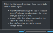
Ah, yes. Generally there is no place for text e.g in Menus, simple buttons. And it is exactly those elements which should be "obvious". Often times there's explanations of UI in the from of Whatsthis / Tooltips. Example from Whatsthis-ing on dolphin's statusbar:

Similarly hover over the buttons in Spectacle and see the tooltips just show what the controls already explains quite well.

That is trying to explain something *very* obvious. I will be surprised if any user actually bothers to click and read this. My point here is that if the UI is obvious, it doesn't need any explanations. The Whatsthis in the above screenshot is adding no value, imo.

I was talking in the Config / settings context, where there is space for additional text. Imo, no, it doesn't lead to visual clutter. A lot of applications do this and I think it is actually better as the help is sitting right there in front of you. Example from VScode:

That actually is very helpful to me as what I probably need is sitting right there, and the "additional help" is actually adding value to the UI.

Also, IMO there's a limit to the length of the text we can add to the UI even in settings. If it's going to be long paragraphs, it has some problems

  • Users can ignore long texts (I think it is one of the reasons behind short error messages).
  • The long message may be try to explain a difficult concept briefly. It will fail to be understandable for common user.
  • Will actually lead to clutter

Example of such a message from our font settings:

IMO, that is trying to explain a complicated thing to a user. I am a dev, and maybe know a little more about computers but I clueless about the setting even after reading that. It would have been much better if it was a short line of text + link to some documentation that actually explains the setting.

That solution looks indeed nice, too.
I would have no issue to adopt that one. Merge requests welcome :P

Thanks! I might have already done more work in that direction if there wasn't this task with many comments pushing towards removing contextual help in general.

In T9986#249424, @waqar wrote:

This is just the same Whatsthis with a button in front.

It doesn't matter if it "is just [anything]" as long as it doesn't share 90% of its usability issues.

In T9986#249578, @waqar wrote:

That is trying to explain something *very* obvious. I will be surprised if any user actually bothers to click and read this. My point here is that if the UI is obvious, it doesn't need any explanations. The Whatsthis in the above screenshot is adding no value, imo.

IMO you are completely failing to understand the user group these help texts are targeted at. There are many 6th graders (in Germany) who are unable to navigate to a folder. (Disclosure: I have taught computer science in schools and studied teaching it for years.) Even if I ignore elderly or other user groups that might not have had any exposure to technology when growing up, there are many who don't have any understanding of the file system at all (until someone explains it to them).

I am sure some What's This help texts in Dolphin are less important than others. I went with full coverage of all widgets when making them so the more obvious ones also have a help text. If a user doesn't understand something obvious and asks "What's This?" about it, help is still provided. That being said, in the picture above there are enough things explained which are important and not obvious to all users:

Status bar text

Background: In our default single-click mode, selecting files isn't obvious to beginners.
There is a good chance the user has nothing selected when seeing the status bar text. (There is even a chance they do not know about selecting at all.) The help text explains that the status bar text is useful if items were to be selected.

Additionally they see something like "12 folders, 3 files (5,8 KiB)" and might be puzzled that 12 folders and 3 files combined are only 5,8 KiB in size. I wanted to write a line that explains that only the file size is counted there but at that time I thought someone was about to implement a feature to get the correct size for both combined. I should probably add that line but the point is that there is something valuable and not obvious to be explained for the status bar text.

Zoom slider

This has been fixed since then but there was no label on this. Even now though only the help states explicitly that only the icon sizes can be adjusted and not the text size.

Space information

An unlabeled text like "5 GB" means nothing to people that do not know the data units. "GB" could be misinterpreted. The user might also have multiple storage devices but no understanding of it and wonder why the free size changes when changing folders. It is also not obvious that the bar next to it states the free size compared to the total size because the text and the bar might not be related just like the bar and the slider are not.

If you are thinking now that I am just making stuff up to justify even the most obviously unnecessary help text then let's look at users with disabilities next. We try to become better with accessibility in KDE with the most thought of deficiencies being (partial) blindness, deafness and motoric disorders. But there are also many users with mental disorders/illnesses. They might have problems to make the most basic connections but still would like to use a computer by themselves. Some weeks ago someone told me how KDE is the best for the people with aphasia they are caring for. Even outside of obvious handicaps we should not choose a threshold at which users are -- by some definitions of the word -- too dumb to use our software, especially because making software more obvious helps everyone, because all users make mistakes. The threshold when something is obvious enough should most definitely not be set based on someone with a deep understanding of technology. If there are users that need help to understand something, we should try to provide that help (without neglecting the needs of the users that might be bothered by too much help). What's This and alternatives are ways to help the users that need help without bothering the rest too much.

IMO, that is trying to explain a complicated thing to a user. I am a dev, and maybe know a little more about computers but I clueless about the setting even after reading that. It would have been much better if it was a short line of text + link to some documentation that actually explains the setting.

So above you complain about the thing being explained being too easy and here you say it is too difficult for users. In KDE the line between user and developer is blurry. Providing such information can help users to get a deeper understanding of a subject that might one day lead to a contribution. Not saying this is necessarily going to happen in this specific case but there is no reason to avoid having such an explanation that a user can seek out.

Anyways there is no reason to believe a short line of text + link is any better than explaining something completely right there. I'll not go into details once more why having help there is better than not having it which would be the case without those buttons.

Even if someone does not understand an explanation fully, that doesn't make the information provided fully worthless.

I was talking in the Config / settings context, where there is space for additional text. Imo, no, it doesn't lead to visual clutter.

If there were four additional "short lines of text + links" in the font config window, IMO of course that would be visual clutter.

Also, IMO there's a limit to the length of the text we can add to the UI even in settings.

  • The long message may be try to explain a difficult concept briefly. It will fail to be understandable for common user.

So the message can't be too long but if the thing being explained is complicated it can not be short either. So your point is that we should not explain things in the UI if they are complicated. The problem is that some things are intrinsically complicated.

In Bavaria about three hours are supposed to be used to explain 6th graders that there is a difference between vector graphics and raster graphics even though "they look the same". Are we not even going to try to explain to users that they might be losing data when saving? The length of an explanation depends on the thing being explained. There is no point in worrying that an explanation might be too long if it can't be explained more briefly.

For code documentation the typical problem is that there is not enough of it. You aren't going to suggest to remove documentation because programmers might write too elaborate explanations there. Just like for users, such help being there is the difference between being able to do a task within a reasonable time frame or not. Providing a link to a tutorial isn't going to cut it just like providing a link to a manual won't.

If everything could be made obvious without even relying on contextual help we wouldn't need teachers, video tutorials or a certification industry around software and would instead rely on school books, articles and manuals. I hope we can return this discussion towards how we can provide contextual help somewhat soon instead of wondering if such a way of providing help is ever useful.

waqar added a comment.EditedFeb 10 2021, 7:18 PM

Thanks! I might have already done more work in that direction if there wasn't this task with many comments pushing towards removing contextual help in general

For Kate, at least I oppose this style of Context Help. The general idea to "hide" it just doesn't make sense. (In Settings/Config context)

IMO you are completely failing to understand the user group these help texts are targeted at. There are many 6th graders (in Germany) who are unable to navigate to a folder. (Disclosure: I have taught computer science in schools and studied teaching it for years.) Even if I ignore elderly or other user groups that might not have had any exposure to technology when growing up, there are many who don't have any understanding of the file system at all (until someone explains it to them).

yes, maybe I didn't understand. Yes, you can be totally right. But also notice that many 6 year old kids use mobile phones without any tooltips around. More than a billion people on earth use mobile phones and don't complain about missing tooltips / whatsthis. That includes disabled users / elderly / children. Mobile phones contain complex applications, complex settings, but they came up with a solution that didn't need these things. It worked, because I have found 0 users till date that complained about not having such stuff.

Humans rely on instinct a lot and they often learn things by experimenting. So explaining what a zoom-slider is or what single-click would do in 2021 especially, is just, imo, adding no value. The reason is that, no, I don't think any user will stop and read the tooltip / whatsthis to find out what it does, they will just move it and see what it does and learn it that way. But having such huge size tooltips around to explain things is going to cause annoyances imo, because it's getting in the way and yes, I have learned, no need to show every time.

If you are thinking now that I am just making stuff up to justify even the most obviously unnecessary help text then let's look at users with disabilities next...

No, I know no one is making stuff up. We might have different opinions though :)

I think the main reason that I am thinking this way is that we have had computers for a long time now and a lot of people have just learned how things work by now. 15 years ago, when we got our first "small" phone in the house, I couldn't understand how it worked. I just couldn't. I struggled with opening the game I wanted to play. These days, my 5 year old neice plays youtube and games and whatnot by herself on the phone.

Similarly, just 2 weeks ago, I had to help a 17 year old install their first desktop on laptop. I chose KDE, of course, as I am biased ;) Anyways, the hardest part was to install KDE-neon. This week I checked on them to see how it was going and they sent me a screenshot of the desktop. Surprisingly it was themed and had all sorts of fancy stuff on it and were pretty much in love with the desktop. This is a very non-techy user and personally I consider Plasma to be somewhat complicated sometimes because we have so many different ways to do things so I was very surprised by all this.

So above you complain about the thing being explained being too easy and here you say it is too difficult for users. In KDE the line between user and developer is blurry. Providing such information can help users to get a deeper understanding of a subject that might one day lead to a contribution. Not saying this is necessarily going to happen in this specific case but there is no reason to avoid having such an explanation that a user can seek out.

The point I failed to make was that you just can't explain some things in whatsthis because of their inherent complexity. At this point, the best thing is to be brief, a single line of text + "Learn more...". That learn more can be wikipedia / our own documentation / an article / a video etc.

Anyways there is no reason to believe a short line of text + link is any better than explaining something completely right there.

You can not explain some things completely right there. You just can't. Sub-pixel rendering is a huge topic, it is simply just not possible.

If there were four additional "short lines of text + links" in the font config window, IMO of course that would be visual clutter.

If we do it right, it would look good. The VSCode screenshot is kind of a proof of this, imo.

So the message can't be too long but if the thing being explained is complicated it can not be short either. So your point is that we should not explain things in the UI if they are complicated. The problem is that some things are intrinsically complicated.

Yes, exactly. Link to documentation / external help is best for these cases.

The length of an explanation depends on the thing being explained. There is no point in worrying that an explanation might be too long if it can't be explained more briefly.

Of course, the length is not the issue, the length "inside the UI" is the issue. You can't have essays / multiple paragraphs of text in UI.

For code documentation the typical problem is that there is not enough of it. You aren't going to suggest to remove documentation because programmers might write too elaborate explanations there. Just like for users, such help being there is the difference between being able to do a task within a reasonable time frame or not. Providing a link to a tutorial isn't going to cut it just like providing a link to a manual won't.

That's comparing apples to oranges. These are different problems, not comparable at all. And actually a link to a tutorial / example is what a lot of programmers look for the first time they start working with a new API. It doesn't *have* to be a manual, these can just be small help articles or visual help / videos / gifs.

Also, please note that I am not advocating the removal of context help. My point is that we should avoid large tooltips. Small tooltips are good, and don't get in the way. For e.g, that large dolphin Whatsthis can be broken into 3 smaller tooltips.

rjvbb added a comment.Feb 11 2021, 1:27 PM

Felix Ernst wrote on 20210210::18:07:07 re: "T9986: Delete "What's This" inline help functionality"

> F9721997: image.png <https://phabricator.kde.org/F9721997>
>
> That is trying to explain something *very* obvious. I will be surprised if any user actually bothers to click and read this. My point here is that if the UI is obvious, it doesn't need any explanations. The Whatsthis in the above screenshot is adding no value, imo.


IMO you are completely failing to understand the user group these help texts are targeted at. There are many 6th graders (in Germany) who are unable to navigate to a folder.
(Disclosure: I have taught computer science in schools and studied teaching it for years.) Even if I ignore elderly or other user groups that might not have had any exposure to technology when growing up, there are many who don't have any understanding of the file system at all (until someone explains it to them).

You seem to be reacting to an image that has nothing to do with navigating to a folder, but I hear you. In fact, I hear even more: users as inexperienced (not to say clueless...) as you suggest they are will probably not understand much of the example What'sThis text - which explains things in just more unfamiliar concepts.

Those users will indeed need someone to explain things to them, or maybe nowadays they'll need animated manga-like cartoons.

It's funny really. I never had CS in school; we had a C64 at home before my school got a few TRS80 fossils. I can't recall any of those having any form of contextual help, and the "just double-click on everything to see what happens" kind of monkey curiosity wasn't exactly possible back then either. Yet I can't recall ever having had problems finding things. But let's not get too far off-topic :)

For reference, Apple used to have this feature by the name of "Balloon Help" back before Mac OS X. It suffered from the same problem as ours:

  • It was incompletely implemented by developers, reducing the incentive to enter the mode that showed the balloons
  • The people who could conceivably benefit from it were so hopeless that they never found the feature and really just needed hand-holding by a physical person in the room with them

Apple quietly dropped the feature with the first version of Mac OS and nobody complained, or even noticed, really.

It's worth remembering that Balloon Help predated the concept of Tooltips, and when Tooltips were invented, they were considered to be an improvement. Today Tooltips survive and thrive basically everywhere, while we're the last holdouts for Balloon help. In typical KDE fashion, we have both. :) I think history shows that the concept failed and was replaced by tooltips, which worked much better--at least on platforms with a pointing device.

  • It was incompletely implemented by developers, reducing the incentive to enter the mode that showed the balloons

That's exactly why I tossed some ideas to show which widgets have the additional information. IMHO that could go for tooltips too - who has never waved the mouse around hunting for that kind of contextual help?

It's worth remembering that Balloon Help predated the concept of Tooltips, and when Tooltips were invented, they were considered to be an improvement.

I cannot really recall Balloon Help but from your description it sounds like a tooltip mode that had to be activated manually.?

Anyway, I think there will always be cases where the possibility to get a more exhaustive tooltip (aka What'sThis) would be welcome. Remember, we have to be a bit careful to avoid one of the pitfalls of FOSS. Most people working on that do it because they like it and presumably because they have use for the code (that's how I came to KDE in any case). IOW, most of us are not paid for our contributions so we basically do what we like with software that we know intimately, and we tend to forget about things we don't have any need for, like What'sThis info or probably even tooltips. That makes it easy to underestimate their importance, and could also explain why the information in question is so incomplete.

Like many of the manuals/handbooks in fact...

FWIW, what's this text is useful for old/experienced users too (I still use it occasionally in e.g. Kate/Dolphin settings dialog, for settings that I haven't changed before, or don't change frequently), it's a simple/fast alternative to having to search through the handbook/manual or search online...

Users not figuring out what the "?" button on the title bar is for... maybe advertise the feature more?

Adding an "i" icon next to every slightly-tricky setting is just not feasible IMHO (and it would clutter the UI).

I find the contextual help quite nice but I don’t see how beginners are actually supposed to use this when experienced users like me (20 years of computers/10 years of Linux) didn’t even know it worked.

Anyway I think @broulik comment about Qt::AA_DisableWindowContextHelpButton (https://phabricator.kde.org/T9986#166343) is a first step to make the What’s This button more obvious since it won’t be there all the time.

Is it possible to include What’s This usage in Plasma user feedback somehow?

I made a proof of concept of an expandable tooltip based on a lot of feedback from this discussion. I think this would be a fine way to provide context help. It allows us to provide it in many of the typical circumstances: https://invent.kde.org/frameworks/kxmlgui/-/merge_requests/45

Unfortunately it isn't a solution for areas that should not have tooltips for which I might make a separate MR which would make it so areas which provide context help would be highlighted after clicking the What's This action.

In T9986#249646, @rjvbb wrote:

In fact, I hear even more: users as inexperienced (not to say clueless...) as you suggest they are will probably not understand much of the example What'sThis text - which explains things in just more unfamiliar concepts.

I agree but I had to draw the line somewhere. I drew it at terms like file, folder, view. Otherwise I would have to paraphrase or explain them in every other text. The context help isn't that well suited for a very basic introduction.

Those users will indeed need someone to explain things to them, or maybe nowadays they'll need animated manga-like cartoons.

Yes. Microsoft used to have interactive tutorials pre-installed for even the most basic stuff like how to mouse click: https://youtu.be/rMhUY5CdcPQ?t=1071
I don't think it is feasible or necessary for us to go that far.

At the moment we rely on beginners knowing someone to explain them the very basics of, for example, Dolphin like "What's a file in a computer? What is 'file management'? What's a folder in a computer? How do I navigate to a file? How do I close a folder? How do I move a file between folders?" We don't need to feel too bad for not providing that help because most people know someone who could at least dilletantly explain this to them if both of them have the patience.
I agree though that it would be great if there was an obvious way to get a video about the basic structure and use of an application. Such things are helpful for making KDE usable by everyone which Linux still isn't known for.

rjvbb added a comment.Feb 22 2021, 8:41 AM
I agree but I had to draw the line somewhere. I drew it at terms like file, folder, view. Otherwise I would have to paraphrase or explain them in every other text. The context help isn't that well suited for a very basic introduction.

Oh, but that's exactly what I was saying; context help is useful only for people who are familiar with the terms and concepts you can justifiably put in that help text.

Yes. Microsoft used to have interactive tutorials pre-installed for even the most basic stuff like how to mouse click: https://youtu.be/rMhUY5CdcPQ?t=1071
I don't think it is feasible or necessary for us to go that far.

Indeed.

I agree though that it would be great if there was an obvious way to get a video about the basic structure and use of an application. Such things are helpful for making KDE usable by everyone which Linux still isn't known for.

I think that there we're above and beyond what can be expected from even an OS; that's FooBar for Dummies territory
https://www.iiitd.edu.in/~amarjeet/Files/SM2012/Linux%20Dummies%209th.pdf

R.

btw how many apps actually use this feature? It might be worth going over them case by case if there's only a few (only seen it in dolphin and ksysguard, which is going bye-bye)

grep'ing in kdesrc-build/kde/src/:

rg -s "setWhatsThis|property name=\"whatsThis\"|whatsThis\(\)" | wc -l
4352

https://lxr.kde.org/search?%21v=kf5-qt5&_filestring=&_string=WhatsThis (only shows the first 1000 results...)

https://lxr.kde.org/search?%21v=kf5-qt5&_filestring=&_string=WhatsThis

That's not really helpful now is it?
Did a bit of research with SourceGraph (excluded deprecated stuff + projects that have high usage) -> loaded all results-> regexed text from page

here's the results

digikam
kexi
ktexteditor
kipi-plugins
k3b
dolphin
akregator
amarok
android-qtwebkit
audex
calligra
clazy
eventviews
falkon
filelight
gluon
kaffeine
kajongg
kate
kbibtex
kcachegrind
kde-cli-tools
kde1-kdelibs
kdelibs4support
kdepim-addons
kdepim-runtime
kdesignerplugin
kdev-python
kdevelop
kdiamond
kgpg
kgraphviewer
khtml
kile
kio
kitemmodels
kleopatra
kmail
kmenuedit
kmplayer
kmymoney
knotes
kolourpaint
kompare
konqueror
konsole
kontact
konversation
kopete
korundum
krita
krusader
kstars
ksysguard
ktimetracker
kube
kwave
kwidgetsaddons
kwin
kxmlgui
labplot
latte-dock
liquidshell
lokalize
marble
massif-visualizer
okteta
okular
phonon
plasma-desktop
plasma-integration
plasma-workspace
polkit-qt-1
qtruby
rekonq
rsibreak
rust-qt-binding-generator
smb4k
syntax-highlighting
systemsettings
tikzkit
trojita
yakuake

not sure if maintaining stuff is worth considering that most projects that do have the functionality don't even display it in the titlebar (kate/krita etc.)

rjvbb added a comment.Mar 1 2021, 9:06 PM

That's a substantial list which includes applications with a steepish learning curve that probably provide useful information in the What's This texts.

not sure if maintaining stuff is worth considering that most projects that  do have the functionality don't even display it in the titlebar (kate/krita etc.)

Did you read the entire exchange? The whole point has become "how can we make it clear that this information exists without a gadget in the titlebar" and in a way where the user doesn't have to start hunting for it. See https://invent.kde.org/frameworks/kxmlgui/-/merge_requests/45 .
Relying on the titlebar was never a good idea in the first place, esp. not in cross-platform applications.

I've read it, just gave my opinion on the status quo

ngraham closed this task as Wontfix.May 14 2021, 8:36 PM
ngraham moved this task from Backlog/Planned to Postponed on the VDG board.

We decided to go in entirely the opposite direction and use the "What's This" strings for expanded tooltips. See https://invent.kde.org/frameworks/kxmlgui/-/merge_requests/45

Who cares what you use the strings for, this request is about removing the stupid button on the title bar and that's more than before a valid request.

dfaure added a subscriber: dfaure.EditedMay 15 2021, 11:59 AM

"Who cares" (which really means "I don't care", since clearly there are people who do care), and "stupid" are not constructive feedback nor acceptable language in this community.
Here's a constructive suggestion for how your feedback should have looked like:

"While it's great that the strings are used to expand tooltips, it seems to me that this request has been closed prematurely because the issues with the titlebar button are still there."
ahmadsamir added a comment.EditedMay 15 2021, 12:11 PM

Adding to what @dfaure said, I think the button is useful, and it should be opt-out, not opt-in; the former is simple using systemsettings, the latter is impossible to discover, because how would a new user find out there is actually a question mark button that can be used to show extra info about some GUI element.

And this is all about new users, if you've been using KDE for 1-3 years, you already know, and you most likely have your settings changed "just the way you like it".

(As I said before, I've been using Linux for ~14 years (and KDE for 10-12 of those 14), and I still find the "what's this" text useful in some cases; my 2p's).

If I don't misunderstand the Qt docs:

https://doc.qt.io/qt-5/qt.html#ApplicationAttribute-enum

Qt::AA_DisableWindowContextHelpButton

Disables the WindowContextHelpButtonHint by default on Qt::Sheet and Qt::Dialog widgets. This hides the ? button on Windows, which only makes sense if you use QWhatsThis functionality.
This value was added in Qt 5.10. In Qt 6, WindowContextHelpButtonHint will not be set by default.

for Qt 6 the ? button will automatically disappear, if we don't actively enable it ourself.

[...]

for Qt 6 the ? button will automatically disappear, if we don't actively enable it ourself.

You mean if we can actually reach consensus whether to keep it (and if it's useful) or not... yeah, getting consensus in a group of 100's (1000's?) of devs and users is hard.

+++

In addition:

  • I only see said button when using KWin
  • KWin allows me to configure which titlebar buttons I want to see (and where).

Therefore, anyone who cares enough about this detail can create a PR for a tiny change to KWin that removes the button from the default titlebar configuration - or even just a feature request to that extent on BKO.

markuss reopened this task as Open.May 15 2021, 12:42 PM

The What's This titlebar button is not available in other desktops and made obsolete by the new tooltip implementation. The new implementation should work everywhere, the button definitively doesn't.

ngraham closed this task as Wontfix.May 15 2021, 4:14 PM

The new tooltip isn't merged yet. Once it is, it will be safe to remove the window decoration button. Until then, the button has to remain, because some people might still be using it.

Regardless, I closed this Phab Task because the original idea that it was tracking has been rejected and replaced with something else (the expanded tooltip idea). That is being tracked elsewhere.

To close the loop on this, the feature has now been integrated, and I have submitted a merge request to remove the button from the toolbar: https://invent.kde.org/plasma/kwin/-/merge_requests/1104