Problem:
Some apps have the hamburger menu at the left, but it seems that the standard is at the right, like the ones seem in Dolphin and Gwenview (latest update).
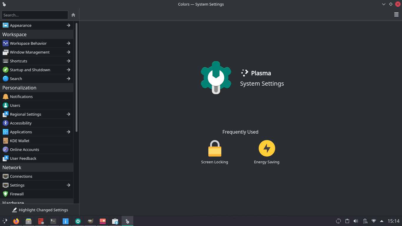
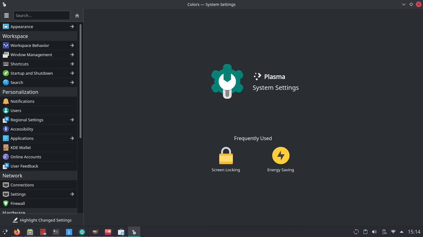
System Settings
- The System Settings has an empty part that doesn't look consistent with other headers present in Discover and KInfoCenter. This problem is even more noticeable when the color scheme has a different color for the titlebar;
- Hamburger menu is not at the right.
Mockup vs current:
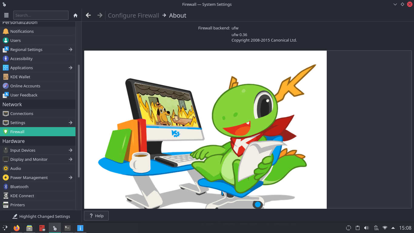
KInfoCenter
- Hamburger menu is not at the right:
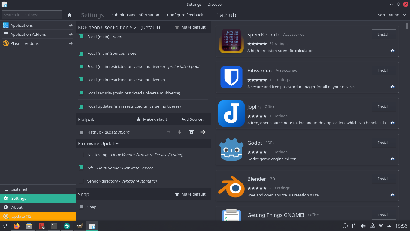
Discover
- Hamburger menu is not at the right;
- Dolphin and other apps have the configure action located at the hamburger menu, so the configure action in the left panel is inconsistent:
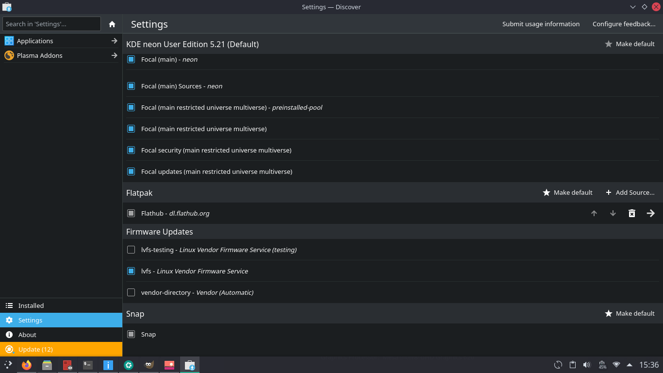
The "submit usage" and "configure feedback" could be options in the hamburger menu, because other apps like System Settings, KInfoCenter, etc. have similar actions inside the hamburger menu (report bug, for example);
Note: the hamburger at the right would break the "sort rating" button when going in Configure > Flathub repository > right arrow, because Discover splits the view when viewing repositories. I think that the repository should open in a new page:
To solve the problem of not possible going back to the previous page, Discover could use the back and forward buttons like in System Settings:
Thinking of, the split view should be ditched in favor of the back and forwards buttons regardless of the hamburger button being at the right, because the header currently looks inconsistent too.
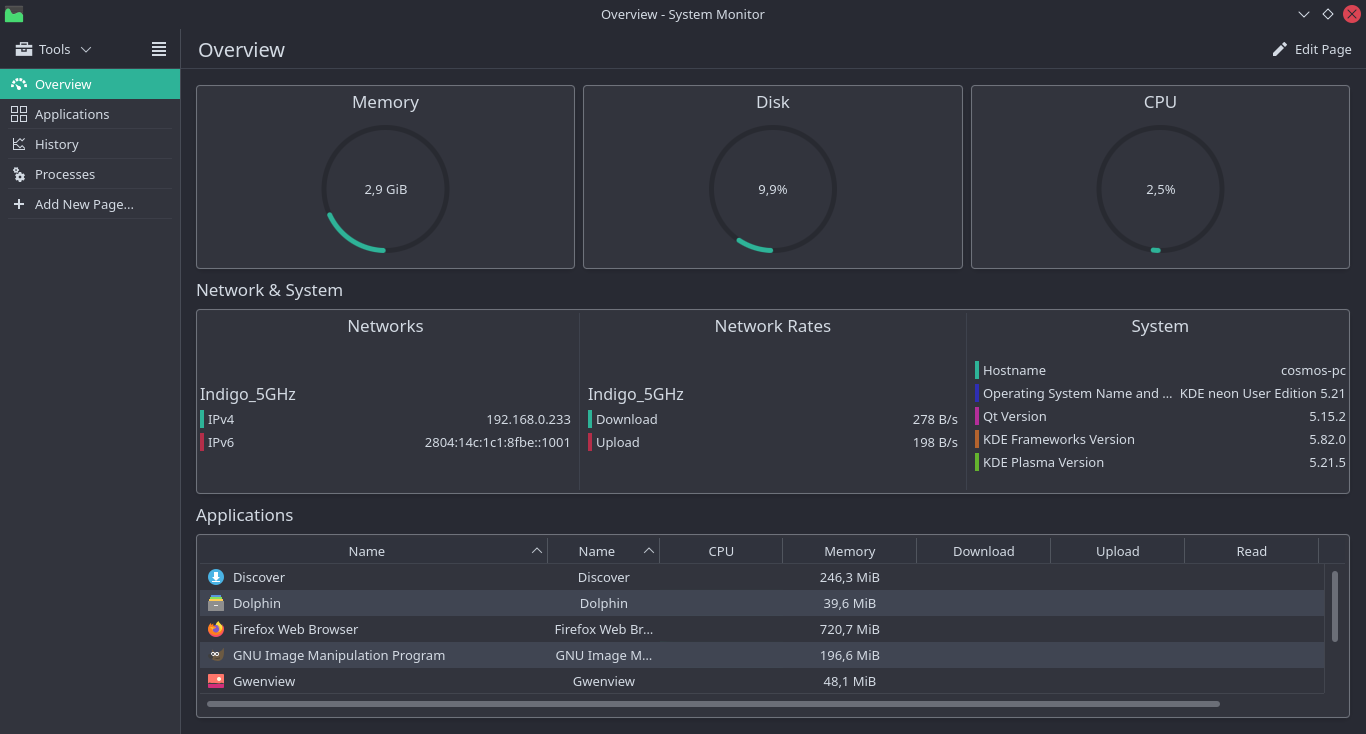
System Monitor
- Hamburger menu is not at the right.