Sizing of icons and text in the panel is incredibly inconsistent. As an example, here's a low-quality example of how many heights we currently have at a random size:

Sizing of icons and text in the panel is incredibly inconsistent. As an example, here's a low-quality example of how many heights we currently have at a random size:
What I was thinking could be done is
While we're at it, it'd be good to finally have one text size for the panel overall. That includes the font size for Digital Clock (all modes), Task Manager, etc. (only the parts of those applets that have text on the panel itself)
Also it'd be nice for the Digital Clock to have one font size for the time and date in date-enabled-mode, but hey.
PS: If it has to come to Digital Clock's date-enabled-mode having a slightly smaller text size for it all to fit on the panel, I'm alright with that.
Yes! And this is something I'd like to see extended to all places where an icon and a single row of text occupy the same line. They should, in my opinion, all have the same height.

Should the icons increase by fixed value steps, or smoothly scale as the panel is resized?
Each has a cost.
Fixed value steps:
Smooth scaling

It was also suggested to make this setting user-facing (by hovering the widget in panel edit mode); I wouldn't do that yet because this is something very technical that the average user shouldn't want to change sizes, plus it could result in inconsistent sizing in the icons that we'd instead like to be consistent (minimize all, tray, clock, etc). This doesn't mean that we couldn't add it in the future if it turns out to be more necessary than we thought.
There was also some discussion regarding using 32px for system tray. Keeping in mind that this solution would still be necessary (e.g.: to extend task manager to borders, which has an internal theme-customizable margin), a bigger system tray could be discussed and implemented in the future; but given that I don't feel like there's a consensus for that, I keep the tray 22px for now (=5.20). A bigger tray can still be obtained by making the panel some pixels bigger (48 or 50px should be enough, depending on the panel size we end up choosing).
That seems like a sensible approach overall. I agree that making is user-facing seems like overkill. As the lone large-system-tray-icon lover, I'm willing to give up my 32px icons on a 46px panel. :) If I have to go up to 50px or higher, that's all right.
One question: why would you make the Application Launcher applet ignore margins? Is that necessary? Maybe we can just fix the icon itself to use the same margins as other icons.
The Application Launcher applet icon is okay, it's just that it looks too small next to the task manager. Imagine having this small icon in Manuel's mockup:
Yeah, though it's starting to feel arbitrary again:
This feels like it's not actually solving the original problem, which, as I understand it, was to use consistent margins for first-party applets. If the two most prominent first-party applets ignore the margins, I feel like we're explicitly abandoning that goal. Are we?
The task manager ignores margin but we can make it apply internal ones as big as the panel ones, so the icon sizes should still be consistent; Manuel was proposing to downscale 64px app icons to a 22px space, which - considering 32px icon sizes - would be as big as the actual launcher icon:
Here's my idea for how it could work:
Key:
ICON is a placeholder for the icon size in the applet. Also the same size as the general widget contents (icon, text, etc.) in the panel would be.
Silver ICON: Same as ICON, but for unhighlighted items to convey the icon size on those as well as on highlighted items
Dark Grey: Highlighted Widget/Item
White: Unhighlighted Widget/Item


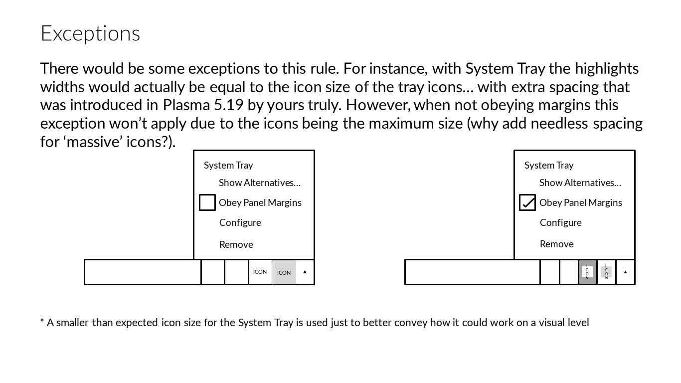

Furthermore, I'd say ALL OF THE WIDGETS should be obeying panel margins by default, although there should be a way, either in Plasmoid files, or in panel creation scripting, to allow layout creators to make certain applets in their layout's Plasma panels not obey the margins 'by default'.
Regarding the technical implementation, I'd make Plasma able to selectively add margin or not for each widget separately; this way all widgets are supported. I wouldn't make the user able to toggle those in the UI yet, we could decide if it's appropriate to add that in the future based on user requests. Right now the plasmoid itself could decide whether to have margin (the default) or not. Task manager really *has* to ignore margin to extend to borders, but then the margins are added back through the task manager internal margins defined in the theme.
I'd like to step back here and make sure we define the problem space adequately.
The title of this task is "Fix sizing of first-party plasmoids in the panel", which implies that there is a bug in sizing with only our plasmoids. The description mentions inconsistent sizing, implying that this is the bug.
So we pushed some patches and now, currently, as of current git master, we actually have rough size consistency for the icon sizes of first-party plasmoids and system tray items:

However it seems as if nobody likes this!
If the original goal was a failure and should be abandoned, I'd like to see us define the problem again before we go off to proposing solutions. Some of what @niccolove and @The-Feren-OS-Dev are proposing look good and seem sane, but I'm wary of jumping to implementation before we know what it is we're implementing. So I'd like to see a strong and firm definition of the problem we're solving as well as some well-considered mockups displaying solutions to that problem before we start implementing things.
I think our goal is to provide a good balance of icon size consistency and panel aesthetic. The idea of making all icon of the same size is - I think - good, as long as those icons are not excessively big nor small, and I'm afraid that neither 32px nor 22px icon visually work on our default 46px panel when icons are all perfectly the same size. So we have to sacrifice a bit of consistency. With my idea (and, now, implementation) - that 100% looks like Manuel mockup - I think we get a good balance of both:
This way, we make the default panel prettier and more consistent by default. It might not be the prettiest or the most consistent, but it achieves partly both goals.
Manuel mockup:


All right. To me that suggests a relatively simple implementation:
Seems like your proposed approach already satisfies 1-3. We'll need to do 5, and maybe discuss whether we should do 4 as well.
One concern I have visually is that the Task Manager icons appear very small inside their now-a-bit-larger frames. They look a bit lost in there IMO. Not a huge deal though, and maybe it's just something to get used to.
Also I wonder how we're going to handle smaller panels? 8px margins are going to be much too large for skinny panels that I know a lot of people like. We'll want to reduce that progressively as panel size drops, probably eventually winding up with 2px margins for really thin panels.
For me unifying the size of the applets is not something we should strive for. The visual difference in the size of icons allows to communicate a visual hierarchy between elements, e.g. task manager icons are more often used than system trays icons. Maybe as a good compromise, we should try to make the icons have the same height as the clock text, it is still bigger than the previous size but smaller than the current oversized icons and it will make the system trays icon size consistent with the elements near it, that is imho more important than with the rest of the panel.
Also, I want to point out that all the scenarios discussed on this thread until now, are using an icon only task manager that takes less horizontal space than the normal task manager. With the current change in master, since the system tray is using more horizontal spaces (~30% more), I have now fewer spaces for the task manager. This makes the task manager less powerful for me at least. Please let's not forgot about the task manager users, even if it's not the default anymore :(
After some discussion with Nate and Noah, these points were agreed upon:
So the default would be:

I tested out your patches for that and I gotta say, I just think that those 22px Task Manager icons are too small. :( I have to agree with Carl and various other people who have voiced this opinion. Those icons look lost inside their highlight effect backgrounds.
I hate to say it, but I think at this point we have to admit defeat on the original goal of making all panel icons the same size. :( Doing so requires either making the Task Manager icons too small for many people's tastes, or the System Tray icons too big for many people's tastes. We've gone back and forth on this over and over again and I just don't think there's any way to make everyone happy. I think we'll have to live with not all icons having the same size.
I feel like what we should do instead is:
Then the default 46px panel would end up looking somewhat like this:

...but with lines around the system tray, as proposed earlier.
I agree.
Maybe we can keep the look of the right side from
and change the left side to have close to no margin. I guess that would actually look pretty good.
I have two proposals:


Some feedback:
The 28px version looks better, but the icons are blurry because this is an unconventional size, so it should be a no go.
With 32px the task manager icons look a bit too big for the panel, and launcher icon too small (compared to task manager). 22px task manager icons in 44px panel will look too small.
This is fine for systray icons, people expect them to be smaller, and there is absolutely no need for separators.
What options do I think are the best for a default good looking panel?
Or
This effectively means 6 to 8 pixels of margin for icons in the panel. (Not all widgets are icons, so this margin shouldn't be strictly respected). The result will be very similar to the mockup some posts above.
However, this configuration will not look good with all panel settings, like custom heights, ultra thin or thick panels, and this is ok! There is no way to automatically make all widgets the right size at all panel heights, without spending a huge amount of effort in the code. What I think that can be discussed latter is the support of more custom default (or recommended) sizes for the panel, something like small, medium, large sizes, that all widgets in it are guaranteed to look good.
This is what I prefer. It is almost what I was thinking about. However the icons left to the task manager seem to be pretty small now. Are they affected by the panel margins? Imho the launcher icon should have the same size / margins as the task manager icons.
Just for reference, since I checked it in https://invent.kde.org/plasma/plasma-workspace/-/merge_requests/95#note_62553: Windows uses a 40px panel height on a 1080p screen.

I'd vote for that, can you create a mockup? Also, is the workspace switcher next to it having any margins applied? Mine is alot more simple, so I don't really know how that would look like. Currently for me it uses almost no margins (and I think I like it).

Actually, there's a third option I prefer. What about a smaller panel, so the icons are not felt "floating", but keeping 22px icons in the TM? See:

22px for the task manager look just too small imho. Also note the panel height should probably not be too small to make touch usage easier. I don't use it, but I think @ngraham mentioned that earlier.
I do have a touchscreen and the target is big enough to easily click. I think they do feel a bit small, but
a) It's not too small, and you can easily get used to it
b) it's weird that icons are this small. conventionally they should be 24px, but apparently iconSizes.smallMedium was decided to be 22px instead, and the svg contains an additional 2px margin meaning the actual icon is often 20px or even smaller. I think if all icons were 24px at least, the situation would be drastically better.
22px TM/widget icons with a thin panel is fine, but the thicker the panel becomes, the sillier 22px icons look inside it. 22px icons in a 46px panel results in more spacing than icon. At this size, TM/widget icons really need to be 32px or else they just look lost inside their frame
If we need to have TM/widget icons that are always 22px to match the size of tray icons, that's just not gonna work. We can have them accidentally match in size when the panel is thin enough that tray and TM/widget icons are both 22px, but I'm just not okay with 22px TM/widget icons for a thick panel, and I don't think our users would be either.
Thanks for the insight!
Regarding the icon size, I also thought that there might be some better size in between 22 and 32px, but did not want to open that discussion, since it is probably not realistic to do that in the near future? I did not know that the icons are actually only 20px. The task manager icons are usually full color with some details which cannot really be seen easily for that size (while the tray icons mostly seem to be abstract and high contrast enough to work well for that size). So I think we really should make sure not to waste too much panel space with just padding. I'd argue since we don't have an icon size in-between, we should go for 32px icons (which are probably also only 30px in reality if they also contain 2px spacing). After having that size set, we should look for a panel size that fits good to these icons so they have the right amount of margin to look good.
If we wanted to go with 32px TM icons by default, here's how it could be nicely and consistently handled:
Then, of course:
This way:
And that is true regardless of the panel size :-)
This would be a nice addition. As I read it it introduces separate areas with separate margins. I wrote about a similar idea recently on a related GitLab issue. One thing to think about would be how many areas (two, three, more?) are sensible or whether one could easily change that in the future.
If implementation would be a huge effort, for a first version it might also be ok to just make the task manager and launcher icons ignore the panel margins as suggested by you some time ago.
Does that work good with changes in panel height? For example when decreasing it to 35px for example, will the tray icons stay at 22px? And will the task manager icons also change to 22px? That would probably be the expected behaviour.
Separators should probably discussed separately. I think there were some mixed opinions on them from a design perspective?
I think two is already a big number. I don't feel the need to go past that.
If implementation would be a huge effort, for a first version it might also be ok to just make the task manager and launcher icons ignore the panel margins as suggested by you some time ago.
It's not so difficult to implement what I proposed in the previous message, so I'd prefer to do it properly. Making app launcher ignore margin does bring some troubles.
Does that work good with changes in panel height? For example when decreasing it to 35px for example, will the tray icons stay at 22px? And will the task manager icons also change to 22px?
Oui.
Separators should probably discussed separately. I think there were some mixed opinions on them from a design perspective?
Fair enough :)
The virtual desktop looks too small for me (at that size I can't really see the different windows anymore) but otherwise +1
Currently me neither. Just wanted to make sure to think there are no corner cases (to not have them apear suddenly after half a year or so when it might be too late and everybody thinks "had we only thought about it when doing this change") or make sure it is easy to expand.
If implementation would be a huge effort, for a first version it might also be ok to just make the task manager and launcher icons ignore the panel margins as suggested by you some time ago.
It's not so difficult to implement what I proposed in the previous message, so I'd prefer to do it properly. Making app launcher ignore margin does bring some troubles.
Alright, great then!
Does that work good with changes in panel height? For example when decreasing it to 35px for example, will the tray icons stay at 22px? And will the task manager icons also change to 22px?
Oui.
Perfect :)
Looks good, imho.
I guess that could be discussed. I am currently not sure whether it looks better with margins applied or without (and whether margins are the cause here).
Looks amazing. The plus symbol could be a bit higher but the rest looks like they're 99% done.
It's a yes from me.
Implementation:
https://invent.kde.org/plasma/plasma-desktop/-/merge_requests/92
https://invent.kde.org/frameworks/plasma-framework/-/merge_requests/60
https://invent.kde.org/plasma/plasma-desktop/-/merge_requests/128
https://invent.kde.org/frameworks/plasma-framework/-/merge_requests/77
https://invent.kde.org/plasma/plasma-desktop/-/merge_requests/129
Magic convoluted solution, second try:
Where does this come from? Has there been some discussion on Riot or somewhere else?
- The plasma themes defines four new margins: left-margin, center-margin, right-margin, separator-margin
- Specifying a generic margin will set the same margin to all three for backward compatibility of third party themes
- At startup and every time an applet is added or moved, the total number of applets with fillWidth: true (which we'll call "separators" here) is counted
- All applets with fillWidth: true (the separators) get the separator-margin
- All applets where separatorsLeftOfThisApplet / totalSeparators < 0.5 get the left-margin
- All applets where separatorsLeftOfThisApplet / totalSeparators = 0.5 get the center-margin
- All applets where separatorsLeftOfThisApplet / totalSeparators < 0.5 get the right-margin
- (separatorsLeftOfThisApplet are the separators left of the applet in horizontal panels, and separators above the applet in vertical ones)
- A new enum costrainmenthints is added, a new property to appletinterface of the same name is added
- The task managers sets the costrainmenthints property to fillArea
- The task manager then sets taskmanager.svg normal-margin internally
- We make the panel 44 px with: 4px left-margin, 8px separator-margin, 8px center-margin, (or 4px?) 8px right-margin
- Make system tray adapt to panel size again, 2 rows where feasible
I like that it will show two rows where it fits!
- We add 2 separators left and right of the tray
Are this visual separators?
- We consider putting the concise date next to the time on horizontal panels (10:40 9 Jan)
I think I prefer the old way visually.
- We consider using the vertical version of the clock in https://invent.kde.org/plasma/plasma-workspace/-/merge_requests/222
This currently does not look good to me, either. The font seems to be too big and it is harder to read imho.
This is fixed now with all panel applets following the same margins, and those margins being partially user-selectable through the use of a Margins Separator applet.

