Implementation
List headers and items:
- Kirigami/QML:
- Use a ListSectionHeader for headers
- Add item action buttons when needed
- Example:


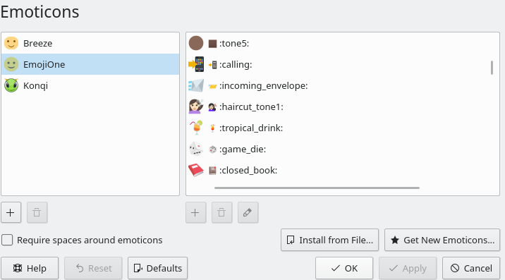
List buttons:
- Multiple icon-only buttons with tooltips on the bottom left when there's more than one button:

- Button with label on the bottom left when there's only one button:

Notes
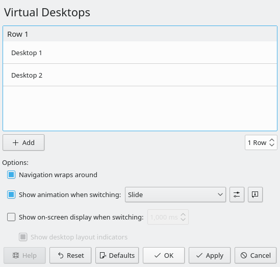
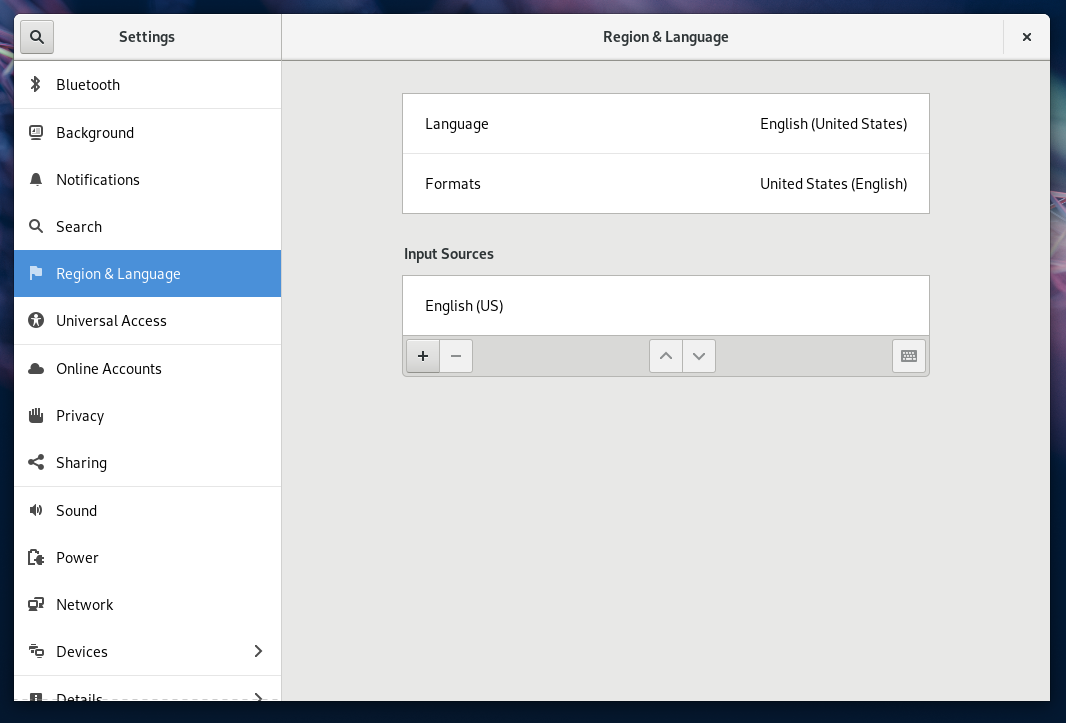
There is a common and functional alternative that's already been adopted by most of our major peers/competitors: putting the buttons in an inline toolbar at the bottom of the window. Here's how it looks on other platforms:
macOS:

GNOME:
Cinnamon:
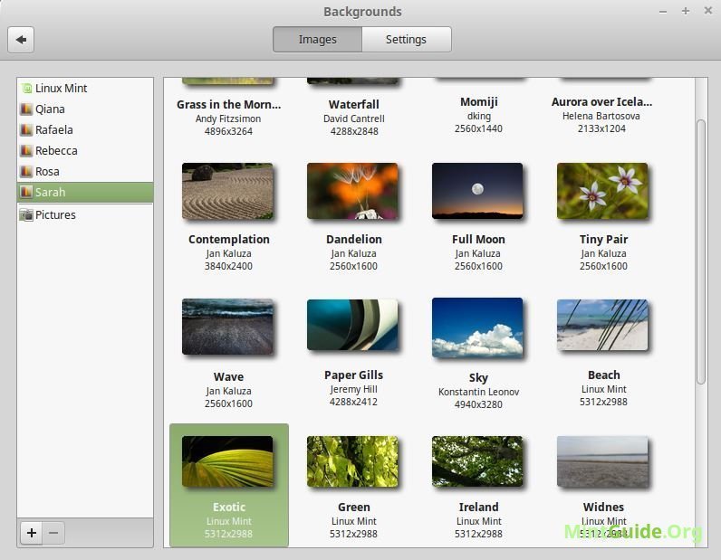
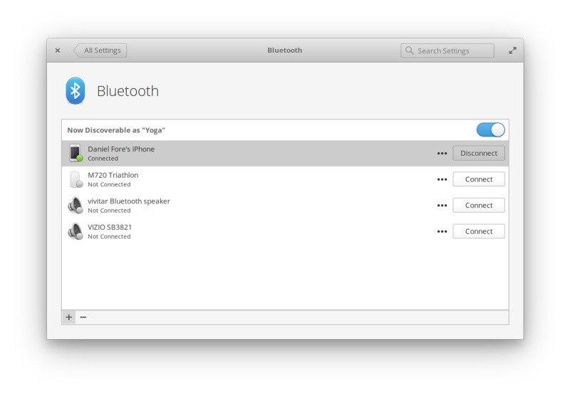
ElementaryOS:
This style seems to have emerged as a de-facto standard, probably because it is both aesthetically pleasing and solves the problem of how to visually connect the buttons with their list in a consistent matter.
I think it would be nice if we adopted this pattern too, perhaps as new Kirigami components that extend the QML ListView and GridView, or else something that can be added to them, in which case the list should lose the rounded bottom edge to make it looks like it's connected with the toolbar.
The list's toolbar should be able to accept arbitrary controls, and any buttons added to it should show text unless there isn't enough space, in which case they should fall back to being icons-only.
We should unify the styles for the lists itself too. The list headers and items currently don't all look consistent.

