In some places, we make the text of the item in question bold, sometimes adding an icon too:
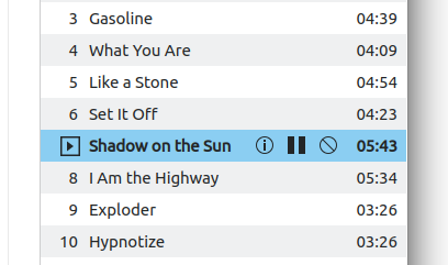
(Elisa)
In other places, we just add an icon:
(Okular)
In other places, we use headers to differentiate "current" or "connected" from everything else:

(Bluetooth applet)
We should consider unifying these and settling on a single style. Personally I think the bold text approach looks the nicest and it happens to already be somewhat commonly used.