Modernize the Calligra UI
Closed, ResolvedPublic

Description

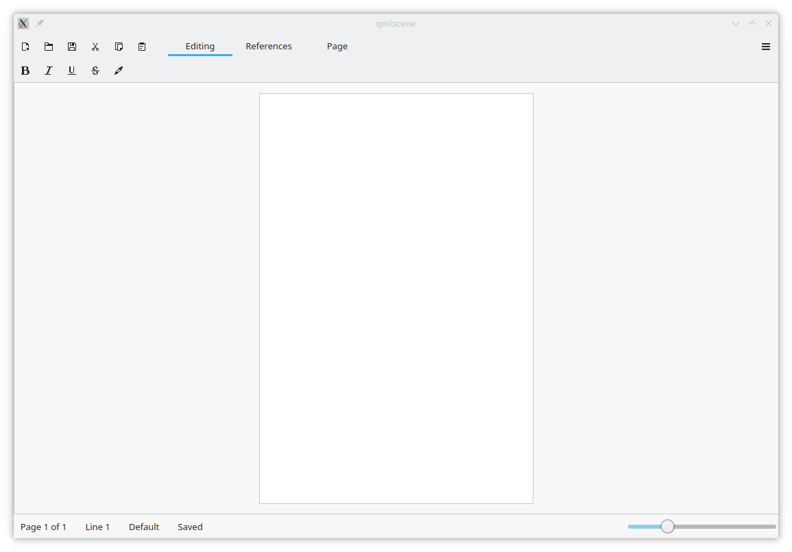
Calligra is a very nice office suite, but when compared to the rest of the Plasma 5 desktop and desktop apps, it looks like something from the KDE 3 era. (no offense there ;) Therefore, I think Calligra should be redesigned to be consistent with all of the other wonderful KDE apps.

Major design changes could include:

  • Redesigning the start screen
  • Removing the menus and replace with a hamburger menu
  • Perhaps changing from a docked interface to a tabbed interface (like MSO)
  • Creating application-wide dark/light modes
  • Give the page borders (a page without border looks odd)

I think that if KDE has a good office suite with modern UI that integrates well, there will be nothing stopping people from migrating to Linux.

Ideas:

Note:
This is NOT a mockup for Calligra, but a minimal office suite which I created (O20, https://gitlab.com/abstractsoftware/o20/o20coreapps). It is meant to give ideas for what Calligra might look like, but certainly not the final product.

This is my first time on Phabricator, and please excuse me if this does not belong here.

ognarb added a subscriber: ognarb.Mar 19 2020, 7:06 PM

Did you take a look at the Gemini interface? It is also Qt Quick based and more modern. The Qt Quick components are also used by the office suite in SailfishOS.

Also for the Qt Widget interface, there is the possibility to change to a tabbed interface.

abstractdevelop added a comment.EditedMar 19 2020, 7:33 PM

I didn't know about Gemini! Yes, it looks nice, but the touch based QtQuick Interface seems to just be for viewing documents, and it seems like none of the editing features are implemented yet. But if that gets working, it will be really cool. :)
For the Words/Sheets/Stage, I can't seem to figure out how to give it the tabbed interface. So maybe adding an option in the settings or making it default would be nice for beginners. It seems like it will just be a matter of tweaking some things, for example some of the buttons look a little funny in the tabbed and docked interface.
I don't mind helping with this, but I can't seem to find any documentation for the Calligra source and API.

EDIT: don't worry, I found the docs.

ognarb added a subscriber: leinir.Mar 20 2020, 5:07 PM

@leinir has more knowledge than me regarding the QtQuick interface. At least I saw that a long time ago you could edit the text and the shaped while using it in some youtube videoi, but it seens this features was lost/disabled.

btw just saw your games collection and created a small patch https://gitlab.com/abstractsoftware/abstract-games/-/merge_requests/1 to allow installing in a prefix ;)

Thank you @ognarb !
I have spent some time making a mockup for Calligra in Qt Quick (it's great for making mockups ;)). Here is how it looks:

I tried not to alter too many things radically, just clean up the interface.

I also think that both interfaces need a bit of work. The QtQuick one is strongly inconsistent with other KDE applications. The QtWidgets one is not great, in my opinion, as the sidebar takes a lot of space and you can't hide it. You can move it on top, but it's hardly usable as a tabbed interface as contents are to tall and takes to much vertical space. I think a general redesign might be very useful to promote the application more :-)

In the case of a tabbed interface, maybe something like this:

I think people liked tabbed interfaces, and they look quite modern. This will look especially be nice when the new 'tools area' is implemented.

leinir added a comment.EditedMar 23 2020, 9:29 AM

I didn't know about Gemini! Yes, it looks nice, but the touch based QtQuick Interface seems to just be for viewing documents, and it seems like none of the editing features are implemented yet. But if that gets working, it will be really cool. :)

So, what we have there is a usability (specifically discoverability) issue - Calligra Gemini very specifically /does/ have editing functionality, and creation functionality. It was designed to adapt automatically to your device's form factor (so if you have a convertible ultrabook, it'll switch automatically when you do the screen-flippy-keyboard-remove thing), but you can also manually switch between these modes. Click the menu button in the top right and then "Switch To Desktop", and you'll get the traditional widget based UX (and in that one, click the Switch To Touch button in the top right to, you know, do that). The concepts are described in this short video: https://vimeo.com/111737183

Thank you for clarifying @leinir. Actually, I did see the "Switch to Desktop" button, and that is the interface which I am suggesting be redesigned. That's really cool how it automatically transforms like that!

PS: I know my mockups weren't very good, they were just ideas and I'm sure somebody else could think of something better, perhaps @manueljlin . He did some really nice ones for dolphin. ;)

I can try to design something if you want. Also, if a task is related to design it should probably have VDG as a tag too
(btw sorry for not seeing the email earlier, you can always ping me on telegram if I take too long to see a task/diff)

Thanks @manueljlin , that would be really nice. Your designs are always breathtaking. :D
I'm not very good in the design department, better at actually doing the code, but I'm trying to improve. :/

Hey @abstractdevelop do you have a matrix or telegram account to talk about the design on the VDG room or via private messages? I'd rather not spam unfinished mockups here like I did on the system tray task.

Sorry to everyone else for the email oops

manueljlin added a comment.EditedApr 27 2020, 5:23 PM


I personally prefer the first one, and it's consistent with okular !156 from Invent and with T11579.
People from VDG seem to agree too

edit2: writer -> words

manueljlin added a comment.EditedMay 6 2020, 2:09 PM

Some more mockups:

Calligra Words with the D29264 tab style
edit1: added the missing dividers between tabs (oops)

Calligra Words with the sidebar at the right side

Calligra Stage

Calligra Stage with the D29264 tab style

edit2: fixed writer -> word lol

ngraham added a subscriber: ngraham.May 6 2020, 2:13 PM

Damn I would love to use an office suite that looked like that again. Reminds me of Apple's Pages which I loved, and sorely miss.

Just my two cents, this might be much better for a simple reaon: the categories can be too many (think Office and the tabs that show up when you edit images/tables/charts/etc.)

Calligra Sheets

Calligra Sheets with the D29264 tab style

Should I also do Plan, Karbon or KEXI? And the new document dialog?

Looking at these, D29264 tab style (as long as it has a different background color for inactive tabs is probably the way to go, or else there might be too many blue rectangles on the screen at once.

n-gone added a subscriber: n-gone.Nov 7 2020, 3:32 PM

Hi

I come a bit late in the discussion, sorry about that :/
@manueljlin I kindly disagree with the proposed UI for words because it reproduces the same mistake as every other word processor (MS Word, LibreOffice Writer, probably Corel WordPerfect).
There is a very deep flaw in the WISIWYG world. When you set a piece of text in bold, this is 99% of the time not what you want to do. What you wanted to do is an emphasis of this text. The difference is subtle but major in user interface. I think there is a place in the word processor landscape for a style first word processor. No bold button, but emphasis style. Numbered list being harder to reach than a title style…
I'm not good at UX and UI design, but do you think there is a way to do that? Getting out of the Word box most UIs are in?

Thanks
 Pierre

The first proposal that is similar to the interface of Microsoft's Word, and the interface that is present for Gemini are utterly unsuitable for Calligra, because they are not adherent to any of the appearances of current Qt software that has been created by KDE, and are consequently more inconsistent.

rokejulianlockhart added a comment.EditedJan 6 2022, 3:23 PM

The colouration of https://phabricator.kde.org/file/data/to7e46zbo7jhwg6mbwv4/PHID-FILE-7qs7usxqzpuvfwbsrgis/sheets_alt.png is the better design, because ascertaining which tabs are active or inactive is easier than in https://phabricator.kde.org/file/data/4mp4omhmpt3j7mxtin42/PHID-FILE-md7fdorexja3vakdh5to/sheets.png".

Despite that, the orientation of https://phabricator.kde.org/file/data/cma7nhmrwihfe5tumuii/PHID-FILE-u7luzem2mm4vwusweedp/small_double_sidebar_writer.png is ideal, because expansion of it would demonstrate easily to the user which tab corresponds to which category of functions.

What's currently present in Calligra?

These mockups have now all been implemented :) Regarding the tabbar, I ended up with a vertical design as it worked the best with some calligra apps containing a lot of tools.

Missing would be a redesign of Karbon, @manueljlin if you have time, some mockups would be appreciated ;) Feel free to put them in https://invent.kde.org/office/calligra/-/issues

Also if you still have the SVG, I would be interested in the assets to create new and more modern templates

ognarb closed this task as Resolved.Aug 12 2024, 9:07 PM
ognarb claimed this task.

This deserves a blog post with screenshots!