BUG: 381288
For active elements, use Shade Black instead of Charcoal Grey and Paper White instead of Cardboard Grey. This slightly increases contrast and makes text easier to read.
BUG: 381288
For active elements, use Shade Black instead of Charcoal Grey and Paper White instead of Cardboard Grey. This slightly increases contrast and makes text easier to read.
Insufficient text contrast has been noted in reviews of Plasma, for example http://www.ocsmag.com/2017/10/18/plasma-5-11-keep-the-momentum-going/
However, font color and contrast are in need of an improvement. I had to change the theme and set the text color to pure black, and this provides an immediate ergonomic boost and helps reduce the strain on the eyes. I really don’t understand why distros don’t use simple black color for fonts. Everything else is configurable but the text should be crystal clear.
Pure black has a few disadvantages, since some people find pure black on pure white to be blinding. So I changed the gray text to a darker gray, but it's not solid black, so there is still never a solid-black-on-pure-white situation.
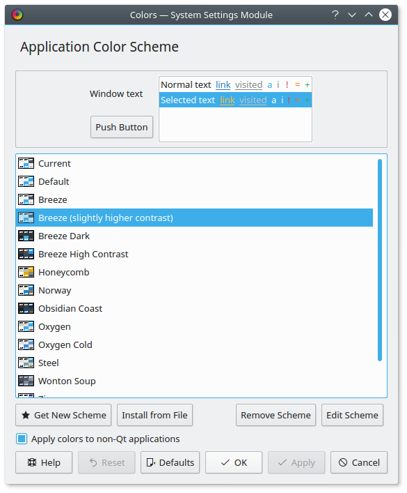
Compare old vs new and look at the text and tooltips:
Before:
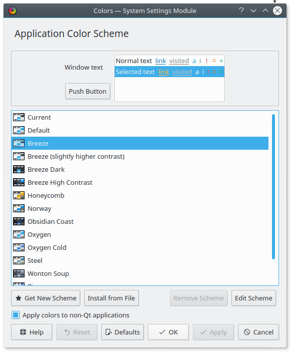
After:
Before:
After:
IMHO the second ones are clearer and less muddy, and therefore easier on the eyes, not harder.
| Automatic diff as part of commit; lint not applicable. |
| Automatic diff as part of commit; unit tests not applicable. |
-1, we discussed this in a bugreport already recently. The rationale in there applies here, too. It's a conscious design choice made, and it's easy enough to ship a color scheme with more contrast.
OK, let's continue the discussion in the bug report. As I've mentioned, the additional high-contrast theme is unsatisfactory because it is radically different from Breeze, and quite unappealing. I believe iImproving the amount of text contrast by default would make Breeze more usable and reduce the need for that other super-super-high-contrast theme in the first place.
Insufficient text contrast was mentioned in a high-profile review of Plasma 5.11 yesterday:
However, font color and contrast are in need of an improvement. I had to change the theme and set the text color to pure black, and this provides an immediate ergonomic boost and helps reduce the strain on the eyes. I really don’t understand why distros don’t use simple black color for fonts. Everything else is configurable but the text should be crystal clear.
Back when I still did stuff like that I was told that complete white and complete black cause eye-strain. It's one of those things where when you ask five people you get six different answers. Unless you can link me to a scientific research paper on that topic.
I concur. One or two or few people's opinion on this is not enough to justify this quite visible change. (Especially since this can easily be changed on a per user basis)
There should be a real study on this, to motivate that the default is modified
In https://bugs.kde.org/show_bug.cgi?id=381288, I provided quite a few such studies and articles that support my view (including from Nielsen Group and W3C):
The W3C recommendation you referenced has an online tool to check specific colors: http://juicystudio.com/services/luminositycontrastratio.php#specify
Current breeze colors give
Passed at Level AAA: The luminosity contrast ratio is very good for the chosen colours (#fcfcfc and #31363b).
There are also studies that warn against using too high contrast in text. For example https://www.researchgate.net/profile/Ricardo_Baeza-Yates/publication/239761586_Layout_guidelines_for_web_text_and_a_web_service_to_improve_accessibility_for_dyslexics/links/02e7e53313bbc5c9bc000000.pdf
The most favorited color pair chosen by our participants
(yellow/black) has the highest contrast color combination,
which is not consistent with [4], that recommends to avoid
high contrast. Moreover, according to [33] such high con-
trast creates so much vibration that it diminishes readabil-
ity. Our explanation is that this pair was chosen because
it is the one that has the highest contrast so it seems more
readable at first sight although eye tracker data showed that
it was actually the hardest contrast to read.
I perceive this "vibration" in the screenshot of your proposed new colors.
(Might vary depending on gamma, brightness, resolution, dimensions of the screen)
To be fair, black and white do too:
Passed at Level AAA: The luminosity contrast ratio is very good for the chosen colours (#fff and #000).
That paper is about people with Dyslexia. Certainly something to be aware of, but not exactly a universally-applicable observation.
I am sure we can play the dueling studies game till the cows come home, what with the volume of scholarship out there. In the end, this has to be a simple judgment call, based on aesthetics and which groups we're willing to saddle with slightly less usability. It seems like those preferring the lower-contrast text are the young, those with good eyesight, and possibly Dyslexics. Those who prefer higher contrast text are the older, or those with poorer eyesight.
The nice thing about Plasma is that this is all so easily changeable, so there's less pressure, but I still think an update to the defaults makes sense so we don't leave older people and those with worse eyesight out in the cold. Perhaps a less extreme change might make sense--a compromise midway between the status quo and my proposed change? How about this:
That way we have better contrast, but we never have the total starkness of black text on a white background.
Sure, as W3C only recommends a minimum contrast, no maximum.
That paper is about people with Dyslexia. Certainly something to be aware of, but not exactly a universally-applicable observation.
I am sure we can play the dueling studies game till the cows come home, what with the volume of scholarship out there. In the end, this has to be a simple judgment call, based on aesthetics and which groups we're willing to saddle with slightly less usability. It seems like those preferring the lower-contrast text are the young, those with good eyesight, and possibly Dyslexics. Those who prefer higher contrast text are the older, or those with poorer eyesight.
Fully agree. This judgement should however probably come from VDG, in particular from those who were involved in the initial design of the breeze color scheme.
The nice thing about Plasma is that this is all so easily changeable, so there's less pressure, but I still think an update to the defaults makes sense so we don't leave older people and those with worse eyesight out in the cold. Perhaps a less extreme change might make sense--a compromise midway between the status quo and my proposed change? How about this:
- Where there's a solid white background, use dark-gray-but-not-quite-black text
- Where there's a gray background, do use solid black text
That way we have better contrast, but we never have the total starkness of black text on a white background.
This might work.
Great, I'll play around with this a bit tonight and see if I can come up with something that works.
But only for breeze dark. And it seems to have the same contrast between background and text like the regular breeze dark.
Nathaniel, maybe you could introduce a breeze light high contrast color scheme and try to optimize the contrast on the two high contrast color schemes instead of changing the default one?
To be honest, the changes needed for the light color scheme are so minor that I'm not sure how much sense it makes to add another one and further clutter up the page.
The "Breeze High Contrast" color scheme just makes my eyes bleed. It's far too much contrast for ordinary use.
Reduce intensity of the change; don't touch almost-white colors, and only slightly darken the dark grays
Do you know if your colors match any of these?
If it doesn't or one of those colors can't work for you, we would need to have a bigger discussion with the team about that since it would mean the inclusion of a new color to our palette. More design oriented. Overall though, I agree with that. In some cases, and some screens, I find myself squinting to read the characters.
Great idea @abetts. Looks like we can easily change from Charcoal Grey to Shade Black (for example) to avoid having to define new colors. I'll work on this a bit.
Tweaked colors to conform to standard Breeze HIG colors (https://community.kde.org/KDE_Visual_Design_Group/HIG/Color)
No strong feelings anymore? :-) As this change is now very minimal and subtle, and as it still conforms to standard Breeze colors, can we consider landing it?
I don't have any objections to this revision. If you used one of the suggested colors for text. Let's go for the change.
Does anybody have any comments, concerns, or objections, or am I clear to land this? If so, it would be good to queue up approval for D8592 too, and once both of those are in, I will update the color HIG wiki page to reflect the slightly darker text color.
The diff you linked was wrong probably. Are the screenshots updated to the last change? It looks very strong there. (I compared them next to each other and I was wrong, the difference is not that much)
Oops, I did link to the wrong recision in my last comment. This is the correct one: D8592 (it's also linked to in the Stack)
The diff _here_ is up to date, and these are accurate before-and-after screenshots:
Before:
After:
I agree with this change but want to add, for posterity, since we don't know the future effects: IF something collaps due to this, some text-colour-to-icon thing pops up - we need to revert or work around it. So essentially banking on the edit to be easily done and easier reverted.
+1
Yes definitely, and I am committed to resolving any potential issues resulting from this change--though to be honest I don't expect any since it's a really subtle change, and I can't imagine many people will even consciously notice.