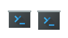
Huh, I was waiting for @hein :) oh well, here it is - C icon with cleaned up source
Feed Advanced Search
Feb 7 2020
Feb 7 2020
mglb retitled D25123: New yakuake logo/icon from [WIP] New yakuake logo/icon to New yakuake logo/icon.
Jan 5 2020
Jan 5 2020
Fix token buffer indexing
Jan 4 2020
Jan 4 2020
mglb added a comment to T10997: Improve check box design.
Todo (user-visible):
- add "mouse down" visual state
- basic color fixes:
- check boxes color in tree view changes when the widget is focused/unfocused. This does not happen in list view.
- draw distinguishable frame around selected check box in menus/lists. Not treating State_Select as focus/mouseOver will fix this.
- clean/simplify animations
Do not treat State_Select as focus/mouseOver
mglb committed R31:7b89a4d70e89: Fix color group handling in QListView item's checkboxes (authored by mglb).
Fix color group handling in QListView item's checkboxes
Handle sunken state
Jan 1 2020
Jan 1 2020
mglb added a comment to T10997: Improve check box design.
Not much, but I'm going to finish at least user-visible things in next 2 weeks.
CheckBoxData: do not inherit GenericData
mglb committed R31:8b675f05f503: Move transition setting to CheckBoxData::updateState() (authored by mglb).
Move transition setting to CheckBoxData::updateState()
Rename multiStateEngine to checkBoxEngine
Simplify radio animation
Dec 5 2019
Dec 5 2019
Fix possible null pointer dereference
Nov 26 2019
Nov 26 2019
mglb added a comment to T11662: Improve visual appeal for KUrlNavigator when in Breadcrumbs mode.
Right now you can't even draw this connection nicely using QStyle.
What do you mean? Qt accepts CSS to style elements so I'm pretty sure it's possible to draw some very nice custom elements with Qt.
mglb committed R319:686a14da0d54: Reconnect SessionController dropped from another window (authored by mglb).
Reconnect SessionController dropped from another window
mglb committed R319:8df48a8f71db: Remove SessionController from the factory during deletion (authored by mglb).
Remove SessionController from the factory during deletion
mglb added a comment to T11662: Improve visual appeal for KUrlNavigator when in Breadcrumbs mode.
mglb added a comment to T11662: Improve visual appeal for KUrlNavigator when in Breadcrumbs mode.
I understand, but I was referring to following mockup, where the button has input field background, so I perceive it as in-field icon like "clear" with separator :)
Nov 25 2019
Nov 25 2019
mglb added a comment to T11662: Improve visual appeal for KUrlNavigator when in Breadcrumbs mode.
Nov 23 2019
Nov 23 2019
mglb added a comment to T11662: Improve visual appeal for KUrlNavigator when in Breadcrumbs mode.
- Don't do straight vertical separators + arrow down - it looks like favorites list or something, not ordered hierarchy.
- > doesn't make sense when placed after directory name - it means something like "next directory is...", and clicking it should modify directory on the right of the arrow.
- Don't highlight arrow and label like it is a single thing - it is not. Clicking label has different action than clicking arrow.
- Don't make last item (current directory) clickable/highlightable - clicking it does nothing.
Nov 22 2019
Nov 22 2019
mglb committed R319:78b8b4c7a643: Change title of control characters filter window (authored by mglb).
Change title of control characters filter window
mglb committed R319:0b36d0aa82a9: Rename buttons in control characters filter window (authored by mglb).
Rename buttons in control characters filter window
Change control characters descriptions
mglb committed R319:5e142c9dadc8: Do not warn when pasting non-dangerous characters (authored by mglb).
Do not warn when pasting non-dangerous characters
mglb added a comment to T11662: Improve visual appeal for KUrlNavigator when in Breadcrumbs mode.
Nov 20 2019
Nov 20 2019
mglb added a comment to T11662: Improve visual appeal for KUrlNavigator when in Breadcrumbs mode.
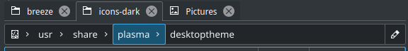
What does this arrow-down near desktoptheme do?
mglb added a comment to T11662: Improve visual appeal for KUrlNavigator when in Breadcrumbs mode.

Nov 16 2019
Nov 16 2019
mglb added a comment to T10201: Window titlebars.
If so, Kirigami can be modified to work as needed.
mglb added a comment to D25337: Change transparency to 10% and added blur.
Default text color and this new background blended with white still has good contrast, but it doesn't look so good when colored text is used (not that it looks perfect now).
Also, please consider how it looks with transparency but without blur (as it does not work everywhere). It can be distracting.
Konsole is sometimes used for hours for looking at text, so it have to be readable by default.
Nov 12 2019
Nov 12 2019
mglb added a comment to T10201: Window titlebars.
Why (assuming it would be possible to disable it)?
Example use case: there is optional feature in Konsole which randomly adjusts foreground and background colors in each session (hue and saturation; perceived lightness is kept constant). It helps with finding specific window/session, as it is easier to find window tinted to specific color than looking at content/title (when it is similar), especially when window is scaled down (present windows effect). It could be nice to extend this adjustment to whole window (and titlebar), of course with user consent.
We make titlebars blended with window for consistency, and because it looks nice. Does it make sense to prevent similar consistency with application which uses different colors (e.g. web browser)?
mglb added a comment to T10201: Window titlebars.
Application Style
Nov 10 2019
Nov 10 2019
mglb added a comment to T10997: Improve check box design.
Color scheme issue. Highlight background color is used. I could change it to something like background color of selected item in unfocused sidebar, but then it won't look that good in light Breeze.
mglb added a comment to T10997: Improve check box design.
mglb committed R31:dab7fddd25cc: Blend checked checkbox frame with WindowText color (authored by mglb).
Blend checked checkbox frame with WindowText color
mglb committed R31:d52eab4a0277: Use blue background in checked checkboxes/radios (authored by mglb).
Use blue background in checked checkboxes/radios
Refactoring leftovers
mglb added a comment to T11979: KDE Welcome Screen.
There are two groups of new users:
- Those who install the system and use it later:
- All this stuff should be available when the system installs itself. Users have to wait until it completes anyway, so this is probably the best moment.
- If they had something better to do during installation, they are self-confident enough to find "New user guide", "Help" or something in application launcher.
- Those who get already installed system:
- Important option to have: language/region selector. I think many devices with Linux/KDE come from smaller companies, which don't have large official distributors in each region, so the system uses US English by default. The first thing we should do for people who don't know English is to talk to them in their language (and don't confuse them with inverted date format :) ).
- You probably want to give them possibility to change their name/login, password.
mglb added a comment to T10997: Improve check box design.
Going back to this. From visible things: implemented drawing of checkboxes/radios in menus; selected list items have checkboxes with hover&focus style.
Draw check box/radio in menus
Change partial→on transition
Refactoring, mainly animations
Extract checkmark drawing to a function
Remove commented code
Merge Timeline and TimelineAnimation
Remove unused PropertyWrapper
mglb added a comment to T11999: Unify search in applications.
There's also floating search bar in Konsole:
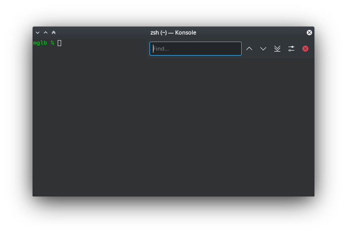
It have to stay floating and on top, but its contents can be changed if needed.
Nov 9 2019
Nov 9 2019
Nov 7 2019
Nov 7 2019
mglb updated the test plan for D25151: Fix tabs not indicating activity.
Nov 4 2019
Nov 4 2019
Nov 3 2019
Nov 3 2019
Fix copyrights
Fix code documentation
mglb abandoned D24621: [RFC] New Konsole and Yakuake icons.
Yakuake icon moved to: https://phabricator.kde.org/D25123
mglb requested review of D25123: New yakuake logo/icon.
Nov 2 2019
Nov 2 2019
mglb added a comment to D24621: [RFC] New Konsole and Yakuake icons.
I'll do the split today or tomorrow.
Oct 31 2019
Oct 31 2019
mglb added a comment to T11950: Reduce the pain of working on monochrome Breeze icons.
Inserting and applying styles can be done with icon template file with predefined swatches. Swatches (which are internally one-stop gradients) would be converted into style later with a script. Not trivial (i.e. not one line sed) to write due to indirect gradient use in inkscape, but also not really hard. Xml parser is the way to go. For extra newbie-friendly solution, "save as monochrome breeze svg" extension could be made.
From designer point of view use is really simple - in fill and stroke dock click "swatch" type and pick named color from a list.
mglb added a comment to D21055: Highlight lines coming into view when scrolling.
This looks really nice and would indeed make this patch useful in the case of scrolling. But fading based on a timer would kill the main feature I see in this: having a visual reference to be able to see what has moved. Maybe we have to find something in between the original proposal and this. What do you think ?
Oct 27 2019
Oct 27 2019
mglb committed R319:51bcb2ebd4da: Reduce code duplication in session creating code (authored by mglb).
Reduce code duplication in session creating code
Change option label in Edit Profile Dialog
mglb committed R319:a16a6189efe2: Start new splits in same directory as current session (authored by mglb).
Start new splits in same directory as current session
Simplify setCurrentSession()
DBusTest: Do not verify exit status
Fix currentSession()
Change DBus functions order
mglb committed R319:eb9fc4c8bb8d: DBusTest: Add test for Window interface methods (authored by mglb).
DBusTest: Add test for Window interface methods
mglb committed R319:7f460ea559b1: DBusTest: Do not show popup when closing multiple tabs (authored by mglb).
DBusTest: Do not show popup when closing multiple tabs
DBusTest: Use correct enum in title/setTitle
mglb added a comment to D24975: Change some 32px action icons to color style.
Why do you replace action icons instead of adding separate colorful icons for use in preference dialogs? Right now all action icons are "monochrome", making few of them colorful will introduce inconsistency.
Oct 25 2019
Oct 25 2019
mglb committed R319:0699c1553f64: Search bar: Activate focused button when enter is pressed (authored by mglb).
Search bar: Activate focused button when enter is pressed
mglb committed R319:d0deb3a1ba1c: Search bar: Handle Esc key in IncrementalSearchBar (authored by mglb).
Search bar: Handle Esc key in IncrementalSearchBar
Search bar: Fix widgets creation order
Search bar: Enable widget focus switching
Oct 16 2019
Oct 16 2019
mglb added a comment to T11817: Make keyword parsing hook script intelligent enough to parse multiple keywords on one line.
There is no merge commit when it is not necessary, and commits are not usually squashed (at least in Konsole, quick look at Okular says the same), so a MR author should put the keywords in one of the commits. You can check commits on a branch (or in commits tab in merge request) and ask commiter to fix commit descriptions. However, force-push is not allowed in some cases, so that might be impossible (IIRC).
Fix scrollbar position
Oct 15 2019
Oct 15 2019
mglb added a comment to T11817: Make keyword parsing hook script intelligent enough to parse multiple keywords on one line.
Gitlab's Merge Request description is not placed in a commit (at least when there is no merge commit, which is default). Each commit in merge request has its own independent description.
Please see "02 Oct, 2019 (5 commits)" in https://invent.kde.org/kde/okular/commits/master - this is the result of mentioned merge. Hooks didn't catch bug entries because they are not in commits.
Oct 14 2019
Oct 14 2019
mglb updated the summary of D24621: [RFC] New Konsole and Yakuake icons.
mglb added a comment to D24621: [RFC] New Konsole and Yakuake icons.
Please note that Konsole icon is intended to be personalized icon/"logo" (see T10243).
The prompt symbol is thick as it is main symbol (like symbols in e.g Plasma, Akregator, Kile, "K" icons/logos) - the window-like background (or just square in var C) is just secondary addition.
mglb updated the diff for D24621: [RFC] New Konsole and Yakuake icons.
Brighten background
Oct 13 2019
Oct 13 2019
mglb requested review of D24621: [RFC] New Konsole and Yakuake icons.
Update Yakuake icon (48px only)
Add Konsole icon (48px)
Oct 12 2019
Oct 12 2019
mglb added a comment to T10891: Breeze theme evolution.
Right one (larger shadow size). Plasma popups open above windows, yet they cast a lot smaller shadow than window shadow right now.
Oct 11 2019
Oct 11 2019
mglb added a comment to T10243: Some KDE applications could use better icons.
Yes, I'll create review soon
Oct 5 2019
Oct 5 2019
mglb added a comment to T10243: Some KDE applications could use better icons.
mglb committed R319:b35811084267: Add missing checkbox label on Edit Profile → Appearance page (authored by mglb).
Add missing checkbox label on Edit Profile → Appearance page
mglb committed R319:ce2029ed75b6: Keep empty lines when "trim leading spaces" is enabled (authored by mglb).
Keep empty lines when "trim leading spaces" is enabled
Oct 4 2019
Oct 4 2019
Bump sessionui.rc version
Remove "Close session" from context menu
Oct 2 2019
Oct 2 2019
mglb committed R319:5e91383e3fc9: Make sure font weight value is within allowed range (authored by mglb).
Make sure font weight value is within allowed range
Oct 1 2019
Oct 1 2019
Sep 30 2019
Sep 30 2019
mglb added a comment to T11714: Redesign kde.org homepage.
mglb added a comment to T11714: Redesign kde.org homepage.
Sep 29 2019
Sep 29 2019
mglb added a comment to T10997: Improve check box design.
I need some more time (~week) for fixes and cleanup.
WIP: Rewrite Timeline stuff