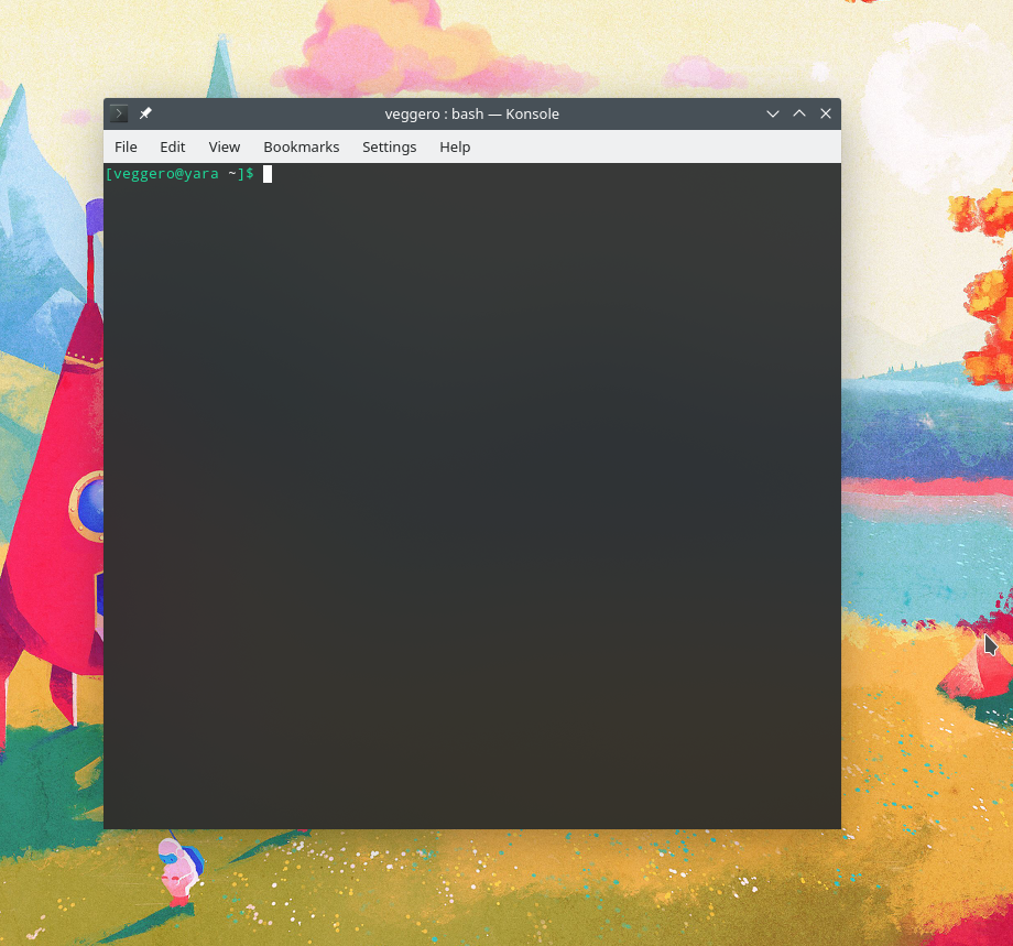
Changed the default transparency to 10% with blur to improve aesthetics.

Diff Detail
Diff Detail
- Repository
- R319 Konsole
- Branch
- background-blur (branched from master)
- Lint
No Linters Available - Unit
No Unit Test Coverage - Build Status
Buildable 18851 Build 18869: arc lint + arc unit
Comment Actions
If we do this, I'd like to see the background color changed to pure black so we don't regress contrast too much (or at all). This could go along with the proposal to do the same thing for text too; if so, we should land them at the same time rather than doing this in an un-coordinated manner.
Comment Actions
I'm not too sure about this, mainly because the background currently uses the breeze dark colors, and would probably look not as good and consistent with black. The text could be made totally white instead of #fcfcfc, but that would not be that much of a difference. On the other hand, this patch does not change the background color by much, especially on dark-y wallpapers.
Comment Actions
Default text color and this new background blended with white still has good contrast, but it doesn't look so good when colored text is used (not that it looks perfect now).
Also, please consider how it looks with transparency but without blur (as it does not work everywhere). It can be distracting.
Konsole is sometimes used for hours for looking at text, so it have to be readable by default.
View backgrounds are not transparent, so this breaks consistency anyway (see Konsole panel in e.g. Kate, Dolphin, KDevelop).
On the other hand, this patch does not change the background color by much, especially on dark-y wallpapers.
In real use cases people use more than one window and don't see wallpaper that much (even behind the window). Sometimes the other window is e.g. white web page or some pdf. Anyway, default wallpaper is far from dark.
Maybe try a color which gives Charocal Grey (breeze dark view background) when blended with white (i.e. #0b0e12)?
As for default text color: it should be darker, to allow intense/bright color to stand out.
Comment Actions
-1
It's not a good default setting, especially for an almost entirely text based application. I'm also just not a big fan of transparent and blurry themes. It just seems over the top to me and isn't consistent with what we normally do with application window backgrounds.
Comment Actions
I have to agree with Noah here. In addition, the proposed change would make things less consistent rather than more because Konsole would be the only app with a partially-transparent window by default.
I think this is yet another example of a thing that would be good to control with the proposed global transparency+blur controls. That way people who like blur and transparency could get it everywhere, consistently, all at once.
Do we have a Phab task tracking the above? If not, maybe we should start one.
Comment Actions
I don't think legibility would be an issue, but it's true this wouldn't be consistent with other windows. The idea to also be able to control Konsole's transparency via some global setting sounds good.