Unify search in applications
Open, Needs TriagePublic

Description

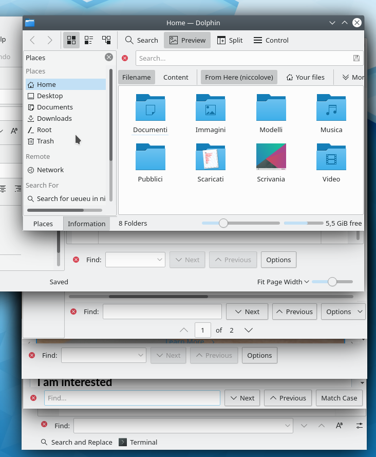
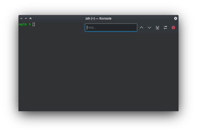
The search widget is different in different applications.

  • In Kate it appears on the bottom, giving you the options to move up, down, match case sensitive and "switch to power search" in icons.
  • On Falkon it also appears in the bottom, but it gives you buttons with text to move up and down, fails to show an icon for the match case sensitive button, and adds a "find..." label in the text input.
  • Konqueror also uses buttons, but puts "Options" instead of match case sensitive.
  • This is similiar to Okular, which also adds a dropdown indicator to "Options".
  • Calligra removes the dropdown button from Option, and also changes the possible options.
  • Dolphin instead puts the bar on the top.
  • Kmail opens a popup.
  • Anything missing?

niccolove created this task.Nov 8 2019, 8:57 PM
niccolove updated the task description. (Show Details)
ognarb added a subscriber: ognarb.Nov 9 2019, 10:11 AM

I tried to unify it some times ago (at least the bottom bar), there is only one technical problem. The find label next to the text field is needed to create accelerator with setBudy. So it's difficult to remove and use a placeholder like in a lot of other places.

ngraham added a subscriber: ngraham.Nov 9 2019, 5:50 PM

We need to distinguish between the following:

  • Omnipresent search (Usually in toolbar)
  • On-demand search (Usually in a hidden-by-default bar on the bottom of the window)

Each one ideally would be consistent.

The issue of the accelerator IMO is a non-issue provided the following are true:

  • The search field has focus when shown
  • Ctrl+F always shows and focuses the search field, even when it's currently hidden.

If those are both true, then to get to the search field using the keyboard, you just always use Ctrl+F which is more widely known and more consistently used compared to an alt accelerator key.

mglb added a subscriber: mglb.Nov 10 2019, 12:12 AM

There's also floating search bar in Konsole:


It have to stay floating and on top, but its contents can be changed if needed.

Why close button is on the left in search bars?

wrobelda added a subscriber: wrobelda.EditedOct 7 2020, 11:49 PM

Let me also add to this list KMyMoney's filtering that is all over the place: https://invent.kde.org/office/kmymoney/-/issues/29

Also, for what it's worth, I think macOS UI guidelines are quite good: https://developer.apple.com/design/human-interface-guidelines/macos/fields-and-labels/search-fields/