In D4264#79949, @varlesh wrote:@alex-l reverted gradient:
Feed Advanced Search
Jan 25 2017
Jan 25 2017

Jan 24 2017
Jan 24 2017
andreaska added a comment to D4258: redesign gimp icon.
How does it look without pencil?
andreaska added a comment to D4262: redesign android-studio icon.
oh schit didn't no this. thanks but I thought only the circle is in the icon now nearly the full height and in your design only 2/3 of the icon height.
andreaska added a comment to D4264: redesign android-file-transfer icon.
where is this icon used? is it an application or an mimetype?
andreaska added a comment to D4262: redesign android-studio icon.
why is the circle now so small?
andreaska added a comment to D4253: redesign gwenview icon.
I also think that we shouldn't update the icon.
Jan 23 2017
Jan 23 2017
andreaska added a comment to D4253: redesign gwenview icon.
first of all, thanks for starting the discussion I think also that the gwenview icon could get an update, but I miss something in the update in addition the dark eye background look to hard.
andreaska added a comment to D4252: fix brackets icon.
I submitt the icon thanks
andreaska added a comment to F2162612: brackets.svg.
thanks for make the icon align to the grid according to the icon HIG. in addition shink the icon size to a minimum is an additional benefit.
Jan 12 2017
Jan 12 2017
andreaska added a comment to T5062: Improve search results tab.
when it's a mockup I would suggest to have an overview on the right where you see the results in the file.
Jan 10 2017
Jan 10 2017
andreaska added a comment to D4050: add a "Plasma made by KDE" sign in the splash.
as the plasma logo is not well recognized yet I would add on bottom to the plasma logo a text field like plasma made by KDE
Jan 5 2017
Jan 5 2017
andreaska added a comment to D3706: WIP: Global Menu Applet.
settingspage
it look a bit "boring" you can select single button for app menu but when I didn't select it what happens than? I would prefer instead of the checkbox all different styles and radio button to select the style the user want.
andreaska added a comment to D3302: [Task Manager] Indicate applications playing audio.
and when I make a new emblem icon for audio on/off this would have an background circle and inside the mute/volume on icon like we have it for owncloud, ...
andreaska added a comment to D3697: Fix progress bar color.
look good +1
Jan 4 2017
Jan 4 2017
andreaska added a comment to T4893: Rename Editions.
please don't forget to describe what's the difference between the dev editions cause now with stable and unstable it is not clear.
It would be nice to mave the same "layout" for the user and dev edition.
Jan 3 2017
Jan 3 2017
andreaska added a comment to T2026: Systemsettings updating to VDG designs.
If we first select the main category we didn't need subcategories and I think the subcategories are the problem of the existing system cause most users know the kcm but not the subcategory. When we have 5 - 7 main categories than we have 10 - 15 kcm's in a list that's not a problem. nobody would have a problem to select first the main group (hardware, appearance, connectivity, ...) and than the user has the list of kcm's. in addition there is the main search and with the "sidebar" you can switch easy between the main groups.
Dec 30 2016
Dec 30 2016
andreaska added a comment to T2026: Systemsettings updating to VDG designs.

andreaska added a comment to T2026: Systemsettings updating to VDG designs.
Kirigami styled SySe follow discover design language
andreaska added a comment to T2026: Systemsettings updating to VDG designs.
It's an old mockup but it describe the direction I would go.
andreaska added a comment to D3418: KMessageWidget: use darker red color when close button is visible.
I'm fine with the contrast. Is it possible to use the icon in the text color (gray) if not possible darker red would be fine. (thanks for the patch I always saw this issue)
andreaska added a comment to T2026: Systemsettings updating to VDG designs.
Ok so we are looking ONLY on the main overview page not a single kcm's.
Nov 16 2016
Nov 16 2016
andreaska added a comment to D3376: [effects] Show a notification when a screenshot got saved to file.
I think so to, use the spectacle icon as it is now.
Oct 11 2016
Oct 11 2016
andreaska added an inline comment to M75: Preliminary Mockups Taskmanager Tooltips.
if you have shortcuts defined for applications it would be nice to show the shorcut in the tooltip.
andreaska added a comment to M75: Preliminary Mockups Taskmanager Tooltips.
I think this is the right direction show only additional stuff. e.g. when you don't use icon only task manager you don't have to show the title or filename cause this information is still available in the taskbar.
andreaska added a comment to M75: Preliminary Mockups Taskmanager Tooltips.
nice designes please have a look that the previews will look good with a light panel and a light theme. therefore a shadow like at the dolphin file preview would help to show the preview better.
Oct 9 2016
Oct 9 2016
andreaska added a comment to M74: Second Draft suggestion for External Monitor OSD icons .
I need some time to know it`s a beamer, but yes I like it.
Oct 4 2016
Oct 4 2016
andreaska added a comment to D2787: Add support for resize only borders on Wayland.
from usability point the existing border size is semi optimal, cause you change the border size and than you have to change the text size to see a difference.
Oct 3 2016
Oct 3 2016
andreaska added a comment to D2853: Mouse KCM: Align spin boxes, port to Qt5.
thanks @marten for this update. If you are interested into some system setting changes let me know.
Sep 22 2016
Sep 22 2016
Sep 13 2016
Sep 13 2016
andreaska added a comment to D2741: [Window Switcher] Cleanup.
good idea
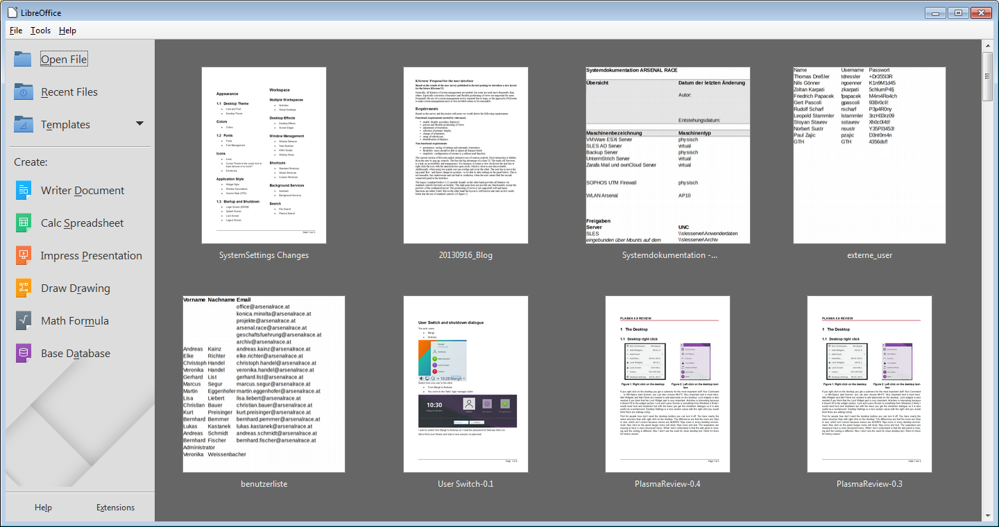
andreaska added a comment to D2741: [Window Switcher] Cleanup.
LibreOffice change there background for the document preview from white to gray cause show screenshots from a white paper on a white background, ... the screenshots lose the focus. So is it possible to use the dark background from the dash as background for the window switcher. The screenshots would be more visible (I'm not sure how it would look in breeze-dark)
Sep 12 2016
Sep 12 2016
andreaska added a comment to D2749: Show battery indicator on login screen.
I would add the battery icon to the right corner.
Sep 11 2016
Sep 11 2016
andreaska added a comment to D1771: [Workspace Options] Add option to disable OSD.
would it help if you add an "screenshot" where you show the information tip and osd?
andreaska added a comment to D2383: [Notifications] Add "Clear Notifications" context menu entry.
ordinary I had more often the problem that the notification stuff is empty but I'd like to know what happend in the past.
Sep 9 2016
Sep 9 2016
andreaska added a comment to D2708: Hide clock if there's no room to show it all.
does the desktop seccion switch (plasma, gnome, ....) and the keyboard indicator work now?
andreaska added a comment to D2723: port panel loading away from ksycoca.
the emtpy system tray (desktop right click add panel) shouldn't be a panel cause it doesn't work like a panel.
Aug 28 2016
Aug 28 2016
andreaska added a comment to T3465: OSD icons for display keyboard switch.
any feedback about the icons?
andreaska added a comment to T3366: Leave dialog theme.
with the current master 28.08. (neon dev unstable) the avatar wasn't croped to the circle.
Aug 25 2016
Aug 25 2016
andreaska added a comment to T3362: SDDM theme.
The background in the mockup is blue like in the lock screen
andreaska added a comment to T3364: Lockscreen.
The time is to height to the top. See sddm theme
andreaska added a comment to T3362: SDDM theme.
I miss the keyboard indicator and the session switcher
andreaska added a comment to T3362: SDDM theme.
The avatars are smaller than in lock screen and any other screen
andreaska added a comment to T3363: KSplash.
Move spinner to the same height than the system icons in shutdown dialogue
Aug 22 2016
Aug 22 2016
andreaska added a comment to T3465: OSD icons for display keyboard switch.
andreaska added a comment to T3465: OSD icons for display keyboard switch.
I would suggest to make two icons for each state. or if you have more than 2 monitors you can add for each monitor an icon.
Aug 11 2016
Aug 11 2016
andreaska added a comment to D2404: [Task Manager ToolTipDelegate] If there's room, show two lines of window title.
is it possible to have the text two lines the same height than the app icon?
andreaska accepted D2398: [Applet Configuration] Match category sidebar style with Breeze widget default style.
+1 for the design improvement
Aug 4 2016
Aug 4 2016
andreaska added a comment to T3366: Leave dialog theme.
about the cancel outside the logout window I'm not sure if this is really importend, but maybe you can add a transparent button? For the keyboard ESC and cursor left right would work and for the mouse user there is a cancel button. So in general I think we don't need an click somewhere nobody know to cancel.
Aug 3 2016
Aug 3 2016
andreaska added a comment to T3361: Plymouth theme.
For the spinner I would choose the same than in ksplash. maybe ksplash can choose the spinner from the plasma theme than plymounth should choose the spinner (busywidget) from the default breeze plasma theme. Distros can switch to there plasma theme busywidget indicator
andreaska added a comment to T3363: KSplash.
for the spinner can you choose busywidget as spinner. would it be possible to use the spinner from the plasma theme?
Aug 2 2016
Aug 2 2016
andreaska added a comment to T3363: KSplash.
thanks @mart for the feedback yes that's the design goal
andreaska added a comment to T3366: Leave dialog theme.
@graesslin mistake the mockup is defined no new stuff.
andreaska added a comment to T3366: Leave dialog theme.
I will remove the colored system.shutdown, -restart, ... icons.
andreaska added a comment to T3366: Leave dialog theme.
@graesslin: Do I understand correctly that you do no longer want the fade to the center?
And that you don't want to blur the background at all? I think that needs real-world testing before removing the blur
andreaska added a comment to T3361: Plymouth theme.
Hi @sitter as fare as I know you already did the changes would it be possible to have it in kde-neon-master-unstable for tests.
andreaska added a comment to T3360: GRUB theme.
Hi @sitter as fare as I know you already did the changes would it be possible to have it in kde-neon-master-unstable for tests.
Jul 19 2016
Jul 19 2016
andreaska added a comment to D2212: Reduce Calendar size in Digital clock.
what's the reason for this pin stuff?
andreaska added a comment to D2212: Reduce Calendar size in Digital clock.
the reduced calender size in the widget is way better than before, but what's with the text (time) in the panel? the time height in the panel should be the same height than the system tray icon
Jul 16 2016
Jul 16 2016
andreaska added a comment to M55: Breeze icons for Minuet's categories.
thank's for supporting the minuet project.
andreaska added a comment to M55: Breeze icons for Minuet's categories.
look good to me
Jul 11 2016
Jul 11 2016
andreaska added an inline comment to M53: Discover .
review result from jens mockups left panel search and filter second column search results third detail view.
andreaska awarded M18: Global menu bar for the workspace (Plasma) a Like token.
andreaska added a comment to M41: Katie tiny document editor/exporter.
love the mockups
Jul 10 2016
Jul 10 2016
Jul 1 2016
Jul 1 2016
Jun 28 2016
Jun 28 2016
when I'd like to log-in I don't want to shutdown or logout (which is not possible). Guest Login is also not possible in plasma, as fare as I know.
make the username / password larger is good but I would make it the same width than the avatar.
I think the interface is a bit to much information in the center.
andreaska added a comment to M49: User Switch.
username is not needed cause you can only switch to active users but you can add an switch to new user botton.
andreaska added a comment to M50: Shutdown/Restart/Logout/Sleep.
a count down is missing.
I like the idea of faded background from the user desktop to the gradient cause this gradient was used also for the shut-down plymounth stuff. so it's a nice fade.
should we ass user switch?
Jun 27 2016
Jun 27 2016
May 18 2016
May 18 2016
andreaska added a comment to D1291: Add microphone volume OSD.
May 11 2016
May 11 2016
May 6 2016
May 6 2016
andreaska added a comment to M22: Avatar as Indicator.
warnings
I like the idea with the faded colorized avatar in c. In the breeze icon set the additional information is in the bottom right and left corners like mail-signed-full, mail-signature-unknown, I think this action icons were used to sign mails, ... so maybe the avatar could have the same language style (emblem icons in the corners)
andreaska added a comment to M22: Avatar as Indicator.
avatar layouts
the user can choose different layouts of the avatars, for office, default, mailing lists, ads, girlfriend(s) ... if you have a conversation the avatar layout shrink, but you have always the same avatar layout in each conversation. you can choose the avatar layout for a mail adress, a mail server (company, e.g. @kde.org, ...)
instead of the color gradient you can also choose the company logo (like you have it for your music) e.g say all @kde.org mail adresses get logo kde or all @deutschebahn.com get the db logo, ...
andreaska added a comment to M22: Avatar as Indicator.
Colors: The idea is to use 1st gradients instead of one color (breeze use always gradients)