Related Objects
- Mentioned In
- D4732: [KCM] Rework design and structure
- Mentioned Here
- T3040: update KCM usability
5.8 kickoff jens: As for any edits to system settings front page whatever personally I think we should see what is at all possible to do (but colomar raised those issues well)
As system settings is, like Plasma, a box surrounding a group of other things it is almost meaningless to edit them if the things within it arent done. And this task is simply to wide to describe the projects current state.
The front page is done. But as every single KCM isnt done and will never be done as it stands due to the fact that they cannot be implemented and feedback is not possible this task is both "done" and "not started" at the same time.
The KCMs have their own task ( T3040 ), so this is really only about the System Settings application as such.
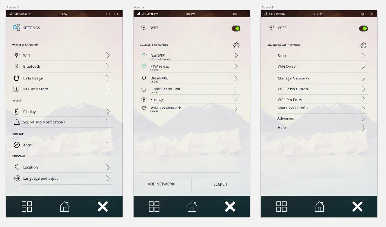
Are there any mockups how this could look in the end? @abetts created a Telegram group some time ago about this topic and also made some mockups, but they concentrate on mobile experience:
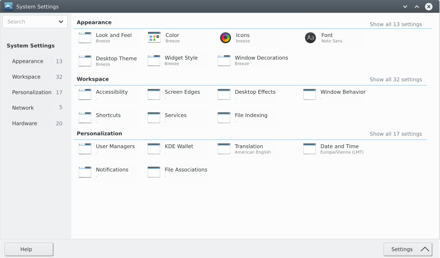
Ok so we are looking ONLY on the main overview page not a single kcm's.
- KDE System Settings has global categories, subcategories and the single kcm's so 3 levels in the above mockup (I like) there are noly 2 levels. As kde has about 70 single kcm's I would prefer 3 levels, but maybe the final mockups say 2 levels are enough, what would be also ok.

Overview of all kcms also as columns? Clicking on one would open the kcm and depict its column like shown in your second picture with a quick animation of the column moving there.

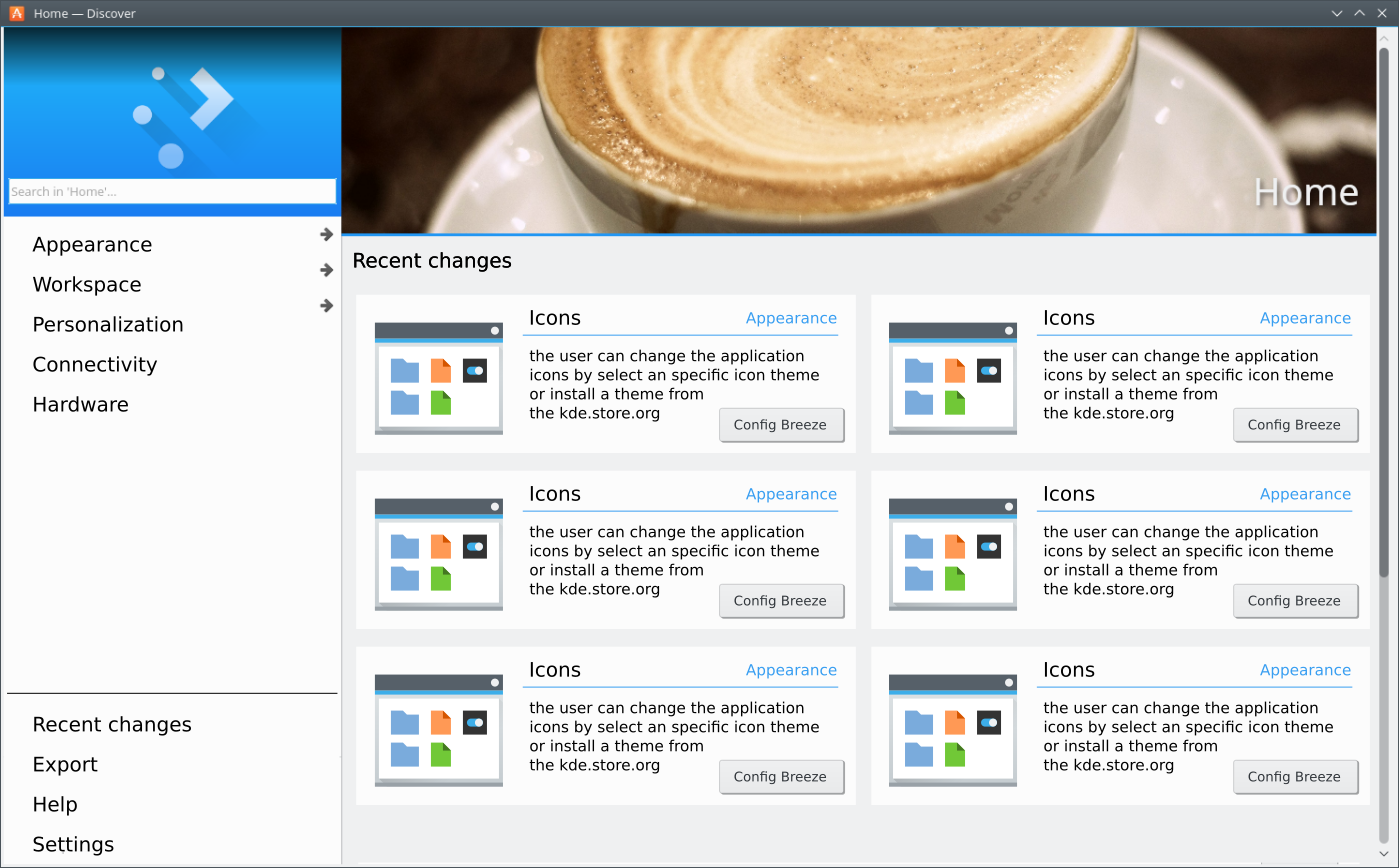
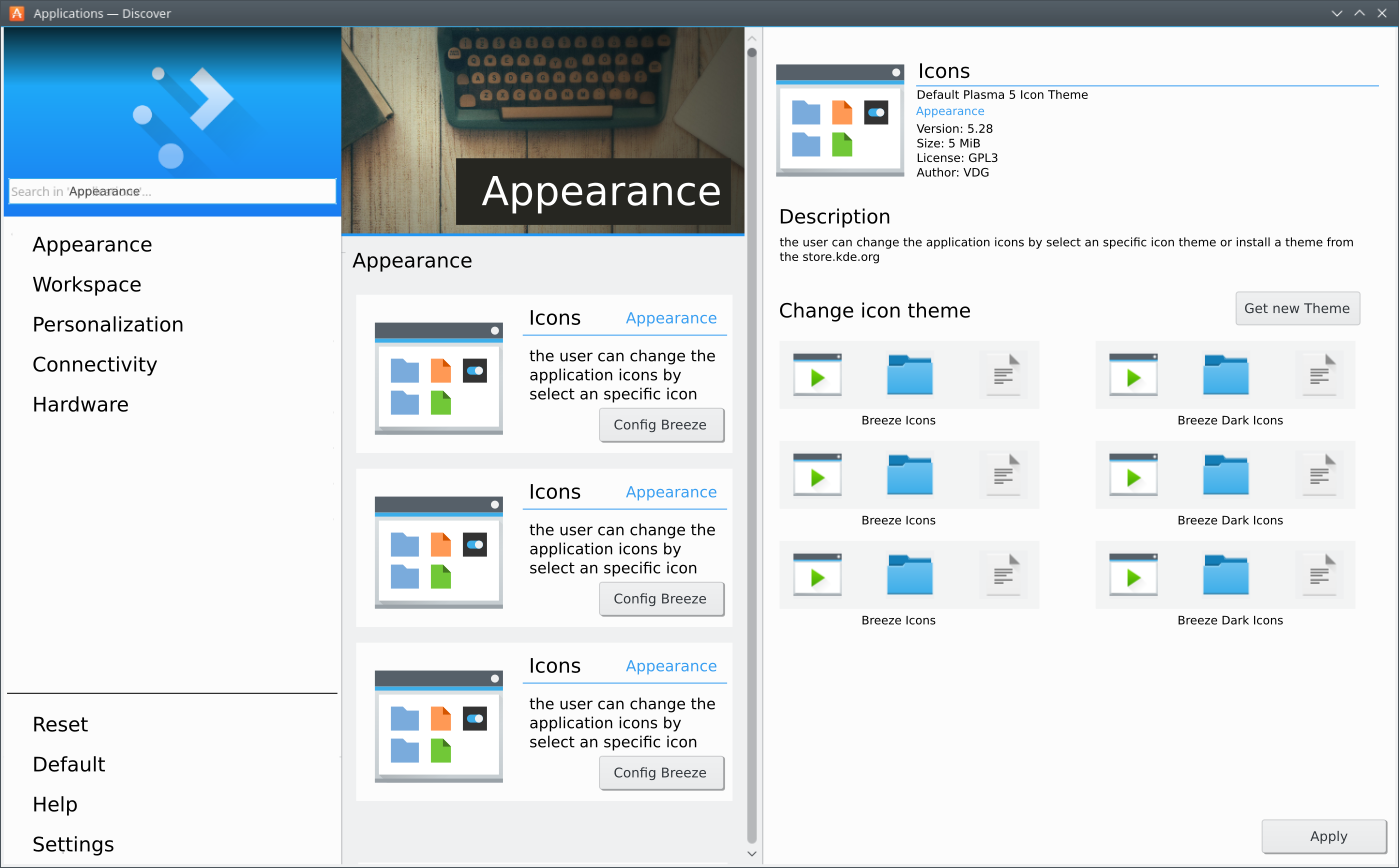
Indeed you're right. So we need at least the subcategories. In this case the columns would work. But another problem might be, that in this case we cannot easily reduce the width of the window without the need of horizontal scrollbars (at the moment it's possible to move items to a second row, although rarely used.
Regarding your mockups based on Discover: Of course the spacing if off right now (for example the first column takes too much space), but in general I find it to be very appealing this way.
If we first select the main category we didn't need subcategories and I think the subcategories are the problem of the existing system cause most users know the kcm but not the subcategory. When we have 5 - 7 main categories than we have 10 - 15 kcm's in a list that's not a problem. nobody would have a problem to select first the main group (hardware, appearance, connectivity, ...) and than the user has the list of kcm's. in addition there is the main search and with the "sidebar" you can switch easy between the main groups.