If help is needed I am willing to support. I can also support the link to libbreoffice.
Feed Advanced Search
Aug 18 2019
Aug 18 2019
andreaska added a comment to T11080: KDE for Big Enterprises.
May 20 2019
May 20 2019
andreaska added a comment to T10891: Breeze theme evolution.

May 7 2019
May 7 2019
andreaska added a comment to T10895: Kirigamifying the Summary.
Pretty good.
Jan 6 2019
Jan 6 2019
andreaska added a comment to T10165: Large category icons should all be colorful.
For icon name l would prefer preferences-appname-xxx like the icons used in syse.
Jan 5 2019
Jan 5 2019
andreaska added a comment to T10165: Large category icons should all be colorful.
Go for colorful icons the question for an icon designer would be
- configure icons are NO action icons, so how should they be called.
- how should the configure sidebar look like in KDE. Which icon size and which layout.
Oct 4 2018
Oct 4 2018
Sep 13 2018
Sep 13 2018
andreaska added a comment to M132: Plasma Mobile Clock.
For the different apps l would also make different tabs like in vvave where you have album, artist, playlist views in different tabs with an icon tab indicator.
andreaska added a comment to M129: Plasma mobile weather app.
Instead of refresh I would use add and update with swipe top to down cause this is a common swipe.
andreaska added a comment to M132: Plasma Mobile Clock.
This look a bit confuse. Please review which functionality you want to offer, and how it will work on mobile form factor and on desktop.
andreaska added a comment to M129: Plasma mobile weather app.
About the previous and next buttons. I don't like them, because nobody know what happens before click next. For me it look like an kde hidden feature.
Sep 7 2018
Sep 7 2018
andreaska added a comment to D15323: Hide printer applet if no printer is configured.
Good idea from ux point of view
Aug 16 2018
Aug 16 2018
andreaska added a comment to T6859: Falkon - VDG feedback.
The breeze one is really boring. I would use the one in the Screenshot
Jul 24 2018
Jul 24 2018
andreaska added a comment to D14326: Fix layout of resolution selection.
The thing is that you should bring more focus to the screen factor setting. Ordinary you should not change the screen resolution you should change the factor on hidpi this should be in focus.
Nobody should change the resolution and the rate by default cause best result will always automatic setting.
Thats the reason thomas prefer the drop down from ux perspective when i say use the slider.
andreaska added a comment to D14325: Remove Advanced section from screen config.
Will be useful. Can you make the dropdown items all the same size.
Jul 23 2018
Jul 23 2018
Jul 16 2018
Jul 16 2018
andreaska added a comment to D14123: Add `drive-optical` icon.
Thanks for the patch.
May 21 2018
May 21 2018
andreaska added a comment to T8753: Launcher Menus Convergence.
Dashboard didn't show recent files only when you search you get recent file and apps listed.
andreaska added a comment to T8753: Launcher Menus Convergence.
As pc doesn't mean only open a app I would like to see some improvements in file and folder handle. Why plasma can't show me what I did recently so I can start the work again.
andreaska added a comment to T8753: Launcher Menus Convergence.
That's something I also had in mind but how should this section be called?
May 20 2018
May 20 2018
andreaska added a comment to D13006: Move the inline installer progress cancel button to the left side.
Thanks +1
andreaska added a comment to T8755: Use colors from the system colorscheme for the Task Manager's accent color in Breeze Light/Dark desktop themes.
Strange I thought it use the color from the scheme
May 13 2018
May 13 2018
May 3 2018
May 3 2018
Apr 17 2018
Apr 17 2018
andreaska added a comment to D10494: update handle- icons for kirigami.

Mar 22 2018
Mar 22 2018
andreaska added a comment to T7662: Online Playlists.
Collaboration with YouTube and nextcloud would be awesome
andreaska added a comment to T8261: Visual image for VVAVE.
Look good to me. I prefer icons pink
Feb 19 2018
Feb 19 2018
andreaska added a comment to T7878: Create or find Icon.
Cuttlefish? How can I help?
Feb 8 2018
Feb 8 2018
andreaska added a comment to D10297: Add new "Tools" button above System Monitor's process list.
Where do you need an icon? The two examples didnt work cause you mix different stuff in one non saying drop down button this doesnt work.
Feb 1 2018
Feb 1 2018
andreaska added a comment to M112: System Settings Alpha Graphic Redesign.
The kcms are included in KIO but from my point of view they can be dropped
Jan 30 2018
Jan 30 2018
andreaska added a comment to T6859: Falkon - VDG feedback.
Cool should look good in the panel with the lighter background.

Jan 27 2018
Jan 27 2018
Jan 19 2018
Jan 19 2018
andreaska accepted D9976: Display version alongside source, and use a combobox to switch between them.
Design look good
Big improvement from design and usability. Top the app information and bottom tecnical stuff
Jan 13 2018
Jan 13 2018
andreaska added a comment to D9847: replace default background for HeaderBar by a wallpaper from Breeze.
That wasnt my intension to bring more complexity
Jan 12 2018
Jan 12 2018
andreaska added a comment to D9847: replace default background for HeaderBar by a wallpaper from Breeze.
Can you use the user wallpaper? Than you dont need to add an wallpaper and have to care.
andreaska added a comment to D9816: Ensure DesktopIcon paints with the correct aspect ratio.
You are my hero. Awesome
Jan 2 2018
Jan 2 2018
Go for the margin
Nov 30 2017
Nov 30 2017
andreaska added a comment to T6831: Top-notch usability and productivity for basic software.
Firefox and other software ask you after your account. Would be nice to have one single account (secret service) somewhere (your cloud, hard disk, ...) where everything is stored and one login would be the universal key. Kde vaults by default where all setting dictionaries will be stored.
andreaska added a comment to T6831: Top-notch usability and productivity for basic software.
Nov 22 2017
Nov 22 2017
andreaska added a comment to M112: System Settings Alpha Graphic Redesign.
Love it.
Oct 12 2017
Oct 12 2017
andreaska added a comment to T7185: Icon for kio-stash action.
folder-stash is the icon called submitted to master. please change dolphin icon name.
andreaska added a comment to T7189: Search results should be organized in folders.
when you click to audio it will show the user the music collection, not only all single files. More like a Music collection app with folders for the different albums. the user can change the grouping. group = folder for genre, album, artist
andreaska added a comment to T7185: Icon for kio-stash action.
what do you prefer? give me a filename for the icon please.
andreaska added a comment to D7520: Fix icon of KStandardAction::MoveToTrash.
+1
andreaska added a comment to D7446: [Places panel] Revamp the Recently Saved section.
works for the VDG really good job. well done. I like it.
Oct 6 2017
Oct 6 2017
andreaska added a comment to T6868: Icons for advanced trimming tools..
awesome
Sep 28 2017
Sep 28 2017
Sep 11 2017
Sep 11 2017
andreaska added a comment to D7440: Turn on Dolphin icon previews by default.
update the previewer (speed) is always a good idea. I always didn't understand that there is an preview icon in the main toolbar but by default all previews are turned off via the settings so after a fresh installation open dolphin click on preview you didn't get a preview. that's strange, because when the user want to see the file preview the user should get it. In addition some modules aren't in the default installation (e.g. video and pdf) so you get first not what you want (no preview when click on preview) and second when you are in the settings you see that there isn't a preview for videos and pdf available.
Sep 4 2017
Sep 4 2017
andreaska added a comment to T6868: Icons for advanced trimming tools..
if someone need help with the color scheme styling I can help.
Sep 3 2017
Sep 3 2017
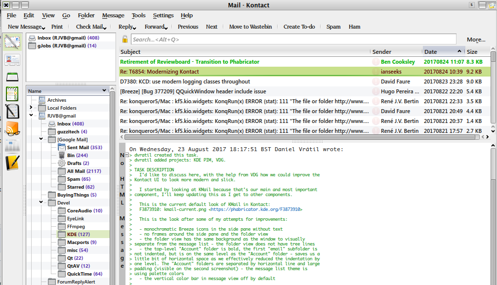
andreaska added a comment to T6854: Modernizing Kontact look.
I would have this 3 buttons instead of bottom left (additional toolbar) to the top toolbar (as there is already an toolbar for the apps). as less different UI elements as possible. In addition you don't have that much actions in the main top toolbar in a PIM suite.
Aug 23 2017
Aug 23 2017
andreaska added a comment to T6854: Modernizing Kontact look.
so when you are interested into some facelift, ping the VDG. As you saw in the two quick mockups it's not another application is't kontact you have there the folder view OR a panel view so simple and advanced and you have the conversation view which you already show on your screenshot only without show the header for each conversation mail.
andreaska added a comment to T6854: Modernizing Kontact look.
the e-mail view (detail view) if fine for me maybe you can add an inline delte, reply, forward, ... action than you can remove the toolbar.
andreaska added a comment to T6854: Modernizing Kontact look.
and the conversation view for the mail section.
andreaska added a comment to T6854: Modernizing Kontact look.
For the sidebar with the mail folders I have something in mind like places and folders widget in dolphin.
andreaska updated subscribers of T6854: Modernizing Kontact look.
I'll hope I can upload here everything I found from the VDG about mail app, ...
andreaska added a comment to T6854: Modernizing Kontact look.
oh and sorry but I don't think the updates (screenshots) are an improvement, sorry.
andreaska added a comment to T6854: Modernizing Kontact look.
Hi @dvratil awesome to make some design stuff here.
Aug 4 2017
Aug 4 2017
andreaska added a comment to T6267: New systemsettings UI.
I would focus instead of the SubSections at the single KCM. If you select first the main group and than show all KCM's the KCM's aren't that hidden as in the old layout. As you can see in the screenshot there are 10 - 15 KCM's per Main Section.
Aug 3 2017
Aug 3 2017
Jul 22 2017
Jul 22 2017
andreaska added a comment to T6545: Splash and Welcome screen.
About the links. I like them. Why you dont have a donate section on the webpage? Something like a tutorial page where you link at the start screen would be nice. However. Donate should be there or support where you have a website like libreoffice https://donate.libreoffice.org/ support via money or time.
andreaska added a comment to T6545: Splash and Welcome screen.
Last mockup is really good. I would use white for recent but for show on startup gray.
andreaska added a comment to T6545: Splash and Welcome screen.
HIG say no splash screen only if really needed
Jul 21 2017
Jul 21 2017
andreaska added a comment to T812: Add image preview to effects.
Kube removes the preview, because it's useless to have a random color and a useless first letter. Group them would be a better way. Maybe have a gif preview of a transition or an icon like PowerPoint did it. I made some icons for libreoffice impress transitions and can support if needed.
andreaska added a comment to T6545: Splash and Welcome screen.
Hide after startup like in krita is shorter. Maybe checkbox hide would be enough. Translations are most of the time longer than english.
andreaska added a comment to T6545: Splash and Welcome screen.
Can you check how it would look like you have recent, new and open in one line. And on bottom the links like in the right pictures.
andreaska added a comment to T6545: Splash and Welcome screen.
Look awesome.
andreaska added a comment to F3816173: welcome-screen-1.png.
Look really good. Maybe when you move recent and links as header in the gray area and in the black rectangle only the files and links.
May 10 2017
May 10 2017
Apr 18 2017
Apr 18 2017
andreaska added a comment to D5424: [Notifications] Introduce "settings" action.
look good to me +1
Mar 20 2017
Mar 20 2017
andreaska added a comment to M90: Sensible icons for Plasma Activities (action icon).
+1 well done
Mar 14 2017
Mar 14 2017
andreaska added a comment to T2782: Outbox.
emblem-pause
emblem-warning
ebmlem-success
are still available in breeze, oxygen and most other icon themes.
Mar 13 2017
Mar 13 2017
andreaska added a comment to T2782: Outbox.
@mbohlender got the ping but didn't found the time, sorry.
Mar 9 2017
Mar 9 2017
andreaska added a comment to T2782: Outbox.
where (and in which size) the icon will be used?
andreaska added a comment to T2782: Outbox.
when you need some new breeze icons, please ping me or fill a bug report.
Mar 8 2017
Mar 8 2017
andreaska added a comment to D4560: Increase smooth scrolling animation duration from 100 to 300 ms and set easing curve to InOutQuart.
I can't give you any feedback, sorry that I can't help, but I don't know how to review it and how to help.
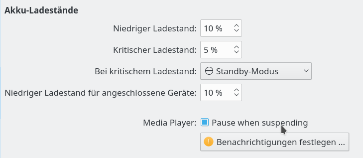
andreaska added a comment to D4960: Pause media players on suspend.
cause Pause media player when suspending is that long when you separate it to
Mar 7 2017
Mar 7 2017
andreaska added a comment to D4917: [Breeze Plasma Theme] Improve action-overlay icons.
only a draft based on the old design with the new semantic.
Feb 21 2017
Feb 21 2017
andreaska added a comment to M90: Sensible icons for Plasma Activities (action icon).
#8 is goog @ivan its your app, your choise
Feb 17 2017
Feb 17 2017
thanks look good.
Feb 15 2017
Feb 15 2017
andreaska added a comment to D3684: Media Controls on lock screen.
thanks well done.
good point. If you want to use this icons I'll make them for the other places size.
Feb 8 2017
Feb 8 2017
andreaska added a comment to D4495: Remove monochrome application icons.
when was the last release for ktorrent?
andreaska added a comment to D4495: Remove monochrome application icons.
please have a look at applications like amarok or ktorrent some icons are needed for this applications.
Feb 1 2017
Feb 1 2017
andreaska added a comment to D4400: Plasma 5.10 "Cascade" Wallpaper.
ken never stop make wallpapers. ken please upload your old wallpapers to the kde store.
Jan 28 2017
Jan 28 2017
andreaska added a comment to D4253: redesign gwenview icon.
Varlesh you do awesome icon work, but gwenview was changed some time ago so no icon redesign needed sorry.
Please work on other icons.
Jan 27 2017
Jan 27 2017
andreaska added a comment to M90: Sensible icons for Plasma Activities (action icon).
circle didn't work at my tests. maybe Ivan has a good idea.
andreaska added a comment to M90: Sensible icons for Plasma Activities (action icon).
would it be possible to use different circles (sizes) than it would be more plasma like maybe.
andreaska added a comment to M90: Sensible icons for Plasma Activities (action icon).
by default the panel use 22px icon size as fare as I know
andreaska added a comment to M90: Sensible icons for Plasma Activities (action icon).
I think the winsows 10 desktop switcher icon is more self explanation but yes the tree dot's could get an improvement.
Jan 26 2017
Jan 26 2017
andreaska added a comment to D4298: [Color Picker] Add contrast frame around colors in popup.
Look good to me +1
andreaska added a comment to D4278: fix icons bittorrent-sync, codeblocks, darktable, ffmulticonverter.
+1 bittorent sync
+1 darktable
+1 ffmulticonverter
andreaska added a comment to D4289: Add VLC tray icon.
can you upload the svgz file cause I can't download it here.