Regarding hamburger menus, I think Falkon/new Dolphin style is the best implementation because it gives the user the option to use the traditional menu or the hamburger menu. This is better for accessibility because people who rely on accelerators can enable a traditional menu and it ensures that the menu options will appear in the global or titlebar menu.
Feed Advanced Search
Sep 8 2019
Sep 8 2019
ndavis added a comment to T11093: Improve Consistency across the Board.
ndavis added a comment to D23778: Remove superfluous 32px recent documents icons.
For now
ndavis added a comment to D23782: Add "edit-none-border" icon.
This is kind of more like a selection icon than a No Borders icon TBH. I'm not sure if this is really more accurate than edit-none.
ndavis requested changes to D23782: Add "edit-none-border" icon.
I think it would be better if this icon had bits in the corners like many of the existing breeze icons:
ndavis added a comment to D23782: Add "edit-none-border" icon.
What is this icon used for?
Sep 7 2019
Sep 7 2019
ndavis requested changes to D23778: Remove superfluous 32px recent documents icons.
Keep the 24px icon for now. It's in Adwaita at 24px too, so there might be some app out there that uses 24px icons. When the repo is setup to generate 24px icons at build time, then we can remove all of the 24px icons. If you need to update it to match the 22px version, just copy the 22px icon, open it in a text editor, change the viewbox or document height/width to 24x24, then group the shapes:
ndavis accepted D23779: Make KWin action menu consistent with task manager, use action verbs for configure items and add more icons.
+1. Not sure about the icon choice for No Borders, but I don't have any better ideas.
I think we should still have 24px icons for compatibility, but since they're exactly the same as the 22px icons with wider margins, it might be better to generate 24px icons at build time.
Sep 6 2019
Sep 6 2019
ndavis added a comment to D23761: Make small recent documents icons look like documents and improve clock emblems.
ndavis added a comment to D23761: Make small recent documents icons look like documents and improve clock emblems.
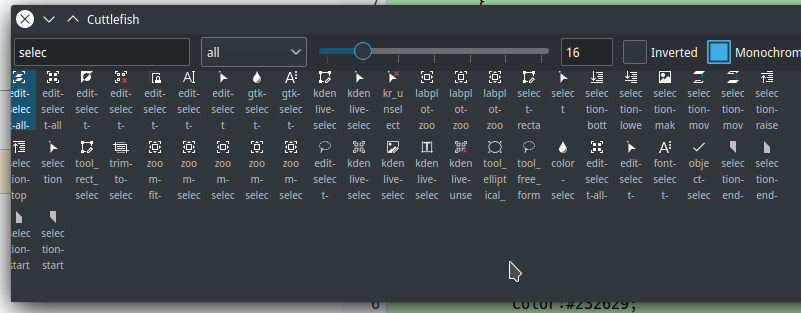
ndavis added a comment to D23712: [Cuttlefish] Overhaul program, use Kirigami.
ndavis added a comment to D23757: Clean up hamburger menu and viewport and single-folder context menus.

ndavis requested changes to D23760: Create new "Recent folders" icon.
Use this 16px icon. It's more similar to the style of the 22px icon.
Just change color:#232629 to color:#eff0f1 for Breeze Dark.
ndavis added a comment to D23754: Use all colorful icons in config window's sidebar.
ndavis added a comment to D23757: Clean up hamburger menu and viewport and single-folder context menus.
Why is add to places grouped with paste?
ndavis added a comment to D23759: Remove unneeded media icons.
A few things to consider:
ndavis requested review of D23759: Remove unneeded media icons.
ndavis added a comment to T10273: Make KCMs consistent and apply the KDE HIG to them as much as possible.

+1
Sep 5 2019
Sep 5 2019
ndavis committed R102:dd9bc6a3cb01: Set a minimum window size to reasonable 800x600 px (authored by alexde).
Set a minimum window size to reasonable 800x600 px
Never mind, a KWin rule I had was messing things up. You're good to go.
ndavis requested changes to D23746: Set a minimum window size to reasonable 800x600 px.
This doesn't seem to do anything, unless I'm testing the wrong thing.
KInfocenter with main page selected:
ndavis committed R318:0c66610260a4: Change terminal panel icon to dialog-scripts (authored by ndavis).
Change terminal panel icon to dialog-scripts
ndavis committed R266:939cbf897133: Add 22px dialog-scripts, change script actions/places icons to match it (authored by ndavis).
Add 22px dialog-scripts, change script actions/places icons to match it
ndavis updated the test plan for D23740: Change terminal panel icon to dialog-scripts.
ndavis updated the test plan for D23740: Change terminal panel icon to dialog-scripts.
ndavis added a dependent revision for D23738: Add 22px dialog-scripts, change script actions/places icons to match it: D23740: Change terminal panel icon to dialog-scripts.
ndavis updated the test plan for D23740: Change terminal panel icon to dialog-scripts.
ndavis requested review of D23740: Change terminal panel icon to dialog-scripts.
ndavis updated the test plan for D23738: Add 22px dialog-scripts, change script actions/places icons to match it.
ndavis updated the test plan for D23738: Add 22px dialog-scripts, change script actions/places icons to match it.
ndavis requested review of D23738: Add 22px dialog-scripts, change script actions/places icons to match it.
Sep 4 2019
Sep 4 2019
ndavis requested changes to D23711: Improve "user-trash" icon.
We're supposed to use 6px margins on the top and bottom, making the visible part of the icon 52px tall. Bottom line shadows are normally supposed to be 1px tall. Other than that, it looks pretty good.
Sep 3 2019
Sep 3 2019
ndavis added a comment to D23389: Use visible buttons to switch the default device.
ndavis committed R266:34fe98546fae: Use empty/filled style for monochrome empty/full trash (authored by ndavis).
Use empty/filled style for monochrome empty/full trash
Make notification icons use outline style
Make notification icons use outline style
ndavis updated the test plan for D23705: Use empty/filled style for monochrome empty/full trash.
ndavis requested review of D23705: Use empty/filled style for monochrome empty/full trash.
Make user-trash icons look like trashcans
ndavis added a comment to D23685: Make user-trash icons look like trashcans.
ndavis added a comment to D23687: New Bottom Help text.
Also, "pixel-by-pixel" (there might be a better way to say it, maybe find it later) is better than "fine tune" because it's more accurate.
ndavis added a comment to D23685: Make user-trash icons look like trashcans.
ndavis committed R266:018b67eff94c: Add breeze icons for ROOT cern files (authored by Marc Henning <marc.henning1@rwth-aachen.de>).
Add breeze icons for ROOT cern files
ndavis added a comment to D23464: Add breeze icons for ROOT cern files.
Looks like you've got everything
ndavis updated the diff for D23658: Make notification icons use outline style.
Move color preference clapper to center
ndavis added a comment to D23685: Make user-trash icons look like trashcans.
Sep 2 2019
Sep 2 2019
Fix small mimetype icon margin info
ndavis requested changes to D23464: Add breeze icons for ROOT cern files.
You're getting there.
ndavis updated the test plan for D23685: Make user-trash icons look like trashcans.
ndavis updated the diff for D23685: Make user-trash icons look like trashcans.
Add breeze dark icons
ndavis updated the test plan for D23685: Make user-trash icons look like trashcans.
ndavis requested review of D23685: Make user-trash icons look like trashcans.
ndavis committed R134:bd12770b2b1c: Change Installed list icon to view-list-details (authored by ndavis).
Change Installed list icon to view-list-details
ndavis added a reviewer for D23678: Change Installed list icon to view-list-details: Discover Software Store.
ndavis requested review of D23678: Change Installed list icon to view-list-details.
ndavis added a dependent revision for D23627: Make notification icons use outline style: D23658: Make notification icons use outline style.
ndavis added a dependency for D23658: Make notification icons use outline style: D23627: Make notification icons use outline style.
ndavis updated the test plan for D23658: Make notification icons use outline style.
ndavis updated the diff for D23658: Make notification icons use outline style.
Add breeze dark icons
ndavis requested review of D23658: Make notification icons use outline style.
ndavis added a comment to D23627: Make notification icons use outline style.
I could use a modified version of the KAlarm systray icon
ndavis added a comment to D23627: Make notification icons use outline style.
Sep 1 2019
Sep 1 2019
ndavis added a comment to D23387: [Folder view] Scale selection and preview buttons with item size.
That's some nice consistent spacing. Does it get the icons from the desktop theme? If so, I could add some additional sizes so that it doesn't look as blurry.
ndavis updated the test plan for D23627: Make notification icons use outline style.
ndavis updated the test plan for D23627: Make notification icons use outline style.
ndavis updated the test plan for D23627: Make notification icons use outline style.
ndavis requested review of D23627: Make notification icons use outline style.
ndavis added inline comments to D23387: [Folder view] Scale selection and preview buttons with item size.
Aug 31 2019
Aug 31 2019
ndavis added a comment to R98:523249683744: [GTK3] Make CSD window decorations 18px instead of 16px.
@cblack thoughts?
ndavis added a comment to R98:523249683744: [GTK3] Make CSD window decorations 18px instead of 16px.
Aug 30 2019
Aug 30 2019
ndavis added a comment to D23464: Add breeze icons for ROOT cern files.

Aug 29 2019
Aug 29 2019
ndavis updated the test plan for D23547: [GTK3] Have checkboxes and radiobuttons respect the user's color scheme..
ndavis requested changes to D23464: Add breeze icons for ROOT cern files.
I think we should use #1ed4e5 for the color instead since that's what the official logo uses. Normally, I'd say to use a similar Breeze-like color, but mimetype icons are a mess anyway and I don't think it's worth worrying too much about unless Breeze's official color palette is expanded.
LGTM
ndavis added a comment to D23547: [GTK3] Have checkboxes and radiobuttons respect the user's color scheme..
ndavis added a comment to D23547: [GTK3] Have checkboxes and radiobuttons respect the user's color scheme..
I should have been more clear, but I meant all of the checkbox and radio button SVGs. The SVGs I provided just did the most difficult changes and could be reused to create the other versions.
Aug 28 2019
Aug 28 2019