User Details
- User Since
- Jul 17 2017, 6:17 PM (411 w, 5 d)
- Availability
- Available
Mar 24 2019
@mgallien Hey, sure! Thanks for finishing it
Oct 27 2018
I tried to take another look at this, but after rebasing on master I started getting an error when building:
Oct 15 2018
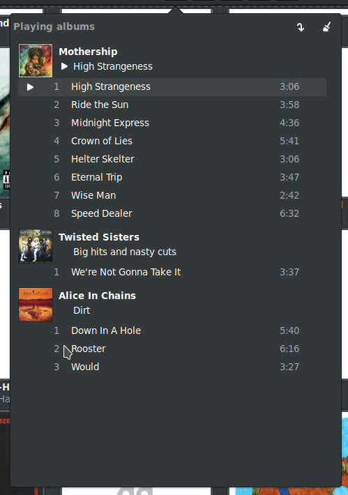
I'll try to look into this again next weekend. I think Elisa was missing some way to go properly from Now Playing to a specific album view, so it went straight to all albums.
Oct 14 2018
Oct 8 2018
Hi guys, sorry I've been dropping the ball on this one. I had reverted this some weeks ago but couldn't find another way to center it. And then I didn't have time to get back on it.
+1 for landing it now
Aug 24 2018
This is mostly done too but there's still one small bug: when I go to the now playing view and then click on the album name it doesn't open the album, but only switches to the album view.
Still trying to figure this out
- Use new AlbumId data
Thanks for the ping! This was mostly done but I had forgotten about it
Aug 14 2018
Hey, great! I can't see the bug anymore. The only thing that's missing now is toggling when the window is maximized, right now the button switches but there's no change in the UI.
BTW, maximizing the UI + window looks awesome. Specially with high-res covers.
Aug 13 2018
Looking good. I noticed the bug seems to show up consistently when the window is maximized (I think that's the one you're talking about)
Aug 11 2018
Aug 10 2018
Hi @ognarb, great work! There's one change I think would make this better. Let the window become smaller when this setting is enabled so it can be the same height as the headerbar in the normal window state. When party mode is disabled though, the window should have the same minimum height as it does now. You can find the properties to do that in ElisaMainWindow.qml
Jul 26 2018
Jul 15 2018
Jul 14 2018
Tested this on my branch and it works now, thanks guys
- Reverse clear list icon
- Add ellipsis on load/save texts (for tooltips)
Looks like ToolButtons ignore text. I managed to hack this by shoving a Text object inside them but it really messes up the layout and only the icon is clickable.
Jul 13 2018
There is some room, but it ends up looking more cramped.
Replace menu with buttons (also eliminates the reverse mode problem)
Hey guys, yeah there's room for the 4 buttons up there. The main pro for the dropdown was having text for the buttons that modified the playlist, but having the buttons could also simplify things. Sorry I keep forgetting about reversed mode
LGTM. Tested this by adding MOD files to the playlist and now they show up correctly.
One small issue is that they are all inside a blank album (with only a CD icon) which looks a bit strange but that's a topic for another patch.
Jul 12 2018
Hey, thanks for working on this. I tried this in the links branch but it seems all albums are giving back zero (even after deleting/rebuilding the db).
@mgallien Thanks!
Jul 11 2018
Bring back goBack action
Jul 10 2018
Good point in the ellipsis. The broom icon is way better but I'm going to wait for confirmation from @mgallien or @astippich since we are on 5.45 now.
Thinking a bit more about this, we might want to use PgUp/ PgDn to scroll in the playlist/content views so maybe we should go straight for the chord.
Jul 9 2018
This patch isn't finished yet. I've come across a problem with the album view: the openOneAlbum() function requires a databaseID to get the album data but I have no way of getting that in the header bar. I looked around the headerbarmanager code for a bit but I have no idea how we could fetch that. Everything else works.
- Make menu text contextual (show/hide)
- Let window be smaller when playlist is disabled (up to 700px)
- Disable menu action in Now Playing view
- Add customizable shortcut for the action (wohoo, I figured it out! It's F9 by default)
Based on the old mockups at: https://diegogangl.github.io/
@ngraham Good point about Ctrl+T , I tried to make them mnemonic but I can see how it could be confusing. What do you think about F9? It's used by the place's panel in Dolphin, so it's a bit similar.
Jul 7 2018
Jul 4 2018
I don't quite understand what you guys mean by a different workflow.
Jul 3 2018
Jul 1 2018
There's one small thing left to do for this one: add a customizable shortcut. I couldn't figure out how to do it though, should I add the action in C++ to do that?
Jun 30 2018
I don't have albums with more than with two digit disc numbers, so I'll take your word for it :)
LGTM
Jun 28 2018
Jun 26 2018
I think it looks really good right now! Two more things:
- Every track has the multi-disc format now (1/2, 1/3, etc.) even when they are not multi disc. Some individual tracks show " / 1".
- The screen you shared earlier had the track numbers and artist names in a lighter grey, did you decide against it?
Jun 23 2018
Jun 22 2018
Tested and LGTM
I can see what you mean, the alternating colors would look weird if they go across albums. The other option could be making the alternating colors "local" to albums, but I'm not sure how we could do that since we can't rely on track numbers.
Jun 20 2018
+1 I've been using borderless windows all the time since I came back to KDE Plasma and haven't had any workflow issues.
A couple more things:
- I think a bit of marginBottom in the title row would be good too, to separate the artist name from the first song name
- The track being played gets a bold font, but only for the title. I think it'd be more consistent to have bold text in the whole row
- Looks like the "-1" for songs without a track number came back
- RTL has some issues (though it's probably not done yet)
I might be biased but I absolutely love this :D
Jun 8 2018
Make filter rating stars always visible
When I tried this the first time I got this error and the loading animation running constantly.
Jun 3 2018
Tried this from master and it works really well. The thing that gets excites me the most is that Elisa can now play MOD files! I can confirm that .xm, .it, .mod and .s3m formats work. MIDI files are also recognized and shown but they failed to play for me.
Tried this again from Master after nuking my DB. I get more genres (I think) but they are all empty and if I try to play them I get an empty playlist.
Jun 2 2018
Here's a new solution for alignment. It should stay in mostly the same place with different fonts, unless you are using some weird fantasy font with bad metrics.
May 31 2018
May 30 2018
No problem :)
May 27 2018
May 26 2018
Here's a test for the "columns" idea.
May 25 2018
- Revert size changes
- Remove blank line
- Tweak border colors (size change)
May 24 2018
TBH I like the concept of the cassette icon more than the current implementation of it. What was good about about is that it had personality, which is a big deal since usually icons also double as logos. IMO a solid icon should be 1) Memorable and 2) Descriptive. Imagine both icons amongst these google search results and consider which one would stand out, which one you would know it's elisa's. These icons are technically great, they are just not memorable.
May 22 2018
Heh I thought this was only affecting desktops so it didn't need to be touchable, I completely forgot PCs have touchscreens too these days.
Good points, I'll revert that later

Did a quick test going back and forth from albums to artists and works great
May 21 2018
I don't think the buttons look so bad jumping around, after all there's only two positions they can be. However I think if we keep them in the same position (in the middle) but actually push them farther to the left we could create the illusion of columns, and it wouldn't look so weird. I'll take a look at it.
Yep it's probably the font, I'm using the ubuntu font and it looks like this:
May 20 2018
May 19 2018
Could be dpi, are you using a high-dpi screen? Could you post a screen so I can see how far off it is?
I'm thinking it could also be the system font. What font are you using?
May 18 2018
Tighten margins
May 16 2018
LGTM. The tracks icon is much better now
May 13 2018
Sorry I forgot to check albums with covers.