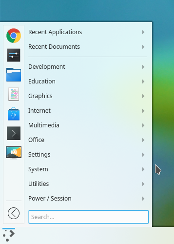
Launchers
Plasma currently has 3 launcher styles added. I believe all of them can be converged or made to look similar. However, given user requests, we have to keep 3 of them and they currently don't seem to correlate visually. We have the dashboard launcher (WIP), Kickoff and Kicker. Each of them brings different kinds of interactivity and space savings for the users.
I would like to propose a visual merge of these three applications so that they look more cohesive, tight and closer to a Plasma style.
Things to note:
- Icons are not meant to be final. They are just a representation
- Spacing is relative
- Current elements on the screen are meant to be there
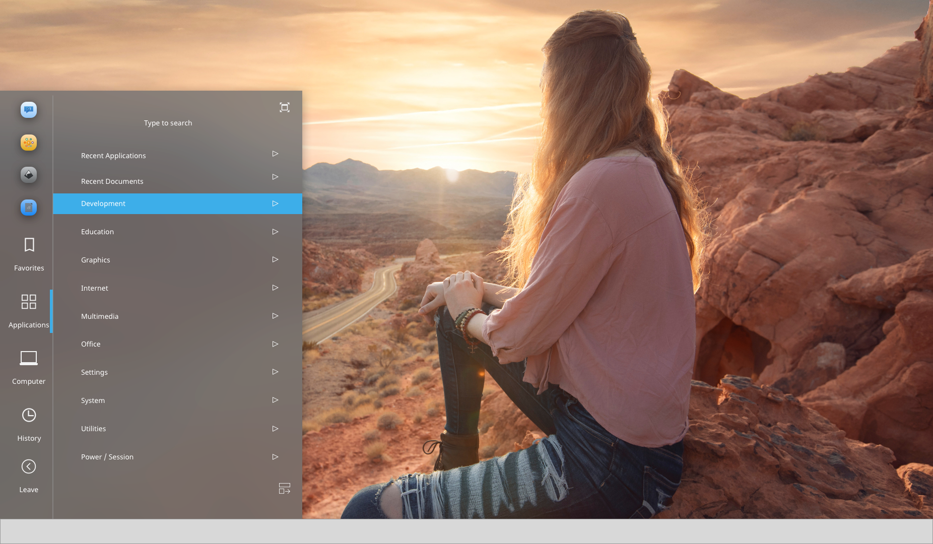
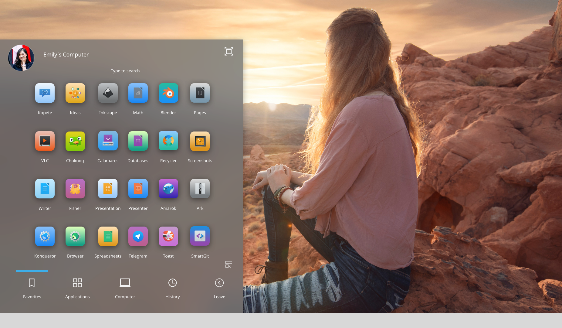
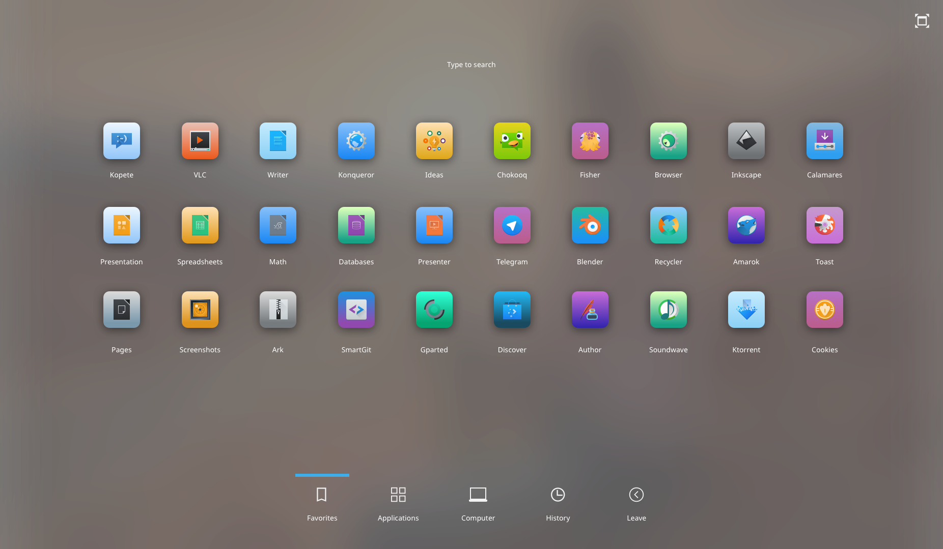
Introductions
Fullscreen button: Will resize from kicker to dashboard launcher, from kickoff to fullscreen launcher. Removed the idea of right-clicking the menu and offered visual controls.
Kickoff Menu: To provide consistency, I preserved the kickoff bottom menu bar throughout the different iterations. This will take care of the category clutter menu that is present in the dashboard launcher.
Things to Consider
- I don't know the possibility of creating this code-wise. I welcome feedback.
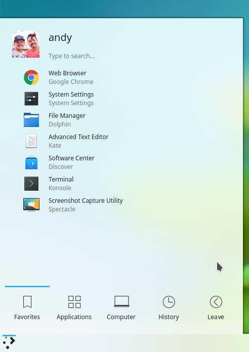
Before:
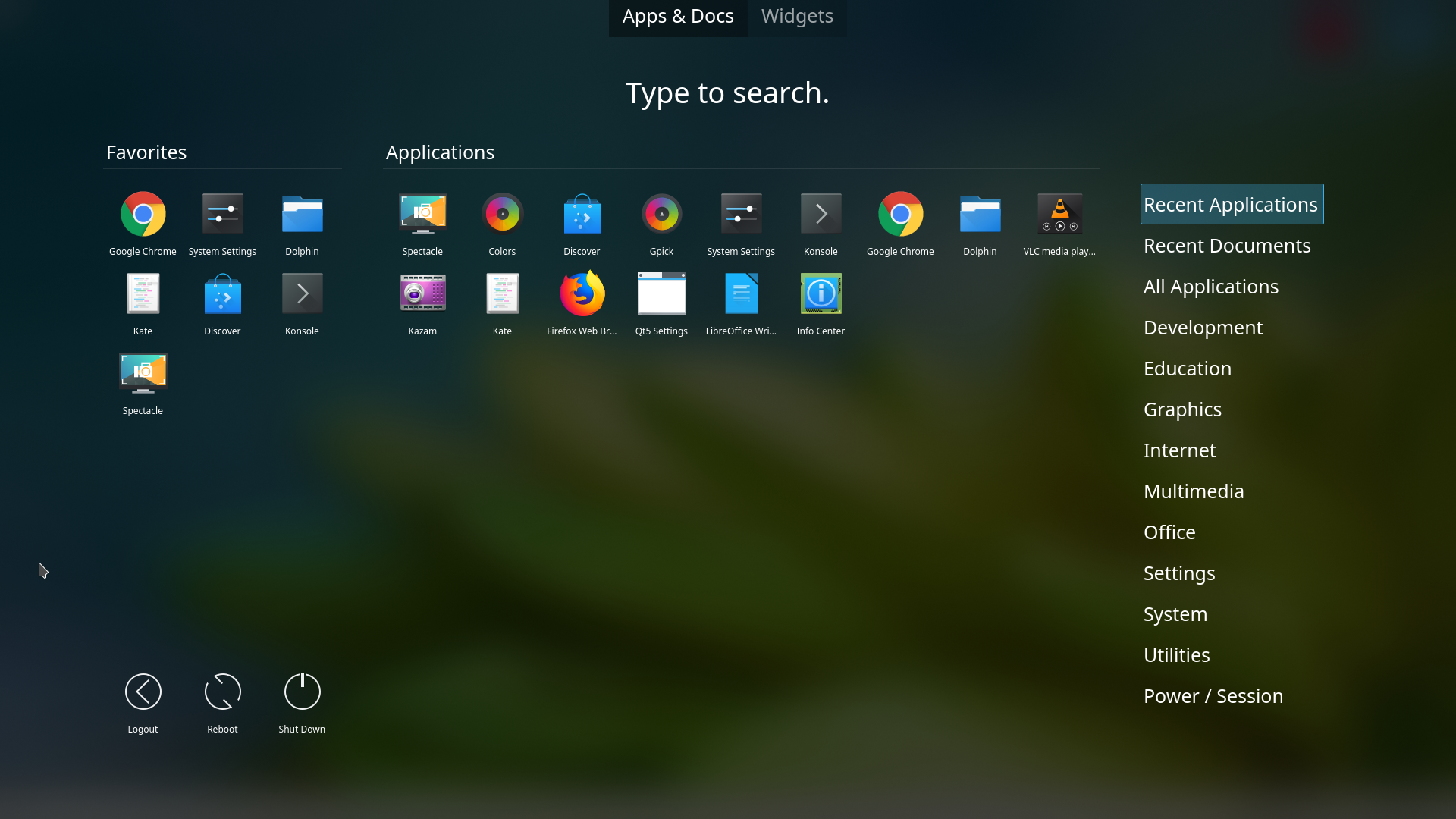
After: