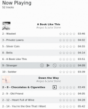
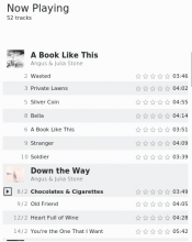
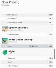
move the playing indicator to be first on line and align titles
Details
Diff Detail
- Repository
- R255 Elisa
- Lint
Automatic diff as part of commit; lint not applicable. - Unit
Automatic diff as part of commit; unit tests not applicable.
I might be biased but I absolutely love this :D
Some notes:
- The track number isn't aligned to the right side of the cover, and the title isn't aligned to the album title. The artist name seems to be more to the left than the title too.
- I'd consider adding a very small padding on the right side (pushing the track time to the left). Like 2-5px, so it's a bit more balanced
- I'd also try adding some marginTop to the album title rows. So albums can be separated better and have some more breathing room.
- Also: should the title rows follow the odd/even coloring of the rows, or always be white? (or other color)
A couple more things:
- I think a bit of marginBottom in the title row would be good too, to separate the artist name from the first song name
- The track being played gets a bold font, but only for the title. I think it'd be more consistent to have bold text in the whole row
- Looks like the "-1" for songs without a track number came back
- RTL has some issues (though it's probably not done yet)
- remove useless i18nc calls
- only display track number if it is valid
- all text for currently playing track is now bold
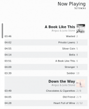
- fix issues for reversed layout
- align cover image with end of track number and add vertical margins
Thanks for the feedback so far. This is very usefull and productive.
+1 for @januz's idea about not following the alternating background color for header rows (i.e. make them always be white or gray). I think that would help to make albums more distinct from one another in the list.
I can see what you mean, the alternating colors would look weird if they go across albums. The other option could be making the alternating colors "local" to albums, but I'm not sure how we could do that since we can't rely on track numbers.
Another issue: songs without an album look a bit weird. This was an problem before too though. Maybe set the title to something like "(No Album)" for these?
Did you had a look at the last screenshot where all album headers have a third color distinct from the rows ? The difference may be too small but at the same time, I am a bit lost on which solution apply.
Another issue: songs without an album look a bit weird. This was an problem before too though. Maybe set the title to something like "(No Album)" for these?
I would prefer to fix this issue in another review to keep this one to the initial scope in the hope to finish it for the next release.
I see, I saw the third color screenshot but I thought you were talking about the alternating row colors going on across albums. I don't think it looks bad, could you push it here so we can see how it looks in elisa?
Another issue: songs without an album look a bit weird. This was an problem before too though. Maybe set the title to something like "(No Album)" for these?
I would prefer to fix this issue in another review to keep this one to the initial scope in the hope to finish it for the next release.
Sounds good
- remove useless i18nc calls
- only display track number if it is valid
- all text for currently playing track is now bold
- fix issues for reversed layout
- align cover image with end of track number and add vertical margins
- increase margins around album headers
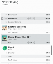
- always set a background with a specific color for album headers
overall quite nice, I like the changes! I think some margin on the right side for the track length would be great though
I think it looks really good right now! Two more things:
- Every track has the multi-disc format now (1/2, 1/3, etc.) even when they are not multi disc. Some individual tracks show " / 1".
- The screen you shared earlier had the track numbers and artist names in a lighter grey, did you decide against it?
Thanks for your feedback. I have added some margins around the track duration. You are right.
I am investigating.
- The screen you shared earlier had the track numbers and artist names in a lighter grey, did you decide against it?
Unfortunately, I have not yet found a reliable way to get light text with all fonts. Some work, some does not work.
That's weird, changing the color should always work. Unless you are changing the weight, that would only work with fonts that have a light variant.
Yes, this is the solution. I will try to see if using a different color would make the visual effect reliable no matter the chosen font. I had always used the light variant of fonts.
I tried modifying the color but I did not manage to do it. I had difficulties to select a color that would work (including dark themes). I tried using dark color but with Breeze dark, the result is just bad.
I found a couple of issues related to management of single/multiple discs albums. Still, I do not yet understand the exact problem you are getting.
I also need to fix the layout in case an album has 2 digits disc numbers.
- The screen you shared earlier had the track numbers and artist names in a lighter grey, did you decide against it?
Unfortunately, I have not yet found a reliable way to get light text with all fonts. Some work, some does not work.
- add margins around the duration label
- ensure disc number is readable even if it has more than one digit
- ensure that disc or tracks number will be visible even when very long
I don't have albums with more than with two digit disc numbers, so I'll take your word for it :)
LGTM
