Align the views buttons vertically in line with the icon
| astippich | |
| mgallien |
| Elisa |
Align the views buttons vertically in line with the icon
| Automatic diff as part of commit; lint not applicable. |
| Automatic diff as part of commit; unit tests not applicable. |
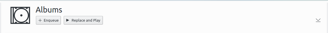
This does not work for e.g. the albums view where you have 2 text lines. The text actually is aligned with the image, it's the icon that is smaller. So any change you make there will break with proper album art.
Sorry I forgot to check albums with covers.
This revision applies margins only when the secondary line is not visible, so it always looks aligned.
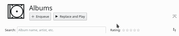
Unfortunately, it is still not nicely aligned here like in the picture. I'm not sure, but maybe we need to take the DPI into account?
Could be dpi, are you using a high-dpi screen? Could you post a screen so I can see how far off it is?
I'm thinking it could also be the system font. What font are you using?
I'm not using a HiDPI monitor, it's Full HD on 24 inches, so pretty standard. Font is standard kubuntu Noto Sans.
It looks this way:
If it is that prone to misalignment, this might not be the best way to fix it. But I admit that I don't know what to do here.
Yep it's probably the font, I'm using the ubuntu font and it looks like this:
Maybe I can give the label a height and make the text fit inside, that way it will remain aligned no matter the font.
Did you try using TextMetrics to get the exact height of the text ? This way, you should be able to compute the exact margins needed.
By the way, this is fixing complaints about misalignment. Thanks for that.
Shouldn't you also align the title of the playlist ?
Here's a new solution for alignment. It should stay in mostly the same place with different fonts, unless you are using some weird fantasy font with bad metrics.
Thanks for your work.
I tried increasing the font size to 14 (OK, this is a corner case) and the bottom of the buttons are no longer aligned.
Did you consider using TextMetrics to get the exact height of the label ?
Thanks for your work.
I tried increasing the font size to 14 (OK, this is a corner case) and the bottom of the buttons are no longer aligned.
Did you consider using TextMetrics to get the exact height of the label ?
I checked this and it's not so much that the buttons aren't aligned but rather they become too big. The entire ui gets too big and starts to overlap actually. There's no way to align the buttons and the text with the icon because they are much bigger. We could rewrite the whole thing to also scale the icons but that could also cause them to get blurry at some sizes.
About font metrics: yeah we could use its bounding rect but with the latest change the albumLabel text is aligned to the top. That means the top margin will always push the text down in the same way, and if it's larger or smaller it will only move the buttons below. The buttons, on the other hand are pushed up with a bottom margin so I don't know how we would apply the metrics there.
Sorry for the big delay on my side.
Let's get it in the 0.2 branch. It is much better with than without it.
We will do a real 0.2.1 with stuff being fixed !!!
Hey, no prob. I noticed the buttons on files aren't aligned, I'll take a look at that in another patch.