The former scaling of the x-Positions of the data points did not fit to the time axis.
Now the x-values of the points, i. e. their timestamps, are correctly aligned.
Feed Advanced Search
Sep 14 2019
Sep 14 2019
alexde updated the diff for D23520: Add time line to X axis.
alexde updated the diff for D23520: Add time line to X axis.
Remove redundant semicolons and move comment about unit (ms) to the declaration of the var
alexde updated the diff for D23520: Add time line to X axis.
Use a switch statement for xTicksAt
Sep 10 2019
Sep 10 2019
alexde updated the test plan for D23848: Add Breeze icons for Jupyter Notebook files.
alexde requested review of D23848: Add Breeze icons for Jupyter Notebook files.
Sep 9 2019
Sep 9 2019
alexde added a comment to D23520: Add time line to X axis.
*Friendly ping to the reviewers.*
Sep 8 2019
Sep 8 2019
alexde added a comment to D23788: Change the blog's texts align to justify..
I think I should exclude the headlines in a following patch.
alexde updated the test plan for D23788: Change the blog's texts align to justify..
alexde updated the test plan for D23788: Change the blog's texts align to justify..
alexde updated the test plan for D23788: Change the blog's texts align to justify..
alexde requested review of D23788: Change the blog's texts align to justify..
Sep 5 2019
Sep 5 2019
alexde requested review of D23746: Set a minimum window size to reasonable 800x600 px.
alexde updated the diff for D23520: Add time line to X axis.
Set correct right border for the grid lines and ticks.
alexde updated the test plan for D23520: Add time line to X axis.
alexde updated the diff for D23520: Add time line to X axis.
Move stroke() out of the loop.
Reduce line with by pixel.
alexde updated the diff for D23520: Add time line to X axis.
Shrink plotWidth a little bit so the earliest date on the right side may fit.
Change the way the division widths are defined to hopefully make the code easier to understand
and to maintain.
alexde added a comment to D23520: Add time line to X axis.
For some reason the xGridOffset seems sometimes to be wrong, and I have no explanation why. It especially happens for 1 hour graphs.

alexde requested review of D23520: Add time line to X axis.
I have changed some stuff, can you please review it again.
alexde updated the test plan for D23520: Add time line to X axis.
alexde updated the diff for D23520: Add time line to X axis.
Rename variables to make their function clearer.
Decrease the lower loop border by 1 to make sure that all
possible grid lines are drawn.
alexde updated the diff for D23520: Add time line to X axis.
Fix issue that a date may be displayed unintentionally.
Shrink right margin for grid lines and try to add an additional grid line
on the right side if reasonable.
Add more divisions for 2h and 24h graphs.
alexde updated the diff for D23520: Add time line to X axis.
Use dashed grid lines instead of solid lines. Grid lines with tick labels are less faint.
Rename variable to make its function clearer.
Show grid lines at all five minutes for the 1 hour graph.
alexde updated the diff for D23520: Add time line to X axis.
Align grid to 10 minutes for the 1h graph.
Sep 3 2019
Sep 3 2019
alexde updated the diff for D23520: Add time line to X axis.
Set valid defaults.
alexde updated the diff for D23520: Add time line to X axis.
- Set valid defaults.
alexde added a comment to D23464: Add breeze icons for ROOT cern files.
alexde updated the test plan for D23464: Add breeze icons for ROOT cern files.
alexde updated the diff for D23464: Add breeze icons for ROOT cern files.
16px: add 2px margins to top and bottom
22px: add 3px margins to top and bottom
32px: use existing and approved 32px icon as template instead of shrinking the 64px version
Sep 2 2019
Sep 2 2019
alexde updated the test plan for D23464: Add breeze icons for ROOT cern files.
alexde updated the diff for D23464: Add breeze icons for ROOT cern files.
Remove all circles and only use root symbol.
This makes the root symbol less faint and the icons fit better to Breeze overall.
Aug 30 2019
Aug 30 2019
alexde added a comment to D23464: Add breeze icons for ROOT cern files.
Aug 29 2019
Aug 29 2019
alexde added a comment to D23464: Add breeze icons for ROOT cern files.
The 16 and 22 px versions aren't supposed to have backgrounds and the root symbols are pretty faint.
alexde updated the test plan for D23464: Add breeze icons for ROOT cern files.
alexde updated the diff for D23464: Add breeze icons for ROOT cern files.
Add new 32px icons.
alexde updated the test plan for D23464: Add breeze icons for ROOT cern files.
alexde updated the test plan for D23464: Add breeze icons for ROOT cern files.
alexde updated the diff for D23464: Add breeze icons for ROOT cern files.
Also add the new 64px breeze icon.
Add new 22 px icons. Transparent background, less faint, original color.
alexde added a comment to D23464: Add breeze icons for ROOT cern files.
alexde updated the test plan for D23464: Add breeze icons for ROOT cern files.
alexde updated the diff for D23464: Add breeze icons for ROOT cern files.
Improve the root logo layout and change the root's color to the offical color 1ED4E5
alexde added a comment to D23520: Add time line to X axis.
Right now I only display the date under the tick mark if the date has changed and the tickmark number is odd, which I think is already good enough for this graph.
However, indicating a date change at midnight (12 pm / 0 am) would make sense as well. If you prefer that and find a suitable position for the indicator label, I may implemement it.
alexde updated the diff for D23520: Add time line to X axis.
Fix displaying wrong variable.
Add postfix "Str" to indicate that those vars are explicitely strings.
Make sure that the date is only displayed when date has changed for <= 24h graphs.
Aug 28 2019
Aug 28 2019
alexde updated the diff for D23520: Add time line to X axis.
Improve the formatting's consistancy
alexde updated the diff for D23520: Add time line to X axis.
Update comment
alexde updated the diff for D23520: Add time line to X axis.
Omit the date if date equals today and the graph does not range over 24 hours.
alexde updated the diff for D23520: Add time line to X axis.
Resolve formatting issues
alexde added a comment to D23520: Add time line to X axis.
alexde added a comment to D23415: Improve comprehensibility and consistency of window placement mode names.
I am not sure if I am allowed to intervene in this discussion, but "smart" is a really "dumb" description as it says nothing about what it actually does.
As a user I am left to do four things to find out, what it means:
alexde updated the diff for D23520: Add time line to X axis.
Set more sane left/right margins
alexde updated the summary of D23520: Add time line to X axis.
alexde updated the summary of D23520: Add time line to X axis.
alexde updated the diff for D23520: Add time line to X axis.
Set correct default value for a tick position
alexde updated the test plan for D23520: Add time line to X axis.
alexde updated the test plan for D23520: Add time line to X axis.
alexde requested review of D23520: Add time line to X axis.
Aug 26 2019
Aug 26 2019
alexde added a comment to D23465: Add new non standard mime type for ROOT cern files.
alexde updated subscribers of D23465: Add new non standard mime type for ROOT cern files.
alexde added a comment to D23450: Icons for ROOT cern files..
Sorry, for some reason it was easier for me to abandon this revision and to reopen another one here: https://phabricator.kde.org/D23464
alexde updated the summary of D23464: Add breeze icons for ROOT cern files.
alexde updated the test plan for D23464: Add breeze icons for ROOT cern files.
alexde added a comment to D23465: Add new non standard mime type for ROOT cern files.
Here's a testfile for the defined mime type:
alexde requested review of D23465: Add new non standard mime type for ROOT cern files.
alexde requested review of D23464: Add breeze icons for ROOT cern files.
Aug 25 2019
Aug 25 2019
alexde added a comment to D23450: Icons for ROOT cern files..
For some reason if I try to set the icons for ".root" files, they are shown in the dialog box, the icon can be set, but they are not shown in Dolphin. Has anyone an idea what I am doing wrong?
alexde updated the test plan for D23450: Icons for ROOT cern files..
alexde requested review of D23450: Icons for ROOT cern files..
alexde added a comment to D22183: Add click to play/pause feature on previews for audio/video.
I am not against a better version, but the culprit is that I am no designer.
For anything more complicated we would need an icon/svg.
alexde added a comment to D22183: Add click to play/pause feature on previews for audio/video.
Is the triangle set? How about such a triangle:
https://www.netclipart.com/pp/m/120-1201455_play-button-png-video-youtube-youtube-video-play.png
I can imagine that it can be discerned better due to the dark background casted on the image preview within the outer white ring.
For Breeze Dark, the colors could become inverted.
Aug 24 2019
Aug 24 2019
alexde added a comment to D23389: Use visible buttons to switch the default device.
for various technical reasons that are not yet fixable
alexde added a comment to D23389: Use visible buttons to switch the default device.
DnD is not very intuitive for things that don't look inherently draggable
alexde added a comment to D23389: Use visible buttons to switch the default device.
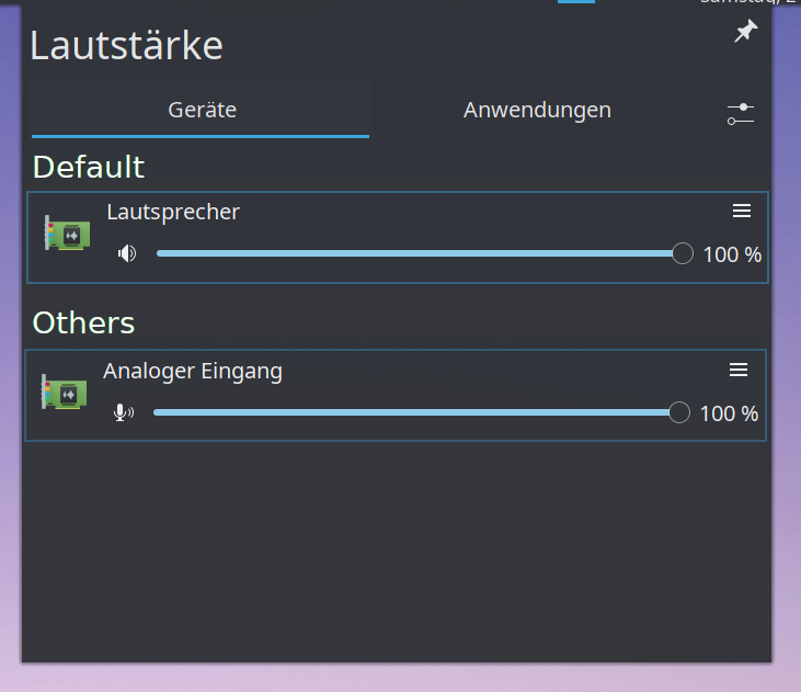
Just brainstorming: What about two sections, 1) "default" with a single entry and 2) "others".
The user could drag and drop the speaker to default place and the current default one would move downwards with an animation.
Aug 19 2019
Aug 19 2019
alexde awarded T11080: KDE for Big Enterprises a Like token.
alexde awarded T11081: Finalize the transition to Wayland and embrace the future of desktop a Love token.
alexde added a comment to D23237: Do not display vendor, Product and capacity in network plasmoid.
alexde added a comment to D23237: Do not display vendor, Product and capacity in network plasmoid.
In which GUI do I find "Vendor" and "Model" now? There's the "Energy Information" in KInfocenter, which
has a section "manufacturer" (in screenshot "Hersteller"), but only lists the serial number. Maby it could go there?

Aug 16 2019
Aug 16 2019
alexde added a comment to T11124: Unify highlight effect style.
Jul 28 2019
Jul 28 2019
alexde added a comment to D22493: [Notifications] Move history items' icons over to the left a bit.
Friendly ping. :-)
Jul 21 2019
Jul 21 2019
alexde added a comment to D22493: [Notifications] Move history items' icons over to the left a bit.
alexde updated subscribers of D22605: Set notifications entry icon size to medium.
alexde added a comment to D22605: Set notifications entry icon size to medium.
For pictures (like people's faces in messenger notifications) I would still prefer the lager icons, though.
alexde updated the summary of D22605: Set notifications entry icon size to medium.
alexde added a comment to D22605: Set notifications entry icon size to medium.
You must run cmake for the whole repository; once done that, you can cd to the applets/notifications/ subdirectory of the builddir, and build only that part.
alexde added a comment to D22605: Set notifications entry icon size to medium.
I would like to test it and post a screenshot, however I am not able to compile it:
- I cloned the source from the git repository
- mkdir plasma-workspace/applets/notifications/build
- cd plasma-workspace/applets/notifications/build
- cmake ..
alexde retitled D22605: Set notifications entry icon size to medium from Set plasma-nm history entry icon size to medium to Set notifications entry icon size to medium.
alexde requested review of D22605: Set notifications entry icon size to medium.
Apr 12 2019
Apr 12 2019
alexde added a comment to D20452: Clear terminal display when closing and opening it.
This patch looks more like a workaround to me. I'd suggest to identify the root cause of "^C" and "cd <path>" whenever the terminal is hidden and reopened again by hitting F4 and to find a another solution as I guess and especially hope that this behaviour is actually not necessary to happen.
Feb 10 2019
Feb 10 2019
alexde added a comment to D18809: Image Wallpaper Slideshow - display the list of images that will be shown.
Feb 9 2019
Feb 9 2019
alexde added a comment to D18809: Image Wallpaper Slideshow - display the list of images that will be shown.
Great work!
Feb 5 2019
Feb 5 2019
alexde updated subscribers of D18744: Add action in Edit menu to select the text on current page.
Dec 6 2018
Dec 6 2018
alexde added a comment to D17354: [Digital clock plasmoid] Calendar settings page: port to QQC2 & Kirigami and improve layout.
alexde added a comment to D17354: [Digital clock plasmoid] Calendar settings page: port to QQC2 & Kirigami and improve layout.
Thank you Nate! I am just curious if you considered to structure titles and options vertically, where the options are indented by a tab:
alexde added a comment to T9658: Rethink blur-by-default for Breeze SDDM login screen theme for Plasma 5.15.
Dec 5 2018
Dec 5 2018
alexde added a comment to T9658: Rethink blur-by-default for Breeze SDDM login screen theme for Plasma 5.15.
Oct 27 2018
Oct 27 2018