BUG: 400663
FIXED-IN: 5.15.0
Details
- Reviewers
mart davidedmundson - Group Reviewers
Plasma VDG - Commits
- R120:ad34212a8ccd: [Digital clock plasmoid] Calendar settings page: port to QQC2 & Kirigami and…
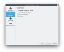
Before:
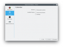
After:
(label alignment being a bit off is unrelated to this patch)
Everything still works.
Diff Detail
- Repository
- R120 Plasma Workspace
- Lint
Automatic diff as part of commit; lint not applicable. - Unit
Automatic diff as part of commit; unit tests not applicable.
Just wondering, shouldn't it look like
Available plugins: [ ] Astronomical events
                   [ ] Holidays
?
That was my first thought too, but this whole list of checkboxes/plugins is dynamic, so putting the label on the left for the first item is a bit challenging.
Though maybe this reveals that we should be using a list box instead of a dynamic set of checkboxes.
Would you want to move the General section to the top and plugins second?
In general, general labels maybe belong to the very top of a KCM? To me, it seems like a more logical progression. From all items to more specific items.
It should be possible, how about adding "Available Plugins" in an item that has the exacth same height with the QtControls.CheckBox ?
at least this was one of the tricks I used for: https://cn.opendesktop.org/img/7/a/f/8/d62284cb18eb3f6c6aaabc9b58f474cb1475.png
OK, if I give the ColumnLayout a label, it mostly works, but the label is vertically centered rather than being top-aligned:
- Move General section back to the top, where it belongs
- Use a left label for the plugin section (currently buggy pending a Kirigami patch: D17362)
Thank you Nate! I am just curious if you considered to structure titles and options vertically, where the options are indented by a tab:
General
[ ] Show week number
Available plugins
[  ] Plugin A
[  ] Plugin B
That's would I personally would favor.
Kind Regards
Yes, quite a bit. This current layout style is the result of an enormous amount of internal discussion. There is no one style that pleased everyone, but this is the one that was most popular and generally considered the most attractive and pleasant to use overall. Again, you can't please everybody especially in matters of style and design, but this style seemed overall to be the favorite when we were trying to figure what we should standardize on.
Changing the style just here would introduce inconsistency at a time when we're trying to make everything more consistent. The current FormLayout style is what we've decided on for the moment and I think it makes sense to fully implement it before we think about replacing it with something else. :)


