Rethink blur-by-default for Breeze SDDM login screen theme for Plasma 5.15
Closed, WontfixPublic

Description

It's too late for 5.14, but for 5.15, we might want to rethink the blur-by-default for our Breeze SDDM login screen theme.

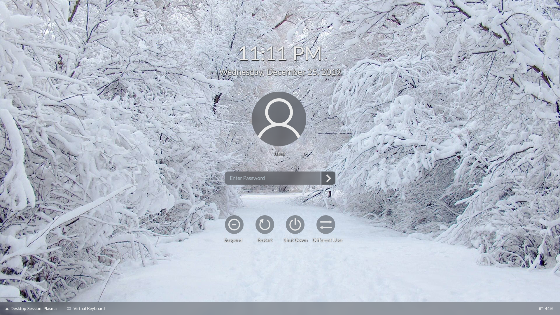
To recap: in 5.13, for the lock and login screens, we added a darkened blur over the background to ensure that the white text and un-framed UI controls always have sufficient contrast against the background.

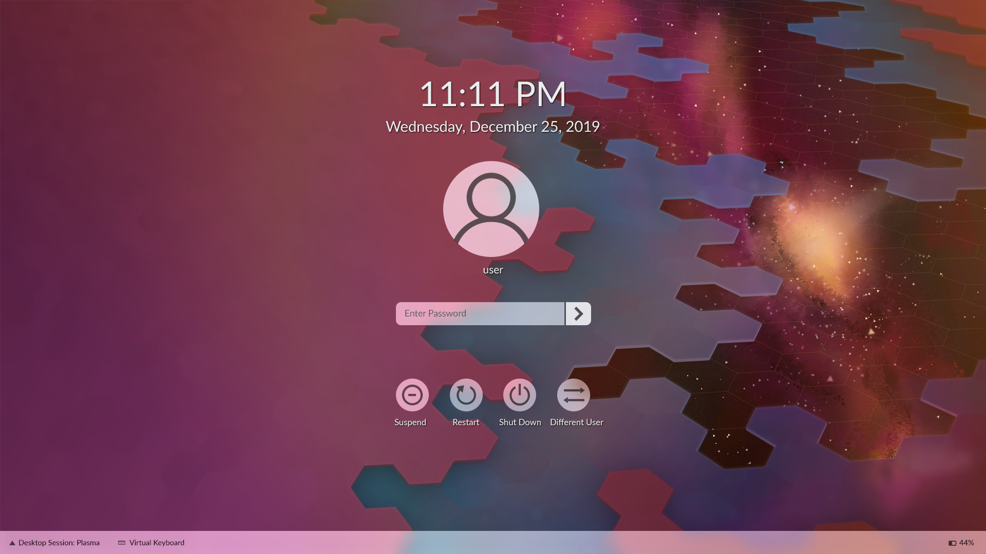
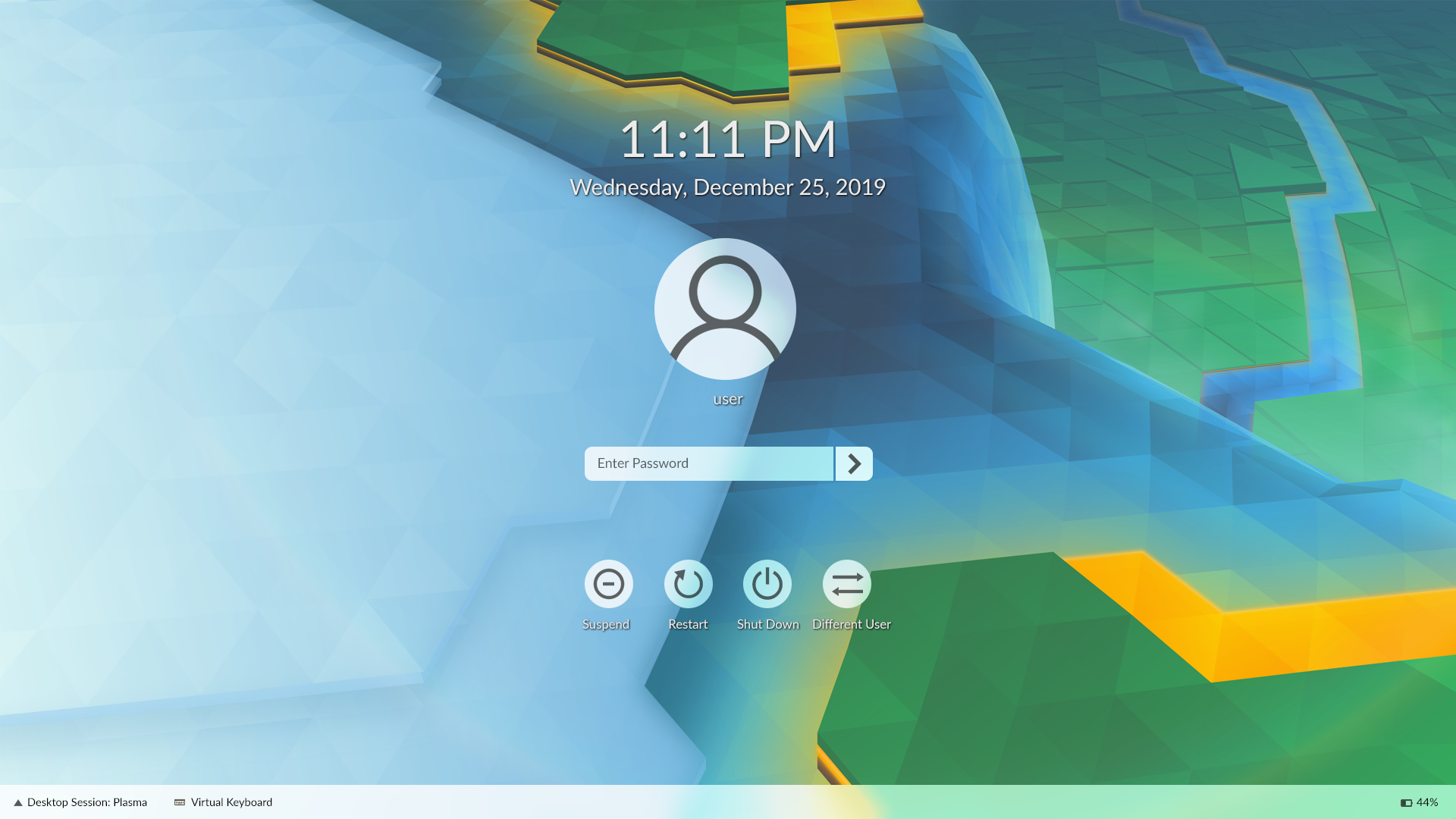
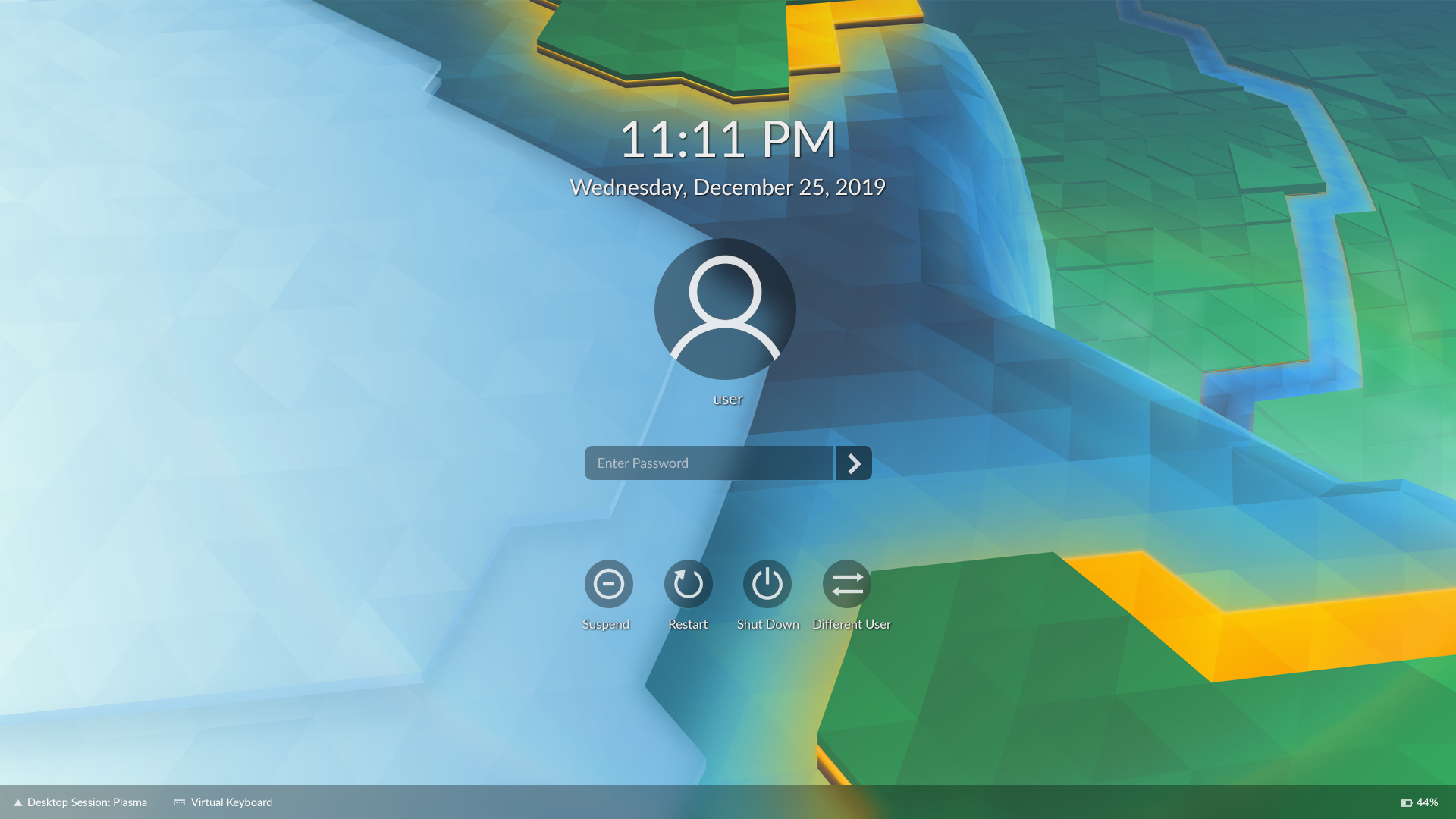
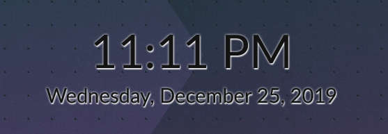
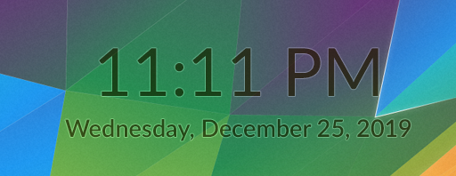
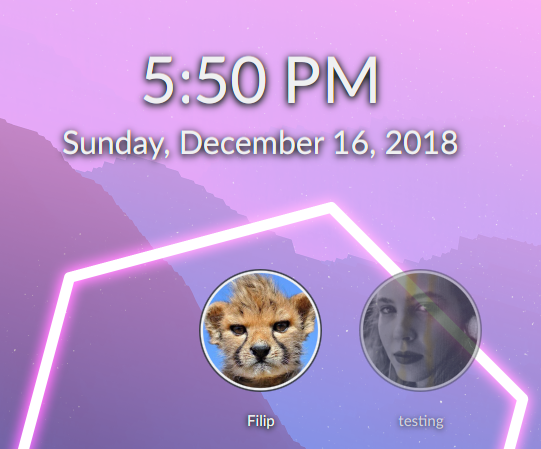
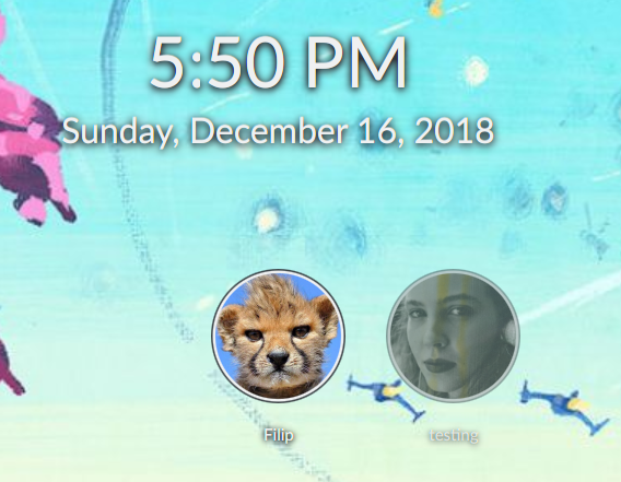
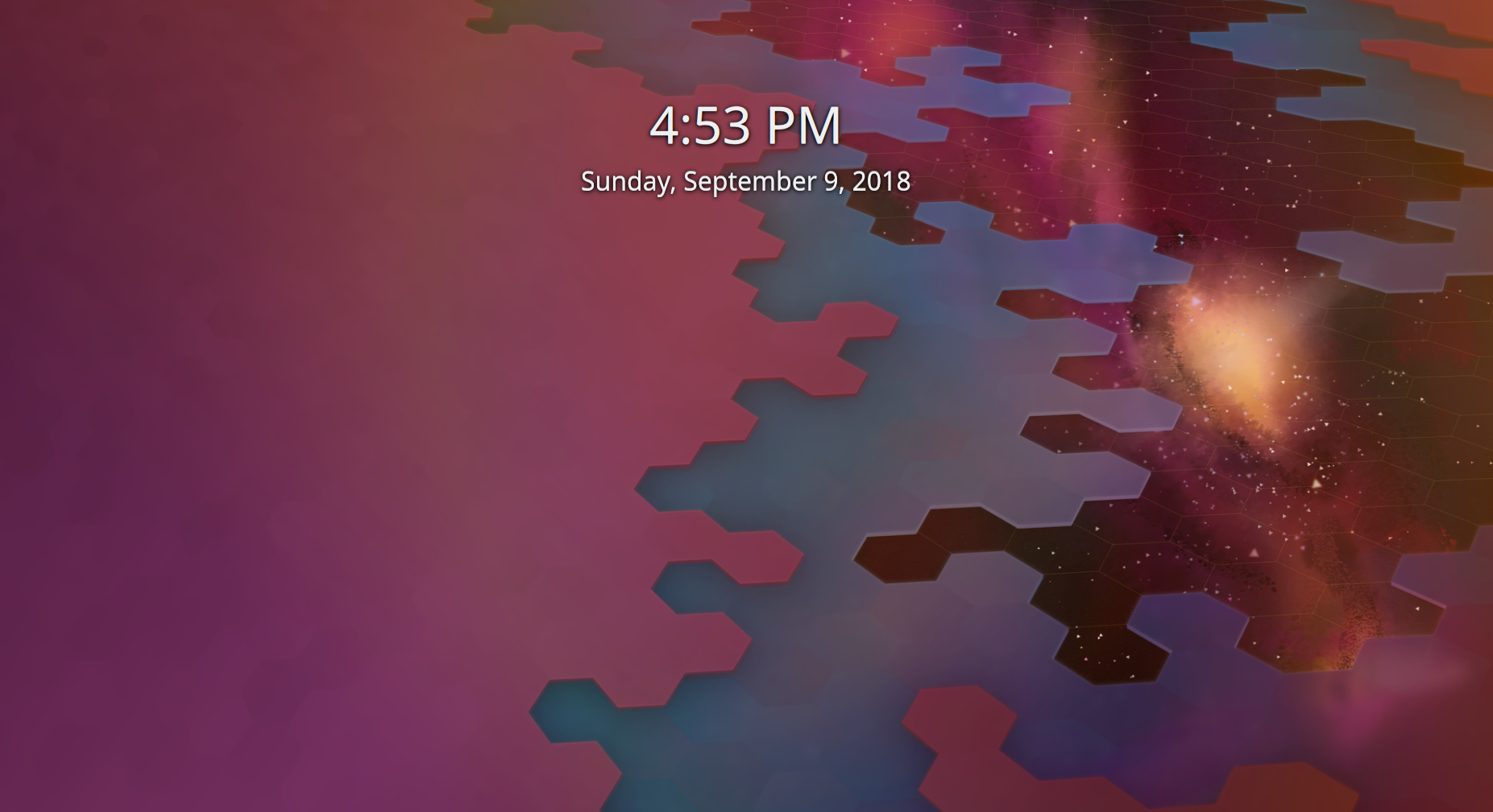
On the lock screen, the UI controls are not visible by default, so the blur only shows up in response to any user interaction. This means that the lock screen background is visible and pretty for a while.

Lock screen default view:

Lock screen view after any user interaction:

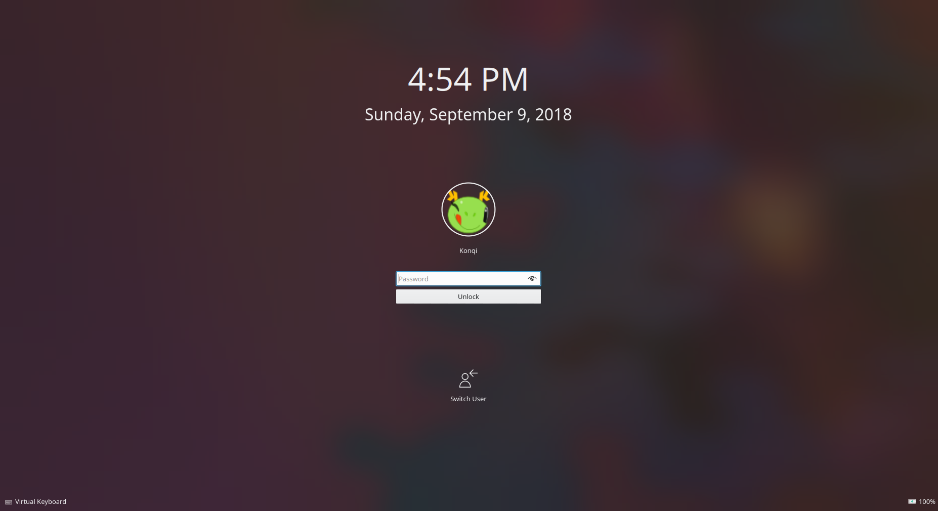
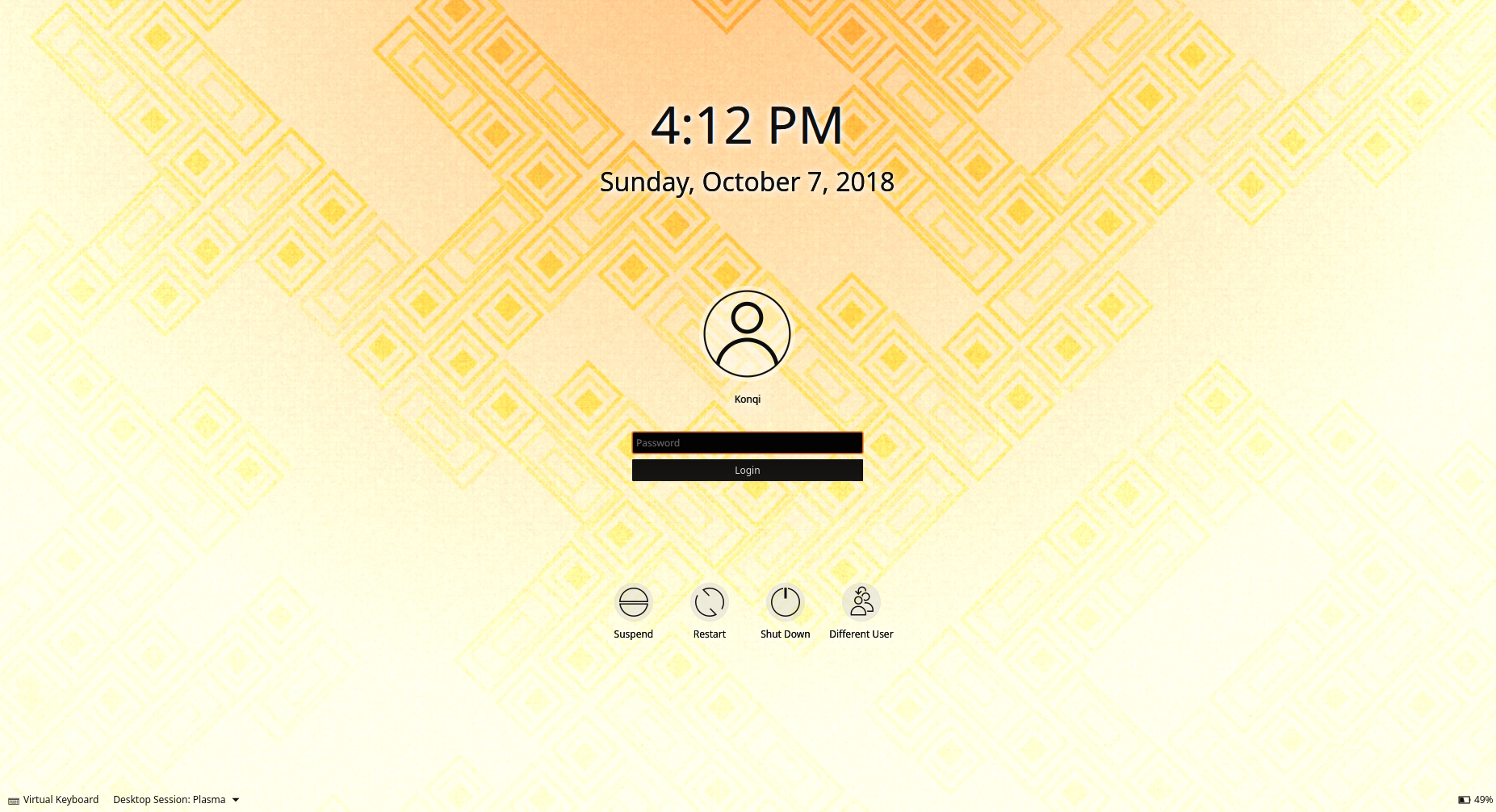
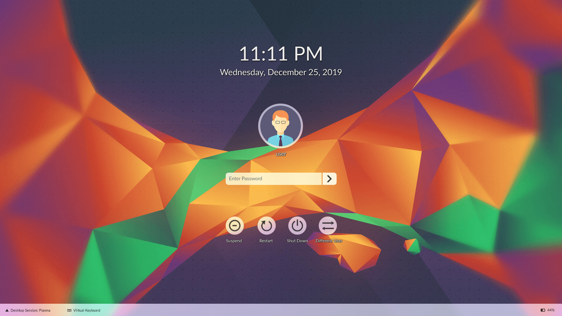
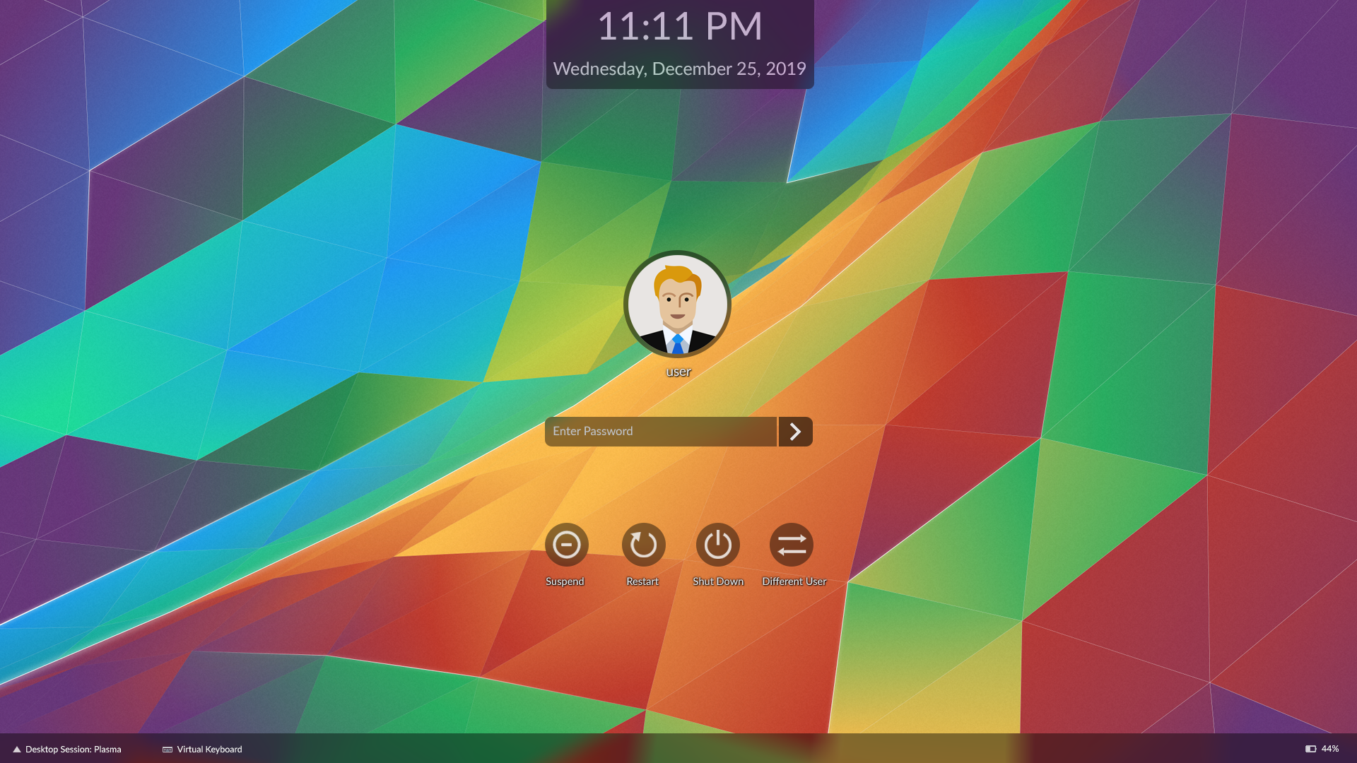
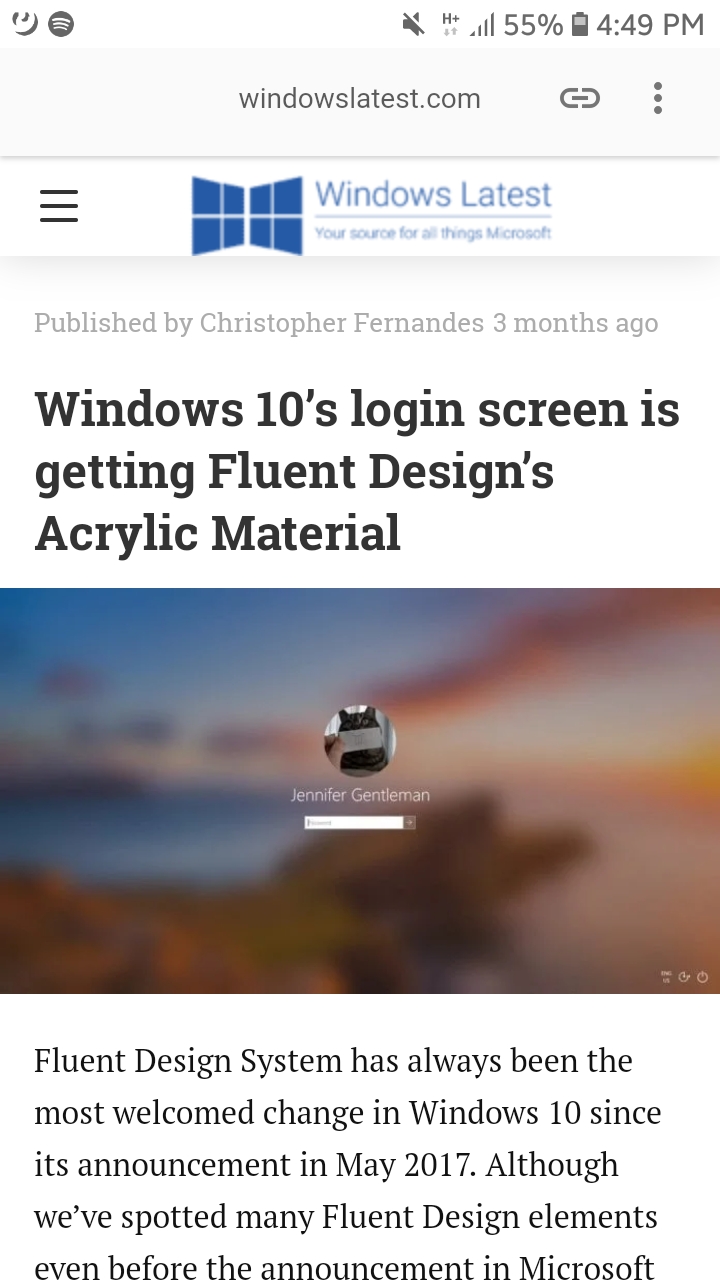
On the login screen, the controls are visible by default, so the blur is as well. This means that the background is pretty much always blurred and obscured. This isn't the most aesthetically pleasing state of affairs, and I've encountered a quite a bit of negative user feedback about it. I'll admit that I share some of it, because the 5.13 Breeze SDDM login screen theme was a bit of a regression for me given that the background I use didn't need to be darkened and blurred to ensure contrast for the UI elements.

SDDM Login screen view:

Let's brainstorm ways to improve this situation for the Breeze SDDM login screen theme. I'll throw some ideas out there:

  • Turn off blur-by-default and put a buttonlike background behind all the buttons and a shadow and/or outline behind the white text of the clock and usernames. See also T9444.
  • Turn off blur-by-default and put everything inside an opaque or semi-translucent windowlike frame, and redo the user switcher so that the user list always fits within the frame.
  • Other options?

If we make any of these changes, we could probably turn down the strength of the blur and darkening effects, too.

We should also consider whether or not to make the same changes for the lock screen theme to maintain visual consistency.

ngraham created this task.Sep 9 2018, 3:02 PM
abetts added a subscriber: abetts.Sep 9 2018, 3:17 PM

So is the transition into blur that received some of that feedback? Or the fact that we use a darkened background?

So is the transition into blur that received some of that feedback? Or the fact that we use a darkened background?

I don't think we can separate the blur from the darkening effect; they are part and parcel of the same thing in this context.

People seem happy enough with the transition into a darkened blur on the lock screen. It's the semi-permanent darkened blur on the login screen that some people (myself included) are dissatisfied with.

abetts added a comment.Sep 9 2018, 6:13 PM

I see, and the login screen doesn't have any kind of similar application like the lock screen? Can it be sharp image > input > transition to blur ?

I see, and the login screen doesn't have any kind of similar application like the lock screen? Can it be sharp image > input > transition to blur ?

If we emulate the Lock screen's UX and make the image un-blurred before user input and a transition, then the login screen won't have the user, password field, or buttons visible until there's some user interaction. We decided that this wasn't appropriate for the Login screen, and that we needed to have the UI elements visible by default. Hence, the login screen has a semi-permanent darkened blur over the background, which hasn't proved as popular as it is on the the lock screen where it only appears after a transition.

ngraham updated the task description. (Show Details)Sep 9 2018, 6:33 PM
ngraham updated the task description. (Show Details)
ngraham renamed this task from Rethink blur-by-default for Breeze SDDM theme for Plasma 5.15 to Rethink blur-by-default for Breeze SDDM login screen theme for Plasma 5.15.
ngraham updated the task description. (Show Details)
huftis added a subscriber: huftis.Sep 16 2018, 4:11 PM

Could the image be sharp "as sddm is loading" and turn blurry when the controls appear?

The loading time isn't actually that long though. And then once it does load (which might be in as fast as half a second), you lose the pretty background image. I'm not sure that will work.

I have a fairly trivial patch that removes the darkened blur and state change (which will also fix https://bugs.kde.org/show_bug.cgi?id=398115). As a result, the login screen looks fantastic again due to the gorgeous new 5.14 wallpaper used as the background image. But the real issue here is improving the contrast with everything else to avoid the issue that prompted us to add the darkened blur in the first place. T9444 will address the buttons on the bottom (as well as fix https://bugs.kde.org/show_bug.cgi?id=393048). After that, we would just need to add drop shadows to the remaining white text and the user avatars and I think we could consider the contrast problem solved.

Also of note: drop shadows don't appear when using software rendering (see https://bugs.kde.org/show_bug.cgi?id=398317). For that case, we should fall back to using plain outlines instead.

It seems we are limited by our tech here. I say, let's give the change a try and get feedback. But let's avoid bouncing between one or the other with every release. I know that there could be people in both sides of this idea, but part of being a good designer is sticking to your vision. There will always be people thinking that it is not the best approach, we can change, but when we change too much, it becomes unsustainable.

But let's avoid bouncing between one or the other with every release. I know that there could be people in both sides of this idea, but part of being a good designer is sticking to your vision. There will always be people thinking that it is not the best approach, we can change, but when we change too much, it becomes unsustainable.

I agree.

Thing is, I'm not sure always-blur-the-login-screen actually was our vision. If I recall, we all loved the state change and sharp-by-default-blur-when-the-controls-become-visible effect for the Lock screen, but were more ambivalent about always-blur-the-background effect for the Login screen (see D11928#241045). But we ran out of time to come up with something clever for 5.13 so we shipped it that way despite wanting something better. This is the discussion regarding something better. :)

I think the Lock screen is just about perfect, and I haven't heard any user complaints about it. All the complaints center on the login screen: people miss being able to see the pretty image used for the background because it's all blurry and dark right now.

Let's go for it then :)

I'm working on patches that:

  • Add shadows behind the buttons' text
  • Add a blurred circle background behind the buttons' icons when the icons themselves have a semi-transparent circular background
  • Remove the blur

I believe @pstefan is working on the new Plasma Breeze theme icons that would be compatible with the blurred circle effect, which has been designed to result in no changes when using icons that do not have a semi-transparent circle background.

Any update on the icon front, re: different background color? Right now my stylesheet class attribute in the icons is "ColorScheme-ViewBackground", which is a light color in the normal breeze color scheme. My thinking was that it would use the breeze dark color scheme on the login screen. Is that assumption correct or do I need to change that?

rooty added a subscriber: rooty.Oct 8 2018, 1:03 PM

I see, and the login screen doesn't have any kind of similar application like the lock screen? Can it be sharp image > input > transition to blur ?

If we emulate the Lock screen's UX and make the image un-blurred before user input and a transition, then the login screen won't have the user, password field, or buttons visible until there's some user interaction. We decided that this wasn't appropriate for the Login screen, and that we needed to have the UI elements visible by default. Hence, the login screen has a semi-permanent darkened blur over the background, which hasn't proved as popular as it is on the the lock screen where it only appears after a transition.

what about blur that's not darkened by default? too much glare?

rooty added a comment.Oct 8 2018, 1:07 PM

regarding D15999, it's less of a stopgap measure to deal with the icons and their thickness (they're too thin? especially compared to icons in other themes such as Adapta) and shadows (might require more contrast) than to add a semi-transparent background that makes them look 2D, as mentioned in D16031 by broulik

while i agree that the (current) blur requires rethinking and the contrast on the lettering does too, the icons might call for a different tack

RE: D16031 I think the background circle for the avatar should either be dropped or flush with the white border.

  • First, the white border is already that, a border. It's independent of the avatar used
  • It's a low information area. Even if the contrast with a particular background is bad, there is no important information in the picture that gets lost
  • A User might expect the transparent parts of their avatar to be shown as such, and not obstructed by another background.

For the fonts; They need to be much more close to the text they are protecting. The clock gets this right IMO. Especially on the last screenshot in D16031, the shadow behind the username looks like a cloud. Without knowing how it's done technically, I looks to me like it's just a diffuse oval. However, the shodow of the clock seems to actually follow the contour of the digits/characters. Maybe we can look into how they did that.

rooty added a comment.Oct 8 2018, 5:43 PM

@pstefan What's your opinion on the lock screen font shadows?

alexde added a subscriber: alexde.Oct 8 2018, 6:29 PM
filipf added a subscriber: filipf.EditedOct 8 2018, 9:21 PM

Okay so I suppose this is the place (as opposed to D16031 and D15999) to lay out all the summative thoughts after seeing the first implementation. I will break it down into elements:

Turning blur off

  • opinion: sorry @rooty but if users are complaining about wanting to see their wallpapers, it's preferable to have no blur by default because it is something added that you impose on someone's wallpaper; those who like it can use a forked 5.14 Breeze SDDM theme or the Chili theme.

New icons (circles)

  • suggestion: scale down the icon itself within the circle, a bit
  • a big aesthetic desire: make the Breeze desktop theme icons thicker
  • a mention: perhaps the circles do not need an extra border, no matter how faint it is

New SDDM theme modifications

  • suggestion: do not add any sort of background behind the user icon
  • suggestion: rethink the shadows behind the action buttons text
  • suggestion pending visual testing: add blur behind circles

The Logout screen

  • opinion: we should have automatic switching of icons -> white circles when using dark color schemes because the effect dims the screen (wheras with light schemes it brightens it)

For more on this (@pstefan), you can see an example solution for dark color schemes and the solution for light color schemes

Ruminations on SDDM theming

  • a very passionate opinion: It's not KDE per se, but SDDM is the most anti-KDE thing about KDE right now -> It's completely uncustomizable, even to the point of needing to add (!) code to change something as simple as the desired font
  • a shy suggestion for outlier cases: I realize there is no desire to address this, but what can at least be helpful is to provide a new Breeze Dark (?) variant in which all the elements are dark

Breaking it down to the simplest level:

State 1: a plain white background -> What do you want your SDDM theme to look like? = Pretty much that ALL your elements are black, including the circles.
State 2: a plain black background -> What do you want your SDDM theme to look like? = You want all the elements to be white, including the circles.

We currently do not offer this definitive solution for state 1 and are instead focusing on making a jack-of-all-trades one. To be sure, real life and wallpapers are more complex than these simple scenarios and usually black text looks ugly, however you do possibly address the most extreme of cases if you provide a new all-dark SDDM theme.

EDIT: Quick visual proof of the feasibility of a dark theme:

ngraham added a comment.EditedOct 9 2018, 6:45 PM

Re: full-screen blur
I'm not open to keeping it in any capacity for aesthetic and promo reasons. People (myself included) quite understandably want to be able to see the background image, not a smudgy version of it. This is the first thing you see after installing Plasma and booting up the computer, and it's important to make a great first impression here.

Re: heavier line weights for Breeze icons
I rather agree, but such a change would need to be done for all icons simultaneously to avoid the theme looking weird and inconsistent. Not a bad idea, but out of scope for this project.

Re: Scaling down the icons in the circles
No opinion; I will defer to @pstefan for that.

Re: Background circle on the avatar
Non-negotiable, or else the default icon disappears against many backgrounds. I will reduce the thickness of the border though to 1 or 2px; see D16031#339559

Re: More options needed for Breeze SDDM theme
Don't necessarily disagree, but I don't feel like fighting that battle. Would prefer to take the path of least resistance with this project. I do think it would be feasible for the text and icons' colors to follow the active theme though. It's a bit odd how the text field and Login button switch their coloration dynamically in response to this, but the other elements do not.

filipf added a comment.Oct 9 2018, 9:46 PM

Thanks for the reply, Nate, and sorry if I've digressed too much during the course of this whole topic - my mind gets racy when I see things that can potentially be changed and then I want to type it all out.

What I added about the thickness of Breeze monochrome icons and improving the customizability of SDDM is just something to consider in the future maybe, right now what's important is to turn off blur for 5.15 and provide a visual solution that will satisfy most users. I think you're pretty close.

ngraham moved this task from To Do to Work in Progress on the Plasma board.Oct 11 2018, 11:02 PM

Will we ever be able to land this? :D

Probably soon-ish I hope! D16031 is ready for review again.

Probably soon-ish I hope! D16031 is ready for review again.

Yay!

filipf added a comment.EditedDec 5 2018, 7:05 PM

If a lot of things were possible, this is how I'd do the SDDM theme design.

I'd first split everything into a Breeze Dark and Breeze theme, then modernize the input box, utilize transparency and add blur behind it.

EDIT: Tested with the vilest of backgrounds.

rooty added a comment.Dec 5 2018, 7:12 PM

fancy, i like it, i'd maybe make the user picture a lil smaller, and maybe more shadowing on the clock but i have to admit this is really nice (and no blur either)

alexde added a comment.EditedDec 5 2018, 9:40 PM

If a lot of things were possible, this is how I'd do the SDDM theme design.

That looks indeed pretty fancy and way more modern than the old design! Do you mind to post a mockup with e. g. music controls, too?

If a lot of things were possible, this is how I'd do the SDDM theme design.

That looks indeed pretty fancy and way more modern than the old design! Do you mind to post a mockup with e. g. music controls, too?

Thanks! I'd have to fiddle with the login screen for that, which would be even more controversial :P ... but I might try playing with it.

In the meantime I've touched up version 1.

@filipf That looks awesome!
One question though: should the clock text change color with the theme?
It looks a bit odd with the white clock in your proposed dark theme

This comment was removed by raddison.
filipf added a comment.Dec 6 2018, 1:13 PM

@filipf That looks awesome!
One question though: should the clock text change color with the theme?
It looks a bit odd with the white clock in your proposed dark theme

Yeah it bothers me as well. The problem with black text is that it often doesn't offer satisfactory legibility:

You can't add shadows so you're adding glow, which looks tacky:

Alternatively the clock could be dropped from the top and text color muted a bit, but it looks awkward to me:

If you don't care about the clock being so big, you can just circumvent the problem by placing it in the panel:

alexde added a comment.Dec 6 2018, 1:44 PM

Yeah it bothers me as well. The problem with black text is that it often doesn't offer satisfactory legibility:

What about a solid white outline around the black text instead of the fuzzy one? That'd would be just the opposite of white text with the black outline you already posted in your earlier mockups.
Alternatively, instead of coloring the text completely black, you may give it light transparent glassy look like the one you chose for the input field.

filipf added a comment.Dec 6 2018, 4:34 PM

Yeah it bothers me as well. The problem with black text is that it often doesn't offer satisfactory legibility:

What about a solid white outline around the black text instead of the fuzzy one? That'd would be just the opposite of white text with the black outline you already posted in your earlier mockups.
Alternatively, instead of coloring the text completely black, you may give it light transparent glassy look like the one you chose for the input field.

What I did with the white clock was actually mix a drop shadow and outer shadow. If you invert the image, it becomes obvious:

We couldn't use something like that. So what about trying out a subtle outline?

Doesn't look too bad, but it has to be tested with the monstrosity that is the following wallpaper:

Legibility is not great. Let's try blurring behind the text, with the range increasing two pixels outwards:

Legibility is improved. Going back to a normal wallpaper the same method yields:

So bottom line is it could be possible to have dark clock text, it's just a very fickle task.

@filipf I think it looks great but the input box is breaking the guidelines. https://hig.kde.org/style/color/index.html

Fortunately, we've got the perfect solution for the problem that never existed.

I gotta say, these ideas are super sexy! I would not at all mind doing this. However since they all require removing the blur, maybe we should focus on getting that done first.

But if you wanted to submit a patche to make it look like this--even one that replaces mine (D16031), please go ahead!

filipf added a comment.Dec 7 2018, 3:54 PM

Thanks!

Oh no, I just wanted to play around with how far we can take the blurless design :D. I think the mockups serve to show aesthetic promise, how much we can juice out of a non-blurred theme.

Implementing these ideas in their entirety at this point would be a total mess - I broke HiG when it comes to icons, input fields and probably something else. It would also take work to figure out blurring, as well as splitting up the themes into a dark and light variant without adding maintenance cost.

But right now a good deal of things are already getting implemented: blur being turned off, a panel, circular icons, circle behind avatar. IMO that's a nice platform to gradually build on.

My objective is a win-win situation not a win-loose situation. I don't want either of the parties end up frustrated. I favor mitigation over exclusion. The thing is all desktops that are popular and/or have a significant market share use blur at login one way or the other. Would it be possible for those who favor full-screen blur to easily tweak their login (say via a third-party theme), should the proposed login pass?

My objective is a win-win situation not a win-loose situation. I don't want either of the parties end up frustrated. I favor mitigation over exclusion. The thing is all desktops that are popular and/or have a significant market share use blur at login one way or the other. Would it be possible for those who favor full-screen blur to easily tweak their login (say via a third-party theme), should the proposed login pass?

Yes, the login screen is themable, and there are already a number of attractive high-blur themes available.

I'm aware of several although I never tried any one of them. If they will work with what you're trying to implement, then I don't want to stand in the way of anyone's happiness. I continue to think that blur + a tint of dark is overall better both aesthetically and functionally (and I'm sure many others think the same) but I don't want to antagonize anymore because it's not worth it. I'd rather want all of us happy.

If they will work with what you're trying to implement,

What I'm trying to implement is a change to the default Breeze theme. It doesn't impact other themes in any way.

If they will work with what you're trying to implement,

What I'm trying to implement is a change to the default Breeze theme. It doesn't impact other themes in any way.

Okay then. I wish you to succeed.

... those who like it can use a forked 5.14 Breeze SDDM theme or the Chili theme.

@filipf Chili is fairly easy to install. What would be the ideal "step-by-step" way to create and install "a forked 5.14 Breeze SDDM theme"? This is not an attempt at fragmentation but an attempt at keeping all users happy.

filipf added a comment.Dec 8 2018, 4:30 PM

... those who like it can use a forked 5.14 Breeze SDDM theme or the Chili theme.

@filipf Chili is fairly easy to install. What would be the ideal "step-by-step" way to create and install "a forked 5.14 Breeze SDDM theme"? This is not an attempt at fragmentation but an attempt at keeping all users happy.

Chilli is on the KDE Store right? Any one of us can go to /usr/share/sddm/themes now , copy the Breeze folder, zip it up and post it on the KDE Store.

@filipf Indeed. Thanks! @ngraham Clear sailing ahead!

This is not an attempt at fragmentation but an attempt at keeping all users happy.

Use of the store is good.

My more general goals are towards keeping Plasma much smaller, more stable, and encourage any overkill settings or any design experimentation there.


On a technical note:
I do want SDDM to support plasma wallpapers (there's some semantics that make that technically ... interesting, but it's not impossible)

I don't really like how the old blur was done, being directly in the login screen, I would much rather have seen it added as a wallpaper type.
That way in system settings -> screen locker -> background you would see wallpaper type: colour / image / blurred image / whatever and there'd be a way to turn it off without cluttering the config UI.

... those who like it can use a forked 5.14 Breeze SDDM theme or the Chili theme.

@filipf Chili is fairly easy to install. What would be the ideal "step-by-step" way to create and install "a forked 5.14 Breeze SDDM theme"? This is not an attempt at fragmentation but an attempt at keeping all users happy.

I've added a fork of the 5.14 theme to the KDE Store: https://www.opendesktop.org/p/1279433/

Since the lack of SDDM customization is my pet peeve, I've added various configuration options to theme.conf. Let me know (on GitHub) if you run into some problems/discrepancies.

On a technical note:
I do want SDDM to support plasma wallpapers (there's some semantics that make that technically ... interesting, but it's not impossible)

I don't really like how the old blur was done, being directly in the login screen, I would much rather have seen it added as a wallpaper type.
That way in system settings -> screen locker -> background you would see wallpaper type: colour / image / blurred image / whatever and there'd be a way to turn it off without cluttering the config UI.

Agreed.

rooty added a comment.EditedDec 11 2018, 3:21 PM

That way in system settings -> screen locker -> background you would see wallpaper type: colour / image / blurred image / whatever and there'd be a way to turn it off without cluttering the config UI.

Agreed.

Good idea! Would you prefer to have the settings store a blurred variant of the image (so the login screen wouldn't have to render the blur)?

Would you prefer to have the settings store a blurred variant of the image (so the login screen wouldn't have to render the

I think on the fly is fine, that way changing the image still works

rooty added a comment.Dec 11 2018, 3:45 PM

A blur like WallpaperFader with a timeout or more of a constant blur effect?

I wanted to test if it would be technically possible to have a single flip switch solution for alternating between a blurred and blurless design. The answer is yes, provided we say it's okay to let QML draw the circles behind icons.

rooty added a comment.Dec 13 2018, 3:54 PM

well well well

After doing extensive experiments of my own with the theme, I've changed my mind on this topic. It's just such an uphill battle constantly having to add and adjust elements and shadows. It has also occurred to me that a login manager is a distinctly utilitarian piece of software used only for a brief time. Therefore the argument of preserving the user's wallpaper no longer seems particularly important to me; SDDM is not the place for wallpaper gazing. For those that have this need (and we have indeed not been provided with any verification of user dissatisfaction with the current solution), a KDE Store blurless version can be made... or even shipped alongside the default one\implemented as a flip switch. There are only rare cases when blurred wallpapers will not provide better overall legibility than non-blurred ones. And the goal of the login manager and something upstream must ensure is to have zero legibility issues. We are never going to be able to guarantee this in 100% of the cases with a blurless design or without resorting to drawing prominent shapes over the wallpaper. That being said the theme should still look nice and the current settings are a bit of an overkill.

What we do to the wallpaper:

What Windows does to the wallpaper:

rooty added a comment.Dec 14 2018, 4:07 PM

+1

i don't think it's possible to find settings, especially font and/or shadow settings that will enable every single wallpaper to be visible without a few of the wallpapers messing up the lettering

accommodating these outliers however, will make the lettering overly saturated... the blur / frosted glass effect takes care of that without ruining the wallpaper (too much). in addition, the frosted glass also serves as a kind of padlock, disappearing the moment you log in. i would very much prefer to keep the frosted glass effect (make it a lot less saturated though, more windows-like, fastblur like) and have an option to turn it off (much like the latest windows builds do)

so yeah... both blur and no blur imo
just without trying too hard to accommodate wallpapers that will ruin it for the rest of them

rooty added a comment.Dec 14 2018, 4:14 PM

p.s. I think @ngraham's idea to modify the fonts (well, shadows) is also going to work with a milder type of frosted glass, so we don't have to transition from no shadows to shadows in between changing the theme from blurry to blurless (dunno if that's a word tho :D)

@rooty you can work something out with action button labels, but the Achilles heel of D16031 and the straw that broke the camel's back for me (= made me go back to advocating blur) was poor legibility of the unselected user's avatar and label.

Busy wallpapers interfere with the avatar:

And light wallpapers make the label barely visible:

ngraham closed this task as Wontfix.Jan 13 2019, 10:57 PM

Not doing this; see D16031#392692.