This shook out of the discussion in D25773, and has also been previously discussed in https://bugs.kde.org/show_bug.cgi?id=399972.
In essence, I would like to consider the possibility of using a vertical Icons-Only Task Manager pre-populated with some apps by default, on a thickened panel. There are a variety of reasons why I think this change would be worthwhile and represents a better default:
- Better for launching apps: An IOTM is first and foremost an app launcher. You pin apps to it and then launch them. The TTM can be configured this way, but it's more awkward since the launchers jump around as apps are opened. Given that launching apps is how the user begins the process of interacting with the computer, it makes sense to put app launching front-and-center and make it as discoverable as possible by pinning some commonly-used apps to it by default (e.g. System Settings, default filemanager, default web browser), as all other platforms do.
- Better accommodates the user's mental model and interaction pattern: IOTMs organize tasks on the basis of apps, not windows. I think this maps better to the way most users perceive how their computers work: they open apps to perform tasks. The fact that apps open windows is incidental, and these days with window tabbing, most apps are single-window affairs anyway. The advantage that a TTM has in presenting tasks as windows rather than apps recedes over time as common workflows converge on the use of multiple apps each opening a single window.
- Able to better accommodate touch use cases: IOTMs require a thickened panel to make sense, or else the click targets become much too small. But if we do thicken the panel and use an IOTM, then each task becomes a large square, making a perfect touch target--much more touch-friendly than the small rectangular TTM buttons of the current default thin panel. It would therefore better support touch interaction for convertibles and tablets without needing to change the UI at all.
- Save precious vertical screen space: If we thicken the panel, then we're using up even more of the screen's vertical space, which is quite previous for the typical 16:9 displays of today's computers. However we can take the opportunity to move the panel to the left screen edge, like the old Unity layout. This would represent a net decrease in vertical screen space usage, leaving more room for content in most apps. This is even more effective with today's ultra-widescreen displays that people are starting to use; a horizontal panel wastes a ton of space on these screens. This part of the proposal is not required, but I think it would be a nice-to-have.
- More visually attractive: IOTMs, expecially with double-thickness panels, are attractive because they showcase large versions of pretty app icons. They're just plain nice to look at.
- Bandwagon/user familiarity: every other major OS ships the local equivalent of an IOTM, Including Windows (since 7), macOS, ChromeOS, Android, iOS, Ubuntu's GNOME, and formerly Ubuntu's Unity. Using an IOTM would also improve consistency with Plasma Mobile, which uses the local equivalent of an IOTM. The last major proprietary OS to ship a TTM was Windows Vista, more than 10 years ago, and the only major FOSS OS I know of that still ships with a TTM is RHEL. Other FOSS OS IOTM users are MX Linux, Linux Mint, ElementaryOS, Deepin, and Solus. I would therefore argue that most users are already accustomed to IOTMs at this point, and they're not unfamiliar, weird, or a big usability regression.
I kept noticing people using this setup, and started using it myself a while back and really like it, for all the reasons mentioned above. Notably, in my guerilla usability testing (T10047), the very first thing my test subject tried to do was switch to a vertical left screen edge IOTM.
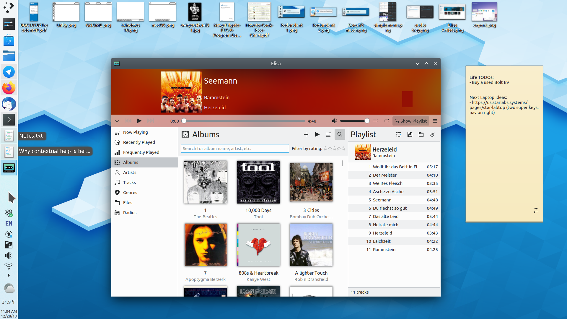
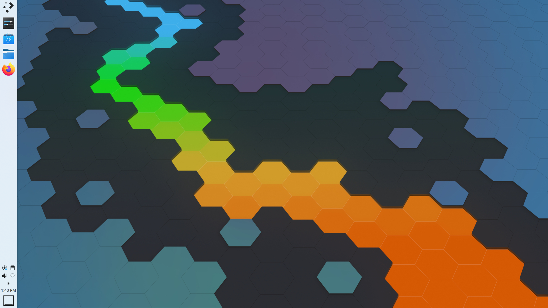
Here's how it looks on my system:

This would be a big change. If we did it, I would want to wait until after Plasma 5.18 branches so we can try it out in a non-LTS release.