RFC: Make Breeze Dark darker
AbandonedPublic

Authored by filipf on Sep 16 2019, 9:54 PM.

Details

Summary

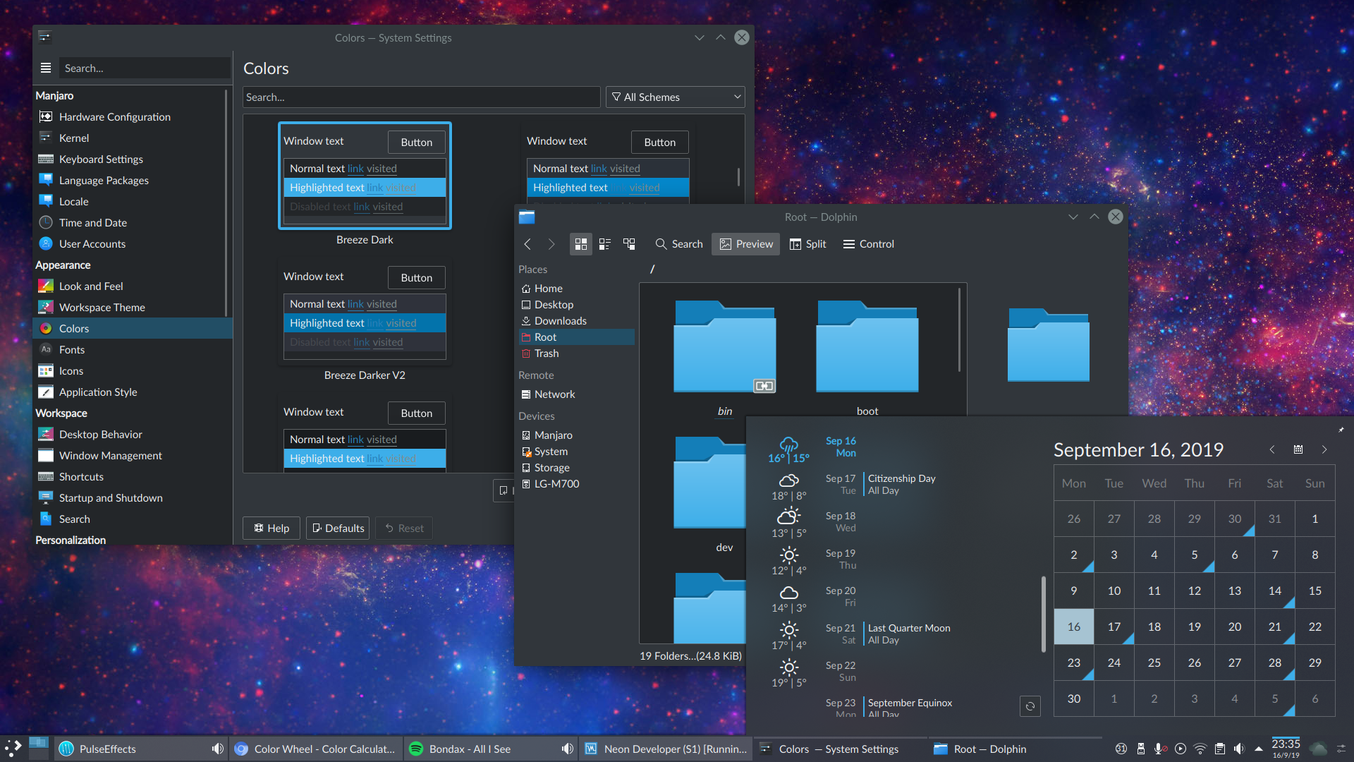
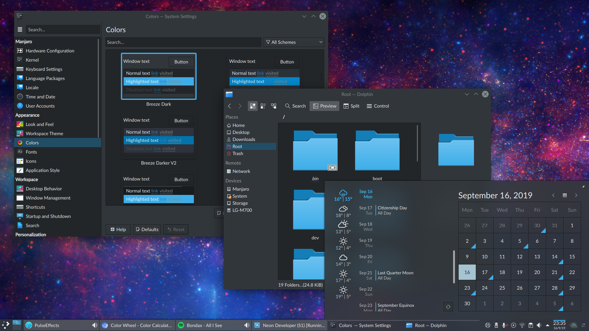
Discussions in VDG and in Phabricator tasks have been hinting at the conclusion that our dark theme is fairly light and might stand to become more attractive by being made somewhat darker.

At this point the patch is just meant to encourage discussion. A proper overhaul requires changes in other places too.

Test Plan

Before:

After:

Diff Detail

Repository
R31 Breeze
Branch
darker-breeze-dark (branched from master)
Lint
No Linters Available
Unit
No Unit Test Coverage
Build Status
Buildable 16660
Build 16678: arc lint + arc unit
filipf created this revision.Sep 16 2019, 9:54 PM
Restricted Application added a project: Plasma. · View Herald TranscriptSep 16 2019, 9:54 PM
Restricted Application added a subscriber: plasma-devel. · View Herald Transcript
filipf requested review of this revision.Sep 16 2019, 9:54 PM
filipf edited the test plan for this revision. (Show Details)Sep 16 2019, 9:55 PM
filipf added reviewers: cblack, ndavis, VDG, ngraham, Plasma.

Looks like an improvement to me.

+1

I'm using it from 5.1 and it's great because it's not so dark, -1 from me.

filipf abandoned this revision.Oct 20 2019, 6:06 PM

Gonna leave all color scheme updates to @ndavis and @cblack who have been working on a new palette for Breeze etc.

onvitaik added a subscriber: onvitaik.EditedFeb 23 2020, 9:19 PM

I'm incredibly late, but the problem, as I see it, with it looking "fairly light" is that all the button and frame borders are lighter than the background and almost as light as the text. These color changes just exacerbate this issue.

So I'm not a fan of this.

On that note, light borders on dark buttons makes no sense if you think of buttons like the keys on your keyboard. It makes the button look like it's sunk, and the borders take your focus nearly as much as the text does. Right now, it's almost like there are a bunch of neon signs all over the place. With darker borders and frames, it looks much less painful to the eyes:

@onvitaik I completely agree. You're gonna have to convince @ndavis and @filipf who prefer light outlines and separators though. :)

ndavis added a comment.EditedFeb 24 2020, 2:14 AM

The problem with having dark separators is that they disappear if you also make the background pretty dark. That isn't an unreasonable thing for a user to want to do. It's also arguable that it isn't unreasonable for a user to want dark separators, so they could be an option, but last time I tried that for colorschemes, it didn't get a lot of support (D25814). It could be an option in the Breeze widget style settings, but I really don't want to start stuffing options in obscure places...

I think these 4 colors could be used for backgrounds in Breeze Dark:

#1b1e20
#232629
#2a2e32
#31363b

Coincidentally, these colors are very close in lightness to the colors used by VS Code (#1e1e1e, #252526, #2d2d2d, #333333)

If adding a color for the separators isn't an option, and adding an option isn't an option (heh), then could we add a simple algorithm to switch to light separators if the background color is set to a sufficiently dark color?

Also is there a better place to discuss this? A Phab task maybe?