User Details
- User Since
- May 26 2016, 9:38 PM (471 w, 2 d)
- Availability
- Available
Jun 24 2022
Example plasma
- dynamic color scheme depend on day/night times
- mouse recorder to automatically do tasks
- offer user automatic support for there workflow like useful widgets
- dynamic layouts depend on the screen sizes
- better accessibility for impaired people
example PDF Viewer/Editor
- add editor functions like merge, insert, delete, ... Pages
- add editor functions like add text boxes, shales, ...
- check what popular pdf editors have and add cool features
- show pdf diffs
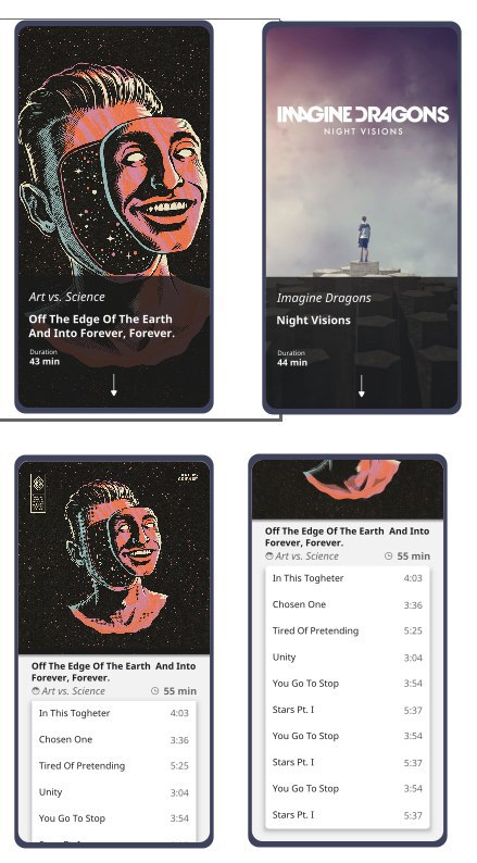
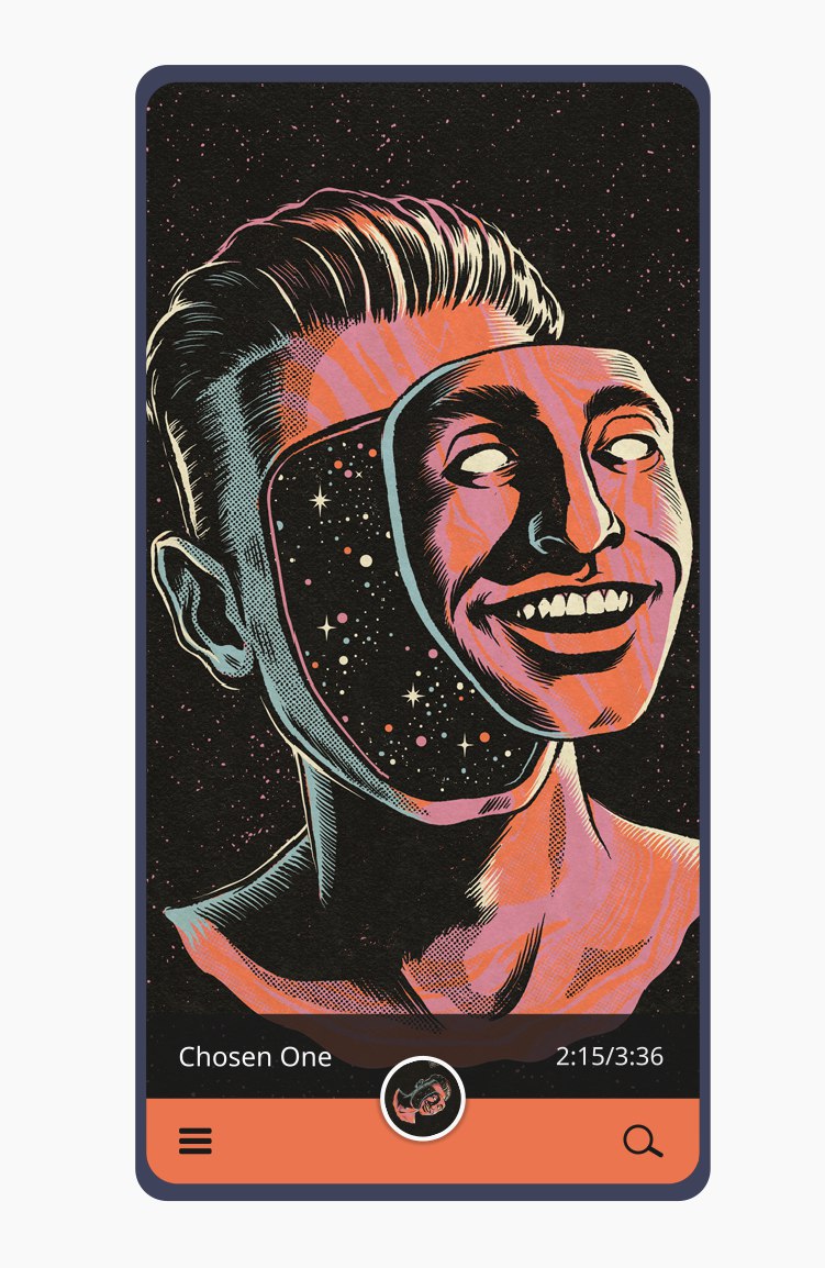
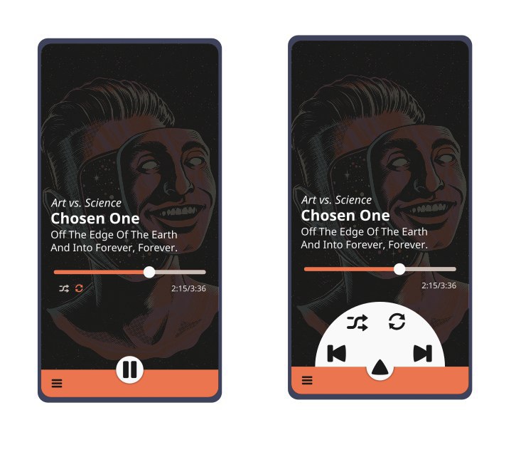
example music player
- show relevant music tracks to each track like YouTube did
- no difference between online and offline music
- no difference between your music and music from a linked friend
- ability to download online music when possible
- automatic tagging
- similar music and playlists
- check features from popular music apps
- example terminal
Oct 28 2021
places folders with the colors from the mimetypes.
about the options idea
- Hide folder crease -> can be done with an separate breeze icon theme where you have the folders with creases. Everything else wasn't needed cause the fallback is breeze
- Standard folders use your accent colour -> no real issue cause the standard accent colour is the colour the folders use by default
- places folders use different colours -> we already have this eg. for desktop, encrypt, as I'd like to implement more specific places folders see https://bugs.kde.org/show_bug.cgi?id=443288
- places folders use different colours -> mimetype icons use also different colors to separate them easier
when you use the plasma accent color you have at the end folders in blue, green, ...
About colored folders I'm thinking on something like this. I know we can theme all the icons but have all folder's blue / pink / gray / ... is "cool" but from recognizion point of view different colors for different folders would be a recognizion benefit.
A screenshot from index at the Maui framework. Done by Uri and his team.
The benefit would be that dolphin didn't look that blueish.
What I like is the use of colors for specific stuff. Like windows and als uri (at maui apps) did with image and audio folders.
About the crease how would the folder icon look like with thumb previews? Cause at Music folder it didn't look like a benefit to have the crease.
Oct 27 2021
I don't like the folder icon with this bottom horizontal element. Sorry but I don't know what it should mean.
About shadows: Our icon's are VERY complex with the colorScheme stuff, ... so if we can live without shadows, go for it. We have to think also for contributors how will submit an icon and not the 1.000 breeze icon.
About monochrome icons we use now 1px line icons if you have a look at gnome and I think also other icon themes, and also at the proposal the symbols on the folders aren't 1px thin lines. As it's way easier to visible, I would prefer to go that way, but than we have to update ALL action icons (which is ok for me)
I don't like the oxygen like folder layout. cause I don't know what the horizontal element at the bottom of the folders is for.
Nov 10 2020
If wanted I can offer the collibre icon theme which was designed for LibreOffice on Windows 10. Collibre icon theme use the icon guidelines from MS so it would fit perfect into windows 10.
I use Dolphin since a while and the biggest problem was that move to trash didn't work.
Jun 25 2020
I never know where I can change opacity. Is it an effect, or in the plasma setting, ...
Don't forget about gif and other related stuff. For me it's more an activate content thing more than don't related.
Jun 21 2020
in the LibreOffice theme we have done icon themes depend on the desktop environment. So there is breeze for kde desktop, elementary for gtk, Colibre for windows and Sukapura for macOS
I use Dolphin from the binary factory. I can test dolphin builds if needed.
Feb 11 2020
Instead of use something from the internet I would suggest to use images/drawings from other KDE/OpenSource projects like
Jun 29 2019
when I have an look at system settings sidebar I have to ask to move the hamburger menu on bottom of the sidebar (with label) and on top only the search.
May 20 2019
where can I get this nice looking checkboxes in svg?
May 6 2019
What I also like is to use for the summary page qml/kirigami, cause for some tasks I learn from my phone that the phone UI is better than the desktop UI. eg. for delete and archive spam mails. So the summary page can give the user the option to have something like an mobile UI, or something like googles inbox. But in the different apps you have the full featured kontact suite.
Mar 31 2019
I had choose also an tooltip like most other apps do and there it work very well.
Mar 6 2019
I have three toppics for this kcm
- Default Leave Option is an subitem of Offer shutdown options

- the shutdown time is 30 seconds (from my point of view 10 seconds to give the user the option to cancel shutdown should be enough) so maybe an option for the time. I already have an old bug report and Thomas say also that 30 seconds is to long.
- End current session isn't my prefered default setting. I'm for Turn off computer (but this is subjectiv and the only rational reason can be energy saving.
Mar 5 2019
Feb 13 2019
Instead of the line connections you see points on the world map the points can be eg. linux users, kde contributors, ...
with the world map as background cause KDE connect the world
Kati and Konqi chat and there are hundreds of other connections, the lines can also get some 3d effect, ...
Second option would be to use the konquies https://www.kde.org/stuff/clipart.php
Have slice of the different wallpapers can look a bit confuse, so I would prefer the default wallpaper
as the landing page is similar to https://riot.im/develop/#/login the easiest would be to use the default plasma wallpaper and instead of the riot logo the kde (the blue one that is linked here) logo.
In reddit the last plasma wallpaper was used and as the channel is called kde the kde icon was shown. So at least the kde image should be there instead of plasma.
Jan 15 2019
Jan 5 2019
Nov 19 2018
Thanks for the update, I will work with the new colors also in LibO. We have there an issue on OS-X cause the contrast was not good enough and the new darker color will give an better contrast.
Nov 7 2018
I would suggest to have by default detail view instead of icon view cause with detail view it's easier to read the paths.
Oct 22 2018
I would choose no images and something that has a better contrast.
Oct 21 2018
as the avatars in sddm and logout screen are bigger than in the past you can use also the origin konquies maybe. I'm thinking on the music konqui, hardware konqui, ... which could be also usefull for activities.
As nowadays avatars or user mascots are circled I would prefer to have a second circled not flat section.
Sep 4 2018
designed from @delsarto
Mobile
- swipe from bottom border up will "zoom" out of the view
- pix: show selected images and image collection
- todo app: show the other todo's
- index: show selected items
- vvave: show current playlist

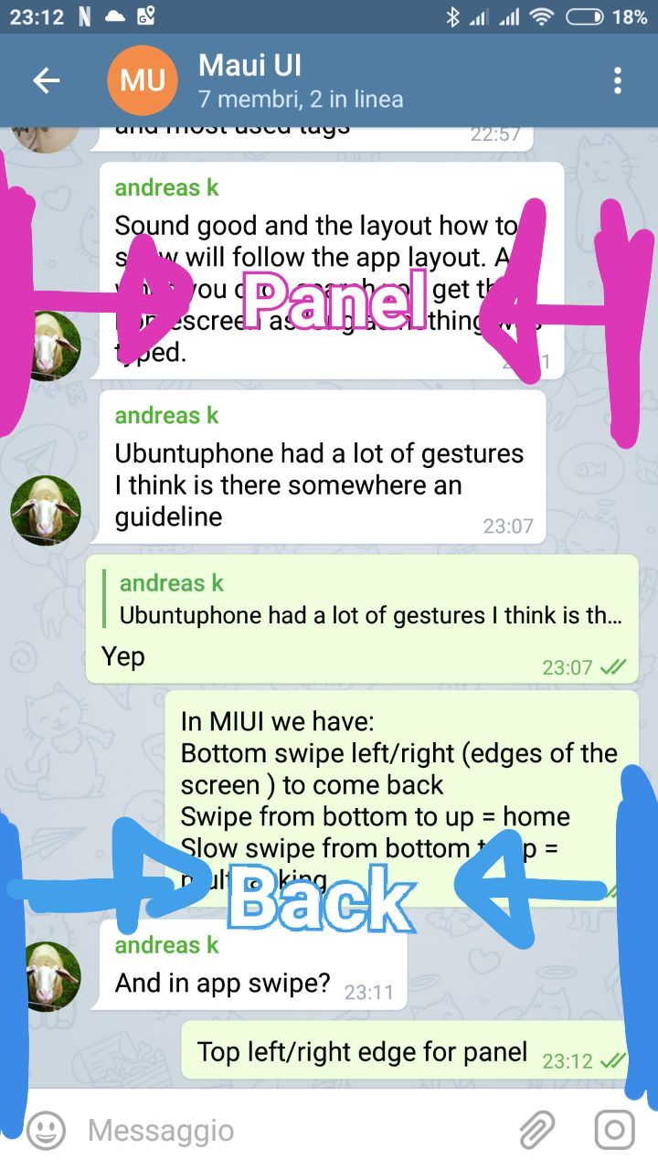
Mobile
- swipe left and right from the border (on the top halfe of the screen) show panels
- left right inside the application is previous and next
Desktop
- left / right key on the keyboard is previous and next
Sep 3 2018

windows 10 file explorer show frequently used folders and recent files. Would work perfect for index.

inspired from netflix where you discover your "collection" with suggestions from the app not with filter set by the user.
mobile
- long click on an icon / preview and you will change to select mode (add stuff to the selection bar)
- long click on the label will show you right mouse click context menu.
top:
- large preview with title
- swipe on the large preview you can "navigate" to the previous or next item (from a folder, from whatever you are)
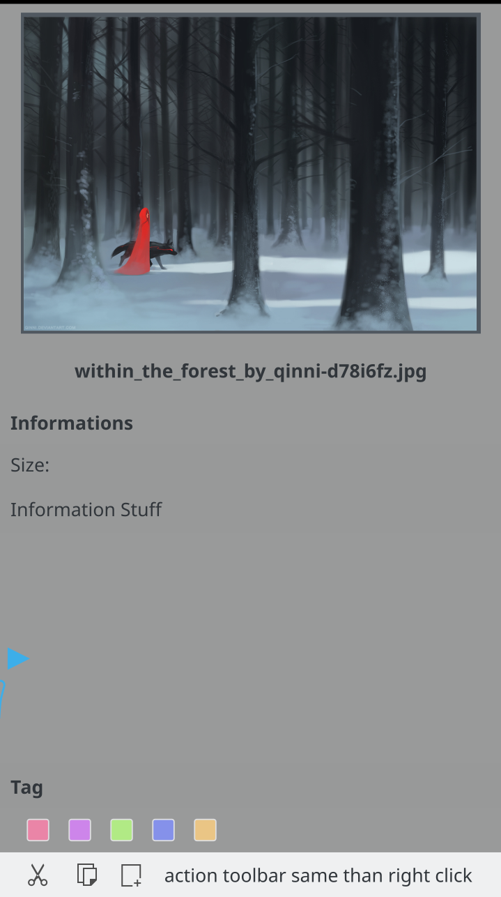
center:
- all kind of informations
- you can edit inline
bottom:
- color labels
- action toolbar
- same than right (long) click on the element
swipe behaviour
swipe on top halfe of the screen from the borders will show panel(s)

on top you have an < arrow to switch between icon only and icon + label view
Toolbars:
- action toolbar
- information toolbar
- footbar
Aug 2 2018
Aug 1 2018
First simple than sidebar with filter to folders if someone don't use folder, no problem, than the sidebar is nearly empty. 3rd step can be some intelligence.
Jul 3 2018
bottom to the image there is enough space for a "edit toolbar".
Jun 19 2018
my proposal is a bit away from search cause my DE should support ME and give me useful results first and if they are not useful for me I have to search. Plasma should think for me not I should think for plasma.
This is what I'm thinking when we talk about Document integration into Application menu.
Jun 16 2018
Jun 10 2018
May 28 2018
May 25 2018
May 21 2018
that one is really good and useable in different sizes.
May 20 2018
If you need icons let me know
Hi very good job,
May 11 2018
oh cool I would like to see a annotation toolbar in okular.
May 2 2018
Apr 29 2018
Thanks for the commit.
Apr 27 2018
Apr 25 2018
Apr 4 2018
Apr 3 2018
Apr 2 2018
and arrange the buttons always the same
Mar 28 2018
sorry for the late approve.
Mar 27 2018
nice I would add the heart somewhere as brand.
I miss the hearth

Mar 25 2018
Mar 16 2018
look good to me thanks