This is an investigation / staging area for a potential "Blue Ocean" icons refresh.
Summary
Over the lifetime of Plasma 5 we've had updates to the Breeze widget style, added an icon colourization system, and witnessed a general trend to "softer" more "approachable" interfaces. I propose we're due for a refresh of our full-colour iconography, much in the same way the Blue Ocean work has refreshed Breeze.
What I'd like to aim for is:
- Target our crop of full-colour icons. "Monochrome" icons aren't targeted by this proposal.
- Leverage the colouration system beyond accents, and have icons subtly adapt to light/dark themes in a way no other product has.
- Update our style in general to fit modern design trends.
- Future-proof our icons by establishing deeper CSS standards, including a new set of classes forming a palette.
- Ensure our assets are at their most consistent.
This also includes updating style specifications and documentation for this class of icon.
Initial Design Proposal
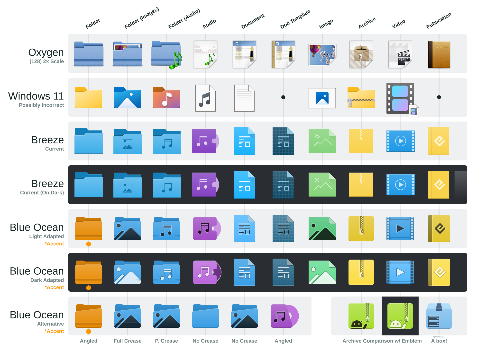
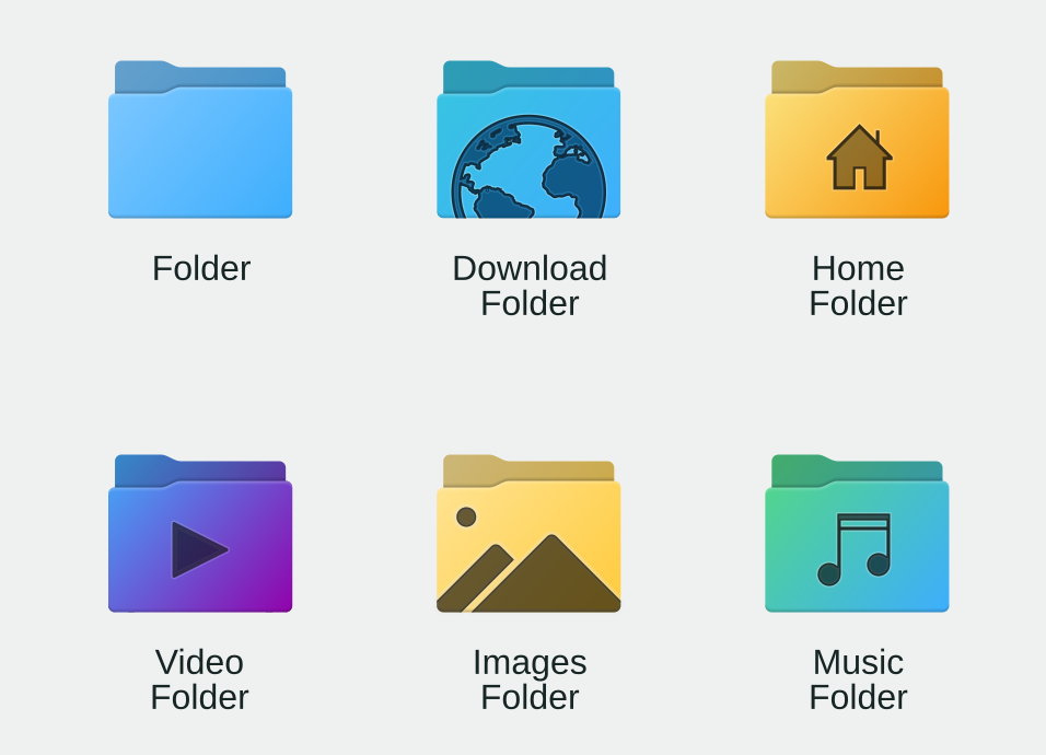
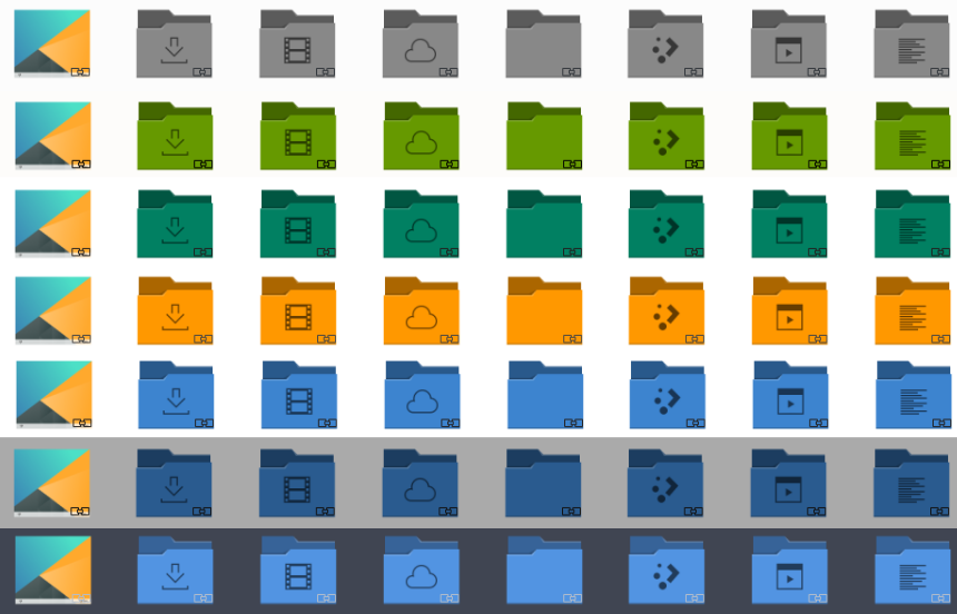
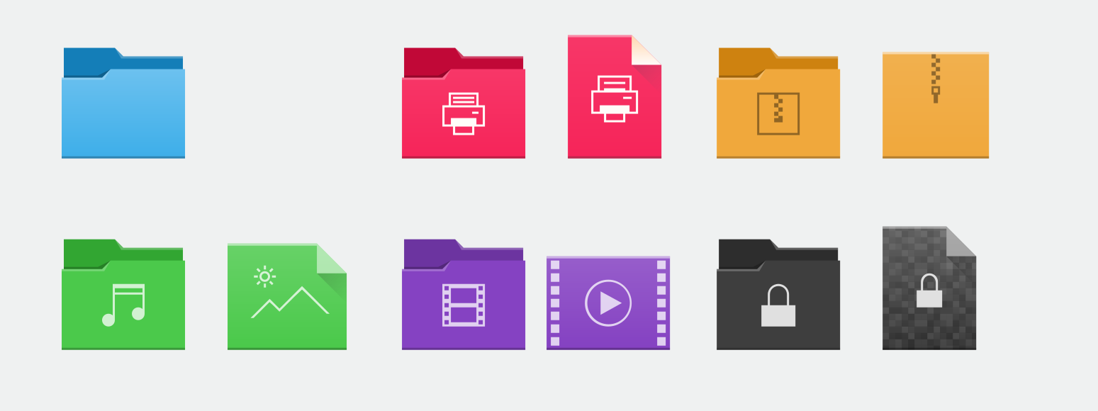
Above is sample set of icons old and new, including a sample of Windows 11 icons for reference. The proposed new icons are labeled "Blue Ocean" for identification. The new icons attempt to take the best of cues from the various designs, inheriting aspects of both Oxygen and Breeze. Additionally as the folders get somewhat close to what Redmond offers, I've provided an alternative collection of folders which are slightly more stylized but do break from what we're traditionally used to for consideration.
There are several things happening in the proposed icons...
Colourations
- Icons modulate their lightness slightly depending on the colour scheme.**
- Icons either have a soft shadow or an underglow depending on scheme.
- Emblems are dark-on-light or light-on-dark to stand out.
- Folders have accent colour support.*
(*) Orange accents are used in the samples. Proposal for disabling accent folders vis backwards-compatible CSS below.
(**) This has been tested using text and viewbackground classes. I do have a "wish" if a developer would like to add 2 CSS classes...
Shape & Spec
- Corners are rounded, angles are smoothed.
- Light moves from being angles to top-down.
- Icons are more likely to use multiple tones.
- Use of "Halo" based shadows and highlights, giving the appearance of soft smooth gradients. *
- Still TinySVG compatible
- Size discrepancies are to accommodate a slightly more accurate pixel-grid.
(*) The Halo method works great for icons upscaled up to 3x their natural scale. At 4x scale eagle-eyes users *might* be able to discern a step if they really, really look for it, but Breeze only upscales up to 3x.
CSS / Future Proofing
These icons are fully backwards-compatible, but test icons do have some future-ready features. These come in the form of a CSS palette, and CSS helper class.
This is the CSS palette, it includes all the major colours in 3 luminosities. This extended scheme guarantees that "orange is orange" and "dark is darkest", but we may in the future modulate these colours if we decide to provide such a feature. For example we may use these to provide higher-contrast icons or more subdued colours on something as simple as a slider, without using post-processing filters that may degrade visual quality. Additionally in future colours could be modulated specifically for those with certain types of colour-blindness. There's many creative avenues, really.
Even if we don't modulate the colours or implement these advanced features, use of this palette will help us maintain more consistent use of colour.
<style type="text/css" id="extended-color-scheme">
    .ExScheme-Black   { color:#172525; }
    .ExScheme-Grey    { color:#909c9c; }
    .ExScheme-White   { color:#fcfcfc; }

    .ExScheme-LightRed     { color:#ffafa5; }
    .ExScheme-LightGreen   { color:#abf9c7; }
    .ExScheme-LightBlue    { color:#abdaf9; }
    .ExScheme-LightYellow  { color:#faffa5; }
    .ExScheme-LightOrange  { color:#ffdaa5; }
    .ExScheme-LightBrown   { color:#e9d6bb; }
    .ExScheme-LightPurple  { color:#f6e1ff; }
    .ExScheme-LightCyan    { color:#b2f2e6; }
    .ExScheme-LightMagenta { color:#f9abda; }

    .ExScheme-PrimaryRed     { color:#bf4231; }
    .ExScheme-PrimaryGreen   { color:#3bb566; }
    .ExScheme-PrimaryBlue    { color:#3daefd; }
    .ExScheme-PrimaryYellow  { color:#cac726; }
    .ExScheme-PrimaryOrange  { color:#ff9701; }
    .ExScheme-PrimaryBrown   { color:#997657; }
    .ExScheme-PrimaryPurple  { color:#b401ff; }
    .ExScheme-PrimaryCyan    { color:#31bfa6; }
    .ExScheme-PrimaryMagenta { color:#f00091; }

    .ExScheme-DarkRed     { color:#5e221a; }
    .ExScheme-DarkGreen   { color:#2b4d37; }
    .ExScheme-DarkBlue    { color:#2b3c4d; }
    .ExScheme-DarkYellow  { color:#4b4d2b; }
    .ExScheme-DarkOrange  { color:#4d372b; }
    .ExScheme-DarkBrown   { color:#433a35; }
    .ExScheme-DarkPurple  { color:#432b4d; }
    .ExScheme-DarkCyan    { color:#2b4d47; }
    .ExScheme-DarkMagenta { color:#4d2b40; }
</style>
The helper class "ColorScheme-Toggle" is also used. This CSS class is present in areas where users may only want accents (or other system colours) to be optional. By taking advantage of CSS ordering this class can, in the future, be used bypass the accent colour if users wish to have a "standard" folder colour. For example we might make the "natural" folder colour blue or manilla, and let users keep that colour if they use, say, magenta accents but don't want magenta folders.
Optional Enhancement
None of this icon work requires effort on the part of our devs, but there is a "wishlist" item: the introduction of two CSS classes to the "current-color-scheme" tag:
- ColorScheme-Compliment: If the theme is predominantly dark, this becomes #000, otherwise it's #FFF.
- ColorScheme-Contrast: Always the opposite of the compliment shade.
The basic logic is taking the window background and rounding it to either black or white. The purpose of these classes is to avoid the corner-case where a colour scheme has a prominent tint and middling luminiousities. It's not necessary, but it affords iconographers the ability to shade an icon without the fear of potentially "muddy" results if someone is running funky colours. For this problem to realistically manifest, the user scheme would need to be nearly unusable. If this is a concern the ColourScheme enhancement needs to be implemented before the release of these icons. If it's not a concern the current text/viewbackground methods are working well, but for some users using schemes like "honeycomb" the icons may not be "absolutely perfect".
Python Scripts & Tooling
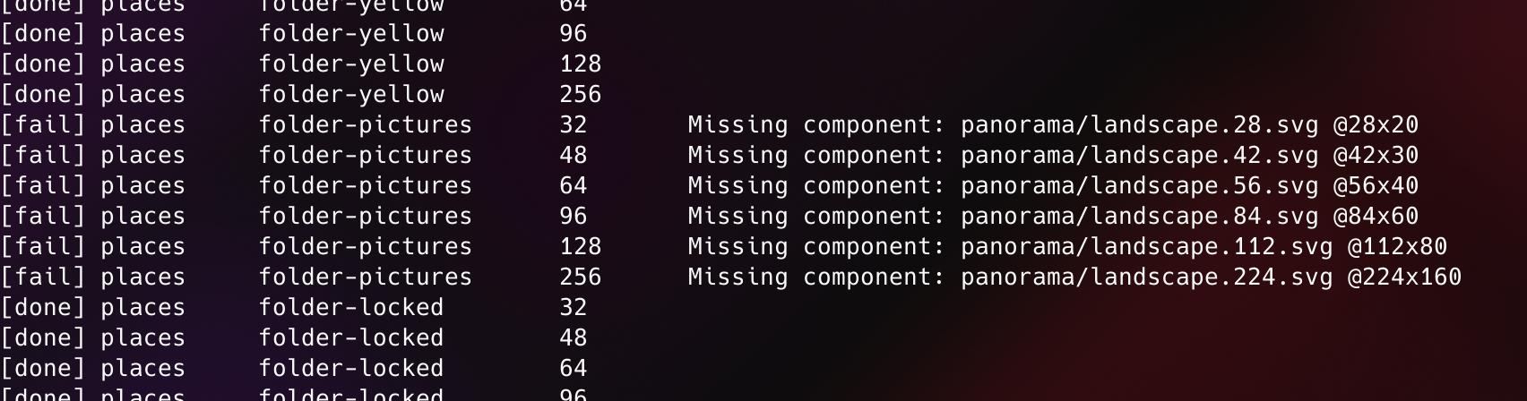
Part of this proposal bundles in a collection of python scripts which will better aid us in maintaining the icons. I've selected Python for portability among authors and their environments, and historically the community has extended the cursor tooling scripts with Python. I'm able to provide the scripts.
Because of the much more structured nature of icons, there's several avenues where we can have the toolchain optimize icons and our process. Preliminary tests are promising.
- Mimetype and Places being auto-generated, including deliberate emblem placement and colour setting via simple "recipes".
- Colour palette validation
- Targeted minification, such as unused colour stripping.
- Mass modulation of the palettes at author-time.
Between the Python scripts and ability to mass-modulate even without system-level support, this technique should give iconographers an avenue to dramatically lower maintenance on large or multiple icon sets.
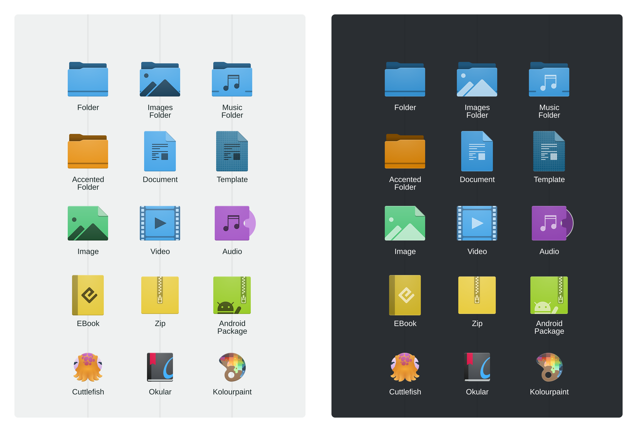
Style

Close-up of the 64px icons.
I have two stylistic variants for folders; "traditional" folders and "angled" folders. Traditional folders are what we know and love, angled folders are a little more unique. If there's an opinion on the preferred direction it would be great to hear.
There's also a set without the "Oxygen crease" in the folders. I personally like the crease; it's a nice throwback, it keeps our folders unique, and the effect has been kept subtle. That being said, if someone wants to argue for the ultra-clean look the angled "no crease" sample gives a rough idea of what it may look like.
Rollout
We have well over 700 full-colour icons. Much like the Blue Ocean updates this proposal aims for a gradual rollout. This would be rolled out in 4 phases, so without assistance I can offer a rough timeline:
- Mimetypes, Places (5.24)
- Preferences, Categories, Devices (5.24/5.25)
- Application Icons (5.25/5.26)
- Anything remaining (5.26/5.27)
Mimetypes and places first, as they are the most regularly interacted with and can be done in bulk. Phase 2 should ideally cover the control panel and common widgets. Phase 3 is app icons which we have the least control of. Phase 4 is the leftovers, and is also going to be where we consider taking the refined validation tools to polish the entirety of the set to a mirror shine.
That's the Proposal!
If this is an avenue worth pursuing I think feedback on the folders would be the best first step, as the mimetypes will follow any design cues the folders set. If this is undesirable that's also fine, so if this isn't the direction we want to go please let me know!


