Make buttons more consistent
Closed, DuplicatePublic

Description

Currently there are multiple designs and versions of buttons that do the same action.

Buttons that open a window or dialog by have something differentiating.
This currently is ellipses at the end of a text on a button: ...

Example:

In the System Settings (and in other apps too) the usage of ellipses on buttons wildly vary from KCM to KCM.
It is not consistent even if the buttons are next to each other:

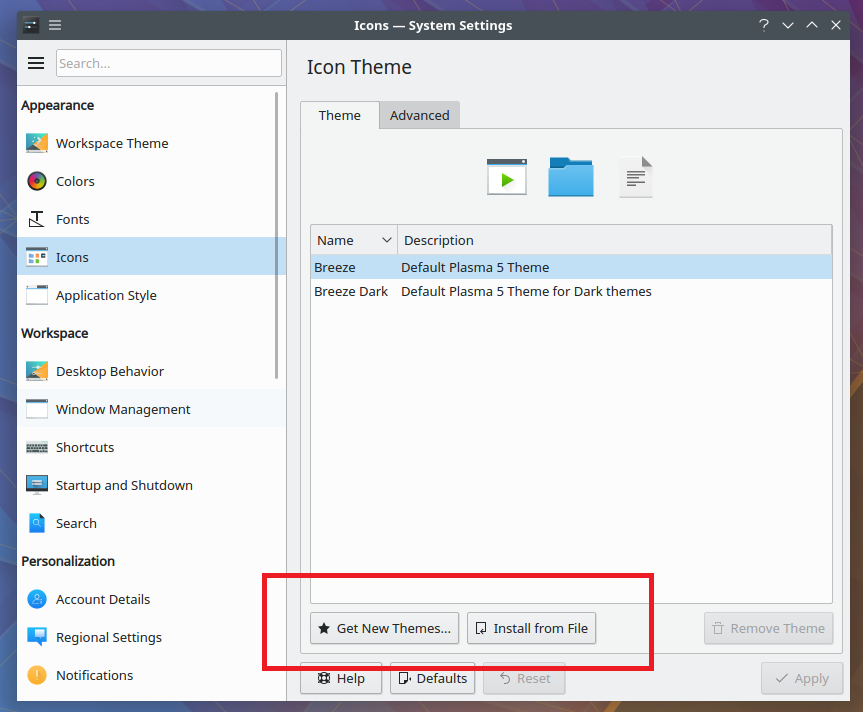
Some buttons don't even have their icons or ellipses:

Some buttons are named differently with different icons that do the same thing.
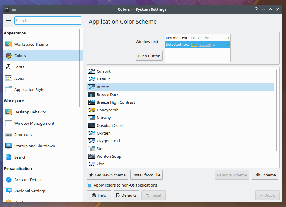
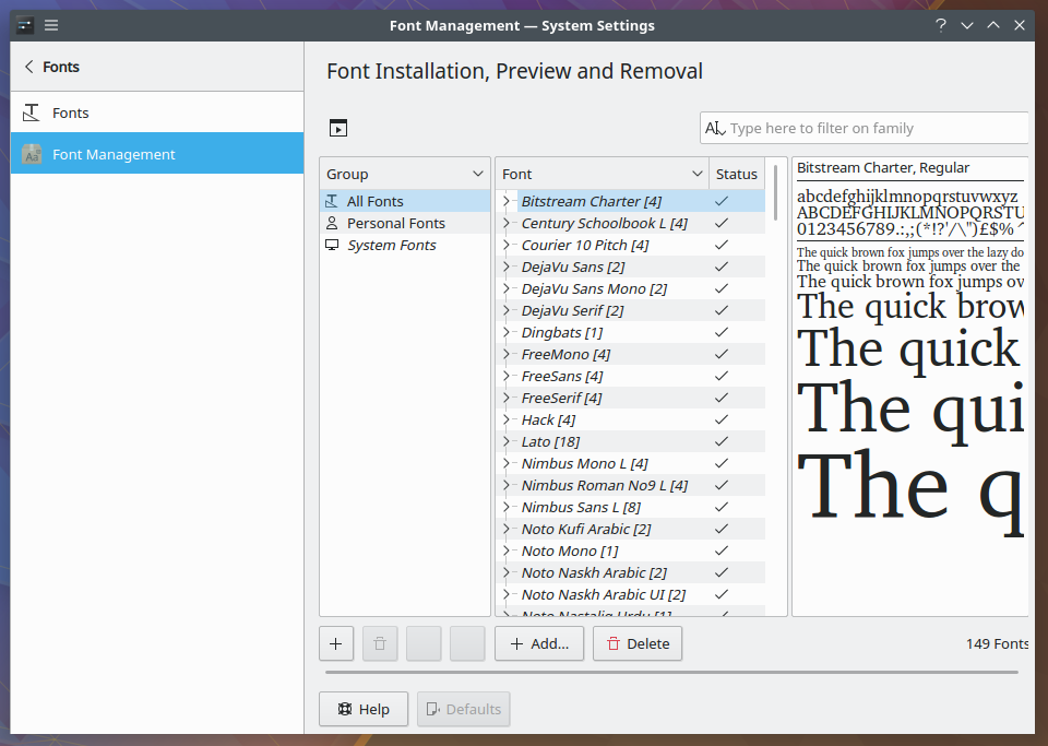
An example here is the "Add" button that does the same thing that "Install from File" on another KCM:


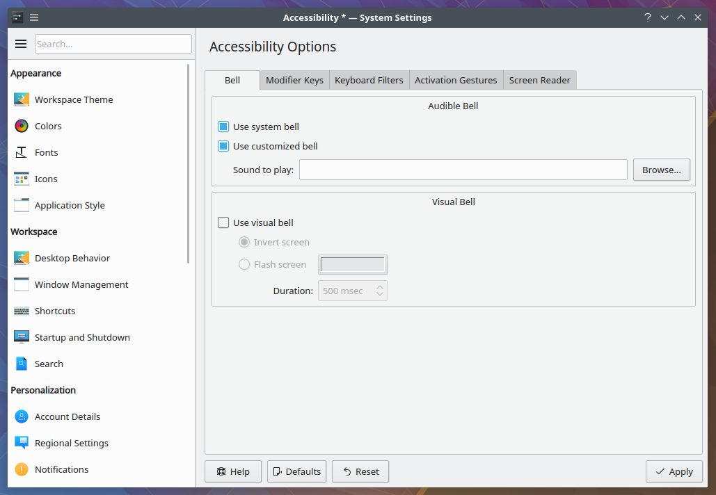
The browse file button has some variations too.
It has a simple "...":

It has a "Browse...":


Curiously the open folder has its own icon:

Maybe the "browse for file" could have its own icon too.


The ellipses indicate that the button is going to open a window or dialog:

Here is a proposal to instead of 3 dots to use a different, simpler indicator for this:


The goal of this task is to make all buttons that do the same thing have the same:

  • Icon
  • Text
  • Marking
  • Position
anemeth created this task.Apr 2 2018, 9:18 PM
ngraham added a subscriber: ngraham.Apr 2 2018, 9:23 PM

and arrange the buttons always the same

anemeth updated the task description. (Show Details)Apr 2 2018, 9:29 PM
anemeth updated the task description. (Show Details)
rkflx added a subscriber: rkflx.Apr 3 2018, 8:49 AM

The proposed design looks quite nifty, but I wonder how this will work in menus where the terminology is also used.

In addition, this has to work with different widget styles, so perhaps it would make sense to first make the usage of consistent, and only afterwards think about modifying Breeze for a different visual representation.

Other desktops and platforms use ellipses too, I'm not sure whether we should deviate from that standard…

In T8400#136271, @rkflx wrote:

Other desktops and platforms use ellipses too, I'm not sure whether we should deviate from that standard…

I looked into it, Windows also uses the ellipses.
And by the way I found that it has the same problems too :) so we are not alone with this issue.

I'm in favor of just keeping the ellipses. No reason to break decades' worth of convention and familiarity, I say.

We're going to keep the ellipses. This task can track making them more consistent, though I already did a first pass on that a few months ago. More is always good of course. :)

ngraham moved this task from Backlog/Planned to Sent to dev on the VDG board.Feb 19 2019, 1:32 PM
ngraham moved this task from To Do to Work in Progress on the Plasma board.
ngraham assigned this task to GB_2.
ngraham triaged this task as Normal priority.