Fix design of annotation toolbar
Closed, ResolvedPublic

Description

The current annotation toolbar is not very flexible and can benefit from some modernization.

Some of the problems are:

  • Custom toolbar UI not integrated with the other Qt toolbars
  • Impossibility to change the color/font of the annotations on the fly (it is necessary to create a new tool with the desired color/font)
  • Some tools are missing from the toolbar by default (e.g. squiggle underline, delete text, rectangle, ...)
  • To keep an annotation tool selected one need to double click on an annotation (not intuitive/no tips for the user) (BUG: 358057)
  • Incoherence between annotation icons used and one in config dialogs (BUG: 358065)

Note: This task has evolved from problems in the annotation configuration dialogs to usability problems in the annotation toolbar itself.

To-do

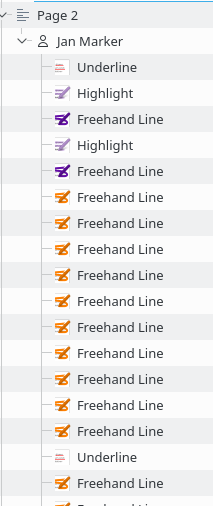
  • Select and use text annotations (highlighter, underline, squiggle, strike out)
  • Select and use note annotations (typewriter, inline note, popup note)
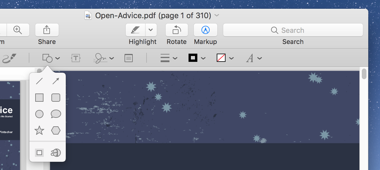
  • Select and use drawing annotations (freehand line, straight line, rectangle, ellipse, polygon)
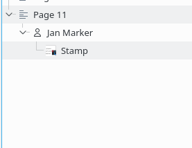
  • Select and use stamp annotation (see also T8074) [possibly disable this button for PDF documents, see 383651]
  • Pin annotation / The annotation remains selected after use if the pin button is checked
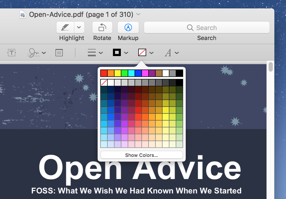
  • Change (outer) color and opacity of annotations [Draft code in place for now]
  • Change inner color and opacity of annotations
  • Make color selectors a list of default colors with an option to select a custom color via a FileChooser
  • Change size of lines (freehand, straight line, geometrical shapes)
  • Change icon of popup note
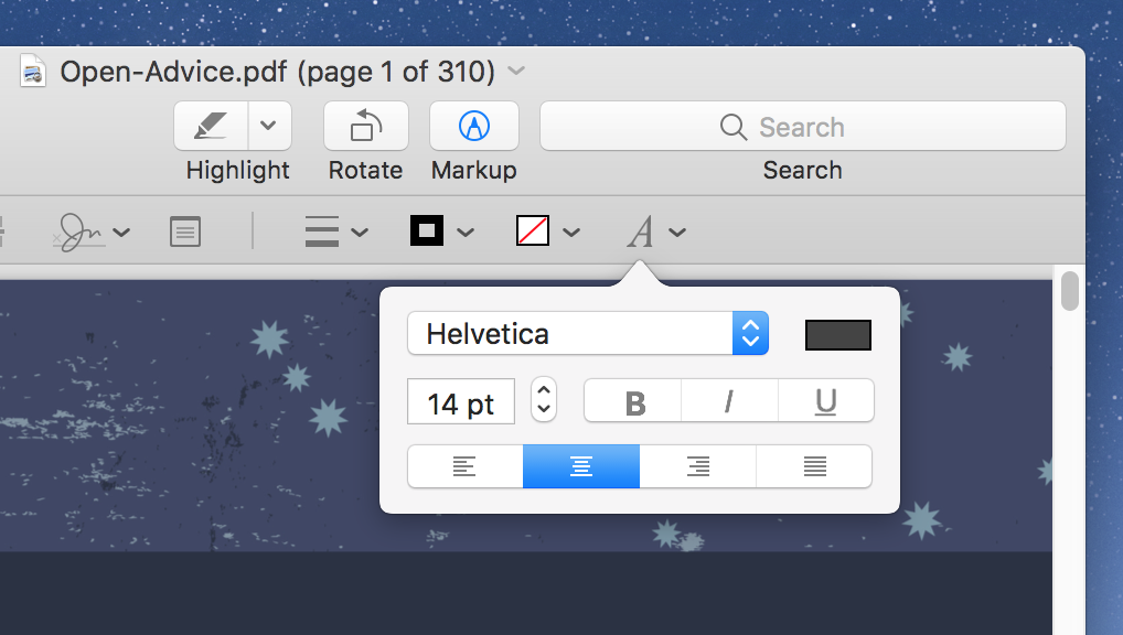
  • Change font of notes annotations (typewriter, inline note, popup note?)
  • Change straight line line extensions ( via Advanced settings)
  • Add mechanism to save annotation tools with custom options (quick tools) See T8076#186855
  • Save state of pin action
  • Prevent changing the annotation type of builtin annotations, when using the advanced setting menu (wait for D10859)
  • Add real value of opacity and line width to the list of action if it is not one of the default values (e.g. if it was set with the advanced settings menu)
  • Set width combo icons (generate programatically see D21364#469241)
  • Activate line width action in one click (not just clicking on the down arrow)
  • Click on a selected annotation should deselect it (see https://codereview.qt-project.org/c/qt/qtbase/+/255770)
  • Selecting an annotation should switch to Browse mode
  • Set default location of annotation toolbar under the main toolbar
  • Show/hide toolbar from menu
  • Set meaningful default shortcuts for implicit and/or explicit tools
  • Set tooltips everywhere
  • Add i18nc everywhere
  • Reimplement code to enable/disable tools or text tools if document not editable
  • Rename and move PageViewToolBar, not part of PageView anymore
  • Do not deselect annotation when color dialog is closed by hitting Esc (how?)
  • Show annotation toolbar when a quick annotation is activated
  • Remove annotation fill color
  • Document properties of tools.xml
  • Disable ToolActionMenu and Quick Annotations if document is protected (but I still can add annotations?!)

    Problems:
    • KSelectAction is an exclusive group, the action will become uncheckable
    • The action is created after we setup the annotationActionHandler actions
  • Add a menu entry to the context menu of 'quick annotation action' to open quick annotation config dialog (how?)
  • Remove legacy code left hanging around after the changes
  • Clean and refactor code
  • Properly manage the upgrade of the configuration file during the upgrade of okular (in particular the AnnotationTools key).

Discuss

  • Default toolbar aspect should be icons only or text alongside icons? (in this second case we need to shrink it)
  • Stamp action shows the default action (Okular icon) by default, so it may not be clear to the user that it is the stamp action. How to workaround this? A possibility is to use KSelectAction in KSelectAction::MenuMode but in this case the action is never shown as checked.

Delegate

  • Create proper icons for all annotation (see BUG: 408283)
  • Update documentation (some icons used in the doc will be removed)

Future improvements

  • Remove unused icons from ui/data
  • Use better engine hoover icons / Make them match to the resulting icons and those in the config dialog
  • Allow setting the inline note text color (code is ready, but setting the text color sets also the border color some needs some discussion)
  • Deselect Browse mode when an annotation action is checked (needs Qt 5.14)
  • Remove non-exclusive QActionGroup workaround (needs Qt 5.14)
There are a very large number of changes, so older changes are hidden. Show Older Changes

Why would you remove comboboxes? How are people supposed to use that funcionality?

simgunz updated the task description. (Show Details)Feb 25 2018, 12:08 PM

I meant group boxes. I've updated the task description now.

Ok. @ngraham suggests to revise completely the configuration dialogs of the annotation tools (see D10859#214352). In particular he suggests to have the configuration of an annotation tool appear in the main UI when the tool is selected.

This requires a lot of changes:

  • Add a toolbar with the config of the tool. Where? Bottom of the page? Next to the existing toolbar?
  • Complete removal of the Annotations config page from the Okular settings? Or should this still be there?
  • Should it still be possible to create new annotation tools? Where should this be done? In the annotation bar (e.g. adding a + button)?

I'll put T8074 and D10859 on hold for the moment.

aacid added a comment.Feb 26 2018, 4:23 PM

What? Show the configuration dialog each time you select a tool? That's going to get annoying really fast. I don't think it's a good idea.

why did you create a task for this, now i don't know where to comment here on in the code review.

ngraham added a comment.EditedFeb 26 2018, 4:33 PM

This task is to discuss the issue so we can come up with a plan before we start coding, which will reduce wasted time and abandoned patches.

No, I'm not proposing a configuration dialog (we already have that), but rather an inline tool options panel, like GIMP, and Blender, and Krita have.

Here is how macOS Preview handles this situation, for example:

The tool options are right there when you need them; no need for a separate dialog window to configure them.

I'm not saying that we should just copy this UI exactly, but the general approach of showing the tool's options inline rather than in a separate configuration window is more humane and efficient that what we have right now, and seems like a good approach to move towards.

A similar UI is present also in Foxit reader. I like that syle a lot.

I would basically clone it.

+1, let's do it!

Adobe version of the tools:

I'll try to make a mockup.

This is a first mockup of the annotation toolbar.

From left to right:

  • Highlight
  • Underline
  • Wiggle underline (wrong icon)
  • Strikeout -------------
  • Inline note
  • Popup note -------------
  • Freehand line
  • Shapes (Rectanlge, Ellipse, ...)
  • Stamp ---------------
  • Line width selection
  • Color (of shapes, font, depending on the selected )
  • Font properties
  • Pin annotation tool (to keep an annotation tool selected)

Some icons are not available in the breeze theme, so I used place holders taken from Internet. Maybe we can ask some KDE designer to make them.

I still haven't planned how to design the drop down menu., in the mean while I want to hear your opinion on the toolbar.

Should we create a new task for this? Or update this one?

That looks great! This task seems sensible enough for now, If you need more icons, open bugzilla tickets against breeze-icons and ping @andreaska.

oh cool I would like to see a annotation toolbar in okular.

I need the icon name and what's the icon for than I can add the missing icons to breeze.

I hope some other pdf-editor features will follow. I wait for long time for rotate page, insert pdf pages, remove pages, ...

@andreask Thanks for the quick reply. I'll soon make a list of the icons required and let you know.

simgunz renamed this task from Fix design of annotation configuration dialogs to Fix design of annotation toolbar ~~configuration dialogs~~.Sep 17 2018, 3:46 PM
simgunz updated the task description. (Show Details)
simgunz renamed this task from Fix design of annotation toolbar ~~configuration dialogs~~ to Fix design of annotation toolbar.

I have added the revision D15580 where I implemented a first (very rough) version of the toolbar, so we can start discussing the best way to implement it.

The current implementation uses PageViewAnnotator. With the new implementation ideally we should have all the annotation tools defined in the XML file shipped with Okular (ui/data/tools.xml) and the buttons will be connected to these tools. At this point having the XML configuration is less useful than before I guess.

To change the color of the annotations on the fly I am currently overriding the value contained in the XML file / QDomElement, not sure is the best approach.

Annotation color:

  • The color button icon may be a simple circle that can be colorized
  • Currently a color picker is displayed, but possibily we can display a popup with some predefined colors and a button to show the color picker
  • The last used annotation color may be saved in the XML configuration file (possibly per-annotation tool)

Pin action:

  • The default value of the pin action / continuous mode can be saved to the configuration file

Show/Hide the toolbar:
Should we keep the option to show and hide the toolbar? Is this feasible?

If you have comments on the implementation let me know (in case I am going in the wrong direction). Note that some code is very dirty for now.

simgunz added a subscriber: tobiasdeiminger.EditedSep 17 2018, 7:58 PM

@tobiasdeiminger mentioned in D15580 that long pressing to select different geometrical shapes (polygon, ellipse) is not very intuitive. I agree on this. I implemented it that way to be consistent with the other tool buttons of okular, for example the selection button (text selection, table selection, ...). In particular the buttons are based on ToolAction which derives from KSelectAction. I would change the default button mode of ToolAction to QToolButton::MenuButtonPopup, but I believe we can open a new bug for this and do it for all Okular buttons.

Also, reagrding the typewrite tool (D15204, D15205 ) I believe there should not be conflicts. I was thinking to add a second color selector for the background given that many annotation tools use a second color. (not sure about the third color though, that may mess the UI a bit too much). Also there are dedicated Actions as KFontAction and KFontSizeAction that can be used to select the fonts of different annotation tools.

Maybe we need to find a way to distinguish between front color and background color without using text, if we want to keep the annotation toolbar icon-only by default.

Another problem regarding colors that can mess up the workflow of some people is that, now, it won't be possible to have 2-3 highlighters (for example) with different colors that can be selected on the fly with the shortcuts (1-9), but the user needs to change color every time, which can be a bit annoying. Any idea on how to deal with this problem?

Maybe we can have a ToolAction (drop down menu) with a set of favorite annotation tools that the user can add (maybe through a favorite/star button that saves the annotation tool in use with the current colors). Then we can assingn the shortcuts 1-9 to these favorite tools in order to somewhat preserve the previous workflow.

@tobiasdeiminger ..and yes I would like to coordinate so we don't waste effort.

@tobiasdeiminger ..and yes I would like to coordinate so we don't waste effort.

Can we agree on what will come in first? Once we know, the second one can help reviewing the first one, or go on with higher level work, or go on coding by rebasing on the first diff, or just idle😏

Typewriter is already in ok-ish condition. Oliver just gave it's basic ok. I'd say it should be a matter of 1..2 weeks or so until we can commit. Can you roughly guess how long your feature will take until being ready? If it takes clearly longer, I'd ask you to let typewriter in first. If they're about equal, then I don't mind.

Guess both of our features can earliest be released with KDE Applicatons 18.12 (because they are features, not bugfixes). So deadline will be tagging in early December. Would be nice if both features get in there.

Yours should go first. I think the toolbar thing is going to take some time both because I'll work on it intermittently and because it may require many changes under the hood. Let's see if I can manage to get it ready for KDE Applications 18.12.

Another UI problem to solve is how to deal with some specific annotation tools "advanced" configurations:

  • Some tools have an icon (popup note, stamp)
  • Straight line tool has Line extensions
  • Inline note has font, font size, alignment

I consider basic properties the color, (maybe background color), size, and opacity (this can be included in the color picker). These can have dedicated actions given that are common to many annotation tools.

But what about the advanced configurations, how should those be exposed?

Migrating comments from D15580, since now I see we're doing the discussion here:

Long press is never particularly intuitive; it's generally preferred to use a Split button instead. Spectacle uses one of these to good effect:

Another option is to not have multiple tools collapsed under a single option; instead of having a single button under which both Ellipse and Polygon live, we would just have separate Ellipse and Polygon buttons. That would bypass the entire issue, assuming there's enough horizontal real estate to fit all the buttons.

As for how to present a tool's advanced options, it might be nice if they could be shown inline, without having to open a whole new window. Perhaps a second toolbar below the first one could show contextually-appropriate options for the currently selected tool. Or it could be off to the side on the same toolbar if there's enough horizontal space. This is how macOS preview does it, indicated in the video I attached to T8076#130673.

@ngraham @tobiasdeiminger See bug 399362 regarding the long pressing of the buttons. I'll put all the items by themselves in the new annotation toolbar, there should be enough space.

@ngraham Can you show me also what happens when you click the "A" button to edit the fonts on the pdf viewer of macOS?

I'll put all the items by themselves in the new annotation toolbar, there should be enough space.

Did you consider the other tools as well? Text Markup has type variants too (Highlight, Squiggle, Underline, Strike out), maybe you run out space once you implement them all.

Nates idea about split button sounded nice to me. Maybe a split button drop down could even be used to select things like stamp image for stamp annotations?

Current situation on a 1680px wide screen:

Icons only:

Icons + text:

If we consider the icons only case (I think this should be the default) there is enough space, if we consider the case icons+text (the user can always switch to this mode if he wants) then we are at the limit of the space, considering that the stamp button and font button at least are missing.

Having all the tools by themselves is the approach that guarantees the fastest access to the tools and it is not problematic for the icons-only toobar. The split button can/will be used for the stamp tool given that many images are available.

A more complex alternative is to change the layout of the actions from independent to grouped in buttons when we the user switches from icons-only to text or text+icons.

@ngraham Can you show me also what happens when you click the "A" button to edit the fonts on the pdf viewer of macOS?

Sure. In fact, here's all of them:

I finally got the chance to test out D15580. Overall pretty nice! Since I noticed many bugs (e.g. with certain tools creating the wrong annotation), I assume it's a work in progress, which is just fine!

Since all the tools are on the main toolbar, even with icons-only buttons a lot of them get cut off and hidden "below the fold" so to speak when the window is tall and narrow--which is exactly the most common configuration for a reader for documents that are most likely to be in the portrait orientation. It might be better if the review tools were on a separate toolbar below the main one if we can't condense them a bit.

Selecting a colored shape and changing the color in the toolbar doesn't apply it to the selected shape. It probably should.

It would be nice if each tool could visibly have its own private settings. Right now it's not obvious which tools will inherit the color settings chosen via the toolbar button, and which ones won't.

I finally got the chance to test out D15580. Overall pretty nice! Since I noticed many bugs (e.g. with certain tools creating the wrong annotation), I assume it's a work in progress, which is just fine!

You need to move the file .config/okularpartrc before testing the revision in order for the buttons to match the tools. I have added this instruction to the description of the review now.

Since all the tools are on the main toolbar, even with icons-only buttons a lot of them get cut off and hidden "below the fold" so to speak when the window is tall and narrow--which is exactly the most common configuration for a reader for documents that are most likely to be in the portrait orientation. It might be better if the review tools were on a separate toolbar below the main one if we can't condense them a bit.

Actually the tools are in a different toolbar. You can unlock the toolbars and move the annotation toolbar under the main toolbar. I still need to figure out if there is a way to specify the default location for the toolbar and if it can be shown/hidden on demand when an action is selected (as it was before).

Selecting a colored shape and changing the color in the toolbar doesn't apply it to the selected shape. It probably should.

It would be nice if each tool could visibly have its own private settings. Right now it's not obvious which tools will inherit the color settings chosen via the toolbar button, and which ones won't.

The color selection works only for text annotations for now, but it will work for any annotation. That is a draft code and I am writing a more general version now. My plan is to edit the settings XML file when the color is changed so that each tool remembers its last color also after switching to another tool and back to it.

simgunz updated the task description. (Show Details)Oct 8 2018, 7:01 AM

Thanks @simgunz! I can't wait to see new revisions, and I will be actively testing and offering feedback. :)

simgunz updated the task description. (Show Details)Oct 9 2018, 7:09 AM
simgunz updated the task description. (Show Details)Oct 13 2018, 10:11 AM
simgunz moved this task from Backlog to In progress on the Okular board.Jun 2 2019, 8:30 AM

This is a first mockup of the annotation toolbar.

Is this still the current idea?

  • Is it still possible to use presets? I. e. choosing between Text Highlight in yellow and Text Squiggle in red with one click?
  • If yes, is it possible to use multiple presets of the same tool? I. e. highlighting text in some predefined colors?
  • Does it show the current state of the annotation to be created? The existing toolbar generates nice preview icons instead of using breeze icons.

For the presets, which are not visible in this mockup, I could imagine a favourites section, which works similar to the existing toolbar.
There would be a button to duplicate the current annotation tool to the favourites section.
I’m not sure what should happen when a tool from the favourites section is selected. It would set the color, width,... buttons and choose the respective type button. What will happen to the previous states of these buttons?

Just pushed few more changes to the toolbar.

Regarding the favorite tools / presets, I was thinking to make it work exactly as you said. Precisely my idea was this:

  • Add a combobox action with a list of favorite tools.
    • Each entry has a name given by the user e.g red highlighter, green hightlighter, my signature (for a stamp) ...
    • The same tool can appear more than once with multiple configurations
  • Add a 'star' button that adds the currently selected tool and settings to the list of favorite ones
  • Keep the current settings dialog for configuring annotations, but use it only to configure favorite tools (reorder them, change the name and so on). Otherwise this could be tricky to do directly from the toolbar.
  • Not sure how to deal with the preview of the tool, my solution is to let the user give a meaningful name of the tool. Adding a small preview as an icon next to the Action can be a solution, but I think the preview is going to be too small. I would just add the breeze icon of the corresponding tool.
  • Currenlty the state of each annotation tool is saved. If I click underline > highlight > underline the state of underline is restored to its previous value. When a favorite tool is selected it sets the status of the color, width, etc. buttons. The state of the previously selected tool:
    • is saved if the tool is different from the current one: e.g. was highlight, my favorite is underline, state of highlight saved
    • is lost if the tool is the same as the current one: e.g. was highlight, my favorite is highlight with different color, now the saved state of the highlight tool is the same as my selected favorite

Ideas are welcomed on this topic.

Regarding the advanced features of the tools (e.g. alignment, line endings, etc.):

I am thinking of adding a "Gear" icon that opens the config widget of the current annotation tool (so we can reuse the current code). The user can then change the advanced settings and he can save the tool among his favorites. In this way we do not have to have cluttered or morphing toolbar. Foxit reader uses this advanced option approach more or less.

simgunz updated the task description. (Show Details)Jun 2 2019, 12:44 PM
  • Add a combobox action with a list of favorite tools.

That means two clicks to change the tool. (Currently, often needs a double-click.)

  • Add a 'star' button that adds the currently selected tool and settings to the list of favorite ones

I was actually thinking about a star icon. :)

  • Keep the current settings dialog for configuring annotations, but use it only to configure favorite tools (reorder them, change the name and so on). Otherwise this could be tricky to do directly from the toolbar.

Probably the current “implicit” tool should be configurable trough the dialog too, so not all controls need to be in the toolbar, but the user does not need to make a favourite for a very special annotation he/she will use only once. (This is probably what you meant in the second section.)

  • Not sure how to deal with the preview of the tool, my solution is to let the user give a meaningful name of the tool. Adding a small preview as an icon next to the Action can be a solution, but I think the preview is going to be too small. I would just add the breeze icon of the corresponding tool.

@jangmarker tried using the existing, configurable icons, and I think it looks ok. Depending on the used dpi, a scalable icon engine would be good for the side panel, but toolbar icons are usually a bit bigger.

Now it looks like this:

A stamp looks like this:

I think we shouldn’t rely on the ability of the user to give meaningful names.

  • Currenlty the state of each annotation tool is saved. If I click underline > highlight > underline the state of underline is restored to its previous value. When a favorite tool is selected it sets the status of the color, width, etc. buttons. The state of the previously selected tool:
    • is saved if the tool is different from the current one: e.g. was highlight, my favorite is underline, state of highlight saved
    • is lost if the tool is the same as the current one: e.g. was highlight, my favorite is highlight with different color, now the saved state of the highlight tool is the same as my selected favorite

Then I’d call them “implicit tools” and “explicit tools”. The tools which can be selected from the toolbar are associated to implicit tools. (I. e. one implicit tool for each Freehand, Stamp, Popup, Highlight,...) By clicking arround in the toolbar the user selects or configures one of them. By choosing a favourite he/she loads a preset into one of the implicit tools.

What I called second section:

  1. Regarding the advanced features of the tools (e.g. alignment, line endings, etc.):

    I am thinking of adding a "Gear" icon that opens the config widget of the current annotation tool (so we can reuse the current code). The user can then change the advanced settings and he can save the tool among his favorites. In this way we do not have to have cluttered or morphing toolbar. Foxit reader uses this advanced option approach more or less.

Will it be possible to put favourites into the action collection, so the user can configure shortcuts for them? Or, maybe simpler, there could be a shortcut control in their configuration dialog.

Probably the current “implicit” tool should be configurable trough the dialog too, so not all controls need to be in the toolbar, but the user does not need to make a favourite for a very special annotation he/she will use only once. (This is probably what you meant in the second section.)

Yes, that is what I meant.

I think we shouldn’t rely on the ability of the user to give meaningful names.

Cool icons! If those works, we can use the standard name of the tool and use the icon to save the favorite tool with one click. Then the user can customize it (e.g. the name) in the Settings as it is now.

Then I’d call them “implicit tools” and “explicit tools”. The tools which can be selected from the toolbar are associated to implicit tools. (I. e. one implicit tool for each Freehand, Stamp, Popup, Highlight,...) By clicking arround in the toolbar the user selects or configures one of them. By choosing a favourite he/she loads a preset into one of the implicit tools.

Exactly

Will it be possible to put favourites into the action collection, so the user can configure shortcuts for them? Or, maybe simpler, there could be a shortcut control in their configuration dialog.

If we give unique names to the explicit tools (e.g Highlighter Custom 1, Highlighter Custom 2, ... or something better) we can add all of them to the action collection probably. In the current version of Okular, the numbers 1-9 select the annotation tools based on their order. Probably some users are used to this configuration and we can recycle it. Either we assign the numbers 1-9 to select the implict tools or use them for the explict tools.

In the current version of Okular, the numbers 1-9 select the annotation tools based on their order.

Good to know... They are not listed in Configure Shortcuts.

Probably some users are used to this configuration and we can recycle it. Either we assign the numbers 1-9 to select the implict tools or use them for the explict tools.

Then we should assign them to implicit tools similar to the existing configuration.

One crazy idea: Allow templates for popup notes, and add such a popup note as favourite. When a curious user tries to use this favourite, a popup note opens with an introduction to the annotation toolbar.
And then set the shortcut to 9.

simgunz updated the task description. (Show Details)Jun 2 2019, 5:05 PM

How will you do what currently a double-click does? It should still be possible to do more than one annotation in one go.

simgunz updated the task description. (Show Details)Jun 3 2019, 6:59 AM
simgunz updated the task description. (Show Details)Jun 3 2019, 7:53 AM
simgunz updated the task description. (Show Details)Jun 5 2019, 7:29 AM

Is it intended to fix Bug 398108 - Annotation toolbar works only in Browse mode, not in e. g. Text Selection mode?

simgunz updated the task description. (Show Details)Jun 14 2019, 10:23 AM
simgunz updated the task description. (Show Details)Jun 17 2019, 3:10 PM
simgunz updated the task description. (Show Details)Jun 18 2019, 6:04 AM
simgunz updated the task description. (Show Details)
simgunz updated the task description. (Show Details)Jun 18 2019, 6:13 AM
simgunz updated the task description. (Show Details)Jun 20 2019, 7:07 PM
simgunz updated the task description. (Show Details)Jul 5 2019, 5:37 AM
simgunz updated the task description. (Show Details)Jul 5 2019, 7:06 AM

How will you do what currently a double-click does? It should still be possible to do more than one annotation in one go.

That is the last action on the right 'Pin'. If you select it, the current annotation tool is kept selected after using it (as double-click in the current version of Okular), otherwise it is deselected after use.

Is it intended to fix Bug 398108 - Annotation toolbar works only in Browse mode, not in e. g. Text Selection mode?

Now selecting an annotation switches to Browse mode as in the current version of Okular. So that Bug is not yet fixed.


The current default for the annotation toolbar is to show only the icons instead of text alongside icons as in the main toolbar. I have now set the default position of the annotation toolbar below the main toolbar, but even in this case enabling 'text alongside icons' makes the annotation toolbar overflow.

We have three choices:

  • Keep 'icons only' the default
  • Make 'text alongside icons' the default and compress the annotation toolbar somehow (e.g. merge highlight, underline, and squiggle in a combobox as the geometrical tools)
  • Split the annotation toolbar in two toolbars, one for the annotations and one for the configurations of the annotations, and make the first 'text alongside icons' and the second 'icons only' by default

The third option may be a bit of a pain to manage though, especially for showing/hiding the toolbar, and may not be intuitive for the user when trying to move the toolbar.

What is your opinion?

simgunz updated the task description. (Show Details)Jul 14 2019, 2:02 PM
simgunz updated the task description. (Show Details)Jul 22 2019, 6:14 PM

@andreask Given that you gave your availabilty to work on the new Okular icons, I have opened this bug (408283) with a (messy) list of what icons are needed. I did not provide icon names yet.

Can also the others have a look at that bug and give me some feedback, propose names for the icons, etc?

simgunz updated the task description. (Show Details)Jul 24 2019, 4:04 PM
simgunz updated the task description. (Show Details)Jul 28 2019, 1:39 PM

I have tried with new layout of the annotation toolbar:

  • Annotation tools actions, add to quick annotation action, and pin action are be defaults text-alongside-icon (to make their meaning more explicit)
  • Annotation config actions are be defaults icon-only (their meaning is quite obvious and common to many other applications)
  • Moved "Quick Annotation" to main toolbar
  • Moved "Pin" and "Add to Quick Annotations" to the left of the annotation config actions

Now on my screen there is free space to the right of the toolbar. If we want to shrink the toolbar even more we can merge underline, squiggle, and strikethrough in a single combobox but I believe it is not necessary

I have renamed "Reviews" to "Annotations" in the UI to be consistent everywhere

I have tried with new layout of the annotation toolbar:

  • Annotation tools actions, add to quick annotation action, and pin action are be defaults text-alongside-icon (to make their meaning more explicit)
  • Annotation config actions are be defaults icon-only (their meaning is quite obvious and common to many other applications)
  • Moved "Quick Annotation" to main toolbar
  • Moved "Pin" and "Add to Quick Annotations" to the left of the annotation config actions

    Now on my screen there is free space to the right of the toolbar. If we want to shrink the toolbar even more we can merge underline, squiggle, and strikethrough in a single combobox but I believe it is not necessary

Here's another idea: would we make the buttons lose their text labels when there's not enough horizontal space to show everything. This would be more user-friendly than moving them onto an overflow menu. Kirigami offers this feature natively but we might need to hack it into Okular or KXMLGui.

I have renamed "Reviews" to "Annotations" in the UI to be consistent everywhere

+1

simgunz updated the task description. (Show Details)Sep 29 2019, 4:26 PM

Here's another idea: would we make the buttons lose their text labels when there's not enough horizontal space to show everything. This would be more user-friendly than moving them onto an overflow menu. Kirigami offers this feature natively but we might need to hack it into Okular or KXMLGui.

I would not hack this into Okular. It seems something that needs to go in KXMLGui if we decide to go this way.

simgunz updated the task description. (Show Details)Sep 29 2019, 4:39 PM
simgunz updated the task description. (Show Details)Sep 29 2019, 6:14 PM
simgunz updated the task description. (Show Details)Sep 29 2019, 7:02 PM
simgunz updated the task description. (Show Details)Oct 8 2019, 4:21 PM
simgunz updated the task description. (Show Details)Oct 12 2019, 5:14 PM
simgunz updated the task description. (Show Details)Oct 13 2019, 9:54 AM
simgunz updated the task description. (Show Details)Oct 20 2019, 3:37 PM
simgunz updated the task description. (Show Details)Oct 27 2019, 5:50 PM
ngraham moved this task from Backlog/Planned to Sent to dev on the VDG board.Dec 28 2019, 8:46 PM
ngraham moved this task from In progress to Done on the Okular board.May 14 2021, 4:12 PM
ngraham closed this task as Resolved.
ngraham claimed this task.

I think we can call this done now. Further improvements can be tracked with Okular's workboard/issue-tracker-used-being-used-as-a-replacement-for-phabricator-tasks.

ngraham moved this task from Sent to dev to Done on the VDG board.May 14 2021, 4:12 PM