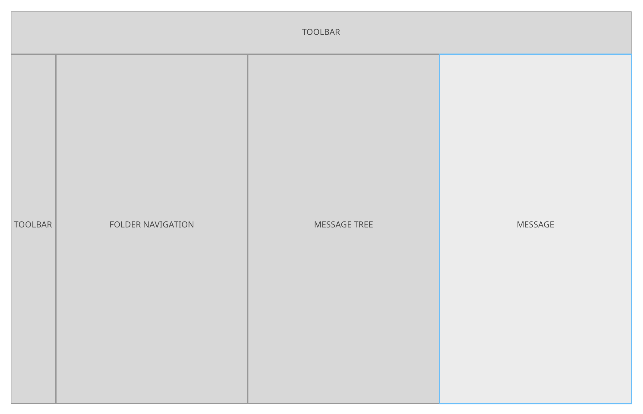
I'd like to discuss here, with the help from VDG how we could improve the Kontact UI to look more modern and slick. This is not really about adding new features or behavior of Kontact, more about face-lifting the UI.
I started by looking at KMail because that's our main and most important component, I'll keep updating this as I get to other components.
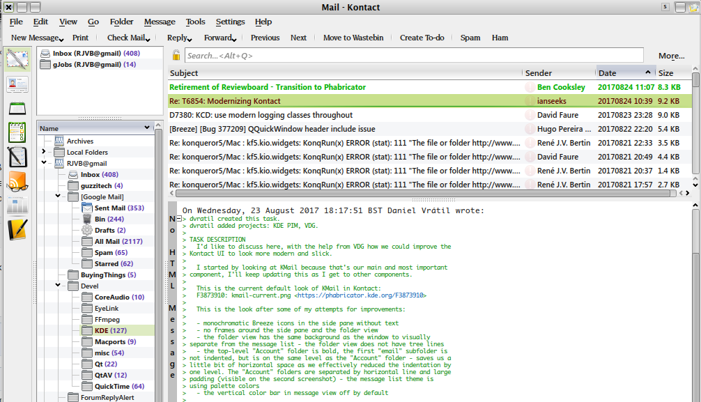
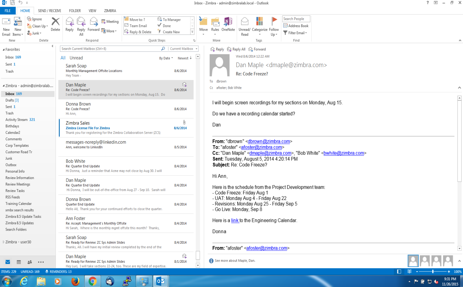
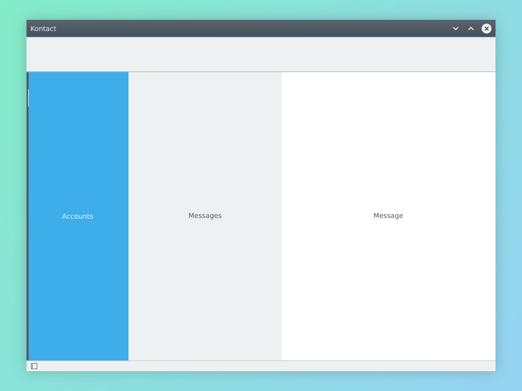
This is the current default look of KMail in Kontact:
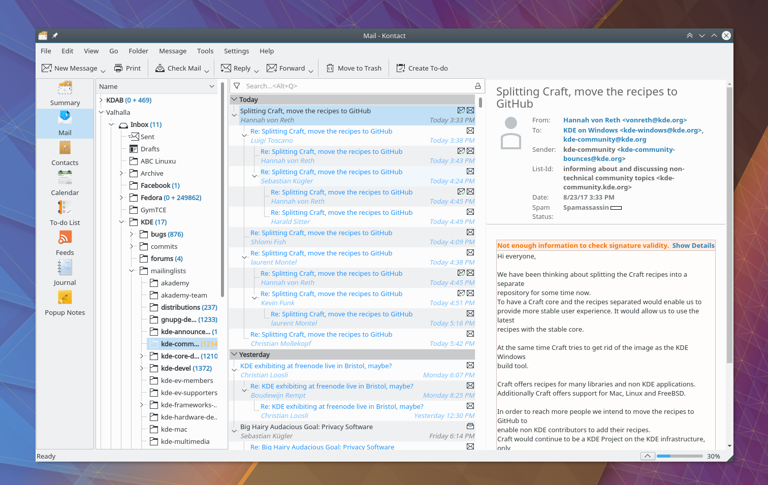
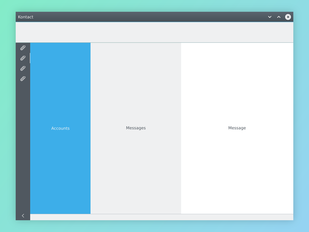
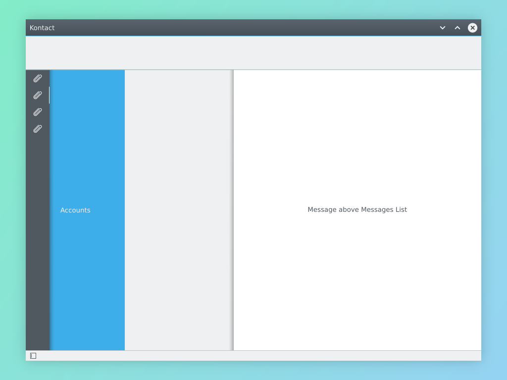
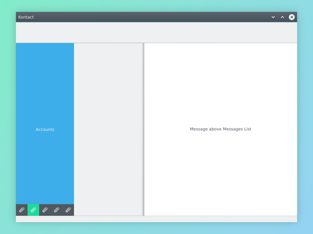
This is the look after some of my attempts for improvements:
- monochromatic Breeze icons in the side pane without text
no frames around the side pane and the folder viewthin frames to separate UI elements- the folder view has the same background as the window to visually separate from the message list
- the folder view does not have tree lines
- the top-level "Account" folder is bold, the first "email" subfolder is not indented, but is on the same level as the "Account" folder - saves us a little bit of horizontal space as we effectively reduced the indentation by one level. The "Account" folders are separated by horizontal line and large padding (visible on the second screenshot)
- the message list theme is using palette colors
- the vertical color bar in message view off by default
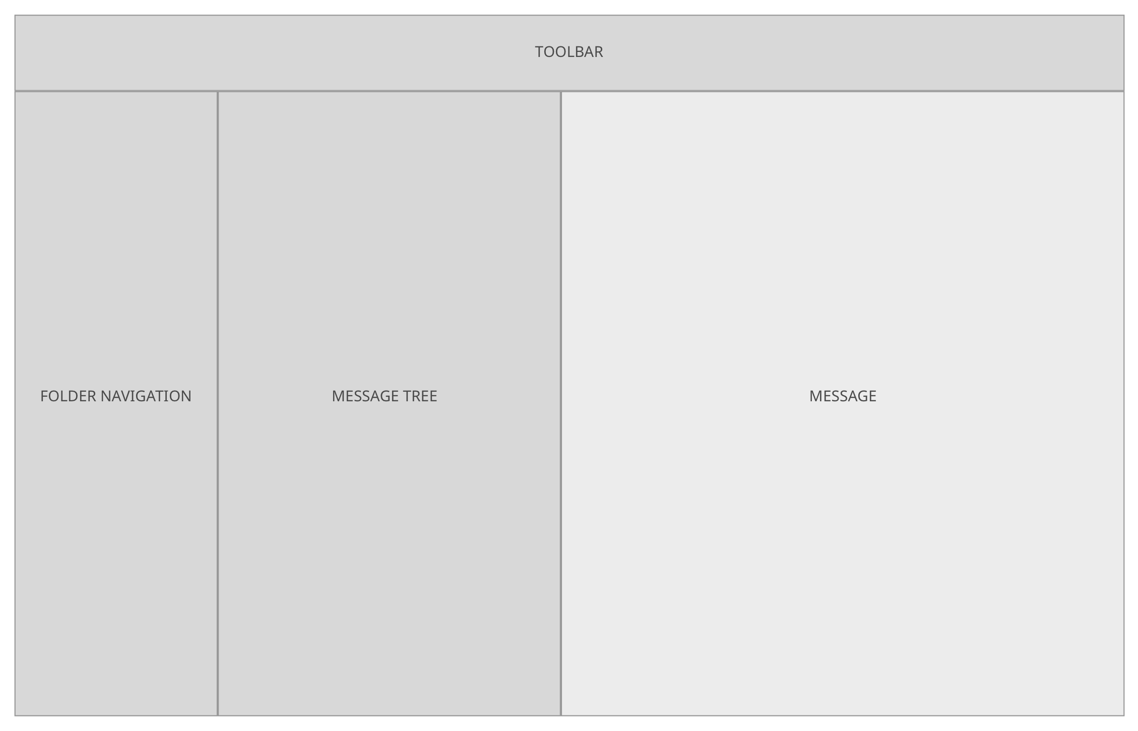
no frames version:
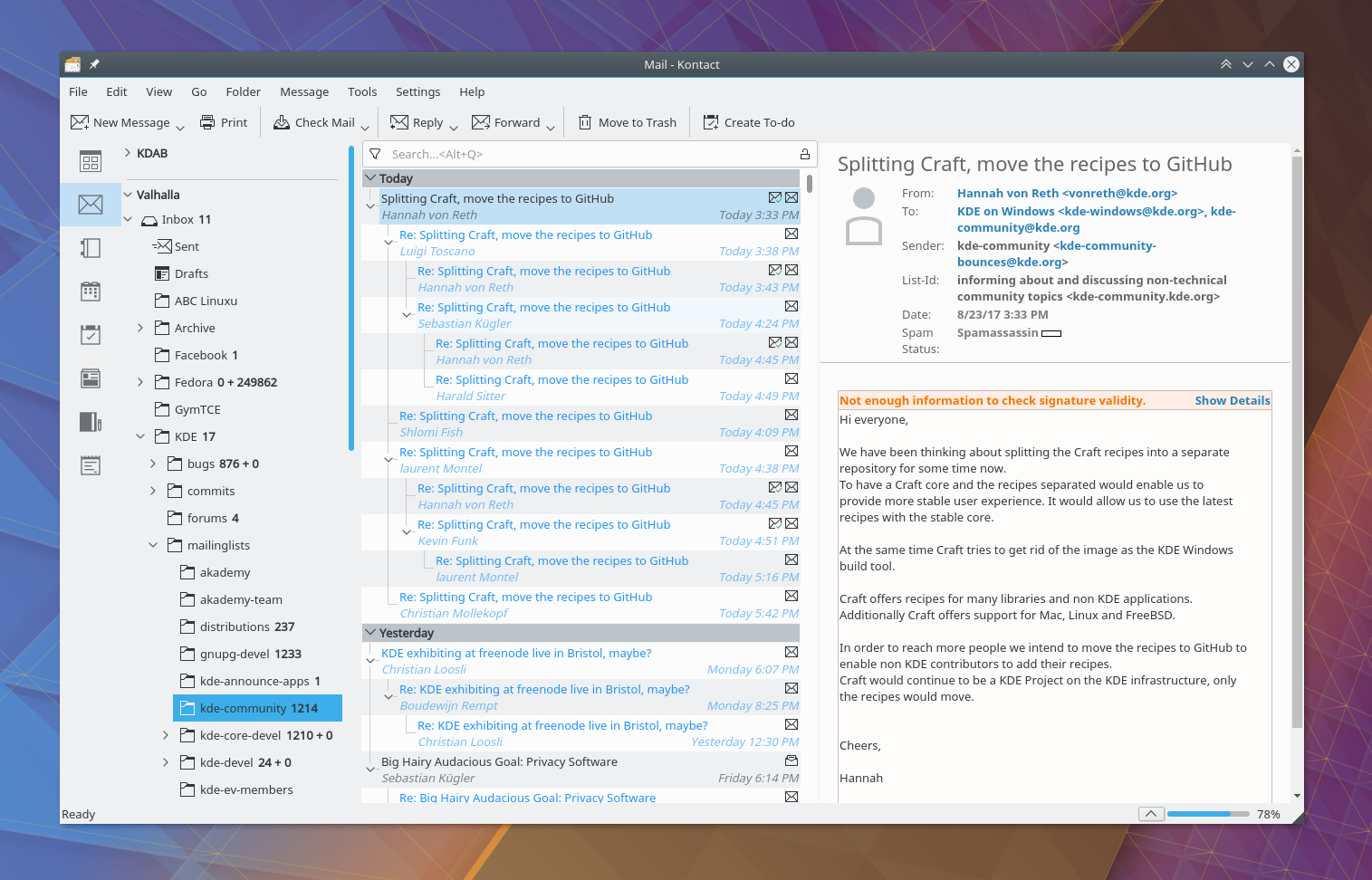
thin frames version:

better view of accounts;

I'd like to get some input from VDG: is this a step in the right direction? Do you have any comments, especially regarding the folder tree?