[WISH] Create a quick image editor for Spectacle
Closed, ResolvedPublic

Description

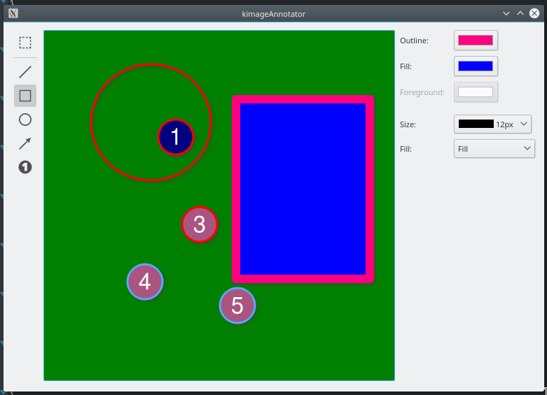
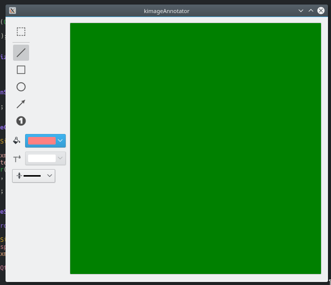
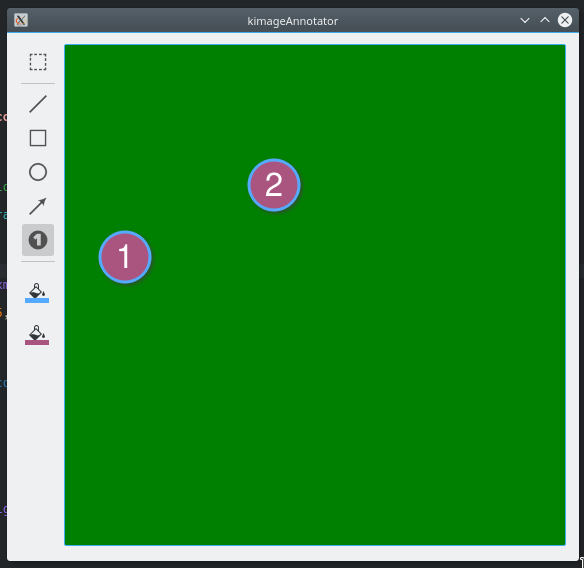
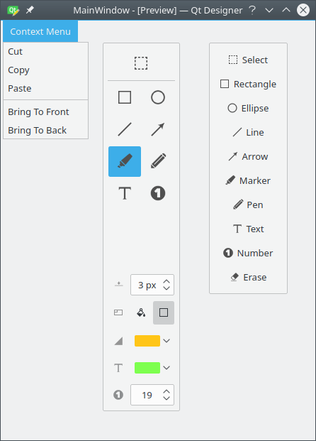
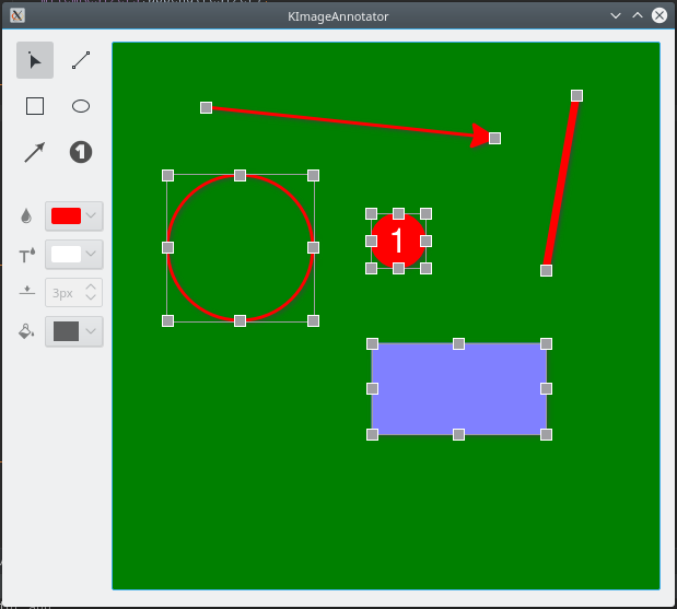
Add a small integrated image editor inside Spectacle. The editor must have the following:

  • Lines
  • Shapes (circles, rectangles and poligons)
  • Blur
  • Text annotations

The function should work as follows:

The default behavior of Spectacle is to show the GUI. So add a 'Edit screenshot' checkbox to show the edit options:

  • When the user clicks the checkbox, the GUI maximizes and shows the quick editor options


Relevant BUGS:
https://bugs.kde.org/show_bug.cgi?id=268260
https://bugs.kde.org/show_bug.cgi?id=372464

There are a very large number of changes, so older changes are hidden. Show Older Changes

@rkflx Thanks for the detailed feedback :)

CMake did not work right out of the box for me (which resulted in make failing too):

I did notice that too once, when I moved the resource stuff to it's own directory and it never happened again, I thought this might be a glitch on my system. I'll definitely need to look into that.

2: You should be able to run the tests by issuing ctest from the test directory.
4: The icons are only placeholders which I have taken from KSnip and all icon were drawn by myself, so the quality/resolution is not the best. I was hoping to find someone to create new icons or use icons from another KDE Application.
6: All logic is in the AnnotationArea class, which inherits from QGraphicsScene, so it can be added to any QGraphicsView. The KImageAnnotation widget is just hosting a view and toolbars that are used to control the AnnotationArea. I was thinking to have a Dialog, a KPart and a Widget version of KImageAnnotation so it could be used in different ways.
9: Actually I was looking at KolourPaint and LibreOfficeDraw for ideas on how to structure the application, I'm still undecided which one could work better. The KolourPaint layout comes mostly due to the fact that I could quickly create the widgets that I need. The ColorPicker widget in LibreOfficeDraw is more challenging to implement, but it's doable, I have something similar in KSnip. It's worth try to see how it works out. The hover effect should not be a problem to implement, though KolourPaint doesn't have it either on the Size and Color Picker.
11: Will come when we add storing settings
12: I was thinking about a FillPicker, which is actually implemented but not yet pushed to github as I'm still fixing a small issue with arrows. Works like the same tool in KolourPaint
15-18: Will come when I get more into the part with keyboard shortcuts, currently I've added only the Delete and Escape for Selected Items.
19: Need to add some minimal default size
20: Yes
21: Yes, was already in KSnip
22: I've noticed that, requires some fixing.
23: Yes, I was planning to add that
24: I was thinking about changing icon but glow seems an interesting idea. I could use the shadow for that, just change it's color and position on hover.
26: Requires some implementation that needs to be coordinated with the Undo/Redo stack. Multi-Selection caused me some headache with KSnip, but it will definitely come.
27: Same as 26.
29: Haven't noticed that yet, will check it out.
30: Yes, I'm not storing the offset of the handle, only for the item itself. Should be easy to fix.

For me is currently the biggest question if we should proceed with the current layout (inspired by KolourPaint) or change direction in favor of some kind LibeOfficeDraw look-and-feel, as changing stuff later on would require a lot of refactoring so I would like to set course now. What's your opinion?

Instead of PNGs, we can probably find some SVG icons in Breeze or try to request missing ones.

Agreed. Current icons don't adapt to dark themes :)

As said, those are only placeholder icons, I'm hoping to find someone with actual design skills to make some better ones.

Color/Width picker felt a bit alien (no hover effect, no Breeze widget style), and I'm not sure whether to expose all options in plain view.

I notice he sets the stylesheet on the color and width pickers. Setting a stylesheet essentially wipes all styles, and starts from scratch, that's why the Breeze styling is gone. From my research, using stylesheets is generally advised against, with QPalette and QStyle being recommended instead.

Actually that is the Idea for those controls as they should always look like this, due to the fact that they are not the usual buttons but more of a specific control for this application. Another option would be to draw those controls ourselves but also in this case we would ignore style.

Idea: Comboboxes like in LibreOffice Draw (but simpler), where users could still see what is selected currently. (Note: Comment does not apply to tool selection.) Possibly needs more thinking, but for a start your approach is fine too.

Would KColorPicker be overkill here? I say probably, but worth considering, maybe in addition to a basic palette.

I know KColorPicker but haven't worked with it in code, does it provide only the Dialog where you can select a color? If that is the case, Qt provides a Dialog for that too, which I was using to add more colors in KSnip. A simple option would be of course to have a button, when clicked, opens KColorPicker, you select a color and when it closes the button shows the color as Icon, so you would see what color you have selected. This could be in future extended to work like color picker in LibreOfficeDraw, with a nice popup menu to chose a color from.

Add hover state to indicate when cursor is over a handle (not sure I'd like changing the cursor itself like LibreOffice Draw or Krita do, though).

I think changing the cursor (like resizing a window) is fine here. It's pretty standard and expected behaviour.
Speaking of cursors, using the 'cross' cursor for drawing might be a good idea.

I haven't yet looked much into the Cursor Icon stuff, we will definitely have something.

I know we don't want too many specific tools, but I think a common and useful annotation tool, is a number-badge that automatically counts up. Great for indicating multiple step instructions.

Numbering tool is one of my favorite tools, I have it in KSnip and we will add it here, definitely.

I'd have a lot of learning to do (only started teaching myself C++/Qt/KDE a couple months ago), but I'm willing to give it a shot. Perhaps we should create a task over in Gwenview? I created on: T8152: Integrate KImageAnnotator

Nice, I've subscribed to the task :)

Can we in Phabricator somehow track open tasks? I would like to have a list of stuff that is planned and will come eventually in future, we could use the to prioritize and track progress. Other folks would be able to see what is planned and what note and eventually add wishes. Something like sub-tasks. How do you handle stuff like that?

rkflx added a comment.Mar 7 2018, 10:22 AM

Can we in Phabricator somehow track open tasks? I would like to have a list of stuff that is planned and will come eventually in future, we could use the to prioritize and track progress. Other folks would be able to see what is planned and what note and eventually add wishes. Something like sub-tasks. How do you handle stuff like that?

On the top right: Edit Related TasksCreate Subtask

Also, the task is part of Spectacle's workboard (and if you'd tagged Gwenview, it would appear there too). We only recently got this, so there is no real organizational scheme yet. Feel free to propose something.

As for priorities, on the bottom combobox you have Change Priority.

(I'll answer your other questions later…)

Update:
I was not happy with the KColourPaint style so I went more in direction of LibreOffice Draw, I'm trying out not this approach, here is how it looks like:

Sure, there is more to do with the layout and the visibility logic, currently I only disable not available properties, but I would prefer to hide them, however, this creates some ugly behavior as the remaining layout expands and so ... anyhow, needs some work.

Following has been added:

  • Numbering tool
  • Additional color pickers, for fill and foreground (outline was already implemented)
  • Storing and loading selection. We not store every property per tool, so when you switch back to the tool, you get your config back. We store also latest selected tool and this one is selected on the next startup

Fixed:

  • With Select tool selected (hah) you can click and drag an item right away, don't need to select it first and then move.
  • Resize handles take now mouse press down position as offset into account, so they should not longer snap to the center

How about something like this instead of a new UI for editing screenshots with Spectacle: https://github.com/lupoDharkael/flameshot/blob/master/img/appPreview/animatedUsage.gif

How about something like this instead of a new UI for editing screenshots with Spectacle: https://github.com/lupoDharkael/flameshot/blob/master/img/appPreview/animatedUsage.gif

In order to fit that into Spectacle you would need to redo the whole UI, which, as far as I understand, is not something that will be done now. We could have such a design on KImageAnnotator but how good does it fit in to the KDE look and feel?
Implementation wise it should not be difficult to implement, it's looks like QPushButtons with custom StyleSheet I guess.

richardbowen added a comment.EditedMar 11 2018, 5:07 PM

Ok, If it can work with KImageAnnotator then that would be interesting. One could edit images before saveand after save.

rkflx added a comment.Mar 11 2018, 6:05 PM

(I'll answer your other questions later…)

Here we go, more random comments:

Skipping over your latest changes, it seems you started to extend the prototype to a proper standalone application. Let me plug our KF5 Tutorials, which hopefully will make your life much easier for some integration aspects of this. KF5 should be very modular, so this will probably add only very little on top of a Qt-only app.

There are also our ECMs, perhaps those will solve some of the CMake and make test issues.


4: The icons are only placeholders which I have taken from KSnip and all icon were drawn by myself, so the quality/resolution is not the best. I was hoping to find someone to create new icons or use icons from another KDE Application.

cuttlefish from plasma-sdk is a nice tool to find icons, then it's often only a matter of QIcon::fromTheme(...). Once we have a list of missing icons, we can ask the VDG whether they can come up with new ones.

11: Will come when we add storing settings

Haha, small misunderstanding. I meant this as a compliment, i.e. in other apps (e.g. Okular) you have to double-click to use the same annotation tool multiple times, because a single click will switch back to selection mode after adding a single annotation, which is annoying. Your current version is much better.

12: I was thinking about a FillPicker, which is actually implemented but not yet pushed to github as I'm still fixing a small issue with arrows. Works like the same tool in KolourPaint

When I tried it in the morning, I saw that you implemented the KolourPaint tool and wondered how it would work as a combobox. And here we are, you added the combobox, and I think I like it.

Disabling instead of hiding is better too. It makes the interface more predictable and less jumpy. I assume KolourPaint did this because they have a huge variety of tools and corresponding options, but that's not the case for us.

More comments below.

19: Need to add some minimal default size

Maybe, but it's probably easier said than done (while keeping a good user experience). Nevertheless, don't forget about touchpads or older users, for them moving the cursor while pressing down is not that easy. A two-click mode would help them.

23: Yes, I was planning to add that

Let me backtrack a bit here: After reading Huon's comment and looking at KolourPaint and Gwenview's crop handles, I think we might as well go with changing the cursor (perhaps in addition also change the hover colour).

We [now] store every property per tool, so when you switch back to the tool, you get your config back.

Cool, that's a great idea.


For me is currently the biggest question if we should proceed with the current layout (inspired by KolourPaint) or change direction in favor of some kind LibeOfficeDraw look-and-feel, as changing stuff later on would require a lot of refactoring so I would like to set course now. What's your opinion?

Played around a bit, I think we have a hard time because we want to provide too much options. I tried to simplify a bit (please give it a chance), this is what I came up with:

Qt designer file: F5749765

Notes:

  • The docker is floatable and changeable in width, so users have flexibility. (I guess this should even be a normal toolbar, so the ugly close button would be gone.)
  • Docking in other areas could change the layout to horizontal (possibly needs two different layout versions?).
  • More compact layout, everything in one place.
  • Bigger selection button, because it might be used often.
  • KColorCombo seems just like what we want here, i.e. some predefined colours as well as custom ones.
  • No superfluous text labels.
  • Comboboxes:
    • Use images instead of text, otherwise they get too wide for some languages.
    • Line width: drop "1px" labels, they are not really needed.
  • Fill options:
    • I wonder whether we really need to introduce the UI complexity of separate foreground and background colors, do users actually need a border with a different colour? Perhaps adding a mode where the outline is a bit more visible will be enough, e.g. based on the background colour add a darker outline. It's much easier to use this way, because you don't have to click again and pick a matching second colour if we do it for the user already.
    • This could be implemented as toggle buttons (background and outline), where having both enabled would emphasize the outline a bit.
  • Text tool: I doubt users will want to change font and colour too often, so this should not get a duplicated colour combobox. To configure this, there are two ways:
    • MenuButtonPopup, which should allow to open a more elaborate font configuration dialog. Shown at the bottom only for demo purposes.
    • Another way would be to add a generic configure button. Should be on the bottom for real.

I tried to emphasize the important functions, because having too many knobs makes it hard to use. Also, if this widget should be embedded in other apps it must be very minimal in order not to compete with the containing app. Thoughts?

I think it could be beneficial to take a step back and think of the most common workflows, and uses of tools, and then designing to UI primary around those common uses, but at the same time keeping it generic and flexible. We don't want to end up with a tool that is amazingly flexible, but fiddly to use for its common uses.
In other words, make the common uses easy, make the uncommon uses possible.

For example, what's the most common use(s) of the rectangle tool? I would guess drawing a box around something (e.g. text or a button), followed by drawing a solid box to redact sensitive info. So it should be easy to 1) draw a rectangle with no fill, and 2) draw a rectangle with fill and outline the same colour (probably black), without too many clicks in between. There's even an argument for two tools here.


this is what I came up with

I like it. Can we use KDEs toolbars here? I.e. like KXmlGuiApplication?

I like having all tools in one spot (on one side of the image).

Fill options:

  • I wonder whether we really need to introduce the UI complexity of separate foreground and background colors, do users actually need a border with a different colour? Perhaps adding a mode where the outline is a bit more visible will be enough, e.g. based on the background colour add a darker outline. It's much easier to use this way, because you don't have to click again and pick a matching second colour if we do it for the user already.
  • This could be implemented as toggle buttons (background and outline), where having both enabled would emphasize the outline a bit.

Agreed, and related to my above comments regarding workflow. I would guess a solid rectable with different colour border is not a common use. I would even suggest removing outline, and simply have a Fill colour picker (which can be set to transparent).

Text tool: I doubt users will want to change font and colour too often, so this should not get a duplicated colour combobox

We don't want to end up with lots of advanced tools hidden behind menus, creating more clicks needed for commonly changed options. I agree font wouldn't be changed much, but text colour I think would. If you can easily change the colour of the background, you should be able to easily change the colour of the text (so it contrasts). Different workflows for changing colour might be confusing.

I agree that three color settings might be an overkill for simply annotating a screenshots but I think that we need two, at least for the text and numbering tool as @huoni explained.

I do think that having a switch for with and without background/fill is useful, you sometimes want to draw a just a frame around something to point it out, or you might need to hide something so you use it with background. Using transparent color for not showing background is not very efficient as I would still need to keep tack of two colors (outline and fill) and also searching for this transparent color would be annoying for me.

I would suggest to go with two colors:

  1. Color, set the color of all tools, line, arrow ellipse..., and text background. Every tool should have this enabled
  2. ForegroundColor, only used for the the color of text and the numbers in the numbering tool. The background color of Text and Numbering tool is dictated by the previously mentioned Color.

cuttlefish from plasma-sdk is a nice tool to find icons, then it's often only a matter of QIcon::fromTheme(...). Once we have a list of missing icons, we can ask the VDG whether they can come up with new ones.

Is there

For fill, I would go with a combobox or simple checkbox, that just says it has a fill or it has no fill. This option would be only used for Rect, Ellipses and Text, for now.

cuttlefish from plasma-sdk is a nice tool to find icons, then it's often only a matter of QIcon::fromTheme(...). Once we have a list of missing icons, we can ask the VDG whether they can come up with new ones.

Is there a list of common icons provided by QIcon::fromTheme()? I always strugle to find something useful there, that's why I mostly make my own.

Played around a bit, I think we have a hard time because we want to provide too much options. I tried to simplify a bit (please give it a chance), this is what I came up with:

I'm not too happy with my current layout the split on two (left the tool, right the properties) feels kind of strange. Having everything on side is an option in case we say we don't want to put too much stuff in there, so it could work.
Docking is nice to have I guess, though I'm not sure how well it works with KPart. I'll give it a try.

So it should be easy to 1) draw a rectangle with no fill, and 2) draw a rectangle with fill and outline the same colour (probably black), without too many clicks in between.

Agree totally with the first part and disagree with the assumption about the color, my rects are mostly red :P
I do think that you want to be able to switch the color of a rect or ellipse, at least because your screenshot could have a dark or light color and you want to make sure that your annotation stands out. But I agree here with @rkflx mostly you don't need to have outline and fill in different colors, mostly it's one color and you either have it with or without fill. So as already mentioned above, in my humble option, one color option for such tools and additionally with or without fill.

I can't say much about KXmlGuiApplication and KColorCombo, need to have a look at them.

@rkflx thanks for the links, I will have a look at them, I should probably start implementing some of the KDE KF5 stuff, probably the KColorCombo is the first candidate.

I've been playing around with the color picker, tried out KColorCombo and some custom stuff. Does this look anything useful? With the icon left from the Combobox it seems a bit too wide. Below for the size picker another option, custom adding icon into the combobox, something like they have in LibreOffice Draw, we could make the same for the color picker.

rkflx added a comment.Mar 14 2018, 6:27 PM

Sorry I did not reply to your previous comment yet, busy with the 18.04 Beta ;)

I guess assigning icons (as well as a tooltip explaining the icon) is our best option if we want to have multiple colour pickers. I'm not too fond of the "wasted" space at the top, but perhaps we could just show (short!, i.e. only a single word) text next to the icon now.

The combobox at the bottom has the benefit that it won't be mixed up with an actual tool (where the icon is also on the left).

I would definitely go with two row tools when we put the properties stuff down there, I do not like the space there too.

I could also try to implement something like this:

That would take the smallest amount of space.

rkflx added a comment.Mar 14 2018, 6:44 PM

I would definitely go with two row tools when we put the properties stuff down there, I do not like the space there too.

In case we have enough vertical space, showing text instead of going with two rows might not be too bad. Let's see where we end up and how much space we need/have after all tools and options have been added before taking a final decision, I'd say.

I could also try to implement something like this:

Hmh, I don't think covering the icon works so well. I like your other version better.

That would take the smallest amount of space.

It's not really about the absolutely smallest amount of space, but the balance is important too.

In T6321#132903, @rkflx wrote:

Hmh, I don't think covering the icon works so well. I like your other version better.

Same here. If space is a concern, perhaps you could reduce the width of the color picker such that the color itself is a square rather than a rectangle.

That would take the smallest amount of space.

It's not really about the absolutely smallest amount of space, but the balance is important too.

+1

And here the button version, which for me personally fits/looks best (image different icons for the two pickers and some nicer ordering):

You prefer something like this? Or which one did you mean?

rkflx added a comment.Mar 14 2018, 7:53 PM

@dporobic Are both variants already in a state which I could play around with? Perhaps that would make it easier to comment.

This was my initial preference, but…

…now this also looks kinda neat. I guess that's because compared to your initial screenshot here the downwards pointing arrows are missing, making me wonder about usability for the user, though…

Also, how would the Custom… text of KColorCombo fit into this narrow space?

Another idea: Give the colour patch a shape, e.g. a rectangle for the background colour, a bold T for the text colour etc.


Do we know the final number of icons we need to fit into this vertical bar? Perhaps this way arranging things could be easier and we don't run out of space with the chosen approach in the end.

rkflx added a comment.Mar 14 2018, 8:00 PM

I agree that three color settings might be an overkill for simply annotating a screenshots but I think that we need two, at least for the text and numbering tool as @huoni explained.

Okay, you convinced me ;)

I do think that having a switch for with and without background/fill is useful, you sometimes want to draw a just a frame around something to point it out, or you might need to hide something so you use it with background. Using transparent color for not showing background is not very efficient as I would still need to keep tack of two colors (outline and fill) and also searching for this transparent color would be annoying for me.

+1, and this would also allow to change the fill after the fact, which would not be possible if this were two separate tools.

Is there a list of common icons provided by QIcon::fromTheme()? I always struggle to find something useful there, that's why I mostly make my own.

There is https://standards.freedesktop.org/icon-naming-spec/icon-naming-spec-latest.html, which lists common names you can pass to that function and which then are resolved into actual icons depending on the chosen size, icon set and desktop environment.

That list is quite limited, and in Breeze there are many more icon names (as displayed in Cuttlefish). For a start, we should make this work with Breeze, and anything we might need to add should also fit into the Breeze styling, which is probably easiest to achieve by asking the VDG.

In T6321#132907, @rkflx wrote:

That list is quite limited, and in Breeze there are many more icon names (as displayed in Cuttlefish). For a start, we should make this work with Breeze, and anything we might need to add should also fit into the Breeze styling, which is probably easiest to achieve by asking the VDG.

...Which is typically accomplished by filing a bug, like so: https://bugs.kde.org/show_bug.cgi?id=391855

…now this also looks kinda neat. I guess that's because compared to your initial screenshot here the downwards pointing arrows are missing, making me wonder about usability for the user, though…

The initial screenshot is a QToolButton with menu. What I've added here is only a QToolButton that opens QColorDialog, which, in case we pick this approach, I would replace with a popup menu, that shows a grid with colors, similar to the one I have used in KSnip. We can show with or without arrow. KColorCombo is not very flexible as I can't set and custom icons so probably wouldn't use it. With the other option (one that looks and works like a combobox), I would make my own color combobox where I can set custom icons.

A thing that makes me think with the small button approach is how to represent size/width, how would the icon look like?

Do we know the final number of icons we need to fit into this vertical bar? Perhaps this way arranging things could be easier and we don't run out of space with the chosen approach in the end.

I though about at least two other tools, Marker and Text, eventually pen, which makes it 9. For the properties stuff I was thinking Color, Foreground-Color, Size, Fill and number picker. The number picker is for the Numbering Tool, people ask for that when they number more then one screenshot, one is on the first, screenshot, two and three on the second and so on, to prevent incrementing the number always from 1, users prefer to be able to set the "next number". Don't know if we need anything else. So eventually 14 buttons or controls.

There is https://standards.freedesktop.org/icon-naming-spec/icon-naming-spec-latest.html

I know that list but found it very limited for anything more then the basic stuff like undo/redo, open file...

in Breeze there are many more icon names (as displayed in Cuttlefish).

Installed Cuttlefish yesterday, I love it. I got enough icons there for prototyping, maybe we will need 2-3 more, later on.

KColorCombo is not very flexible as I can't set and custom icons so probably wouldn't use it.

Might be a good opportunity to improve KColorCombo, so everyone gets the benefit of a better UI, and then we wouldn't have to write and maintain custom code here.

rkflx added a comment.EditedMar 15 2018, 3:16 PM

Just tried Ksnip again, and discovered the "Configure" button actually changes its options when selecting different tools. Who knew! IOW, that could probably be made more intuitive :D

The colour selector is also great, e.g. the grid, the predefined options, the "..." button etc. The only thing I stumbled upon was how to delete a recently used colour again (perhaps this could be in sync with the "Custom Colours" in the dialog?).


Playing with the final tool selection really helped to make progress:

  • Having text next to the buttons uses too much vertical space, so we need the two-row approach.
  • Duplicating tools into variants w/ and w/o background would result in too many buttons.
  • We need a context menu with less used options.
  • Dividing in a lower and upper group helps navigation vastly.
  • For now we could use KColorCombo, and later add something grid-like as featured in Ksnip to KWidgetsAddons.
  • Tailoring widgets to each tool option does not work, it makes the layout too busy. This needs a consistent pairing of icon and tool.
  • Edit: Different icon sizes help.

QtDesigner file: F5755054

The only thing I'm not yet happy about is the background fill toggle. Ideas?
Edit 2: Added something.

General thoughts about this approach?

Yeah, saving configuration and last screenshot option is saved by default though this can be disabled via settings. Same works in KImageAnnotator now, I'm using more or less the same approach.
The color grid works like: Load a predefined list of colors, after loaded, load last or default color for current tool, if the color doesn't exists in current grid, add the color to the grid. So basically all but the last selected custom color is cleared on startup. If you have selected one of the default colors, all custom colors are deleted after startup.

> We need a context menu with less used options.
Yes, options like copy/past, bring to front/back, are ideal candidates for context menu, same I had in KSnip

For now we could use KColorCombo, and later add something grid-like as featured in Ksnip to KWidgetsAddons.

Makes sense. The popup grid requires some serious redoing, in my opinion it was too complicated to maintain, I think I could make that more simple now. I would also go for popups for other configuration opstions

Tailoring widgets to each tool option does not work, it makes the layout too busy. This needs a consistent pairing of icon and tool.

You're talking about hiding not available configuration vs disabling them when they're not available?

The only thing I'm not yet happy about is the background fill toggle. Ideas?

I would go with combobox which has two icons, one filled rect the other rect without fill. That would fit also with other options

General thoughts about this approach?

Looks good for the begin, probably the best that we could get without making custom controls. I'll make a version tomorrow or the day after tomorrow so we can test around.

Yeah, saving configuration and last screenshot option is saved by default though this can be disabled via settings. Same works in KImageAnnotator now, I'm using more or less the same approach.

Cool, saving colours etc. should be kept, I like that ;)

What I meant was more that e.g. for the Number tool a spinbox would appear, while for the Rectangle tool it would not be shown. Normally I check all buttons once, so more buttons appearing after I inspected the UI was unexpected…

The color grid works like: Load a predefined list of colors, after loaded, load last or default color for current tool, if the color doesn't exists in current grid, add the color to the grid. So basically all but the last selected custom color is cleared on startup. If you have selected one of the default colors, all custom colors are deleted after startup.

I see. Possibly needs more thought to make it more intuitive, but that's for later.

Tailoring widgets to each tool option does not work, it makes the layout too busy. This needs a consistent pairing of icon and tool.

You're talking about hiding not available configuration vs disabling them when they're not available?

Yes, disabling is better than hiding. In addition I was referring to the fact that my draft for the bottom group always had an icon on the left, and the actual widget on the right, consistently for every option.

The only thing I'm not yet happy about is the background fill toggle. Ideas?

I would go with combobox which has two icons, one filled rect the other rect without fill. That would fit also with other options

Hm, maybe. On the other hand, my idea requires one click less per use (which after my latest revision is not so bad anymore, as before I only had a single toggle button instead of the radio buttons).

General thoughts about this approach?

Looks good for the begin, probably the best that we could get without making custom controls. I'll make a version tomorrow or the day after tomorrow so we can test around.

Okay great ;) Take your time, I'm busy anyway…

rkflx added a comment.Apr 2 2018, 8:11 PM

FWIW, here is Basket's colour picker (it's still working fine in the KF5 version of Basket, BTW): http://basket.linux62.org/screenshots/select-background-color.png

Note how this uses a combobox, but the menu shown after clicking is wider than the button itself. It also shows more colours, has a nicer layout overall and employs a hover effect.

Might be worth adding that to KWidgetsAddons in case it could be useful for KImageAnnotator.

Yeap, that looks nice, that is the kind of control I was hopping to implement. I'll look later into implementing something like this (or the exact think) in KWidgetsAddons, when we get to the fine-tuning stuff.

I guess that is just a regular combobox with a custom popup, can be probably implemented with a tool button too, which is currently the approach that I would favor at the moment. We'll see later on.

Quick update on the implementation: I've added multiple selection of items with move and delete for the selection and currently I'm working on the cursor feedback (resize and move cursors). Next is probably send to back and bring to front feature.

@rkflx @huoni
I've added few more things, like multiple item selection/delete/move, bring selected items to front/back, different cursors for hover over items and resize, snap-to for creating items (hold ctrl), toggle selection (hold ctrl), preciser hit detection (we count now only hit on shape, if item has no file, the inner space is not accounted as item).

Would be nice if you could test it out and give me some feedback.

How should we proceed with the project in regards to transitioning it to the KDE platform? What would be the first step? Incubator eventually?

huoni added a comment.Apr 17 2018, 1:44 AM

Would be nice if you could test it out and give me some feedback.

Nice work! Here are my thoughts. Note they are general thoughts for discussion as well as addressing your recent improvements, so ignore any issues you're already aware of.

  • Multi-selection, and the bulk actions (delete, arrange, move) all work well and intuitively.
  • I'm not sure about the selection rectangle, especially for lines/arrows. I think drawing an outline/stroke to indicate selection would look better, and perhaps less confusing when there are a lot of shapes selected. Additionally, the resize handles already indicate which item is selected, so you could go without the selection outline when only one item is selected.
  • Snap-to / aspect lock works well when creating. I think this also needs to be implemented when resizing an existing item though, locking it to whatever ratio it is currently.
  • I like the colour chooser, but the "Custom" entry for me just says "Cus" because it's too narrow. This might be even worse in other languages. So either we need to resize to fit the word, use an icon, or come up with another solution.
  • The resize cursor for the corner handles is the four-pointed arrow. This is good for resizing arrows, but for rectangle and ellipse, it seems odd. In Greenshot, the angled arrow cursor is used, i.e. Qt::SizeBDiagCursor and Qt::SizeFDiagCursor.
  • The badge counter text isn't centred properly, especially at larger sizes where the text actually is outside the circle for double digit numbers.
  • Speaking of the badge counter, the 'line width' tool changes the size of the badge - this doesn't seem very intuitive to me. We could change the tool icon to more represent a general 'size'. Or we could simply disable it and force one size (can resize afterwards anyway?)
  • And speaking of the line size widget, when the pixel value is double digits, it's not wide enough and the 'x' in 'px' is cut off partially.
  • The resize handles for the badges are drawn inside the shape instead of on the border.
  • When badges are deleted, we should probably reset the counter. Two workflows I imagine. 1) Delete all badges to start again - should reset to 1. 2) "Undo" one or more badges - count should start from the last highest number. In fact, how Greenshot does it, is it always keeps the numbers consecutive. E.g. if you have 1, 2, 3, and delete 2, then 3 becomes 2, and you end up with 1, 2. This is probably the best way to do it, otherwise you could easily end up with missing numbers.
  • Can't change colours of existing items. Is this planned?
  • Currently, if I draw a shape outside the edge of the view, it automatically resizes and scrolls. However this only happens up to a certain distance, and all other drawing outside the view results in the document resizing but not auto-scrolling. If that makes sense? I think it should always auto-scroll, and there should be no limit to the size of the resulting document (or rather, a very large limit).
  • I think we should allow panning by holding e.g. space and dragging, otherwise navigating a large image would be annoying (for non-touchpad users anyway).

Those sound mostly negative, but overrall I really like it! I like the tool layout - simple and easy to use. Keep up the good work!

Thanks for the feedback :)

I'm not sure about the selection rectangle, especially for lines/arrows. I think drawing an outline/stroke to indicate selection would look better, and perhaps less confusing when there are a lot of shapes selected. Additionally, the resize handles already indicate which item is selected, so you could go without the selection outline when only one item is selected.

I was trying to accomplish this before but it isn't that easy with the tools that I currently have. I was not able to get only the outline of items as they are composed of paths and you get some strange construction when you try only to draw the outline. What could eventually work is using something like the shadow effect to have the outline, but that is just some guess. I'll try to play around with it more, let's see if I can come up with something. Any other ideas are also welcome.

I think this also needs to be implemented when resizing an existing item though, locking it to whatever ratio it is currently.

Resize will get the same functionality

I like the colour chooser, but the "Custom" entry for me just says "Cus" because it's too narrow. This might be even worse in other languages. So either we need to resize to fit the word, use an icon, or come up with another solution.

I will probably replace that widget with another one, I'm not too happy with it.

The resize cursor for the corner handles is the four-pointed arrow. This is good for resizing arrows, but for rectangle and ellipse, it seems odd. In Greenshot, the angled arrow cursor is used, i.e. Qt::SizeBDiagCursor and Qt::SizeFDiagCursor.

At first I had those cursors but then I changed them as you can actually move the corners in any direction. If it feels that strange, I can change them back.

The badge counter text isn't centered properly, especially at larger sizes where the text actually is outside the circle for double digit numbers.

Not easy to center text, I'm actually resizing the text and then checking if it still first into the bounding rect of the circle, which is all not so precise. I'll try to tweak that.

Speaking of the badge counter, the 'line width' tool changes the size of the badge - this doesn't seem very intuitive to me. We could change the tool icon to more represent a general 'size'. Or we could simply disable it and force one size (can resize afterwards anyway?)

I would prefer setting size, but didn't thought about the icon and text, you're right looks strange. It could be annoying to resize every item, one by one.

And speaking of the line size widget, when the pixel value is double digits, it's not wide enough and the 'x' in 'px' is cut off partially.

Can't reproduce on my machine, which is bad. I'll increase the size a bit.

The resize handles for the badges are drawn inside the shape instead of on the border.

The handlers are on the points that you actually resize, the border is just the bounding rect, which is item + penSize. If it feels strange, I could work around that with offsets.

When badges are deleted, we should probably reset the counter. Two workflows I imagine. 1) Delete all badges to start again - should reset to 1. 2) "Undo" one or more badges - count should start from the last highest number. In fact, how Greenshot does it, is it always keeps the numbers consecutive. E.g. if you have 1, 2, 3, and delete 2, then 3 becomes 2, and you end up with 1, 2. This is probably the best way to do it, otherwise you could easily end up with missing numbers.

The problem is keeping only the right numbers there. In ksnip I had a separate text box to enter the next number, which is useful when you have several screenshots and on every new screenshot you start with the next number and not from 1. Greenshots approach is nice and complex, you need to keep track of items and update all numbers when you undo/redo/delete/add. I'll see what I can do here.

Can't change colours of existing items. Is this planned?

Yes, planned.

Currently, if I draw a shape outside the edge of the view, it automatically resizes and scrolls. However this only happens up to a certain distance, and all other drawing outside the view results in the document resizing but not auto-scrolling. If that makes sense? I think it should always auto-scroll, and there should be no limit to the size of the resulting document (or rather, a very large limit).

I personally don't like the resizing, usually you don't want to go outside of the screenshot and sometimes you extend it by mistake and then your screenshot is not in the center, which is annoying. I would prefer to have no scrolling but only a 50px or so, border around the screenshot. I didn't look into this at all.

I think we should allow panning by holding e.g. space and dragging, otherwise navigating a large image would be annoying (for non-touchpad users anyway).

Can you elaborate on this one?

I'm not sure about the selection rectangle, especially for lines/arrows. I think drawing an outline/stroke to indicate selection would look better, and perhaps less confusing when there are a lot of shapes selected. Additionally, the resize handles already indicate which item is selected, so you could go without the selection outline when only one item is selected.

I was trying to accomplish this before but it isn't that easy with the tools that I currently have. I was not able to get only the outline of items as they are composed of paths and you get some strange construction when you try only to draw the outline. What could eventually work is using something like the shadow effect to have the outline, but that is just some guess. I'll try to play around with it more, let's see if I can come up with something. Any other ideas are also welcome.

If it's possible to change the colour of the shadow, that could work. Perhaps use the color scheme highlight colour, and decrease transparency. Also it would need to be symmetrical on all sides.
Otherwise, could you 'fake' an outline by drawing a differently coloured, slightly larger version of the shape underneath?

And speaking of the line size widget, when the pixel value is double digits, it's not wide enough and the 'x' in 'px' is cut off partially.

Can't reproduce on my machine, which is bad. I'll increase the size a bit.

Haven't looked at the code, but are you setting fixed width? I think any widget with text should have a dynamic size to fit the contents. Or perhaps there's something else going on.

The resize cursor for the corner handles is the four-pointed arrow. This is good for resizing arrows, but for rectangle and ellipse, it seems odd. In Greenshot, the angled arrow cursor is used, i.e. Qt::SizeBDiagCursor and Qt::SizeFDiagCursor.

At first I had those cursors but then I changed them as you can actually move the corners in any direction. If it feels that strange, I can change them back.

The angled cursors are pretty consistently used for the corners of rectangles or other 2D shapes, including in window managers. I think angled is better here, but ensure the angle swaps if you resize to flip/mirror the shape.

The badge counter text isn't centered properly, especially at larger sizes where the text actually is outside the circle for double digit numbers.

Not easy to center text, I'm actually resizing the text and then checking if it still first into the bounding rect of the circle, which is all not so precise. I'll try to tweak that.

Maybe using a fixed-width font would help?

Speaking of the badge counter, the 'line width' tool changes the size of the badge - this doesn't seem very intuitive to me. We could change the tool icon to more represent a general 'size'. Or we could simply disable it and force one size (can resize afterwards anyway?)

I would prefer setting size, but didn't thought about the icon and text, you're right looks strange. It could be annoying to resize every item, one by one.

I assume we'll add a text tool at some point. That will require a font size. So instead of using 'line size' to change the badge size, we could just use the font size control. Then the badge just increases size to fit the font.

The resize handles for the badges are drawn inside the shape instead of on the border.

The handlers are on the points that you actually resize, the border is just the bounding rect, which is item + penSize. If it feels strange, I could work around that with offsets.

It does feel strange. Resize handles should always be on the border/edge of the shape, never inside. If they are inside, it doesn't seem like they are resizing the full shape.

When badges are deleted, we should probably reset the counter. Two workflows I imagine. 1) Delete all badges to start again - should reset to 1. 2) "Undo" one or more badges - count should start from the last highest number. In fact, how Greenshot does it, is it always keeps the numbers consecutive. E.g. if you have 1, 2, 3, and delete 2, then 3 becomes 2, and you end up with 1, 2. This is probably the best way to do it, otherwise you could easily end up with missing numbers.

The problem is keeping only the right numbers there. In ksnip I had a separate text box to enter the next number, which is useful when you have several screenshots and on every new screenshot you start with the next number and not from 1. Greenshots approach is nice and complex, you need to keep track of items and update all numbers when you undo/redo/delete/add. I'll see what I can do here.

IMO we should aim for the complex solution, as I feel it has the best UX. But we could do something simpler to start with. E.g. being able to set a number or reset the counter, perhaps in the context menu.

Currently, if I draw a shape outside the edge of the view, it automatically resizes and scrolls. However this only happens up to a certain distance, and all other drawing outside the view results in the document resizing but not auto-scrolling. If that makes sense? I think it should always auto-scroll, and there should be no limit to the size of the resulting document (or rather, a very large limit).

I personally don't like the resizing, usually you don't want to go outside of the screenshot and sometimes you extend it by mistake and then your screenshot is not in the center, which is annoying. I would prefer to have no scrolling but only a 50px or so, border around the screenshot. I didn't look into this at all.

There are definitely times where you don't want to annotate on top of the screenshot, but next to it. E.g. for a text box, or arrows pointing in at the edge. Perhaps restricting it to a reasonable margin is fine, as long as it's big enough to allow those use cases. I agree the auto-resizing by accident is annoying, but the best way to solve it is to have it also auto-resize smaller. So you just undo, or move the shape back inwards and all is well. We'd also need to clearly indicate the edge of the document vs the edge of the image.

I think we should allow panning by holding e.g. space and dragging, otherwise navigating a large image would be annoying (for non-touchpad users anyway).

Can you elaborate on this one?

If scrollbars are visible, scrolling vertically is easy with a scroll wheel. Scrolling horizontally not so much. There needs to be some sort of panning tool, activated by holding down a key since clicking and dragging normally does other things. I like Photoshop's way of doing this, which is hold space, click + drag to pan (scroll).

@huoni how about something like this for selected items:

Or like this:

btw, I have logged issues (on github) for the points that you have made, if you want you can subscribe to them and get updates when I change something.

huoni added a comment.Apr 21 2018, 7:40 AM

@huoni how about something like this for selected items:

It's not obvious enough. You could have just changed the colours of those items to a lighter shade.

Or like this:

Sorry don't like this one either. It looks like the dark ones are disabled somehow.

We need to stick with convention. Many apps rely on the resizing handles to indicate selection - maybe we should stick with that, and keep them visible if >1 item selected.
Alternatively, show the selection rect like you were doing, but only for shapes where it makes sense, and not for lines/arrows, where it looks odd.

It's not obvious enough. You could have just changed the colours of those items to a lighter shade.

It's not the same, with this approach you see selected items that are hidden behind other items and the color could be any color of course.

Anyhow, here another solution, the one that you mentioned last. It's the same approach that Microsoft uses in PowerPoint, there you can have multiple items selected and you can select one by one

I'm still refactoring that thing but the visual should not change.

Anyhow, here another solution, the one that you mentioned last. It's the same approach that Microsoft uses in PowerPoint, there you can have multiple items selected and you can select one by one

I'm still refactoring that thing but the visual should not change.

+1, that's great, and a very common UI in drawing apps.

huoni added a comment.Apr 23 2018, 3:48 AM

Anyhow, here another solution, the one that you mentioned last. It's the same approach that Microsoft uses in PowerPoint, there you can have multiple items selected and you can select one by one

I'm still refactoring that thing but the visual should not change.

+1, that's great, and a very common UI in drawing apps.

Agreed, I like this the best. Keeps consistency with other apps, is clear and unambiguous.
Thanks for trying it out :)

rkflx added a comment.May 9 2018, 8:37 PM

@dporobic Thanks for your patience, hopefully I'll find some time to look into your work soonish (impressive rise of compile times due to all the tests, BTW!).

Small compile fix below:

diff --git a/tests/annotations/undo/AddCommandTest.h b/tests/annotations/undo/AddCommandTest.h
index 99b6f31..03e6b78 100644
--- a/tests/annotations/undo/AddCommandTest.h
+++ b/tests/annotations/undo/AddCommandTest.h
@@ -23,7 +23,7 @@
 #include <QtTest>
 
 #include "../../../src/annotations/undo/AddCommand.h"
-#include "../../../src/annotations/AnnotationArea.h"
+#include "../../../src/annotations/core/AnnotationArea.h"
 #include "../../../src/annotations/items/AnnotationLine.h"
 
 class AddCommandTest: public QObject
diff --git a/tests/annotations/undo/DeleteCommandTest.h b/tests/annotations/undo/DeleteCommandTest.h
index 107c097..9e32450 100644
--- a/tests/annotations/undo/DeleteCommandTest.h
+++ b/tests/annotations/undo/DeleteCommandTest.h
@@ -23,7 +23,7 @@
 #include <QtTest>
 
 #include "../../../src/annotations/undo/DeleteCommand.h"
-#include "../../../src/annotations/AnnotationArea.h"
+#include "../../../src/annotations/core/AnnotationArea.h"
 #include "../../../src/annotations/items/AnnotationLine.h"
 
 class DeleteCommandTest : public QObject

@rkflx are you using latest version? I have fixed those error yesterday commit

Test Compile time starts to annoy me too, I'm looking for improvements already, but I'm also open for suggestions :)

@rkflx the slow test build should be fixed now. The initial approach has build all the source for every source file, now we build the source as a library once and link it to every test.

@rkflx are you using latest version? I have fixed those error yesterday commit

Well, I used a fresh checkout. However, by chance you pushed a fix right before I commented, so I missed it. No worries ;)

@rkflx the slow test build should be fixed now. The initial approach has build all the source for every source file, now we build the source as a library once and link it to every test.

Nice!

FWIW, 426f92caa761640fa0db9e1ab72fc1cd7a125b56 and 7cb618ea3246a8bb6f3f3550618302e116d18b34 break compiling for me again…

dporobic added a comment.EditedMay 21 2018, 7:49 AM

@rkflx do you have a CI that builds on every commit? xD
That was another refactoring, should be working again.

@rkflx @huoni Both of you have mentioned that you don't like the resize handles being not on the border when the thickness is large, for rect and line. I have an attempt to fix that but it creates another glitch for which I can't see any solution at the moment. Check out what happens when you pull the top handle down below the bottom handle in this gif

The reason for this behavior is that we resize the shape, not the border itself, so with this thickness, the border never gets thinner, but we have to swap handle offset at one point, and this is when top < bottom, so the initial offset of x=-5, becomes x=+5, and now the handle is no longer directly under the cursor. I don't see a solution to this without changing the way we paint stuff.

LibreOffice paints the handles in the border, like we did before this change. Do you guys know of an application that has this resolved?

Oh, and btw. Undo/Redo should be working for all Items operation, like Add, Remove, Resize, Move and Arrange.

rkflx added a comment.May 21 2018, 8:39 AM

@rkflx do you have a CI that builds on every commit? xD
That was another refactoring, should be working again.

No, just bad luck every time I try have a look at your work :D Absolutely no problem in this state, but once your code is releasing from KDE's repos, it is important to keep it building at all times, as otherwise git bisect becomes very hard to use. The CI on https://build.kde.org will indeed build on every commit then, and even run your tests…

Also, going forward you might want adapt your commit titles a bit to our preferred style, see https://chris.beams.io/posts/git-commit/#imperative for details.

(More to come by tomorrow evening, gotta run now…)

Checked out the latest version, it's looking better every day and coming along great ;)

I jotted down some things I noticed, but it probably does not make sense to list every single detail here at this point. Nevertheless, do let me know if you want detailed feedback or rigorous testing on a particular topic (which should be much quicker now that I'm up to speed with the current state again).

Regarding the selection handling:

  1. In general the square handles work really well, also in conjunction with the different cursors. The jumpiness of earlier iterations is gone, it's all very smooth. Multi-selection is fine.
  2. Using the hand cursor for moving is consistent with Gwenview and Spectacle, which is probably good. Only the omnidirectional cursor for line handles feels a bit heavy and unusual. There does not seem to exist a standard solution, but maybe the "pointy hand" cursor might be worth trying.
  3. After switching the cursor theme to DMZ (which has less duplicated shapes than Breeze), you'll see for the left corners the wrong cursor shape is chosen.
  4. For thin lines it's sometimes hard to position the cursor at the right spot, perhaps in those cases the "active" area could be a bit larger than the actual visual line width.
  5. When the "hand" cursor is shown, it is not clear to which object it belongs. Maybe some kind of hover effect (bigger shadow?) could work, but for a start you could try showing the normal rectangular outline (without the handles).
  6. Conceptually the rectangle outline is quite good, but in particular for rectangular objects it sometimes makes for a muddy look. I'm not quite sure why that is yet (e.g. whether it's the colour or the positioning), but I noticed a more general problem which might be related: Try drawing straight lines (modifier FTW ;) with 1/2/3/4px width next to each other and look at them with KMag. They are not really aligned to the pixel grid, so Qt uses anti-aliasing, resulting in different colours and line widths. I think that's important to solve first, and afterwards focus on polishing the rectangle outlines or try a different approach if that fails.
  7. A lot of apps show the selection handles directly after finishing drawing (without switching to the select tool, though, allowing to invoke drawing again). I think this would also work really well here, and improve the experience quite a lot.
  8. Try hiding the handles while resizing and the mouse button is pressed down (like in Gwenview, this might look a bit slicker).

Misc:

  1. Snap-to works great, but could be extended from initial creation to editing later on.
  2. For numbers, keeping the aspect ratio should be turned on by default.
  3. For a straight line across the screen, drawing a selection rectangle in the center of the screen to select that line only works sometimes.
  4. Undo/Redo: Cool! (but could only do a short test)

pull the top handle down below the bottom handle

Spectacle and Inkscape (in that special resize mode you get into with double-clicking) simply stop resizing and don't invert the object or change the handle. I could imagine this would work well for us too (only for resizing, not for creation, of course). BTW, Shutter has the same problem…

(I noticed I duplicated some things @huoni already mentioned, so take it as an additional opinion… I'm also happy to discuss some issues brought up in previous comments, if you want, I simply wanted to focus on a single topic in this comment.)


As for how to integrate your code into KDE's git repos, I guess that would be easier to answer once we know where it should go. I don't think it can go straight to KDE Frameworks, because for that the code has to prove itself first for some time and it has to be used in a couple of places.

Reading https://community.kde.org/Policies/Application_Lifecycle, there are two basic options (playground or incubator), but I don't see any mention of how this would relate to Phabricator (note that Phabricator distinguishes between projects and code repositories). I'm not an expert on this topic really, so you might want to ask around on the kde-devel list instead. However, in any case probably some of the answers will become more clear once there is some demo code actually integrating annotations in an application.

If you simply want to host the repo in playground and get a project up on Phabricator (e.g. for task/issue tracking) to get the ball rolling, try asking a sysadmin (e.g. by opening a sysadmin ticket on Phab).

Anyway, reading https://community.kde.org/Incubator/Projects/Ksnip you probably know more about this than I do ;) What's your plan going forward? Do you want continue with feature development and bug fixing for the moment, or should we look more into polishing the infrastructure for integration with other apps and KDE's ways of doing things (e.g. I still have CMake issues with fresh checkouts, and it might be worth comparing your approaches to how things are done in more established code bases like Gwenview)?

In T6321#143745, @rkflx wrote:

pull the top handle down below the bottom handle

Spectacle and Inkscape (in that special resize mode you get into with double-clicking) simply stop resizing and don't invert the object or change the handle. I could imagine this would work well for us too (only for resizing, not for creation, of course). BTW, Shutter has the same problem…

I checked Greenshot on Windows, and that actually draws the handles in the center of the border.
I think @rkflx's idea of just preventing flipping when resizing is the best choice. I don't think it's a feature users would naturally expect, and move+resize is easy enough.

Try drawing straight lines (modifier FTW ;) with 1/2/3/4px width next to each other and look at them with KMag. They are not really aligned to the pixel grid, so Qt uses anti-aliasing, resulting in different colours and line widths. I think that's important to solve first, and afterwards focus on polishing the rectangle outlines or try a different approach if that fails.

Here's a screenshot that shows this. All lines drawn at 1px setting. Actual width is 2px, and therefore opacity is also <100%.


Some other things that probably don't need attention right now and are more polish, but figure I'll mention anyway:

  1. I think some of the tool/control button tooltips are a little confusing:
    1. Foreground Color might be better as Text Color if it only affects the text
    2. Fill could be Fill Type in case it's confused with the fill color
    3. Rect should probably be Rectangle
  2. Idea: (tab) to cycle selection?
  3. Minimum size of the number badge is a bit big IMO

I noticed a more general problem which might be related: Try drawing straight lines (modifier FTW ;) with 1/2/3/4px width next to each other and look at them with KMag. They are not really aligned to the pixel grid, so Qt uses anti-aliasing, resulting in different colours and line widths. I think that's important to solve first, and afterwards focus on polishing the rectangle outlines or try a different approach if that fails.

Here's a screenshot that shows this. All lines drawn at 1px setting. Actual width is 2px, and therefore opacity is also <100%.

Yes, Antialiasing is enabled on purpose because otherwise the line would look like this:


I'm not sure if there is much that can be done, we could try to disable Antialiasing below a specific width but IMO that looks worse.

Spectacle and Inkscape (in that special resize mode you get into with double-clicking) simply stop resizing and don't invert the object or change the handle.

I'm not the biggest fan of this, because we're limiting a feature just to fix visual handle positioning, but it would make resizing Pen and Marker much simpler to implement. I'll guess we go with that option for now.

When the "hand" cursor is shown, it is not clear to which object it belongs. Maybe some kind of hover effect (bigger shadow?) could work, but for a start you could try showing the normal rectangular outline (without the handles).

I've logged an issue for that https://github.com/DamirPorobic/KImageAnnotator/issues/11

A lot of apps show the selection handles directly after finishing drawing (without switching to the select tool, though, allowing to invoke drawing again). I think this would also work really well here, and improve the experience quite a lot.

Currently we have the handles only in selection mode, I think it would be confusing when we show the handles while still in drawing mode. Eventually when we change later on the selection logic, (something like double click on an item, or soemthing else), we might consider this again.

Try hiding the handles while resizing and the mouse button is pressed down (like in Gwenview, this might look a bit slicker).

https://github.com/DamirPorobic/KImageAnnotator/issues/12

Snap-to works great, but could be extended from initial creation to editing later on.

https://github.com/DamirPorobic/KImageAnnotator/issues/13

Anyway, reading https://community.kde.org/Incubator/Projects/Ksnip you probably know more about this than I do ;) What's your plan going forward? Do you want continue with feature development and bug fixing for the moment, or should we look more into polishing the infrastructure for integration with other apps and KDE's ways of doing things (e.g. I still have CMake issues with fresh checkouts, and it might be worth comparing your approaches to how things are done in more established code bases like Gwenview)?

I didn't get far with this process with ksnip, I've never found a sponsor. Regarding the imageAnnotator, it would be nice to start using it somewhere to get some user feedback. I think I'll add few more features, like text item, pen and marker and do some more polishing before starting with the release.

I think some of the tool/control button tooltips are a little confusing:

I've fixed all three of them

Idea: ⇥ (tab) to cycle selection?

Cycle tool or item selection?

huoni added a comment.Jun 2 2018, 11:41 PM

I noticed a more general problem which might be related: Try drawing straight lines (modifier FTW ;) with 1/2/3/4px width next to each other and look at them with KMag. They are not really aligned to the pixel grid, so Qt uses anti-aliasing, resulting in different colours and line widths. I think that's important to solve first, and afterwards focus on polishing the rectangle outlines or try a different approach if that fails.

Here's a screenshot that shows this. All lines drawn at 1px setting. Actual width is 2px, and therefore opacity is also <100%.

Yes, Antialiasing is enabled on purpose because otherwise the line would look like this:


I'm not sure if there is much that can be done, we could try to disable Antialiasing below a specific width but IMO that looks worse.

The problem isn't the antialiasing - we definitely want that. The problem is that the shapes aren't aligned to whole pixels. My screenshot shows a 1px wide straight line drawn over two pixels. A 1px wide perfectly horizontal/vertical line should be drawn the exact same with and without antialiasing. What appears to be happening is they are always offset by half a pixel.

Idea: ⇥ (tab) to cycle selection?

Cycle tool or item selection?

Item selection.

rkflx added a comment.Jun 3 2018, 7:07 AM

@dporobic Thanks logging those issues! (Once the code lives in KDE's repos, we should probably use tasks on Phabricator for tracking…)

Currently we have the handles only in selection mode, I think it would be confusing when we show the handles while still in drawing mode. Eventually when we change later on the selection logic, (something like double click on an item, or soemthing else), we might consider this again.

Hm, I find it's very convenient actually, and not confusing at all: Try it in Inkscape, or in LibreOffice Draw (after double clicking on the tool). There is some value to consistency with user's expectations.

In T6321#145883, @huoni wrote:

The problem isn't the antialiasing - we definitely want that. The problem is that the shapes aren't aligned to whole pixels. My screenshot shows a 1px wide straight line drawn over two pixels. A 1px wide perfectly horizontal/vertical line should be drawn the exact same with and without antialiasing. What appears to be happening is they are always offset by half a pixel.

Yup, that's a good description of the likely problem. To visualize it a bit more:

KImageAnnotator (note wrong line widths and colours):


Inkscape (how it should be aligned, don't mind the lack of shadows):


I didn't get far with this process with ksnip, I've never found a sponsor.

Don't take it personally. I guess people were busy, or there was less interest due to overlap with Spectacle. That's why I jumped in here, to help you clear any hurdles. There surely is quite a bit of interest in this annotation feature, judging from comments in various places.

Regarding the imageAnnotator, it would be nice to start using it somewhere to get some user feedback. I think I'll add few more features, like text item, pen and marker and do some more polishing before starting with the release.

I can imagine several ways to approach this:

  • Add a separate integration branch to Spectacle, which people can compile and give feedback. Try to find testers on PlanetKDE, Reddit etc.
  • Ship something experimental, which needs a flag to be enabled.
  • Reduce the feature set for the first release, and polish a subset to a level of quality it can be enabled by default (still with a flag for disabling, should distros not want to pull in the dependency).
In T6321#145897, @rkflx wrote:

Thanks logging those issues! (Once the code lives in KDE's repos, we should probably use tasks on Phabricator for tracking…)

Sure, for now I only use them for myself and it's easier for me to track them in github, and the project lives there currently.

In T6321#145897, @rkflx wrote:

Yup, that's a good description of the likely problem. To visualize it a bit more:
KImageAnnotator (note wrong line widths and colours):

Thanks for clarifying, now I get what you mean. I'll have a look into it.

In T6321#145897, @rkflx wrote:

I can imagine several ways to approach this:

I think I would start with the branch, but first finish the basic features.

In T6321#145897, @rkflx wrote:

Try it in Inkscape, or in LibreOffice Draw (after double clicking on the tool)

If you didn't told me twice I would have never found this feature.

I don't know if I get you correctly but to me this looks like an Antialiasing issue.
Here with enabled Antialiasing

And here with disabled Antialiasing:

There is also a "High Quality Antialiasing", but doesn't look much better:

rkflx added a comment.EditedJun 3 2018, 10:40 AM

I don't know if I get you correctly but to me this looks like an Antialiasing issue.

Hm, this is getting interesting, but I think I've found something which hints at a combination of antialiasing and aligning to the grid ;)

In general the following should hold when rendering to raster-based media:

  • We want antialiasing, in order to avoid jagged edges on angled lines.
  • For vertical and horizontal lines which fall onto the pixel grid (both in width and coordinates), antialiasing is a no-op.

With that in mind, I looked at http://doc.qt.io/qt-5/coordsys.html:

If you set QPainter's anti-aliasing render hint, the pixels will be rendered symetrically on both sides of the mathematically defined points

That's exactly what we are seeing, i.e. for 1 px and 3 px the line becomes muddy, but not for 2 px and 4 px. Since it's working fine for us with even line widths and antialiasing turned on, I assume the coordinates you are using internally are already aligned to the grid (double-check with qDebug()). With antialiasing turned off, Qt will adjust the coordinates automatically (see images label with "One pixel wide pen").

Ideas to get the best of both worlds:

  • Research online whether there is already a solution to this issue.
  • Turn off antialiasing for rectangles and vertical/horizontal lines. EDIT: Ah, we cannot do that due to the rounded line ends / corners and the arrows.
  • Keep antialiasing on, but manually adjust the coordinate based on the line width.

First I though about going with the second option but got to the same point you got in your edit. Then I remembered about about translating the painter which I read bout in a Qt bug and this could actually work, here the result:

I'm shifting the painter by 0.5 px on X and Y for all odd width/sizes, this should place all odd widths directly on the pixel.

rkflx added a comment.Jun 4 2018, 7:36 PM

I'm shifting the painter by 0.5 px on X and Y for all odd width/sizes, this should place all odd widths directly on the pixel.

Perfect, that's exactly what I imagined. I tested the latest state of the repo, works great for me!

In T6321#143745, @rkflx wrote:
  1. Conceptually the rectangle outline is quite good, but in particular for rectangular objects it sometimes makes for a muddy look. I'm not quite sure why that is yet (e.g. whether it's the colour or the positioning), but I noticed a more general problem which might be related: Try drawing straight lines (modifier FTW ;) with 1/2/3/4px width next to each other and look at them with KMag. They are not really aligned to the pixel grid, so Qt uses anti-aliasing, resulting in different colours and line widths. I think that's important to solve first, and afterwards focus on polishing the rectangle outlines or try a different approach if that fails.

I guess this resolves this issue, it's looking really polished now.

@rkflx thanks for confirming.

I've added two small things that you've suggested, hiding resize handles while resizing (and moving) and hover effect when in selection mode and hovering over an item. The later, as said, only in selection mode and only while the items are not selected, don't know if it should be enabled also for selected items, would be consistent, but maybe redundant, don't know. The onHover effect was achieved by changing the shadow color, I've tried to keep it light, might be not always directly visible. Thoughts?

rkflx added a comment.Jun 6 2018, 9:48 PM

From the git log:

Change selection rect from solid to dashed line

Ah yes, even better – I like it ;)

hiding resize handles while resizing (and moving)

Nice, thanks for implementing the suggestion. The only thing that's a bit inconsistent is that for moving the handles disappear on mouse-down already (like in Gwenview), but for resizing they hide only when starting to move the cursor (unlike in Gwenview). I'd prefer the former behaviour.

A final optimization would be to suppress hiding the handles when you are selecting multiple objects, i.e. when Ctrl is pressed.

hover effect when in selection mode and hovering over an item

Changing the shadow is great, but perhaps a bit too subtle. At first I even thought you forgot to push the commit… Did you try changing the lightness of the object itself too? I guess this could also help for cases where objects are stacked in a way where parts of the shadow are hidden anyway. But maybe to that's too heavy, therefore see next point too.

don't know if it should be enabled also for selected items

I think it makes sense to make hovering and the visual selection indication quite similar. Therefore you could also try to use the dashed line (maybe with a slightly lighter colour). Again, this would solve the stacked case.

How about enabling hovering also when drawing the selection rectangle? (Unless it's a performance problem.)


One more thing I noticed (but not really critical for a first release): Selecting multiple objects shows multiple outlines (which is good), but also a set of resize handles per object. Inkscape shows selection handles only for the bounding box of the whole selection, and resizes everything together (like moving already does here).

The only thing that's a bit inconsistent is that for moving the handles disappear on mouse-down already (like in Gwenview), but for resizing they hide only when starting to move the cursor (unlike in Gwenview). I'd prefer the former behaviour.

I've pushed a quick fix which also hides the handles while resizing on mouse down, but in this quick solution it behaves the same like when moving, which means, hides all handles, not only of the one item that is currently being resized. Thought? Is it better to work on this further so that only the one that is being resized is hidden?

A final optimization would be to suppress hiding the handles when you are selecting multiple objects, i.e. when Ctrl is pressed.

Can you give an example for this?

Changing the shadow is great, but perhaps a bit too subtle.

Check out latest commit, I've changed the color a bit, for testing purpose.

Did you try changing the lightness of the object itself too? I guess this could also help for cases where objects are stacked in a way where parts of the shadow are hidden anyway. But maybe to that's too heavy, therefore see next point too.

This is also an option, we could try, if you think that the shadow doesn't work out well. Do you know any application that uses this kind of behavior?

I think it makes sense to make hovering and the visual selection indication quite similar. Therefore you could also try to use the dashed line (maybe with a slightly lighter colour). Again, this would solve the stacked case.

Probably the best option but we currently don't draw the selection Rect for line and arrow items. I could write another class that could handle hover stuff and draw a hover rect for all items, so that we end up with two rect, one shows on all items except line and arrows when they are selected, and another rect that is drawn for any item when it's hovered. The hover rect would be drawn over select rect but below handles, from a Z order point of view. Does that make sense?

One more thing I noticed (but not really critical for a first release): Selecting multiple objects shows multiple outlines (which is good), but also a set of resize handles per object. Inkscape shows selection handles only for the bounding box of the whole selection, and resizes everything together (like moving already does here).

Personally. I'm not a big fan of this approach, but most application use it so we should somewhere in the future implement it, just to make things consistent. But as you said, probably not critical at the moment.

I've pushed a quick fix which also hides the handles while resizing on mouse down

Works great this way IMO, the idea being that the user can better judge how the final result will look like, without handles in the way.

but in this quick solution it behaves the same like when moving, which means, hides all handles, not only of the one item that is currently being resized. Thought? Is it better to work on this further so that only the one that is being resized is hidden?

Yeah, it's a bit odd when the handles indicate all items will be affected, while actually only one item will be resized. Either only hide handles for a single item, or go all the way and implement a single set of selection handles for the bounding box of all items.

A final optimization would be to suppress hiding the handles when you are selecting multiple objects, i.e. when Ctrl is pressed.

Can you give an example for this?

Let me phrase it differently: When selecting the first item, the current behaviour is fine. When adding a second item to the selection by clicking and keeping Ctrl pressed:

  • For the second item it should work the same as for the first, i.e. show the handles only after releasing the mouse button. (← That's already the case.)
  • Always show the handles for the first item, instead of hiding them temporarily when clicking on the second item. (← That would need changing.)

(Basically, I'd imagine it working just like in Inkscape. Perhaps there is also a connection to the previous point, i.e. clicking should only affect the current item in terms of showing the handles.)

Changing the shadow is great, but perhaps a bit too subtle.

Check out latest commit, I've changed the color a bit, for testing purpose.

It's a bit better, but coming back to this after a week I'm still not too fond of the shadow changing at all.

Did you try changing the lightness of the object itself too? I guess this could also help for cases where objects are stacked in a way where parts of the shadow are hidden anyway. But maybe to that's too heavy, therefore see next point too.

This is also an option, we could try, if you think that the shadow doesn't work out well. Do you know any application that uses this kind of behavior?

Maybe I was thinking of Dolphin, where upon hovering the item gets a bluish tint (which might work even better than simply changing the lightness). I guess in a general purpose graphics app such a behaviour would be annoying, but for a specialized app like you are building here it might make sense to highlight what is under the mouse with a visually busy screenshot in the background.

I think it makes sense to make hovering and the visual selection indication quite similar. Therefore you could also try to use the dashed line (maybe with a slightly lighter colour). Again, this would solve the stacked case.

Probably the best option but we currently don't draw the selection Rect for line and arrow items. I could write another class that could handle hover stuff and draw a hover rect for all items, so that we end up with two rect, one shows on all items except line and arrows when they are selected, and another rect that is drawn for any item when it's hovered. The hover rect would be drawn over select rect but below handles, from a Z order point of view. Does that make sense?

I think I know what you mean, yet it's often only a prototype where you'll see how well an idea will work out in practice. Unfortunately, I forgot about the line/arrow case, where the extra rectangle might look a bit odd and add too much visual noise, in particular for narrow line widths. Maybe try with the highlighting idea first?

Yeah, it's a bit odd when the handles indicate all items will be affected, while actually only one item will be resized.

I've fixed that now, hiding only the one that is currently resizing.

Always show the handles for the first item, instead of hiding them temporarily when clicking on the second item.

Ah, yes, it's because we don't know if you're going to move the item or just clicked on it. That needs fixing, but it's more related to the the selection mechanic. I've logged an issue for that.

It's a bit better, but coming back to this after a week I'm still not too fond of the shadow changing at all.

Me too, I've taken it out for now and will probably come back later to this feature, currently we have the changed mouse cursor, that must be enough for the beginning.

I've added the pen and maker tool, let me know what you think.

rkflx added a comment.Jun 26 2018, 8:30 PM

Always show the handles for the first item, instead of hiding them temporarily when clicking on the second item.

Ah, yes, it's because we don't know if you're going to move the item or just clicked on it. That needs fixing, but it's more related to the the selection mechanic. I've logged an issue for that.

Question is: What should happen when trying to move while Ctrl is pressed? Currently you toggle the selection (i.e. either select or unselect depending on the previous selection state) and then move. Maybe it would make sense to only do one of those actions in that case, but not both?

I've added the pen and maker tool, let me know what you think.

Nice, both are working great for me.

One idea I had: To differentiate both tools from each other even better, I could imagine changing the defaults for the Marker a bit: Yellow colour, and a size large enough to be able to fully cover strings with a default font size. And possibly set less rounded line ends?

A visual glitch I noticed: In particular with a white background and a yellow Marker the shadow is shining through, giving the resulting colour a muddy look. Could we simply disable shadows for markers?

Set min resize width and height

I guess this makes sense, but I also noticed some oddities:

  • When using a selection handle from one of the corners to resize a Rectangle, once you reached e.g. the minimum height, you are also not allowed to decrease the width anymore. It feels as if the resizing got stuck…
  • After drawing a horizontal line with the Pen and increasing the height, you cannot decrease the height again to return to the original state. On the other hand, enforcing limits for more rectangular drawings is probably not too bad. Hm.
  • Should the size limits also be applied when initially drawing a Rectangle or an Ellipse?

bottom to the image there is enough space for a "edit toolbar".

In addition to edit I would recommend also to have the following actions available

  • crop
  • zoom
  • color edit support (grayscale the image, invert, ...)
  • share (with the last 3 used items as buttons and everything else in a more button)

I don't know how "intelligent" spectacle is, what would be really cool would be if spectable remember the different windows in the screenshot and you can select on the screenshot an specific window (so you can "later" use the predefinition of what spectacle should save.

rkflx added a comment.Aug 16 2018, 8:48 PM

@dporobic

Disable shadow for marker tool

Yay!

BTW, after stumbling on deepin-screenshot today on Reddit, I tried it (again), and at least the way they solved the mouse-over/hovering and selection indication is actually quite nice. You also don't have to switch to a dedicated selection tool after drawing, you can directly click on any object.

You should try it sometime (quite easy on openSUSE…), to copy the best ideas ;)

I have disabled the shadow for marker in the recent version and also added some different default colors for the tools. The build error that we had is also fixed.
Thanks for the tip with deepin-screenshot, I'll have a look into it.

I'm currently trying to turn the kImageAnnotator into a shared library so that it can be used with other projects and that is not going as smoothly as I was hoping. Will need some more time with that.

rkflx added a comment.Aug 25 2018, 8:28 AM

Hi everyone. Sorry to say, but in light of recent events I lost all motivation to further contribute to Plasma. As for the Gwenview integration, Huon told me he's not very likely to contribute code anymore either. Not sure what this all means, but good luck anyway.

Don't give up, @dporobic! I'll be glad to take over the UI review part of this ticket using kImageAnnotator-example once I've read through everything here to make sure I'm not re-treading old ground.

I'm having trouble compiling using the instructions in https://github.com/DamirPorobic/kImageAnnotator/blob/master/README.md, though:

[ 26%] Building CXX object tests/CMakeFiles/kImageAnnotatorStatic.dir/__/src/gui/KImageAnnotator.cpp.o
/home/nate/git projects/KDE/kImageAnnotator/src/gui/KImageAnnotator.cpp:31:10: fatal error: kImageAnnotator/KImageAnnotator.h: No such file or directory
 #include <kImageAnnotator/KImageAnnotator.h>
          ^~~~~~~~~~~~~~~~~~~~~~~~~~~~~~~~~~~
compilation terminated.

Indeed, I can't find the header file. Is it implicit? Do I need to do anything specific to make it appear?

Hey Nate,

That ware just the source files for the unit tests, I've fixed the cmake configuration. I'm currently turning the kImageAnnotator into a shared library, after that I will start using it in ksnip and later on we can port it to KDE.

Regards,
Damir

Thanks for fixing that; I can compile now!

Some initial impressions trying out the example app

  • Super nice work. Very polished.
  • I'd like the ability to change parameters of selected items in addition to shape and size. For example, if I select an arrow or a box, I can retroactively change its size, but not its color, line weight, etc.
  • Would really like a text tool. I assume this is simply in the works. :)
  • For the color picker, a grid might be a bit more user-friendly than a scrolling list, as mentioned up-thread (@rkflx is impressively thorough, as usual)

Just a thought: perhaps we should work towards integrating this even if it's not 100% complete yet just so we can have something in production sooner and get more eyeballs on it. Sometimes that's better than waiting an extended time for perfection (which in any event is unachievable, as people will find bugs in the initial release no matter how much time one spends on polishing it!).

+1.

One task would be to move the code of KImageAnnotator (which currently lives at https://github.com/DamirPorobic/KImageAnnotator; with a dependency to https://github.com/DamirPorobic/kColorPicker) to KDE infrastructure.

@dporobic how's it coming with the Frameworks release target? Anything I can do to help?

I've finished the work on the shared library stuff and I'm already using it in ksnip, where you can test the latest version. Guess as @gregormi said, someone should probably start porting it to KDE infrastructure. I'm currently still working on some bugs and and new features so if someone has spare time, that is probably where to start @ngraham .

The shared library can already be used in Spectacle, for testing purpose but you probably want to make it KDE conform sooner or later.

Do you guys have any idea if there is a way to keep a none-KDE version of the annotator? As said, I'm using it already in ksnip and I would like to keep using it in future. Maybe a fork and the cherry pick commits between does two versions?

Do you guys have any idea if there is a way to keep a none-KDE version of the annotator?

What exactly do you mean with none-KDE version?

What exactly do you mean with none-KDE version?

In its current form the annotator has nothing KDE related in it. I like to keep one version (fork) in this form in order to use it in my own screenshot application, which is cross platform.

nicolasfella added a comment.EditedFeb 6 2019, 8:41 AM

First step would be to get the infrastructure set up. That is a repository (either on the traditional KDE git system or the experimental Gitlab instance on invent.kde.org if you prefer that) and a product on bugs.kde.org. Please file a sysadmin task for that.

I don't see any reason to create two separate versions. Many KDE apps/libraries work cross-platform. We have an awesome tool for building KDE apps on Windows and Mac (Craft). There is no need to do anything that is incompatible with other DEs or OSs. After all it's your project and you decide what is going in.

That said there are a few things you can do to make your code more aligned with other KDE projects, but none of them is a must and you are free to ignore them if they don't fit your vision of your project:

Ok, lets start with the repository (I prefer GitLab as I have some experience with it) and bug tracker. Where can I log a sysadmin task?

In the top bar in Phabricator there is a little star button. If you click on that it offers to create a Sysadmin task

Should we move kColorPicker to KDE infrastructure too?
https://github.com/DamirPorobic/kColorPicker

Not sure that would need its own repo. Could probably go in KWidgetsAddons.

https://cgit.kde.org/kwidgetsaddons.git/about/

kImageAnnotator got its KDE Repo https://cgit.kde.org/libkimageannotator.git/

Next would be adding kColorPicker to kwidgetAddons.

Woohoo! \o/ I think the KColorPicker is going to be very popular in our various drawing and image editing apps. I bet the Kolourpaint foks in particular would like it.

guotao added a subscriber: guotao.Mar 27 2019, 6:57 AM

Maybe do it like in Flameshot? It is much more convenient and faster that mini GIMP.

ngraham moved this task from Backlog/Planned to Sent to dev on the VDG board.Dec 28 2019, 8:41 PM
ngraham moved this task from Backlog to REVIEW on the Spectacle board.
ngraham closed this task as Resolved.May 14 2021, 3:28 PM
ngraham moved this task from Sent to dev to Done on the VDG board.

Done in Spectacle 20.08 IIRC.

ngraham moved this task from REVIEW to DONE on the Spectacle board.May 14 2021, 3:28 PM