Extend KConfigDialogManager internals to insert a small
SettingsStatusIndicator widget next to widgets representing a setting
which is differs from default value.
Details
Tested it with several widgets based KCMs, namely: qtquicksettings,
desktoppath and screenlocker. Those three have different situations
in term of layouts. Worst case scenario is desktoppath which leads
to the right hand side of the fields moving a bit to fit the indicators
but that's the price to pay for the feature I guess while keeping
things readable.
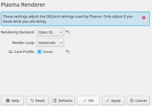
Here is a screenshot how of it looks on the qtquicksettings KCM:
Note that the indicators are clickable and reset the field to default value.
Diff Detail
- Repository
- R265 KConfigWidgets
- Lint
Automatic diff as part of commit; lint not applicable. - Unit
Automatic diff as part of commit; unit tests not applicable.
| src/kconfigdialogmanager_p.h | ||
|---|---|---|
| 61 | Not gonna rename those though, I'm merely moving code around (apart from indicatorWidget I could at least rename that one indeed). | |
The editmarks should probably respect the visibility of the associated widget. In this picture I use a invisble lineedit to manage the settings of the QButtonGroup beneath (QButtonGroup isn't supported by KCOnfigDialogManager)
I'd say you should try it. ;-)
I really need wider feedback on how it behaves in different context. Currently the patch makes it mandatory for everyone.
I use KConfigDialogManager to manage the settings in Spectacle MainWindow which are instant apply by
connect(mConfigManager, &KConfigDialogManager::widgetModified, mConfigManager, &KConfigDialogManager::updateSettings); and I don't like it that they appear there too
a setting which is currently dirty or which differs from default value.
What is your idea behind this? After first seeing this patch my intuition was that it would show for unsaved changes. But then I was confused when I open a SettingsDialog that there were already marks even though I changed nothing! I would expect them only for unsaved changes, I don't know how other platforms handle this if they have something similiar?
You mean they appear and stick around? Or they appear/disappear immediately?
If they stick around I'd indeed have to check why the state isn't recomputed on the updateSettings call...
a setting which is currently dirty or which differs from default value.
What is your idea behind this? After first seeing this patch my intuition was that it would show for unsaved changes. But then I was confused when I open a SettingsDialog that there were already marks even though I changed nothing! I would expect them only for unsaved changes, I don't know how other platforms handle this if they have something similiar?
Currently it helps the user find out the unsaved changes (the least useful in some way, or your immediate memory is not good) but it also helps the user find out which of her settings differ from the default values (and that's indeed something you will forget over time and wonder "why the hell is the defaults button enabled").
Hope the extra context helps.
They stick around because as you said the settings differ from the defaults.
The pen for me conveys the meaning that something was edited that's the reason I would only show it for unsaved changes. But let's others weigh in what they think
Please add screenshots to the Test Plan section for patches that change the UI. :) Also it would be nice to indicate how someone can test this. Which apps? System Settings? Where? How?
Right, so "not a bug" (as in that's what's the patch is intended to do so far).
The pen for me conveys the meaning that something was edited that's the reason I would only show it for unsaved changes. But let's others weigh in what they think
Right, I picked visual indicators which came to mind, I'm totally open to suggestions on which would be better suited.
For the record, next iteration of that patch will honor the visibility of the associated widget (got some more changes to do locally before uploading though, stay tuned).
That being said, what you did is a very naughty hack you know. Why not fixing KConfigDialogManager or go through a QGroupBox (which is handled in some way). ;-)
Handle visibility of the tracked widget, setters become slots, and add plural to "indicatorWidgets".
That title is now not optimal isn't it? 1. It's not only in KCModule 2. It also shows unsaved settings
I can see the utility of indicating non-default values in some cases, particularly with software that has a lot of necessary complexity in the settings or where non-default values can cause problems (see SVG Cleaner GUI for an example of both). However, I don't think it's necessary for most software to indicate non-default values or even dirty values.
Here's a picture of SVG Cleaner GUI for reference:
Notice how the non-default values are indicated with a blue dot and categories that contain options with non-default values also have a blue dot.
I doubt it, this bug report seems confused BTW... it was never broken on the kdelibs side but *some* dialogs have bugs which break the feature for them. Unrelated to this patch we'd been doing a big sweep on the systemsettings module to address among other thing the problems they might have in that department.
@ndavis I know you had some idea for which icon to use, and an idea to make it a clickable button, right?
Right, it's like MuseScore:
- It's simple to understand with the right iconography.
- It's convenient when you're working with a lot of settings that you don't necessarily fully understand.
- By being enabled or disabled, it indicates whether or not a control is set to the default value or not.
Some extra rules I thought of:
- With the checkable label example in the mockup above, it should reset both the label and the checkbox.
- In cases where there is no default value and a user is expected/required to change the value (e.g., LineEdits for the user's first and last names), we should not show a reset button.
- I don't want users to mistake it for a clear text or undo button.
- When the reset button is disabled, it should be invisible to reduce visual clutter.
Just for the record, this will unlikely to be enforceable on the framework side of the code, likely to be taken care of on a case by case basis when we encounter those in the modules themselves. Just managing expectations on what the code can easily do at that level of abstraction. So don't look for it in the patches I submit around the topic. ;-)
The rest should be doable I'll update my patches shortly.
Why I'm not surprised. ;-)
Honestly with enough code it might be possible, but that'd be expensive in term of effort... I'll need to keep track of all widgets in the page. I'll give it a shot but don't hold your breath.
Alright, turns out I managed to do it both for QtWidgets and QtQuick cases, so you can breath again. ;-)
Reviews on all my patches very welcome.
As advised by Kai and David on D27840, switch to using tool buttons and fix RTL handling.
What do we want to happen for released code that gets a bugfix update?
| src/kconfigdialogmanager.cpp | ||
|---|---|---|
| 609 | Why not item->readDefault()? | |
| 625 | won't it do it itself when the property changes? | |
| src/settingsstatusindicator.cpp | ||
| 76 |
For X and wayland it's setVisible(true) but we shouldn't count on it. | |
| 176 | unused? | |
| 185 | Can we be sure the tracked widget always has a parent widget? If someone doesn't use layouts a widget might not have a parent. | |
| 193 | that's not true for the RTL case where the widget is expected to resize. It would be w->pos().x() + w->width() - widgetExpectedWidth(w) | |
Somehow I missed the notification that this was updated.
Thanks for the horizontal alignment. Could you also add a left margin to the column of reset buttons? It should be the same as the spacing between the labels and the controls, which is equivalent to Kirigami.Units.smallSpacing, IIRC.
| src/kconfigdialogmanager.cpp | ||
|---|---|---|
| 609 | Wouldn't do the same thing at all. readDefault() takes a KConfig object and updates the default value stored in the item with what it found in there. Yes, I know... the item API is weird... | |
| 625 | Good point, was indeed unnecessary now, I removed the line. | |
| src/settingsstatusindicator.cpp | ||
| 76 | I don't think it matters for widgets which have a parent and not the Qt::Window window flag, but OK, switching to setVisible() instead of show/hide. | |
| 176 | I'm not sure how you end up to this conclusion, it's written two below if we are at the window edge, and it's used in the move call at the end. | |
| 185 | Well that'd mean the tracked widget is a window... it's pretty much an impossibility IMO. | |
| 193 | Either I misunderstood what you meant or you got the math wrong on that one. What you're proposing (or what I understood you're proposing) breaks the "RTL + widget at edge" case in my tests. The line I wrote is working perfectly fine for my tests with desktoppath and qtquicksettings both in LTR and RTL modes. | |
I have concerns about this. The button has no tooltip so it's not obvious what will happen when clicked on. It should at least say "Revert to default setting" in a tooltip, and preferably even the name or text of the default setting that will be reverted to.
Also, we now have a new inconsistency in that a small fraction of System Settings KCMs and app settings windows will display these indicators, but not others.
Finally clicking on the revert button in Spectacle's settings page causes a segfault for me:
Dude, I jumped through all the hoops for the past weeks. Also it got no further reply after I updated the screenshot almost two weeks ago so yes I assumed you guys had nothing else.
Couldn't quite reproduce it the way you described, but indeed managed to get it to crash. It's fixed with D29014
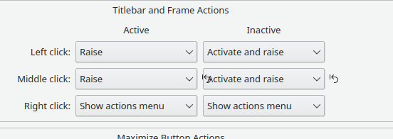
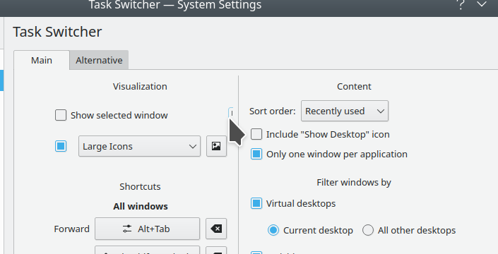
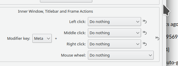
Sorry I didn't have the time to test it again. It's not just about the UI design itself, but also avoid obvious visual glitches, like this:
There are also numerous cases in other KCMs where the indicator gets cut off, positioned strangely, or isn't visible at all for a non-default setting:
How are we going to fix that? The diversity of user interfaces we have throughout KDE software makes me skeptical that any kind of auto-generated icon placement can ever work, let alone look good. Where will the icons go in list items? Grid views? And so on. To be completely honest, if nobody could come up with a good UI, it might be a sign that the feature itself needs to be re-thought. I remain unconvinced that this is the best way to show that there are changed settings. I think @GB_2's idea of displaying the original or previous state when hovering over the Defaults or Reset button made more sense. As is, I don't really understand who the target user is for this feature.
IMO this feature would have benefited from being outlined first in a Phabricator task and soliciting VDG feedback before coding began, so we didn't frustratingly go back and forth in the patches. Given the above visual regressions and broken behavior on multiple KCMs, I think this needs to be reverted and discussed and re-thought in a central location. Sorry. :(
You know it started as a proper painted indicator within the widget area, right? As such it couldn't have any of the issues you're pointing out now... Who pushed me to have them at distance I wonder? Right, was people from the VDG. So I find grand that then it goes all to revert because after weeks of pushing me to add more weird constraints then disappearing letting me alone trying to figure out where to go (and it was a large struggle at every step), the conclusion is "let's revert because VDG wasn't involved". There were technical reasons for the very first iteration and they had to be disregarded for design license.
Honestly I'm disgusted by the way it's been handled.
Yeah, I'm sorry about that.
If VDG people ask for something that's technically impossible, you've gotta push back on that. They often don't know what is and isn't possible, or reasonable. We've been trying to help VDG people be more technical so they don't propose impossible things, but it's not perfect. The whole process needs to be a push-and-pull compromise where the design people accept when a design isn't technically feasible, and the tech people faithfully implement the design without diverging too far from it due to minor technical limitations, or letting the design people push them into something impossible due to major technical limitations.
The basic problem with this feature is that I think we never did the initial design work to figure out who the target audience was, what their needs were, and why they would use and benefit from this feature. Even with an inline indicator like a glowing outline around the widget, we'd have the same problem that we do with the dot proposal in the sidebar view that it would be look like non-obvious visual noise to people. And with that, we'd lose the functionality of being able to revert individual settings. But is that needed? Who benefits from it? And so on. Such a complex and all-encompassing feature needs to have these kinds of questions answered first before implementation begins. We've found that Phabricator tasks are perfect for this, and we use them extensively to plan out work before coding begins for many projects.
I know we're all exhausted and frustrated at this point, but maybe we can do that so we can push this forward in a way that makes everyone happy in the end?
My opinion on this patch from the beginning has been that it really doesn't add much more than was there before. Visually, it clutters the UI. The icon selected for it might also not be visually appealing or meaningful enough. I believe there should be a different approach to this request. However, I am also open to just dropping the idea completely.
Some ideas for better UX on this:
- Hover over the "Defaults" button and the UI shows highlighted controls and labels that have changed. If you want to return things to default, click the button.
- Color controls and labels differently once they have changed to a non-default state. From Breeze Blue to a lighter blue, for example. (This could be confusing to some users)
- Keyboard shortcut. Use a keyboard shortcut to return settings back to their default state. Control + Z comes to mind.
I'm sorry this happened. I was working with what I could see. For what it's worth, I would have accepted it if you said it could not be done well. I know I don't know as much about the technical side of this as you do. You have a right to disagree with me and tell me when I'm wrong.
Let's have the rest of the discussion in a central phab patch, which I probably should have pushed for at the start. I'll make one...


