Figure out a good UI for the "show which settings have been changed" feature
Closed, ResolvedPublic

Description

See discussion in D27540. We should have had a task like this all along and settled on a workflow and visual style first. Sorry about that. Better late than never, hopefully...

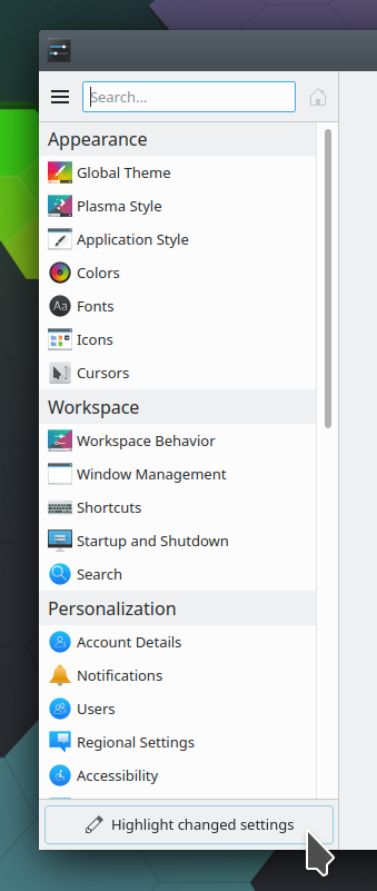
It seems like the impetus is that we want to be able to show in System Settings (and possibly KDE apps' settings windows too) when a category has any settings in it that have been changed from their default values. And on those pages, we want to be able to show which settings have been changed.

Let's see if we can come up with a UI we can all agree on here.

ngraham created this task.Apr 20 2020, 8:36 PM
ngraham triaged this task as Normal priority.

Personally what I think we really need more than this feature is a global "reset everything" button. This is something I hear users asking for all the time, and I think it's a more common use case to want to reset everything to defaults than it is to want to see (and then maybe reset) which individual settings have been changed from their default values. Supporting this was what I thought all the KConfigXT porting was all about. :)

ndavis added a subscriber: ndavis.Apr 20 2020, 8:37 PM
filipf added a subscriber: filipf.EditedApr 20 2020, 9:02 PM

I think the discussion should ideally start from data on users and the settings they change the most. If the data would show visual changes dominating (which I suspect to be true), indicators won't serve much of a purpose because it tends to be pretty obvious when non-default visual settings are used. The settings are also the easiest to find, I would say.

Also, it seems to me that the presupposition (correct me if I'm wrong) behind the usefulness of indicators for non-visual options is that we have a lot of options and that it's easy to get lost in them or maybe misunderstand them. If so the right course of action is to work even harder on having better settings IMO.

But I also believe a global settings reset feature would be useful nonetheless. Having that instead of indicators would be very helpful for our visual presentation. Indicators as I've seen them proposed unfortunately seem quite visually cluttering and we already get some criticism on that front.

I think the discussion should ideally start from data on users and the settings they change the most. If the data would show visual changes dominating (which I suspect to be true), indicators won't serve much of a purpose because it tends to be pretty obvious when non-default visual settings are used. The settings are also the easiest to find, I would say.

Yeah. Similarly, "non-default setting" indicators for all of the KCMs in the Personalization and Network categories and about half of the KCMs in the Hardware category make no sense at all ("you have a non-default volume level!" "you have a non-default timezone!" "you have a non-default printer"!)

Also, it seems to me that the presupposition (correct me if I'm wrong) behind the usefulness of indicators for non-visual options is that we have a lot of options and that it's easy to get lost in them or maybe misunderstand them. If so the right course of action is to work even harder on having better settings IMO.

I think that's true. Of course redoing the KCMs for better usability is an ongoing, seemingly endless project. :/ The appearance KCMs are all in a pretty good state though IMO. However I think the requirement that we redo all the KCMs before we fundamentally re-organize the location of settings is an impediment here because realistically we won't have all the KCMs rewritten until at least 2023, which means the re-organization that I think we all think needs to happen keeps getting pushed off further and further into the future.

abetts added a subscriber: abetts.Apr 20 2020, 9:09 PM

Personally what I think we really need more than this feature is a global "reset everything" button. This is something I hear users asking for all the time, and I think it's a more common use case to want to reset everything to defaults than it is to want to see (and then maybe reset) which individual settings have been changed from their default values. Supporting this was what I thought all the KConfigXT porting was all about. :)

I was totally thinking of this too! What do you think of having a global theme that is super packed with settings as well? Like a default environment global theme?

I was totally thinking of this too! What do you think of having a global theme that is super packed with settings as well? Like a default environment global theme?

We kind of already have that for appearance settings: it's the Breeze global theme. :)

I was thinking more of a button in the System Settings UI itself. See https://bugs.kde.org/show_bug.cgi?id=389568

ervin removed a subscriber: ervin.Apr 21 2020, 5:42 AM

Sorry, got no time for this.

bport added a subscriber: bport.Apr 21 2020, 5:49 AM

We don't manage default for volume for example so nobody as idea to put revert to default for volume, those icons need only to be when that make sense.
I guess we can use this task to also discuss https://phabricator.kde.org/D28461 because they are linked.

A reset all settings seems quite a dangerous button, and don't serve the same purpose at all

crossi added a subscriber: crossi.Apr 21 2020, 6:45 AM
zamundaaa added a subscriber: zamundaaa.EditedApr 21 2020, 3:11 PM

I know this is a bit outside the scope of this task but maybe a backup & restore page with a reset button would be good? This page would of course have to have appropriate warnings but it would probably help some users if they could

  • get an overview of all settings they changed, with a list of links to the actual settings pages?
  • backup their configuration
  • restore old configurations
  • reset all settings

This would enable users to freely experiment with the settings without the fear of breaking something / toggling some behaviours they'll not find again. Just back up and everything's safe.
Backups into a file then that would also easily allow users to synchronize their settings from PC to PC without needing to copy their whole home or .config folder (possibly integrate KDE Connect here?).
I definitely agree that a reset button is dangerous but I think if we display appropriate warnings and require the user to put in their password then it should be just fine. After all, how many users have accidentally reset their Android phone?

Now I think that's a great idea, @zamundaaa!

bport added a comment.Apr 22 2020, 2:28 PM

I know this is a bit outside the scope of this task but maybe a backup & restore page with a reset button would be good? This page would of course have to have appropriate warnings but it would probably help some users if they could

  • get an overview of all settings they changed, with a list of links to the actual settings pages?
  • backup their configuration
  • restore old configurations
  • reset all settings This would enable users to freely experiment with the settings without the fear of breaking something / toggling some behaviours they'll not find again. Just back up and everything's safe. Backups into a file then that would also easily allow users to synchronize their settings from PC to PC without needing to copy their whole home or .config folder (possibly integrate KDE Connect here?). I definitely agree that a reset button is dangerous but I think if we display appropriate warnings and require the user to put in their password then it should be just fine. After all, how many users have accidentally reset their Android phone?

Even if it can be a nice idea, the work to implement that will be really huge, for example we don't know how to associate label to entry when we are in a KCM so having a general page will mean rework really deeply each KCM, I don't think we can manage to do that

I feared that the overview isn't easily possible. Would it be feasable to show a list of KCMs that have non-default values? I'm not sure how useful that would be though, if the user would already know the setting they're searching for is in a particular KCM they probably would've found it themselves.

I feared that the overview isn't easily possible. Would it be feasable to show a list of KCMs that have non-default values? I'm not sure how useful that would be though, if the user would already know the setting they're searching for is in a particular KCM they probably would've found it themselves.

The problem is a user don't like current settings after changing them, but don't know their name, so hard to search. So showing settings with non-default value allow them to easily find what is not standard

My point is that a simple list with KCMs that have any changed values in them wouldn't be overly useful.
Can we log when a setting has been changed / when a KCM had its last change? Then we could show the user a list with KCMs where they last made changes, in order of when they were made. A UI for that would perhaps then even be as easy as showing a "last changed" list under the "Frequently Used" on the home screen of system settings.

@bport and @davidedmundson and I put our heads together today and came up with the following proposal:

We add a new button to System Settings to turn this feature on, and have it off by default. The button lives in a footer of the sidebar:

[warning: crude, non-final mockup approaching]

In Icons view, we add a new button to the global toolbar.

The button is checkable. When checked, the following things happen:

  1. The sidebar/Icon view shows a colored dot on the right of each entry that has any changed settings. Hovering over the dot will display a tooltip saying which KCMs have changed settings.
  2. When viewing a KCM, any settings in that KCM which have been changed have their outline drawn with the same color as the dot (probably orange by default, but it will depend on the color scheme)

This way, the feature is not on by default, so people will not be confused by randomly-colored dots and differently-colored controls in KCMs; they will only appear in response to an explicit user action, connecting the two together in the user's mind.

How do people feel about this?

niccolove added a subscriber: niccolove.EditedMay 12 2020, 6:21 PM

I'm not a great fan of button that will be - imo - hardly used by the average user in such a visible location. Also, it takes up some vertical space from the sidebar which isn't great.

I think the best idea currently would be to draw a light gray dot (rather than blue as in the patch, and a bit smaller), so that it won't be annoying to see even when multiple KCM are changed. Its meaning could be communicated by a tooltip and hopefully association (I click apply -> a dot appears).

I think the button has a good reason to be really visible exactly because it will only be used by beginners, hiding it would make it more difficult for them to discover the feature.
I agree though that taking up vertical space from the sidebar isn't great and if we do use a button it should optimally be somewhere else... I don't see a good alternative though.

That was our conclusion, yeah. If the sidebar view had a top toolbar like the icon view has, we could put it there. But it doesn't, so we can't.

GB_2 added a subscriber: GB_2.May 17 2020, 9:17 AM

What if we put a checkable menu item inside the hamburger menu? It's not like this is a feature you need to access often. Then it also won't take up any space in the sidebar.

bport added a comment.May 18 2020, 3:28 PM

This feature need to be discoverable easily by end user. We spoke about beginners

Yeah. The worry is that if it's hidden in a hamburger menu, the kind of person who could benefit from it will never find it.

alexde added a subscriber: alexde.EditedMay 19 2020, 8:47 AM

What do you think about placing the button on the top next to the search?


That way it wouldn't look too intrusive to me.
Do you plan to make the big hightlight button hideable (in the context menu?) for 'advanced users' or shall it be displayed for everyone always?

What do you think about placing the button on the top next to the search?


That way it wouldn't look too intrusive to me.
Do you plan to make the big hightlight button hideable (in the context menu?) for 'advanced users' or shall it be displayed for everyone always?

The problem with that approach is that the button can't have any text, which means the icon needs to be perfect else people will ignore it. Many don't hover over unclear icons to read their tooltips; icons-only buttons need to have *perfect* iconography. It could work, but we would need to come up with a perfect icon.

ngraham closed this task as Resolved.Sep 18 2020, 12:46 AM

We figured it out and something nice shipped in Plasma 5.20. :)

ngraham moved this task from Backlog/Planned to Done on the VDG board.Sep 18 2020, 12:46 AM
ngraham moved this task from To Do to Done on the Plasma board.