Totally agreed. A better way to explain the feature is also definitely needed here.
Feed Advanced Search
Apr 7 2019
Apr 7 2019
Feb 7 2019
Feb 7 2019
Jun 7 2018
Jun 7 2018
ngraham added a comment to M112: System Settings Alpha Graphic Redesign.
paldepind added a comment to M112: System Settings Alpha Graphic Redesign.
it would not allow 2, but rather n alterantives, since there are people who might have e.g. 3 use cases (all windows, all of current VD, all of current activity)
ngraham added a comment to M112: System Settings Alpha Graphic Redesign.
Thanks @Fuchs. Even if KWin doesn't support an arbitrary number of switchers, I think we should consider this "additional task switcher" feature to be for power users and maybe hide it behind an Advanced button or something.
Jun 6 2018
Jun 6 2018
hein added a comment to M112: System Settings Alpha Graphic Redesign.
Andy Betts, [07.06.18 06:20]
and yes, I was asking if you could help me track those KCMs where we introduced changes to the mockupsAndy Betts, [07.06.18 06:20]
Hopefully it is not a huge list?Eike Hein, [07.06.18 06:21]
I'm not sure. I'd suggest going over the Phabricator KCM reviews (the ones I can think of right now: Language, Icons, Launch Feedback, Colors, Widget Styles, Cursors, etc. - maybe more). In terms of components, we have a new "Grid" style KCM and a new "List" style KCM and we figured out how we want to do draggable lists and we made FormLayout with its various abilities (reflow, clickable sections, etc.)Eike Hein, [07.06.18 06:22]
So now it's about "If I had to do the design with these components, I would ..."Eike Hein, [07.06.18 06:22]
So for example take the Keyboard KCM, which is now going to reuse the new "Draggable list" component/pattern we made for the Language KCM together - in the mockups, the Keyboard KCM is actually just blank, the mockup has no contentEike Hein, [07.06.18 06:22]
There's probabl other cases where we didn't know the answer at the time, where we have a more solid idea nowEike Hein, [07.06.18 06:24]
The process has been: Make initial mockups -> Consolidate ideas and come up with reusable components for consistency between KCMs and now it needs to continue with -> update mockups to reflect new componentsEike Hein, [07.06.18 06:25]
And this cycle will probably continue as we identify the need for new components, make them, ...Eike Hein, [07.06.18 06:26]
Maybe @kbroulik also has an opinion here since he was one of the people who expressed frustration with aging mockupsAndy Betts, [07.06.18 06:30]
Oh this is good informationAndy Betts, [07.06.18 06:30]
Can you copy this into the ticket?Andy Betts, [07.06.18 06:31]
Just so I can review after work?Andy Betts, [07.06.18 06:31]
Please? :D
Fuchs added a comment to M112: System Settings Alpha Graphic Redesign.
Task Switcher > Alternative (https://phabricator.kde.org/M112/390/) - What does this actually do?
abetts added a comment to M112: System Settings Alpha Graphic Redesign.
I agree, the user doesn't know what to expect.
roberts added a comment to M112: System Settings Alpha Graphic Redesign.
FWIW, I agree with @ngraham here, interactive elements should be visible in the view at rest. Buttons appearing on hover violates the principle of least surprise, makes selection unpredictable, and raises cognitive load.
Jun 4 2018
Jun 4 2018
abetts added a comment to M112: System Settings Alpha Graphic Redesign.
I got plenty to do! Thanks Nathan.
ngraham added a comment to M112: System Settings Alpha Graphic Redesign.
I went through them all and I have the following observations and rcommendations:
Jun 3 2018
Jun 3 2018
abetts added an inline comment to M112: System Settings Alpha Graphic Redesign.
May 19 2018
May 19 2018
May 18 2018
May 18 2018
davidedmundson added a comment to M112: System Settings Alpha Graphic Redesign.
I had some comments about the date & time KCM mockup, I followed that up on https://phabricator.kde.org/T7248 as here has quite a lot of cross-talk
Apr 22 2018
Apr 22 2018
abetts added a comment to M112: System Settings Alpha Graphic Redesign.
What KCM are your comments about @broulik ?
broulik added an inline comment to M112: System Settings Alpha Graphic Redesign.
Feb 20 2018
Feb 20 2018
argonel added an inline comment to M112: System Settings Alpha Graphic Redesign.
argonel added an inline comment to M112: System Settings Alpha Graphic Redesign.
I wrote these comments on October 23rd, but they got stuck in a draft. I can't seem to delete them. A couple are still relevant though.
Feb 19 2018
Feb 19 2018
progwolff added a comment to M112: System Settings Alpha Graphic Redesign.
@abetts The font itself has already a preview in the font chooser. This is okay for me. What I meant to have a preview for is what elements a font is used for. For example it is a little unclear what "small fonts" is used for unless you apply the settings and try it out.
But I'm not sure how a preview for this would look like either.
Feb 15 2018
Feb 15 2018
abetts added a comment to M112: System Settings Alpha Graphic Redesign.
I like those suggestions. I would probably not move the previous, however, since they are already loaded in a different screen. But maybe, what would be helpful is to use a menu that showcases the font in some way. For example, like this:
progwolff added an inline comment to M112: System Settings Alpha Graphic Redesign.
davidedmundson added an inline comment to M112: System Settings Alpha Graphic Redesign.
FYI, I was going to take on the clock for the next release. I've got some questions
Feb 14 2018
Feb 14 2018
ngraham added an inline comment to M112: System Settings Alpha Graphic Redesign.
Feb 8 2018
Feb 8 2018
davidedmundson added an inline comment to M112: System Settings Alpha Graphic Redesign.
Feb 1 2018
Feb 1 2018
ngraham added a comment to M112: System Settings Alpha Graphic Redesign.
Agreed. These aren't needed systemwide.
andreaska added a comment to M112: System Settings Alpha Graphic Redesign.
The kcms are included in KIO but from my point of view they can be dropped
mmustac added a comment to M112: System Settings Alpha Graphic Redesign.
Jan 22 2018
Jan 22 2018
IlyaBizyaev added a comment to M112: System Settings Alpha Graphic Redesign.
I see your point, I am just afraid of the opposite effect: the general structure of current settings has even more mobile in mind that the proposed one. And as there currently is not much development on that side, I am trying to not let it slip out of the way completely, as this year could well be our last chance to jump into mobile.
abetts added a comment to M112: System Settings Alpha Graphic Redesign.
I highly doubt that we will turn this work into a mobile app in the same way. We are not close to that discussion yet. Empty space works best in desktop. It allows people to focus. To cram every corner of the interface with a lot of data is also very challenging for finding your way. I can definitively review the margins. As of right now, we don't have a lot of work going into this project so I prefer to address this question once there is more development into it.
IlyaBizyaev added a comment to M112: System Settings Alpha Graphic Redesign.
The mockups are nice, although there is a part I do not particularly like: all of them have a lot of empty areas, which means they are planned for big screens. By just scaling the pictures so that fonts had normal size, I get a window higher than my 15'' 16:9 laptop! :)
Also, I am concerned about those designs on mobile... Is the spacing supposed to scale? How would the 2-level drawer look on a phone? Could you picture those?
Nov 22 2017
Nov 22 2017
abetts added a comment to M112: System Settings Alpha Graphic Redesign.
Could you maybe add a rough mockup of this suggestion? Just for more clarity. Also, we discussed some time ago that it would be ok for the "install" from file to be in Discover and that GHNS would "also" be in discover. What do you think? Should we do that or keep "install from file" in the same window where the themes are?
andreaska added a comment to M112: System Settings Alpha Graphic Redesign.
Love it.
Nov 3 2017
Nov 3 2017
mart added a comment to M112: System Settings Alpha Graphic Redesign.
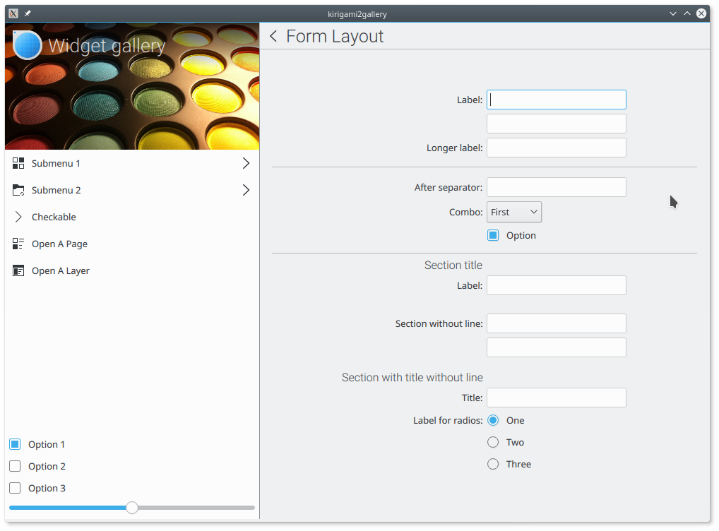
as part of the work of other kcms which have a form layout, a layout component in kirigami which would be used for it https://phabricator.kde.org/D8641
Nov 1 2017
Nov 1 2017
abetts added a comment to M112: System Settings Alpha Graphic Redesign.
Ok, the second stage of this redesign might be a little easier, it is aligning labels, shrinking comboboxes, and others to the center. Putting labels or "titles" on the 1st third of the space while the rest of the elements are on the 2/3 to the right. I will add a mockup to explain this.
Oct 31 2017
Oct 31 2017
abetts added a comment to M112: System Settings Alpha Graphic Redesign.
let's do it!
mart added a comment to M112: System Settings Alpha Graphic Redesign.
ok, so let's make it final the "pure grid" one wit the version of the flexible spaces around the grid view.
we can then start with a mixed one and see how it works there
abetts added a comment to M112: System Settings Alpha Graphic Redesign.
Thank you for your comments. @mart I have some mockups where this is the case and there is a mix of edge to edge content with other controls. I didn't think it looked bad honestly but feels a bit out of place. I can post something on it later tonight.
ngraham added a comment to M112: System Settings Alpha Graphic Redesign.
I have to say I'm not a huge fan of the screenshots posted at the top of the thread--the proposed total visual redesign. It seems like we would be throwing out a lot of work and all the embedded lessons learned and bugfixes accumulated over the years, and it looks like... well... it looks like Windows 10. :-( This modern depth-less totally flat interface trend is really not well suited for the desktop IMHO. It will look "stale" in a few years and we will be yet again on the treadmill of visual redesigns. My vote is for incremental improvement on what we've already got, which is really nice and has a timeless quality to it, like it's got more immunity to the UI fashions of the day.
mart added a comment to M112: System Settings Alpha Graphic Redesign.
well, there are two mutually exclusive designs at the moment which are being moved forward which should be chosen from, basically the last couple of screenshots and like last januz comment.
personally, i think my latest screenshot is the "easiest" to implement, but the other option (which i still don't know how to solve a bunch of problems) looks more modern
ngraham added a comment to M112: System Settings Alpha Graphic Redesign.
That's really nice, @mart.
abetts added a comment to M112: System Settings Alpha Graphic Redesign.
I love it! Shall we move to the next phase?
mart added a comment to M112: System Settings Alpha Graphic Redesign.
actual implementation of the proposal with flexible lateral space
januz updated subscribers of M112: System Settings Alpha Graphic Redesign.
The grid with margins is the best IMO. It's the best use of screen space (and it looks better than the others) . I totally agree with the frame-in-frame problem (I wish dolphin looked more like your mockup!), but I think that adding too many lines can also end up adding visual noise.
Oct 30 2017
Oct 30 2017
mart added a comment to M112: System Settings Alpha Graphic Redesign.
here an example of the view resized in two possible size, one which the thumbnail size matches exactly the available space for the number of columns, and another one that doesn't
margins of the white area always stay fixed, those around are flexible.
mart added a comment to M112: System Settings Alpha Graphic Redesign.
hmm, my attention is pretty much taken by the gap there and the step the two rows of buttons do...
perhaps if the row of buttons is still aligned with the others it would look better...
and if the margin around the view is not fixed, but whatever to make the white edges in the view fixed, it could have its why...
romangg added a comment to M112: System Settings Alpha Graphic Redesign.
The Dolphin mockup looks good. But the KCM one looks somewhat confusing. Elements belonging to each other are not visually related anymore (the list view and the rest of the KCM). Maybe it's just because of the sidebar being white as well. But there is also the problem that not all KCMs have a list view, and then their design would differ greatly from the ones with a list view.
mart added a comment to M112: System Settings Alpha Graphic Redesign.
so, to explain the idea i had to reduce visual noise and the " frame in frame" effect, i did a quick and dirty edit in gimp of the window:
Oct 27 2017
Oct 27 2017
leinir added an inline comment to M112: System Settings Alpha Graphic Redesign.
Oct 26 2017
Oct 26 2017
mart added a comment to M112: System Settings Alpha Graphic Redesign.
latest version of a grid based one

mart added an inline comment to M112: System Settings Alpha Graphic Redesign.
abetts added an inline comment to M112: System Settings Alpha Graphic Redesign.
So for my own understanding I'm wrapping up (correct me if I'm wrong):
- Normally list views have a background (which is FCFCFC without any transparency or soft shadows at the borders as in the mockups) in Breeze.
- Current qqc scrollview though doesn't have this.
- So the question is if we should just ignore this background in qqc scrollviews or if there needs to be a version of scrollview with background so that it is like in the mockups and not different from other components.
abetts updated images of M112: System Settings Alpha Graphic Redesign.
abetts updated images of M112: System Settings Alpha Graphic Redesign.
abetts added a comment to M112: System Settings Alpha Graphic Redesign.
januz added a comment to M112: System Settings Alpha Graphic Redesign.
Here's a mockup I made based on @mart 's:
Oct 25 2017
Oct 25 2017
mart added a comment to M112: System Settings Alpha Graphic Redesign.
Are we opposed to using toggles like these? I have hear diverging opinions.
as far i remember the decision back in the day was to use those only on mobile, no idea if the idea may be reexamined now
abetts added an inline comment to M112: System Settings Alpha Graphic Redesign.
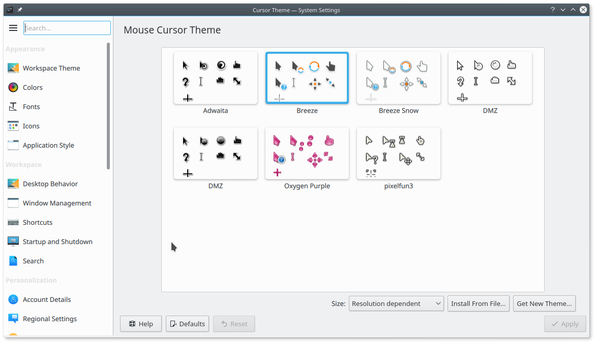
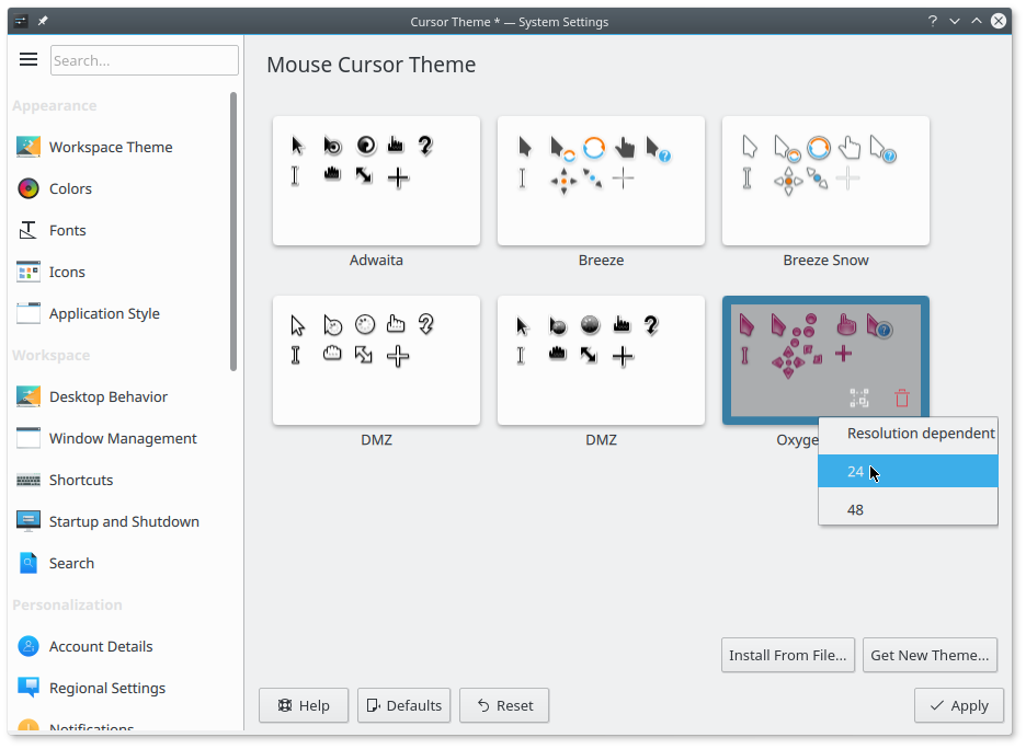
any idea how to implement the mouse cursor selection size?
mart added a comment to M112: System Settings Alpha Graphic Redesign.
current status:
mart added a comment to M112: System Settings Alpha Graphic Redesign.
i was thinking about an icon, then clicking on it opens a small overlay popup with the choices, which is not super pretty, but ok
mart added a comment to M112: System Settings Alpha Graphic Redesign.
any idea how to implement the mouse cursor selection size?
mart added a comment to M112: System Settings Alpha Graphic Redesign.
I'll add a small shadow, hopefully will be easy to dynamically disable it when running on the software renderer
abetts added a comment to M112: System Settings Alpha Graphic Redesign.
blur: another thing i would like to avoid if possible, as we need all this stuff to work correctly if possible also on very low-end hardware where we should render in software mode
Oct 24 2017
Oct 24 2017
romangg added an inline comment to M112: System Settings Alpha Graphic Redesign.
abetts added a comment to M112: System Settings Alpha Graphic Redesign.
I hope it wasn't too difficult and I am already seeing an easier interaction with the themes. Even at this early stage.
mart added a comment to M112: System Settings Alpha Graphic Redesign.
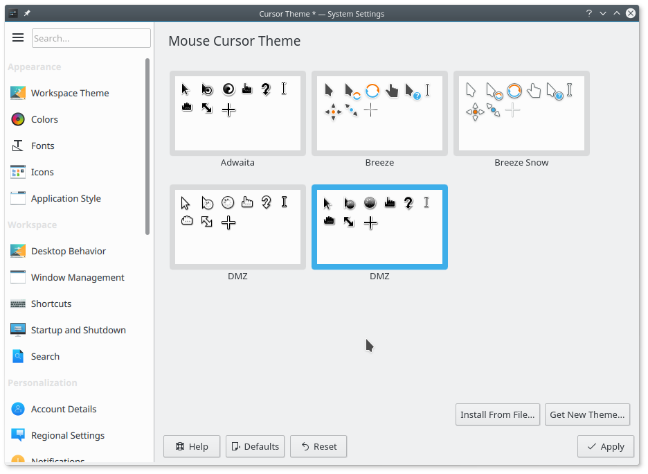
early version of the cursor kcm
mart added an inline comment to M112: System Settings Alpha Graphic Redesign.
mart added an inline comment to M112: System Settings Alpha Graphic Redesign.
mart added an inline comment to M112: System Settings Alpha Graphic Redesign.
abetts added an inline comment to M112: System Settings Alpha Graphic Redesign.
You might be able to answer those same questions by going to this
mart added an inline comment to M112: System Settings Alpha Graphic Redesign.
Oct 23 2017
Oct 23 2017
abetts added a comment to M112: System Settings Alpha Graphic Redesign.
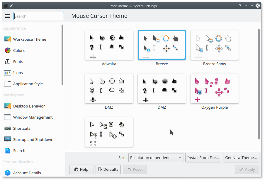
looks like many kcms would have a similar structure of thumbnail preview grid... maybe we can componentize that?
mart added a comment to M112: System Settings Alpha Graphic Redesign.
looks like many kcms would have a similar structure of thumbnail preview grid... maybe we can componentize that?
davidedmundson added a comment to M112: System Settings Alpha Graphic Redesign.
Oh, wow! I'm genuinely really impressed.
abetts updated the image names of M112: System Settings Alpha Graphic Redesign.
abetts updated images of M112: System Settings Alpha Graphic Redesign.
Nov 28 2016
Nov 28 2016
bcooksley changed the edit policy for KDE Developers.
Jan 25 2016
Jan 25 2016