+1, makes sense!
Feed Advanced Search
Jun 17 2019
Jun 17 2019
astippich retitled D21859: Use view-media-lyrics for Now Playing View from [RFC] Use view-media-lyrics for Now Playing View to Use view-media-lyrics for Now Playing View.
Jun 16 2019
Jun 16 2019
astippich added a comment to D21859: Use view-media-lyrics for Now Playing View.
This has always bugged me.
astippich requested review of D21859: Use view-media-lyrics for Now Playing View.
astippich requested review of D21858: Port playlist entry to qqc2.
astippich updated the diff for D21853: Port track delegate to qqc2.
- limit button size so that it does not expand past the delegate height
astippich planned changes to D21853: Port track delegate to qqc2.
Forgot to check the album view, buttons are currently too big
astippich requested review of D21854: Port mediaplaylistview to qqc2.
astippich requested review of D21853: Port track delegate to qqc2.
Jun 15 2019
Jun 15 2019
Thanks
Jun 14 2019
Jun 14 2019
mgallien added a comment to D21806: Use existing settings storage for shuffle and repeat.
I am looking at it.
Jun 11 2019
Jun 11 2019
Jun 10 2019
Jun 10 2019
Jun 5 2019
Jun 5 2019
Jun 4 2019
Jun 4 2019
Perfect!!!! The code looks good and the behavior is now excellent. I can clearly see what has focus and navigating the whole app with the keyboard is a breeze. It looks great too. I'm not totally sold on having all the backgrounds animate their opacity and color (we just got rid of that in QML comboboxes in fact), and it feels like something that should be in the style rather than hardcoded in the app. However that's a really minor aesthetic jusgment call and we can think about it later (or not). Huge +1 for landing this. Great work!
Jun 3 2019
Jun 3 2019
mgallien updated the diff for D21081: fix focus rectangle not visible in single album view mode.
- emulate focus beahvior of list view as shown in feedback
- fix views displaying tracks to have the same focus logic than playlist
- fix keyboard focus issues whith NavigationActionBar and tab navigation
- fix focus issues in ListView of single tracks
- fix qml warning in FrequentlyPlayedTracks and RecentlyPlayedTracks views
- fix small differences between list based views
- Elisa sidebar with colored backgrounds
- improve focus handling of view selector list
- solve some keyboard focus issues
- fix tab focus handling in some list views (playlist and album view)
- for consistency, put the same behavior for generic grid views
- add mostly the same focus behavior to file browser
Jun 1 2019
Jun 1 2019
jguidon added a revision to T7567: Add support for radio streams: D21525: Add support for radio streams.
May 31 2019
May 31 2019
mgallien added a comment to D21081: fix focus rectangle not visible in single album view mode.
May 30 2019
May 30 2019
ngraham added a comment to D21081: fix focus rectangle not visible in single album view mode.
May 29 2019
May 29 2019
ngraham added a comment to D21081: fix focus rectangle not visible in single album view mode.

mgallien added a comment to D21081: fix focus rectangle not visible in single album view mode.
ngraham added a comment to D21081: fix focus rectangle not visible in single album view mode.
Humongous improvement so far! One thing that sticks out is that the left-most sidebar list still needs the new style for selected categories so that it matches other list-style items:
asn added a comment to T7567: Add support for radio streams.
@jguidon any news on this?
mgallien updated the diff for D21081: fix focus rectangle not visible in single album view mode.
- emulate focus beahvior of list view as shown in feedback
- fix views displaying tracks to have the same focus logic than playlist
- fix keyboard focus issues whith NavigationActionBar and tab navigation
- fix focus issues in ListView of single tracks
- fix qml warning in FrequentlyPlayedTracks and RecentlyPlayedTracks views
- fix small differences between list based views
May 17 2019
May 17 2019
ngraham added a comment to D21081: fix focus rectangle not visible in single album view mode.
This is functionally much better! Now I can tell where the keyboard focus is. Visually I think it's a small improvement but we can do even better for the list and grid items and also be more consistent with how other apps generally handle this.
mgallien updated the diff for D21081: fix focus rectangle not visible in single album view mode.
- use a rectangle around the current item with focus in view selector
- use rectangle borders to show the active focus in most elements
May 13 2019
May 13 2019
Works for me, thanks.
May 12 2019
May 12 2019
mgallien added a comment to D21039: avoid sending wrong or empty metadata to mpris2 interface.
Ping.
I would like if possible to get this in before end of next week to have in the 0.4.0 release.
May 8 2019
May 8 2019
ngraham added a comment to D21080: fix some layouts to look correct when reversed (typical for RTL locale).
mgallien added a comment to D21081: fix focus rectangle not visible in single album view mode.
Looks good now! BTW it's unrelated to this patch, but I notice that song length display in the playlist has regressed in the last day or two:

safaalfulaij accepted D21080: fix some layouts to look correct when reversed (typical for RTL locale).
Can't test, but seems fine.
Thanks for informing! :)
ngraham added a comment to D21081: fix focus rectangle not visible in single album view mode.
This works, but to be honest I really dislike this focus rectangle in every view where it appears in Elisa. I don't think it matches Elisa's visual style at all. See how the blue rectangle touches the vertical line on the left, but it's a few pixels away from the line on the right? And it also isn't actually framing anything since Elisa's views don't use gray frames. So it appears "out of the blue", so to speak.
This looks much better, thanks. It makes sense that font.pointSize should be rounded to an integer value.
mgallien retitled D21081: fix focus rectangle not visible in single album view mode from GIT_SILENT made messages (after extraction) to fix focus rectangle not visible in single album view mode.
mgallien updated the diff for D21081: fix focus rectangle not visible in single album view mode.
try to include only the correct commit
mgallien updated the diff for D21081: fix focus rectangle not visible in single album view mode.
an extra commit from 0.4 is included
mgallien added a project to D21081: fix focus rectangle not visible in single album view mode: Elisa.
mgallien added a comment to D21043: do not extend mouse areas in header bar longer than the text.
mgallien added a project to D21080: fix some layouts to look correct when reversed (typical for RTL locale): Elisa.
mgallien added reviewers for D21039: avoid sending wrong or empty metadata to mpris2 interface: astippich, ngraham.
mgallien updated the diff for D21043: do not extend mouse areas in header bar longer than the text.
- use Math.round to avoid having a font.pointSize being decimal
May 7 2019
May 7 2019
This now works!
mgallien updated the diff for D21043: do not extend mouse areas in header bar longer than the text.
- fix corner cases by adding an extra length
May 6 2019
May 6 2019
ngraham added a comment to D21043: do not extend mouse areas in header bar longer than the text.
I'm afraid even with this latest update to the patch, I still see elided text. :(
mgallien added a comment to D21043: do not extend mouse areas in header bar longer than the text.
mgallien updated the diff for D21043: do not extend mouse areas in header bar longer than the text.
- use the correct way to get the width of the text
ngraham added a comment to D21043: do not extend mouse areas in header bar longer than the text.
11 pt Ubuntu font. I see the same thing with default 10 pt Noto Sans though:
mgallien added a comment to D21043: do not extend mouse areas in header bar longer than the text.
James added a comment to T6356: Integrate visualization branch.
Would this be for music visualizations, by chance? As in spectrum analyzers, etc?
ngraham requested changes to D21043: do not extend mouse areas in header bar longer than the text.
For me this patch re-introduces the original bug (https://bugs.kde.org/show_bug.cgi?id=406483).
mgallien added a project to D21043: do not extend mouse areas in header bar longer than the text: Elisa.
mgallien added a comment to D21039: avoid sending wrong or empty metadata to mpris2 interface.
May 5 2019
May 5 2019
broulik added a comment to D21039: avoid sending wrong or empty metadata to mpris2 interface.
Does Plasma crash because of this or Elisa?
mgallien added a project to D21039: avoid sending wrong or empty metadata to mpris2 interface: Elisa.
trmdi added a comment to D21006: Add global menu by using qml native menu components.
May 4 2019
May 4 2019
mgallien added a comment to D21006: Add global menu by using qml native menu components.

mgallien added a comment to D21006: Add global menu by using qml native menu components.
trmdi added a comment to D21006: Add global menu by using qml native menu components.
Why is it like this:

ngraham added a comment to D21006: Add global menu by using qml native menu components.
Seems to work perfectly. My only UI suggestion is to hide the hamburger button in the window when exporting the menu like this.
May 3 2019
May 3 2019
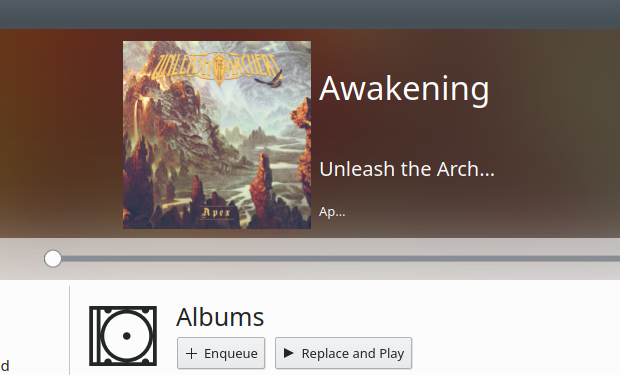
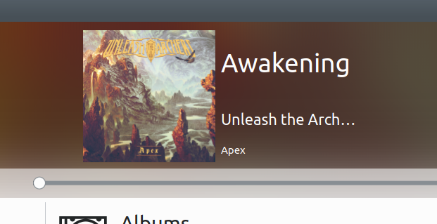
ngraham added a comment to D20879: do not forget the album cover when using embedded cover images.
So much better now!
May 2 2019
May 2 2019
Yep, a cleanup of my Baloo database fixed it, so that looks like a Baloo bug rather than an Elisa bug. Upgrade works now.
mgallien added a comment to D20944: fix upgrades from 0.3 stable version.
ngraham added a comment to D20944: fix upgrades from 0.3 stable version.
I'm not sure whether it's related to this or not, but now I get stuck on a particular song again. I can paste the full log, but the last item seems revelant:
May 1 2019
May 1 2019
mgallien added a comment to D20879: do not forget the album cover when using embedded cover images.
mgallien added a comment to D20929: fix compilation to not require filesystem stl c++ header.
Looks ok now, thanks for the changes.
mgallien updated the diff for D20929: fix compilation to not require filesystem stl c++ header.
- simplify the QDir::rename usage
pino added inline comments to D20929: fix compilation to not require filesystem stl c++ header.
mgallien updated the diff for D20929: fix compilation to not require filesystem stl c++ header.
- remove the #if
mgallien added a comment to D20929: fix compilation to not require filesystem stl c++ header.
pino added a comment to D20929: fix compilation to not require filesystem stl c++ header.
Or, even better, just unconditionally use QDir::rename? This way there is no need to maintain two different code paths with a number of arbitrary #ifdef blocks.
Seems sensible.
ngraham added a comment to D20879: do not forget the album cover when using embedded cover images.
Out of curiosity where on disk is the database located, and is it safe to blow away for testing purposes?
Apr 30 2019
Apr 30 2019
mgallien added a project to D20929: fix compilation to not require filesystem stl c++ header: Elisa.
mgallien added a comment to D20879: do not forget the album cover when using embedded cover images.
jguidon added a comment to T7567: Add support for radio streams.
Just to keep you updated about my progress, I could read a radio stream within Elisa. I also could get some information from the stream like the current played song and update the information in the interface (in the headerbar and the playlist).