5.16 Login screen improvements
Closed, ResolvedPublic

Description

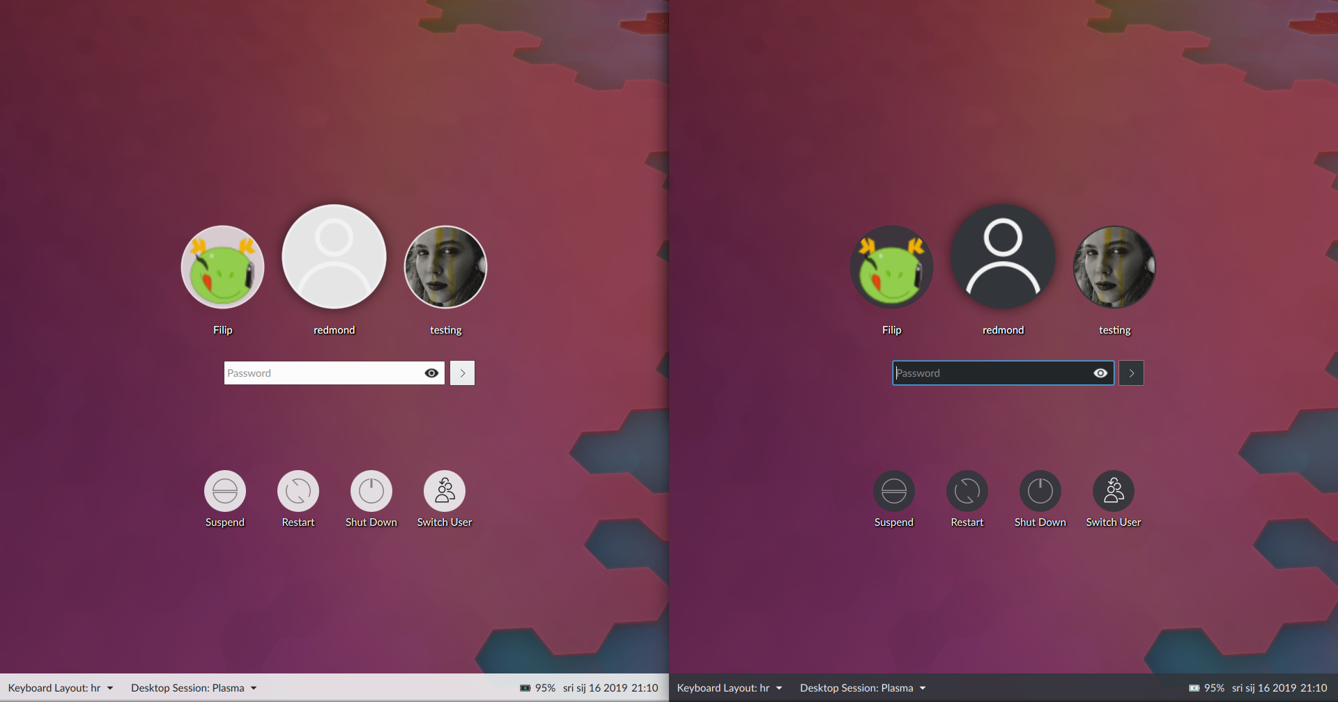
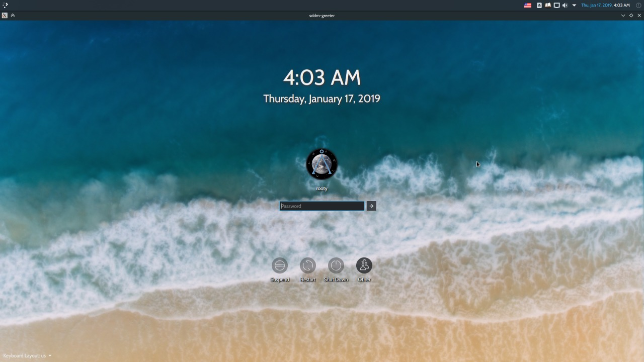
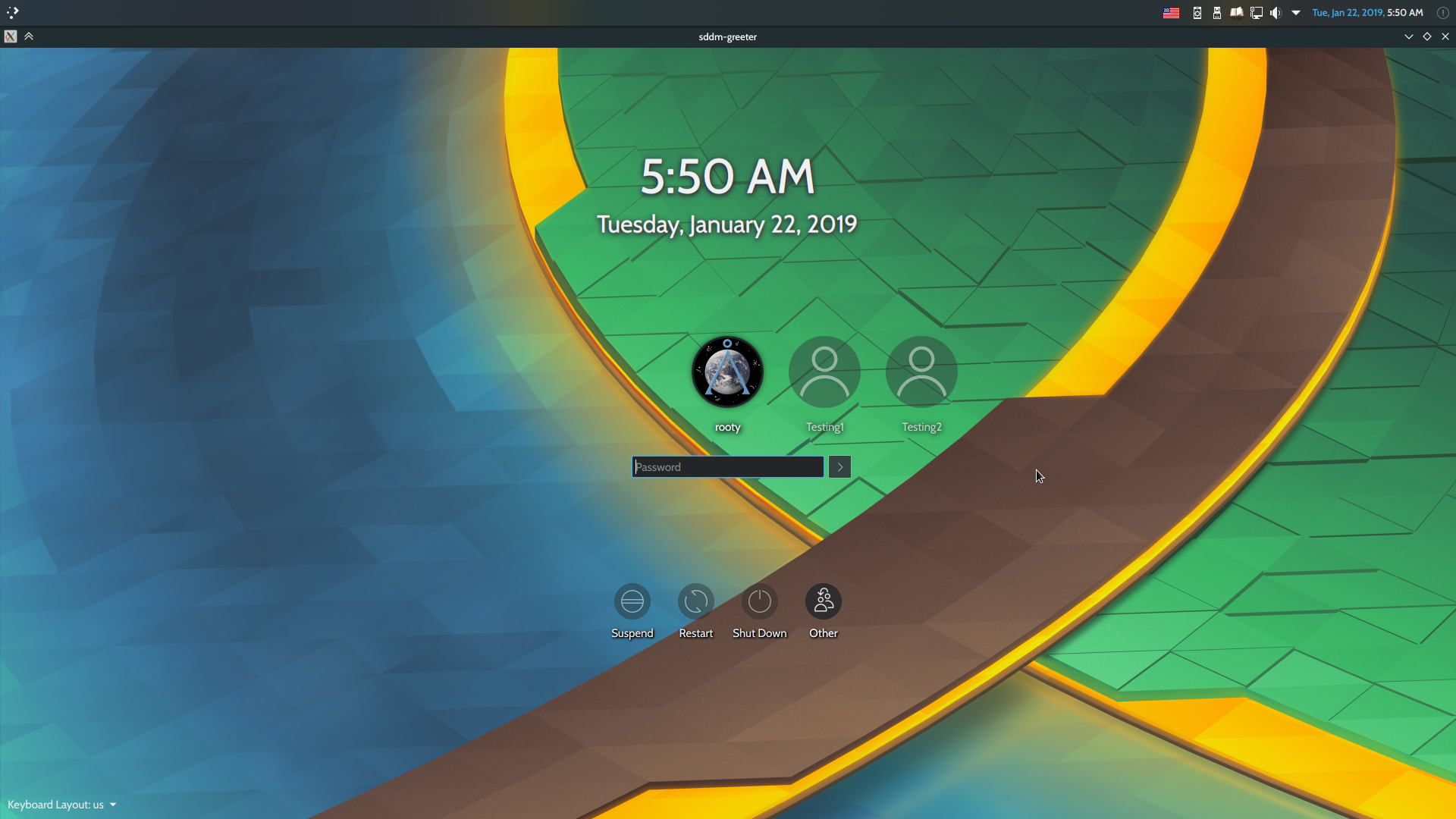
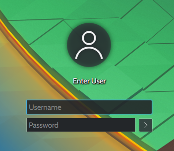
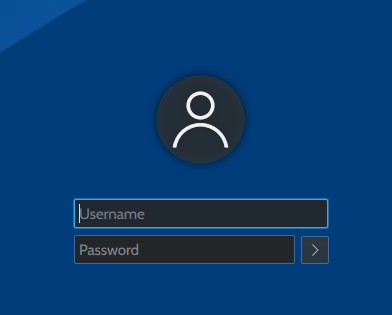
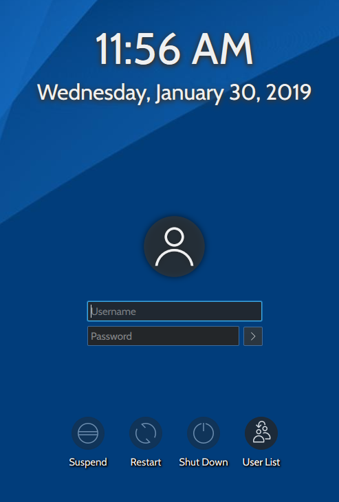
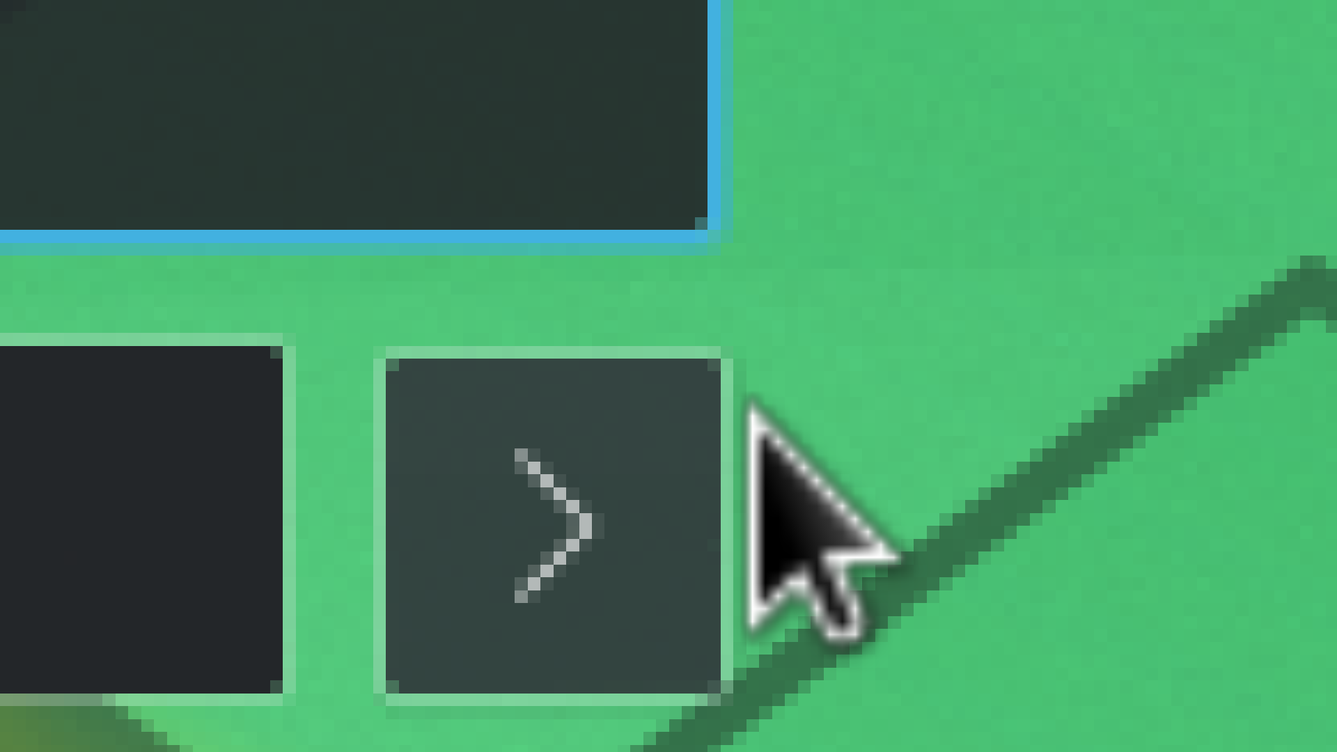
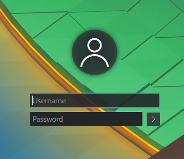
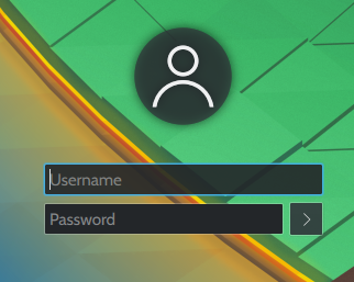
This task tracks our design process for the 5.16 lock screen theme redesign.

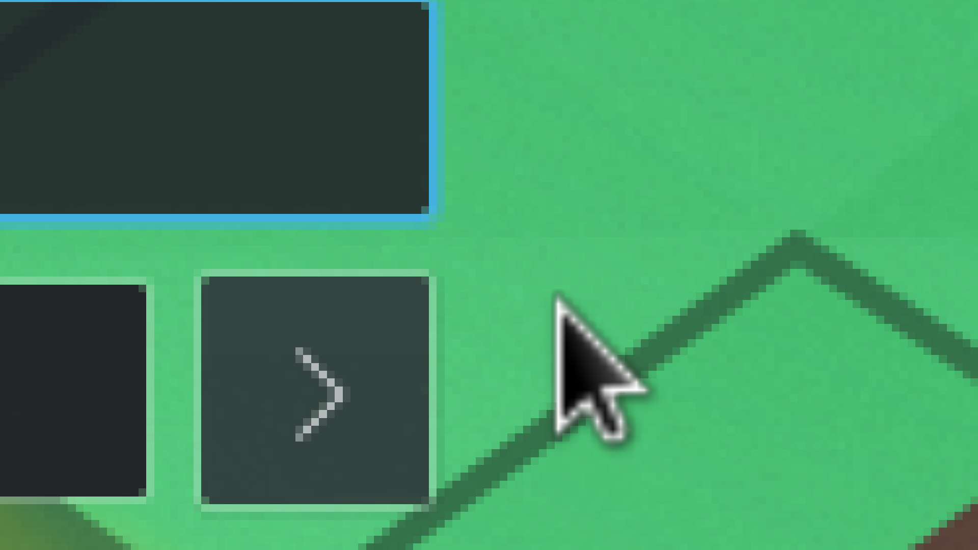
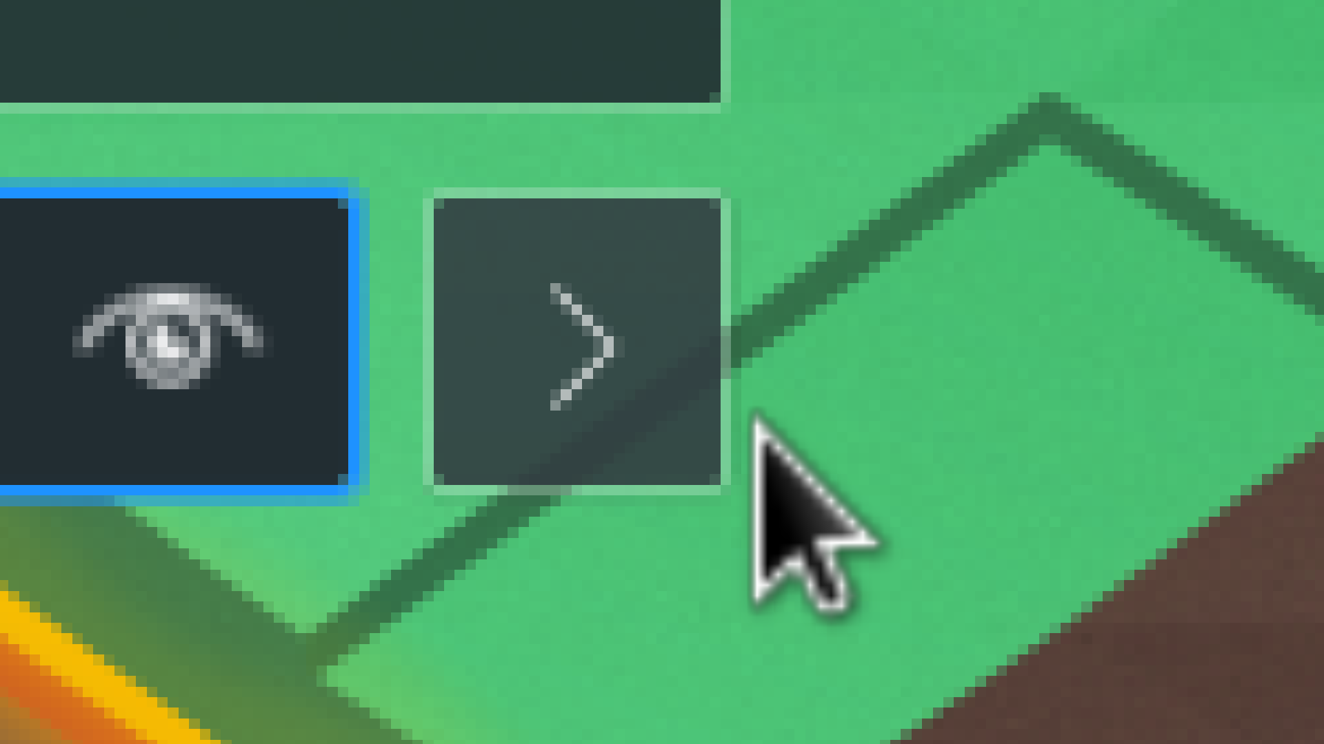
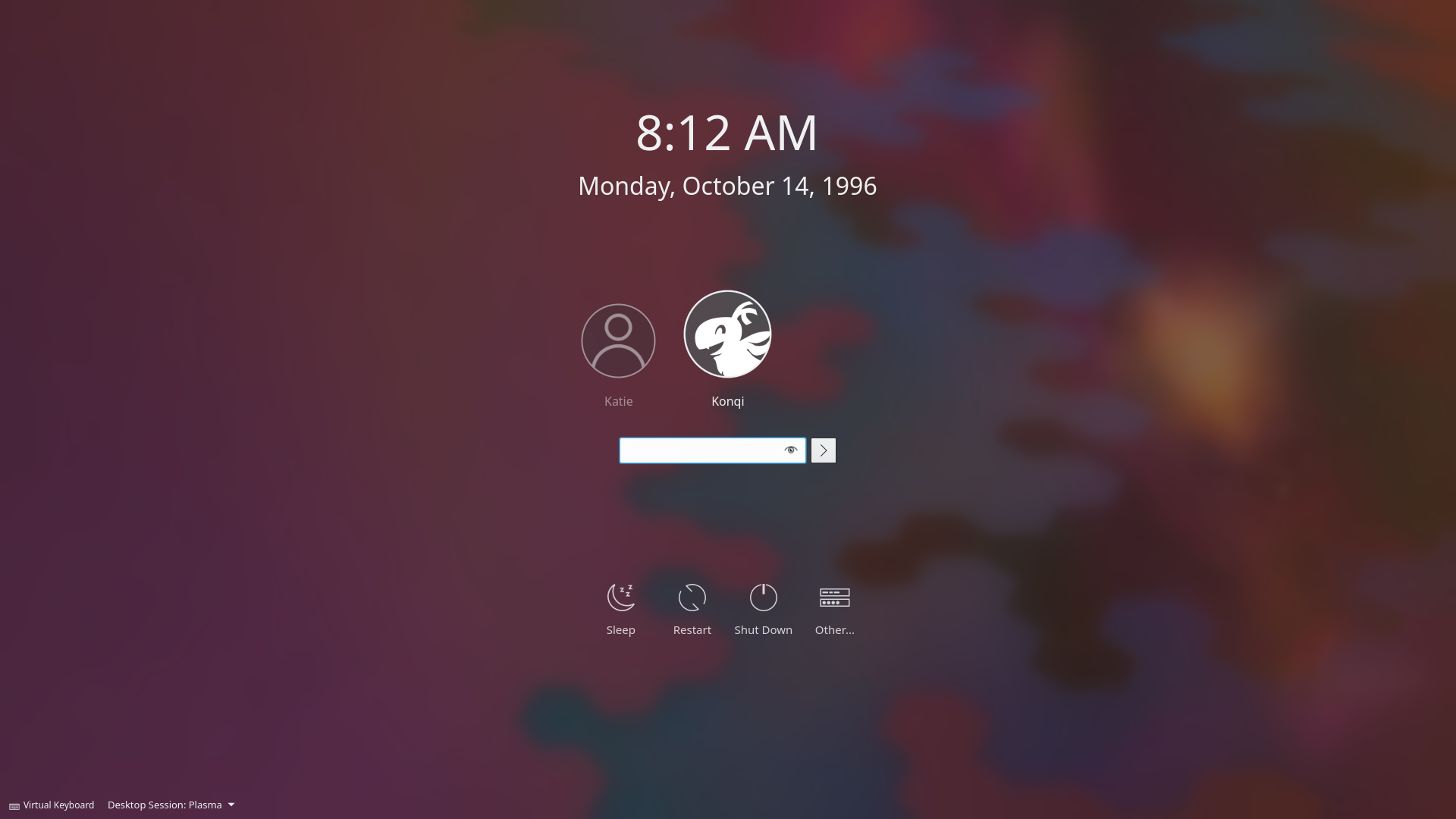
We are targeting the following changes for now:

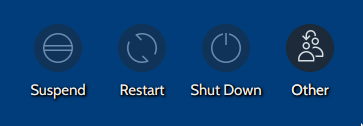
  • Improve buttons' icons
  • Improve buttons' text labels
  • Improve buttons' selected/hovered behavior
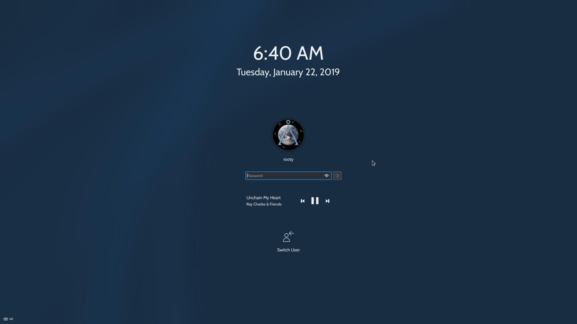
  • Modernize text field + login button layout
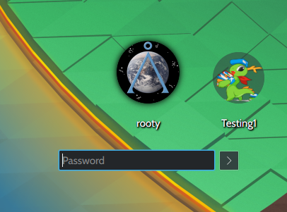
  • Make it more obvious on the user switcher that the centered icon is for the current/selected user
  • Refine and town down the blur effect
  • Use shadows only when the wallpaper is blurred
  • Improve appearance in software rendering mode
  • Fix the numbers in the clock getting cropped (https://bugs.kde.org/show_bug.cgi?id=404651)

Related Objects

StatusAssignedTask
Resolvedngraham
Resolvedrooty
There are a very large number of changes, so older changes are hidden. Show Older Changes
rooty added a comment.EditedJan 15 2019, 3:58 AM

hey guys i have a relatively simple question

this is what the mac login screen becomes with many user accounts:

listing all the users that aren't in focus at the moment on the left side of the entire layout might not be a bad idea (thank you windows)?

because whatever layout we choose (boxes/no boxes etc.) we're going to have to deal with user icons, and @filipf and i have been working on a redesign but we need to be told what direction to go in in terms of icons :D

There is also the possibility of getting the current theme to work without blur & fader. Something still rough (and including some other changes) I've been playing around with:

I would be all for that if we can make it look cohesive! Your changes look great Having everything being light or dark definitely improves the cohesiveness. However how would you implement the dark/light theming? For obvious reasons SDDM deosn't have access to user configuration data, so it can't just automatically use the same theme that your user account uses.

I would be all for that if we can make it look cohesive! Your changes look great Having everything being light or dark definitely improves the cohesiveness. However how would you implement the dark/light theming? For obvious reasons SDDM deosn't have access to user configuration data, so it can't just automatically use the same theme that your user account uses.

Yeah, we'd have to add an option to set a color scheme :/

It would also probably mean adding a mechanism that copies user made color schemes into the root directory so SDDM can access it.

It's more work, but IMO in the end a more elegant solution than just making two separate light and dark themes?

I think separate dark and light schemes makes more sense IMHO because:

  • It doesn't require code changes to the SDDM KCM
  • Then a Look-And-Feel package (e.g. Breeze Dark) can apply the correct SDDM theme

Good point. The only problem I'm seeing is that the password and login box cannot be assigned custom colors. The color is determined by the color scheme, which for root is always Breeze, which in turn means the boxes would always be white, even in the dark theme.

rooty added a comment.EditedJan 17 2019, 3:30 AM

We do have our own style though. How do you guys feel about just improving on the current design, because unlike any other OS or desktop environment I've used so far (including Windows that requires an extra swipe, macOS that has its date and time tucked away, gdm that don't seem to entertain the notion of a big clock at all, deepin that tucks it away in its bottom left corner), our current login screen doubles as a lock screen already (because of the clock, and hence there's no need for the wallpaperfader either). Something along the lines of:

Maybe just a dash of blur (like in this picture) to smooth out the potential literal rough patches of a wallpaper a user may choose.

I think a tiny bit of blur would almost be more frustrating than the current amount. It would look like a visual glitch rather than a deliberate effect.

rooty added a comment.EditedJan 22 2019, 4:54 AM

Since seeing Alex's improvements to Kwin's blur effect, I've abandoned the idea of implementing blur because it suffers from the same side effects Kwin used to (or... still does, until the diff's approved). In addition, I've noticed it makes people feel as though they suffer from nearsightedness.

How do you feel about this? No blur whatsoever.
It's basically your old proposal (ditch the blur and add shaded action buttons and user icons) except

  • I'm not sure if the fonts are slightly larger than your version, but they're definitely larger than master
  • no more WallpaperFader.qml seeing as we're not going to be needing it
  • without a footer (a footer is a great idea actually, but it makes things look kind of asymmetrical)
  • the "log in" button's gone and replaced with a button with an arrowhead (the lock screen would have to be changed as well, for the sake of consistency, but it's such a minor change I don't think it'd be a problem)
  • no border around the user icons (I think it looks better this way because it doesn't infringe on the user avatars + the actionbutton icons don't have them either)
  • the buttons use title capitalization unlike my older slightly shabbier mockups
  • the Different User button label's been replaced with Other

I've replaced the label "Different User" with Other for two reasons:

  • it's a better description (even if a little vague) of what the button does - namely it opens up a dialog with which you can log into any user's account (including the ones that were selected or listed but unselected, hence the word different doesn't really apply)
  • the label "Different User" is relatively long (14 characters), and the labels look fairly out of balance (tipped/tilted in the direction of Different User), the label "Other" makes the action button levels far more balanced in my opinion

vs

There's an issue however: poor visibility of the users that aren't selected/being logged into.

Other things to put forth for consideration:
I've noticed that certain people simply prefer having a username and password dialog as their default login screen over icon/avatar selection (Corporate setting? Tons of users?). So I think we should consider:

  • implementing settings that remember/retain whether a user prefers the username-password dialog, and that
  • we should hence replace the label "Back" (as well as its icon) with something more like "User Selection" (I haven't worked that part out yet)

In my mockup, I've also done away with the label "Log in as different user" because to be fair, the label's slightly misleading (Different from what? Also, I can log in as any user so it's not always a different user?)


This still needs a lot of work (as you can see). I'm not sure about the labels but I'd like for this to be a viable alternative (or a viable alternative default). The shadowing stands to be improved, and I haven't yet added shadows or an outline, or anything really to highlight the footer bar (in my case "Keyboard Layout" in the screenshots) which isn't that easy to read on top of a bright background.

P.S. This is what the lock screen would look like with the arrowhead button, font changes, and no border around the user avatar:

Admittedly, the spacing/padding/anchors are still a work in progress :D

filipf added a comment.EditedJan 22 2019, 10:57 AM

Current user delegate behavior wouldn't cut it. Leaving the footer as is poses even greater issues for legibility. There's three options:

  • use a panel -> simple hack; asymmetry gets solved by subtracting the footer height
  • expose the frames around footer text -> would look extremely ugly
  • use a darkening gradient at the very bottom -> we would be altering the user's wallpaper again

Example of the latter:

AFAIK adding shadows to the footer text isn't possible since it's all buttons.

Here's an idea for the inline login button issue:

  • On the page with the graphical user switcher, center the text field and put the login button on the right side
  • On the page with the username field, slightly reduce the width of the password field so the combined password field + login button are exactly the same width as the username field above them
rooty added a comment.Jan 29 2019, 6:19 PM

Is this okay?

GB_2 added a subscriber: GB_2.EditedJan 29 2019, 7:05 PM

How about this: we put the username input box where the "Enter User" label is.

rooty added a comment.Jan 30 2019, 2:00 AM
In T10325#174775, @GB_2 wrote:

How about this: we put the username input box where the "Enter User" label is.

Hey I like that idea

Good (plus @GB_2's idea, which I like)

For this representation, I think it might look nicer if the password field itself is centered, and the login button is off on the right side.

Are you sure though? It seems like it kinda sticks out too far beyond/to the right of "Other"

vs

rooty added a comment.EditedJan 30 2019, 10:45 AM
In T10325#174775, @GB_2 wrote:

How about this: we put the username input box where the "Enter User" label is.

Something like this?
How do you feel about the spacing? it doesn't seem even to me

rooty added a comment.EditedJan 30 2019, 12:00 PM

By the way guys it's been pointed out to me that the login button is off by a single pixel


But if I align it or anchor it, it's off by single pixel on top and at the bottom:
which seems to make matters worse (it looks too big).

There is a dirty solution to this problem:

implicitHeight: passwordBox.height - 2
Layout.rightMargin: 1

With this change, it looks pixel perfect no matter the font family or size, but is this an acceptable solution?

why i have to type the username when i can choose it

why i have to type the username when i can choose it

You don't; there are multiple views. This is the "choose a user by typing their username" view.

ngraham renamed this task from 5.16 Login screen redesign to 5.16 Login screen improvements.Feb 19 2019, 12:19 PM
ngraham updated the task description. (Show Details)
ngraham reassigned this task from ngraham to rooty.Feb 19 2019, 12:38 PM
ngraham updated the task description. (Show Details)Mar 2 2019, 11:02 AM
rooty updated the task description. (Show Details)Mar 3 2019, 10:24 PM
ngraham updated the task description. (Show Details)Mar 3 2019, 10:27 PM
filipf moved this task from Backlog/Planned to Work in Progress on the VDG board.Mar 7 2019, 9:39 PM
filipf updated the task description. (Show Details)Mar 7 2019, 11:30 PM
rooty updated the task description. (Show Details)Mar 8 2019, 2:56 AM
rooty updated the task description. (Show Details)Mar 8 2019, 1:47 PM
filipf updated the task description. (Show Details)Mar 8 2019, 9:40 PM
ngraham updated the task description. (Show Details)Mar 8 2019, 10:05 PM
rooty updated the task description. (Show Details)Mar 9 2019, 6:52 AM
filipf updated the task description. (Show Details)Mar 9 2019, 8:34 PM
filipf added a comment.Mar 9 2019, 8:36 PM

We still have a little bit of polishing left to do.

Fixing the numbers in the clock getting cropped (https://bugs.kde.org/show_bug.cgi?id=404651) is a must. We could port to QQC2, probably implement QtRendering (again) or, what would be the best, fix it in Components.

Some ideas we could look into:
https://bugs.kde.org/show_bug.cgi?id=336369
https://bugs.kde.org/show_bug.cgi?id=391168

Another thing I've been thinking off is to somehow have the login button's appearance change after text gets typed in.

Not the login screen, but since we've been touching all of them up: "Oh by the way, and I know I should write a bug report about that, but when switching users, there is this giant PLUS icon above a "new session" label, and under all that a "Start a new session" button. It bugs my significant other that the PLUS icon is non-clickable. :-)" - user opinion

I agree that this could be done better.

That drives me bananas too! It looks so tantalizingly clickable. +1 for replacing it with something that doesn't look like a button. Also, I'd like to make this screen not even appear at all when there's only one existing session; instead just go straight to SDDM: https://bugs.kde.org/show_bug.cgi?id=386361

rooty added a comment.Mar 11 2019, 3:18 AM

Oh one more thing - should we push the entire clock + stack a little bit further down to make it more (or entirely) vertically centered?

It's not centered at all at the moment.

ngraham closed this task as Resolved.Mar 20 2019, 5:52 PM

Congratulations everyone! Now let's never touch it again lol

rooty added a comment.Mar 20 2019, 7:29 PM

Congratulations everyone! Now let's never touch it again lol

Hear, hear :D

mikhailn removed a subscriber: mikhailn.Apr 26 2019, 9:17 AM
mikhailn added a subscriber: mikhailn.
mikhailn removed a subscriber: mikhailn.
mikhailn added a subscriber: mikhailn.
mikhailn removed a subscriber: mikhailn.
mikhailn added a subscriber: mikhailn.
mikhailn removed a subscriber: mikhailn.
mikhailn added a subscriber: mikhailn.
mikhailn removed a subscriber: mikhailn.
mikhailn added a subscriber: mikhailn.