Improve contrast and selection state of action buttons on login, lock, and logout screens
Closed, ResolvedPublic

Description

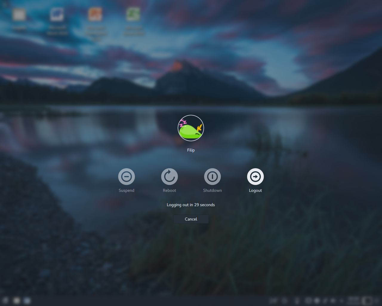
I wanted to propose having a circle behind the icons in lockscreen and sddm for better visibility. The shading can be blurred or faded so they don't look too harsh but this could be a welcomed addition for whenever you have very light wallpapers. It can help with the recognition of the icons.

Thoughts?

abetts created this task.Aug 18 2018, 9:46 PM
abetts triaged this task as Wishlist priority.

Like the media player icons?

A close example would be this:

https://dribbble.com/shots/3393398-iOS-11-Lockscreen-Concept

Just a little darker. Just very subtle. Sorry, the designer talk is coming out...

+1 conceptually. This would improve readability if we ever offer a checkbox to turn off the fade effect in the lock and login screens, as some people have been requesting.

Let's make sure to do the same with the logout screen, which currently has a different selection/hover behavior that causes https://bugs.kde.org/show_bug.cgi?id=393048

This idea would not be directly affecting that overall look. It would just be a visual trick to help the buttons be visible. But I agree.

filipf added a subscriber: filipf.Aug 23 2018, 8:24 AM

How would this be implemented? In Breeze or globally (by modifying the logout screen and SDDM)?

Note that some other desktop themes already provide icons that are visible enough so it would be preferable to restrict the change to Breeze. And if you hardcode circles to the Breeze SDDM theme instead of changing the actual icons you suddenly have an issue with modding the Breeze SDDM theme so there should be an option to disable that somewhere.

Example of a scenario where this change is not as necessary:

Thanks for jumping into this. This would signify modifying the icon. However, in your example, there is very little transparency in the circles. This is not the desired outcome. Instead the circles should change to a dark shade and transparency below 25%. They should not be perceptible but only when a light background is used.

I will try to add a mockup to explain.

Ah, excellent, there are no issues with third-party themes then if just changing the icons :) . I agree that having transparency could look more elegant and be more versatile than pure white as in the screenshot I've shown.

Ah, excellent, there are no issues with third-party themes then if just changing the icons :) . I agree that having transparency could look more elegant and be more versatile than pure white as in the screenshot I've shown.

Thank you sir!

So is the idea here to change the Breeze icons to include a circular background? If we do this, I worry that it would generate visual regressions elsewhere where the circular background is not needed (e.g. Kicker and Kickoff). Remember that these same icons are used in quite a lot of different places!

I think the root cause issue here was an initial design decision for the Breeze SDDM/lock/logout themes: they put a bare icon against a variable background without some kind of container or button to hold it and provide the needed visual separation. This creates problems:

  1. Poor readability against light-colored or busy backgrounds
  2. No visual visual change on hover, or a change that is too subtle
  3. Difficulty visually detecting selection status (for the logout screen, where icons are selectable)
  4. 3rd-party icon themes feel the need to solve the problem themselves by including their own background and making the icon look more like a button

For the lock and login screens, we tried our best in 5.13 to fix this state of affairs by introducing the current blur mechanic so that the background beneath the icons is generally more conducive to clarity. That mostly solved problem problem #1, but not 2 or 4, and now we have people complaining that they don't like the blur effect. :-(

IMHO, the icon-without-a-button-on-a-variable-background paradigm is an example of excessive minimalism. If we put the icons inside a typical rounded rectangle button, all our problems would be solved. 3rd party icon themes that draw a circular background for the icon probably wouldn't look bad, and could over time stop working around the issue.

Thoughts?

I was looking for a good example of what I mean visually. I think I found one. My perspective that "only" the icons in the lock screen and sddm show this behavior while the icon themselves do not. That would look really odd in the desktop.

Here is an example:

As you can see, there is a very subtle and blurred background on the icon. This only shows when there are different graphics than defaults on the screen.

Would this work from a technical perspective?

If we do this, I worry that it would generate visual regressions elsewhere where the circular background is not needed (e.g. Kicker and Kickoff).

Kiconloader has a special trick, one can specify to load the icon foo-bar. If it doesn't exist it will look for an icon called foo.

I don't know if the plasma theme icons have this trick.

The way I see it these would be the preferable solutions, ranked in order of which one would be the best:

  1. have the *icons* display the circles only on the lock-screen and SDDM (but not by calling upon a different class of icons because that would break other desktop themes I suppose)
  2. if 1 is not possible, add circles as permanent parts of the locker screen and SDDM, but include a GUI option to turn it off so it does not necessarily cause visual regressions with some third party themes
  3. if 1 and 2 not possible, add circles to the locker screen and SDDM, but extensively test with third-party themes so it doesn't cause visual regressions

The unpreferable option would be 3, but to ask the theme developers to adapt. This wasn't done well with the 5.13 media applet icons - from what I've gathered, the developers didn't know it would happen and weren't told how to fix it. We also have to take into account some themes don't get updated anymore or as much, but some users may be quite fond of them nevertheless. And it's not desirable to break third-party theming anyway, no matter how small the change.

IMHO, the icon-without-a-button-on-a-variable-background paradigm is an example of excessive minimalism.

I tend to agree with this. Having looked at the Windows 10 and macOS login screens, it just seems that's the trend nowadays though. But aside from macOS circumening the problem by adding a strong blur, it seems like they have one small thing going for them - their action actions are a bit thicker than ours. I don't know if this has been discussed more globally, but visually the 1px thin Breeze monochrome icons sort of draw back to 1980s graphical interfaces (which isn't ideal) and run the risk of looking choppy due to their thinness, or are potentially not as legible. I wonder if making them at least 2px thick would have any affect on the issue at stake here, although discussing it should have no bearing on whether the circles should be added - I think it's a good idea regardless.

I gave option 3 a crude attempt tonight:

I don't think it's going to work. Not all icons are circular and symmetrical; being neither, the "Different User" icon looks terrible on top of a tight circular background. Also if we draw the circle small enough to look good for (some) Breeze icons, icons from other icon themes that are larger and could be square will overflow. If we make the circular background big enough to contain even the largest icon, it becomes comically huge and looks bad. This also does nothing to solve the current problem of selection being too subtle: https://bugs.kde.org/show_bug.cgi?id=393048

I think our options are now:

  1. Add circular backgrounds to Plasma theme icons and use David's trick to make sure they only get the circular background here
  2. Put the whole icon and text inside a square-ish button

I rather prefer option 2 since:

  • We could make the selected state more obvious, solving 393048
  • The large button rectangle would be large enough to fit large icons from 3rd-party themes, and even look fine when the 3rd-party icons have their own circular or square background
  • The whole button could visually match the text field and Login button rather than (almost) always being white

It would look kind of like a not-horrible version of this:

ngraham renamed this task from Add Semitransparent Circle Behind Lock Screen and SDDM Controls for Better Visibility to Improve contrast and selection state of action buttons on login, lock, and logout screens.Sep 14 2018, 2:57 AM
ngraham claimed this task.

I gave option 3 a crude attempt tonight:

I don't think it's going to work. Not all icons are circular and symmetrical; being neither, the "Different User" icon looks terrible on top of a tight circular background. Also if we draw the circle small enough to look good for (some) Breeze icons, icons from other icon themes that are larger and could be square will overflow. If we make the circular background big enough to contain even the largest icon, it becomes comically huge and looks bad. This also does nothing to solve the current problem of selection being too subtle: https://bugs.kde.org/show_bug.cgi?id=393048

I think our options are now:

  1. Add circular backgrounds to Plasma theme icons and use David's trick to make sure they only get the circular background here
  2. Put the whole icon and text inside a square-ish button

    I rather prefer option 2 since:
  3. We could make the selected state more obvious, solving 393048
  4. The large button rectangle would be large enough to fit large icons from 3rd-party themes, and even look fine when the 3rd-party icons have their own circular or square background
  5. The whole button could visually match the text field and Login button rather than (almost) always being white

    It would look kind of like a not-horrible version of this:

The second option is a great option IMHO. Thanks Nate. Is it possible for the backgrounds to have rounded corners and be darkened? My main idea is that they become very faint. Just between the point of being faded and distinguishable.

The second option is a great option IMHO. Thanks Nate. Is it possible for the backgrounds to have rounded corners and be darkened? My main idea is that they become very faint. Just between the point of being faded and distinguishable.

So my idea is essentially that we actually make these buttons look like buttons, not that we do another blur experiment. :) What do you think?

Purely from a visual perspective, it will look pretty ugly. Let’s go the design route on this one. It will be best in the long run. I know technically, it might be easier to implement a button that already exists, I just don’t feel ot will be great aesthetically.

Yeah, I think you're right, @abetts. I made some efforts over the last few days but couldn't find a way to make those big square buttons not look ugly. Looking back through the thread here, I have to say that I like @filipf's screenshot:

We could modify the Breeze Plasma Theme icons to have built-in backgrounds to make them look like this. The contrast between the active and inactive icons is also much better there, and I think that would be sufficient to consider https://bugs.kde.org/show_bug.cgi?id=393048 fixed. Then we probably wouldn't need to do anything fancy like add some blur behind the icons.

I also think our Switch User icon needs some improvement. The current icon doesn't work well because it's not centered, symmetrical, and circular like the others, and an arrow pointing to a person's head doesn't really do a good job of communicating the meaning. See:

It's definitely th odd one out there. Maybe two arrows pointing in opposite directions inside a circle would be better. I'm not an icon designer though; I'll let @abetts and @andreask chew on that. :)

Thoughts?

I like this one best: https://www.flaticon.com/free-icon/switch-user_72336#term=switch&page=2&position=3

However this one fits best with the Breeze theme's circular motif for these icons: https://www.flaticon.com/free-icon/switch-arrow-button_19879#term=switch&page=2&position=69

A clever combination of the two would be ideal, if it's not too much detail to fit into a small space (but it's okay to lose the circle at sizes smaller than 32px).

Hence my comment of looking for something generic, since the icons with line art can become quite crowded quickly. I would support something like https://www.flaticon.com/free-icon/switch-arrow-button_19879#term=switch&page=2&position=69 but I wouldn't want to add much more to it.

For reference, the desktop theme in that screenshot was Arc Color (variant of Arc KDE). What's cool about it is they've made their icons adaptive, based on the color scheme you use.

So previous screenshot was Breeze Dark, but if you change to the Breeze color scheme, you get this:

It does mean in this case however that you have these same icons in Kicker, Kickoff etc.

It does mean in this case however that you have these same icons in Kicker, Kickoff etc.

Can you share a screenshot of what that looks like?

filipf added a comment.EditedSep 16 2018, 7:03 PM

It does mean in this case however that you have these same icons in Kicker, Kickoff etc.

Can you share a screenshot of what that looks like?

Sure!

Kickoff is the biggest pickle I think. In the case of the Breeze desktop theme, if you add circles behind the action buttons, it will break consistency with the icons of other tabs (because it affects the icon for the "Leave" tab). Actually maybe an easy solution is to use a different icon for the Leave tab, but this may break other themes. In the case of Arc Color it all somehow works because the other tab icons are very, very thick and full. The respective icon theme (Papirus-Adapta) also pitches in by putting circles behind its action icons, and even colors the circles (not sold on this :P ).

Kicker I'd say is safe. It doesn't have those monochrome tab icons like Kickoff does, which means that action buttons with a background behind them wouldn't create a consistency mess.

The application dashoboard actually doesn't work as intended in the case of light color schemes so I'm going to report that to the Arc people. Despite this, it's just three icons at the bottom and I don't think there would be an issue here. Here's what it looks like with a dark color scheme:

EDIT: Papirus-Adapta is clearly not a respective icon theme of Arc-Color, sorry :D The Adapta desktop theme mostly uses the same icons as Arc-Color, just colored, so it was all the same in my head.

Well, while I understand the argument, I don't see the effect. We simply cannot be looking out for 3rd party themes since they decide how to adapt to the desktop. The direction is inverted. If we decided to change our icons, then the devs from the icon theme would want to adapt to that change.

ngraham added a comment.EditedSep 16 2018, 9:55 PM

I agree that supporting 3rd-party themes shouldn't drive our design decisions. At the same time, it also shouldn't be ignored.

That said, in this situation it's a moot point if we decide to adjust the Breeze icons rather than what's currently behind them. That won't have any effect on 3rd-party icon themes unless we change what icon is used where. But this doesn't generally have a detrimental effect on 3rd-party themes unless we switch from using a Plasma Breeze theme icon to a Frameworks Breeze theme icon, which can result in issues like https://bugs.kde.org/show_bug.cgi?id=397082. That should generally be avoided. But I don't think that's on the table here.

I'd like to propose the following action items to move forward:

  1. Add a built-in contrasting round background on all the power-related icons (system-switch-user, system-log-out, system-lock-screen, system-suspend, system-hibernate, system-reboot, system-shutdown) for their 32px and larger sizes
  2. Change or improve the system-switch-user icon to follow the general round style of the other power-related icons
  3. Use a different icon for Kickoff's "Leave" icon. Either system-shutdown-symbolic maybe, or else we could use @davidedmundson's name prefix trick for the Plasma Breeze theme to use a special version without a solid background.

All in favor?

Sounds great to me on all counts - a design and bugfix win-win scenario. It's not ideal, but sometimes it is warranted to break things if it means progress. If the "Leave" icon has to be a totally new icon it would be fine to just give people a little bit of a heads up, something like a thread on Reddit and/or a note in a weekly Usability and Productivity post. On a philosophical level it actually makes more sense to me that that particular tab has an icon of its own instead of just reusing the logout icon, although on practical level if the trick David suggested can be used, that's the most neat solution.

What's the consensus on the transparency though? Better to have it opaque?

And I have a technical question -> The Breeze desktop theme can pick up the color scheme and adjust the icons appropriately, but how would SDDM do this? Could it perhaps somehow pick up on how light/dark the background is?

The SDDM Breeze theme is color aware and has the ability to request dark or light icons. But the point of this endeavor is that we won't need to care about the SDDM background image as long as the icon brings its own background. In the worst case scenario where the image background is the same color as the icon background, the symbol contained therein will still be visible. But to make it really bulletproof, we could outline the circular background with the opposite color to always provide the needed contrast.

ngraham closed this task as Resolved.Sep 17 2018, 4:54 AM

Action item 1 (add background): https://bugs.kde.org/show_bug.cgi?id=398742

Action item 2 (improve switch user icon) : https://bugs.kde.org/show_bug.cgi?id=398741

Action item 3 (don't change Kickoff's Leave icon): https://bugs.kde.org/show_bug.cgi?id=398743

Let's close this task and track the work in the Bugzilla tickets now. Thanks everyone!