Revamp buttons on the bottom to solve various usability issues
Open, Needs TriagePublic

Description

Issues

  • Confusing Quit button: Bug 386163
  • Preferences hard to find: Bug 375965
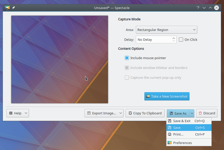
  • Multiple unrelated options in the Save As popup menu button.

Ideas

  1. The popup menu button is a standard element, I think it is fine for presenting the different save options available (even if dedoimedo does not like it). It should stay.
  2. Print should go to Export Image (which could get a better name, though).
  3. Preferences should be renamed Configure... and moved into its own button to the right of Help (not sure yet whether icon-only button or with text).
  4. Quit/Discard should be either moved or removed. Reasons:
    • 3 buttons in the bottom right group are easier to navigate than 4.
    • Makes space for a Preferences button in the left group.
    • Redundant to the regular window close button. Caveats:
      • We should get some input from users of tiling window managers who switch off decorations.
      • Does the HIG require such a button?
      • Maybe it was added for a reason? After all, KSnapshot did not have it.
      • Solve Bug 389691 (Ambiguous shortcut warning when pressing Ctrl+Q, Ctrl+S or Ctrl+Shift+S).
    • Having a button potentially resulting in losing your work without any confirmation right next to the button saving your work is quite dangerous.
    • The wording changing itself is confusing.
    • Some use cases are already solved by Save & Exit.
  5. Add a "quit after save/copy/export" checkbox to the main UI and then get rid of Save & Exit item; would solve Bug 389773
  6. Properly indicate unsaved screenshots instead of changing wording of Quit button, e.g. by adding "*" in title and showing a confirmation dialog for unsaved changes on closing.

Tasks

  • Finish design
  • Implement changes
  • Make sure D9117#202448 is implemented and works, otherwise Copy To Clipboard with Quit after Copy is broken (or at least add a tooltip as well as docbook documentation).
  • Adapt docbook
  • Provide new screenshots
ngraham added a subscriber: ngraham.EditedJan 31 2018, 2:14 PM

Your thoughts are almost exactly in line with mine. My original plan was as follows:

  • Remove the quit/discard button
  • Remove the "Save & Exit button from the split button
  • Remove the Print item from the split button and put it under Export
  • Remove the Preferences item from the split button and make it its own button to the right of the Help button
  • Add a checkbox on the main UI for "quit after saving" that remembers its status
  • Indicate unsaved screenshots somehow
  • Figure out a way to make it clear that the preview reflects the current screenshot, and the UI elements currently to the right of it apply to replacging it with a new screenshot
rkflx added a comment.Jan 31 2018, 2:19 PM

That's great. So we'd need to put more thoughts into Quiting and the "unsaved changes" thing.

Current state for reference:

rkflx updated the task description. (Show Details)Jan 31 2018, 2:24 PM

Also I wonder about "Include window title & borders" Is this actually used by anyone? Checking it results in everything drawn by KWin not being included. What's the use case for it? Could we possibly demote it to the settings window so it's not cluttering up the main UI?

This comment was removed by ngraham.
ngraham updated the task description. (Show Details)Jan 31 2018, 7:12 PM

I think we can safely agree on removing the Quit/Discard button. Most apps don't have a visible Quit button, and people who turn off window decorations or use tiling window managers are advanced users who already know how to quit their apps.

  • Figure out a way to make it clear that the preview reflects the current screenshot, and the UI elements currently to the right of it apply to replacging it with a new screenshot

This needs more time to figure out properly.

Also I wonder about "Include window title & borders" Is this actually used by anyone? Checking it results in everything drawn by KWin not being included. What's the use case for it? Could we possibly demote it to the settings window so it's not cluttering up the main UI?

KSnapshot has it, as well as gnome-screenshots -i and Shutter.

I don't think it belongs in the settings, because it's not a set-and-forget but more of a once-in-a-while feature. I guess Current pop-up falls in the same category of "obscure, but sometimes useful" (GNOME and KSnapshot don't even have it). Either we keep both, or remove them completely in favour of Region. I'd prefer the former, because simply undoing work other contributors did only recently does not feel right to me and it could get us bad press if even GNOME has it.

As for use cases: I've never used the feature, but I could imagine in some specialized workflows (capturing a dashboard app, making screenshots for a book etc.) users might not be interested in borders. Here is where (opt-in) telemetry would come in handy.

Also we should keep in mind to reserve some space for a shadow checkbox anyway (see Bug 372408), because disabling compositing gets old fast. I assume it would be useful to be able to decide this on a case by case basis instead of having to go in the settings.


Here is an idea: Implement collapsible headers:

  • Capture Mode (expanded by default)
  • Content Options (collapsed by default, because less relevant)
  • Save/Workflow/Whatever Options (collapsed by default) ← Quit after Save goes here

Yay/Nay?

Do we have a standard widget for this or an example? Cannot remember right now, but I must have gotten the idea from somewhere!


One more thing: What about a "Remember" feature for Export Image, perhaps in a later iteration?

All right, let's keep the "don't capture any window decorations" feature.

I love collapsible headers, so that's always going to be a big thumbs up from me. These are heavily used in Apple's desktop UX and it's very nice.

I agree with all your suggestions. The usability will be improved a lot.

I like collapsible headers, but I haven't found a standard implementation of it. There is QToolBox but it does not look so nice to me (at least in the version I see in QtCreator).

In the "Open with" dialog I have implemented the "Terminal options" expandable section by hand basically, but I am curious to know if there is a standard way to do it.

rkflx added a comment.EditedFeb 3 2018, 1:38 PM

@simgunz Cool, the "Advanced options" thingy is exactly what I thought of. I knew I came across it before ;)

  • Figure out a way to make it clear that the preview reflects the current screenshot, and the UI elements currently to the right of it apply to replacing it with a new screenshot

Any ideas regarding that?

ngraham updated the task description. (Show Details)Feb 3 2018, 9:28 PM
ngraham added a comment.EditedFeb 3 2018, 10:39 PM

How's this for a first pass?

  1. Patch 1: Remove Quit/Discard button and make quitting always discard an unsaved screenshot
  2. Patch 2: Add "Configure..." button and remove Preferences from the split button
  3. Patch 3: Add "Quit after save/copy/export checkbox, and remove "Save & Exit" item from the split button.
rkflx added a comment.Feb 3 2018, 11:14 PM

I'm all for it ;). Maybe having something to play around will make it easier to figure out the rest.

Great, I will try to start this work over the weekend.

ngraham added a subscriber: gregormi.EditedFeb 4 2018, 5:07 PM

We've also got a nice contribution from @gregormi in the pipeline: D10295: Add new button "Record screen" that allows to select a Screen Recording tool

We'll need to see if/where/how the proposed new button fits once the bottom button bar changes are in.

rkflx added a comment.Feb 4 2018, 10:42 PM

We've also got a nice contribution from @gregormi in the pipeline: D10295: Add new button "Record screen" that allows to select a Screen Recording tool

We'll need to see if/where/how the proposed new button fits once the bottom button bar changes are in.

TBH, I don't really like having a dedicated button in our already crowded and space-constrained UI for something not related to functions Spectacle actually provides. Still I can see why someone would find it useful, so I thought about it and came up with this:

  • Share menu (perhaps with a better name, but ideally only a single/short word): just like the current Export Image button
  • Tools menu: Print, Record screen, Annotate etc.
rkflx added a comment.Feb 4 2018, 10:55 PM
In T7841#126507, @rkflx wrote:
  • Tools menu: Print, Record screen, Annotate etc.

Another (rather controversial) idea: Move Copy To Clipboard also to the tools menu. At the same time, provide overlay (on mouse-over) buttons on the thumbnail for Copy To Clipboard and Annotate.

In T7841#126507, @rkflx wrote:
  • Tools menu: Print, Record screen, Annotate etc.

+1, I also think that the "Record screen" (maybe better "Record screen video") is better placed in a submenu like you proposed.

In T7841#126510, @rkflx wrote:

Another (rather controversial) idea: Move Copy To Clipboard also to the tools menu. At the same time, provide overlay (on mouse-over) buttons on the thumbnail for Copy To Clipboard and Annotate.

My two cents: I think at least the "Copy to Clipboard" should be easily accessible. Why not reserving some space below the image for the additional buttons Copy To Clipboard and Annotate which would be always visible? Downside: then there would be 2 button rows which might look not so polished. I don't know how well overlay buttons perform when it comes to accessibility issues (like screenreader support etc.).

alexeymin added a subscriber: alexeymin.EditedFeb 5 2018, 7:24 PM

Yeah, agree, Copy to clipboard button should stay visible; if you hide or remove it, copy screenshot to clipboard automatically, righ after shot was taken or after modifications to image (annotate) like windows built-in SnippingTool does.

rkflx added a comment.Feb 7 2018, 1:20 AM

Move Copy To Clipboard also to the tools menu. At the same time, provide overlay

Thanks everyone for the comments, I knew it would be a long shot. Let's just keep it as is right now.

Tools menu: Print, Record screen, Annotate etc

@ngraham Thoughts? If you like it, I'll contribute my share of the code and implement this. Afterwards Gregor could rebase D10295 on that.

In T7841#126848, @rkflx wrote:

Move Copy To Clipboard also to the tools menu. At the same time, provide overlay

Thanks everyone for the comments, I knew it would be a long shot. Let's just keep it as is right now.

Tools menu: Print, Record screen, Annotate etc

@ngraham Thoughts? If you like it, I'll contribute my share of the code and implement this. Afterwards Gregor could rebase D10295 on that.

That seems eminently sane. Once we get the annotation feature we might want to feature it more prominently than hidden away in a Tools menu, but as we don't have that yet, the point is moot and I think a Tools menu button makes sense as a catch-all to put other stuff into as necessary. We'd finally be able to have a Save button that only has Save items!

rkflx added a comment.Feb 7 2018, 10:41 AM

Tools menu: Print, Record screen, Annotate etc

Once we get the annotation feature we might want to feature it more prominently than hidden away in a Tools menu

Of course.

Still I'd advocate to ship the annotation feature fast, but also don't want to compromise on the overall polish of the UI (which I suspect will happen if we want to change too much at the same time with limited resources). We definitely need a bigger reorganisation of the UI to integrate it properly, because you want to annotate with 100% zoom, which means our current options bar takes up way too much space (think about a fullscreen screenshot).

Let's ship faster and reduce risk by putting it in Tools first, opening a separate window/dialog with simple OK and Cancel buttons. Once it matured a bit, we can proceed with more changes.

That said, if anybody has spare cycles to design and implement a completely new UI paradigm right now, we can skip the intermediate step.

simgunz added a comment.EditedFeb 7 2018, 12:26 PM

Is it there a pending revision regarding the annotation feature? Can you link to it?

Edit: Found it. It is a work in progress: T6321

ngraham updated the task description. (Show Details)Feb 10 2018, 4:03 PM
rkflx updated the task description. (Show Details)Feb 10 2018, 11:58 PM
  1. Properly indicate unsaved screenshots instead of changing wording of Quit button, e.g. by adding "*" in title and showing a confirmation dialog for unsaved changes on closing.

The first part already works, and a confirmation dialog might be annoying for Copy To Clipboard users and for simply retaking a screenshot with Take a New Screenshot.

Let's skip this for now and think about it again when Annotate allows more modifications which should not be lost accidentally (perhaps only show the dialog when copying/quitting/retaking after annotating a screenshot).

rkflx updated the task description. (Show Details)Feb 12 2018, 5:57 PM
rkflx added a comment.Feb 14 2018, 9:52 PM
In T7841#126848, @rkflx wrote:

Move Copy To Clipboard also to the tools menu. At the same time, provide overlay

Thanks everyone for the comments, I knew it would be a long shot. Let's just keep it as is right now.

Just as a heads up: We might be up to do more changes regarding this button for good reasons, see https://bugs.kde.org/show_bug.cgi?id=390415#c5. If anyone has spare cycles and wants to spearhead this, open a new task ;)

rkflx added a comment.Mar 8 2018, 10:54 PM
  • Provide new screenshots

@ngraham Should we tackle this now? Are you good with screenshots? ;)

rkflx added a comment.Mar 11 2018, 6:23 PM

I love collapsible headers, so that's always going to be a big thumbs up from me. These are heavily used in Apple's desktop UX and it's very nice.

I like collapsible headers, but I haven't found a standard implementation of it. There is QToolBox but it does not look so nice to me (at least in the version I see in QtCreator).

In the "Open with" dialog I have implemented the "Terminal options" expandable section by hand basically, but I am curious to know if there is a standard way to do it.

Just had a look at 0296b89714ce, KCollapsibleGroupBox is the standard way I would say. Didn't know this existed before, so I'm mentioning it here in case we might want to use it in Spectacle or Dolphin some day…

rkflx updated the task description. (Show Details)Mar 19 2018, 5:08 PM

FWIW I used to use the Quit button a lot and I've been missing it on the new Spectacle.

I guess it's because Spectacle always "felt" like a dialog rather than a normal window, and dialogs always have the Cancel button on the bottom-right corner.

rkflx added a comment.Apr 25 2018, 6:59 PM

FWIW I used to use the Quit button a lot and I've been missing it on the new Spectacle.

I guess it's because Spectacle always "felt" like a dialog rather than a normal window, and dialogs always have the Cancel button on the bottom-right corner.

@elvisangelaccio Thanks for your feedback. Yeah, it might feel a bit odd at first if you are not yet used to it, but given that KSnapshot also had no Discard button and Spectacle is more and more becoming a full app (Help menu, Configure button etc.), maybe losing that "dialog" feel is actually good. At least from a usability perspective it was needed to make room for other buttons.

Obviously we cannot change it back immediately just for you ;), as the feature was under review for a long time and finally shipped in 18.04. Nevertheless, we'll keep your feedback in mind and see how other users feel about it.

You might want to try the new Quit after Save or Copy checkbox, though.


Also, feel free to comment on the overall direction of T8552: Polish Open/Save dialogs too, until it is too late again.

Actually KSnapshot used to have a Quit button, then it was removed at some point.

I'm not saying that we should re-add it, but there is still room for improvements. Maybe "Quit after save" could be on by default and we could show a notification after Spectacle gets closed? (like we already do with Shift+Print)

rkflx added a comment.Apr 29 2018, 9:30 AM

Maybe "Quit after save" could be on by default and we could show a notification after Spectacle gets closed? (like we already do with Shift+Print)

Before the patch and with KSnapshot taking multiple screenshots was supported. I think we will get a lot of angry users if we changed default here, because automatic closing is not really the expected action IMO. Some people don't know about the shortcut and start Spectacle from the menu, so for them it would be annoying having to go through the process for every single screenshot.

Also I quite like it that we cater for two different groups of users: One can use the shortcuts and does not have to bother with the UI at all, and one can take multiple screenshots and change settings effortlessly. For the rest, there is the checkbox.

room for improvements.

Maybe we can make the option a bit more prominent or put it in another place? I don't see a good solution at the moment, though.

rkflx added a comment.May 1 2018, 8:25 AM
In T7841#140065, @rkflx wrote:

Maybe we can make the option a bit more prominent or put it in another place? I don't see a good solution at the moment, though.

Got an idea:

  • Remove the Quit after save checkbox.
  • Add Save and Quit to Save dropdown button.
  • Change Copy to Clipboard into a dropdown button, with Copy and Copy and Quit options.

This would alleviate the problems with discoverability, which might be real given Elvis' comment and two bug reports we already got about the removal of Save & Exit.

The downside of this are keyboard shortcuts, so you'd have to press in addition to the normal Ctrl+S/C shortcut, while with the checkbox you save one key press. OTOH, if we'd get a Configure Shortcuts dialog, that problem would go away.

That said, I still would not like to re-introduce a separate Quit button.

@elvisangelaccio @ngraham Thoughts?

I think that would fall under the category of excessively changing the UI out from under the user.

Are we sure we have a discoverability problem? Everything is visible right there in the main UI. It seems like we're preparing to change what we consider to be a good design because of teething issues; anytime you change anything, someone always says "the old thing was better!" even if if really wasn't as good as the new thing.

What is actually confusing people? Is it just because we changed thins, or is there actually anything genuinely confusing that doesn't match people's mental model of how the tool should work?

rkflx added a comment.May 1 2018, 1:11 PM

What is actually confusing people?

I don't know, apparently they are not finding the checkbox on their own and need "user support" via a Bugzilla ticket:
https://bugs.kde.org/show_bug.cgi?id=393574
https://bugs.kde.org/show_bug.cgi?id=393715

rkflx added a comment.May 1 2018, 1:14 PM
In T7841#140280, @rkflx wrote:

What is actually confusing people?

I don't know, apparently they are not finding the checkbox on their own and need "user support" via a Bugzilla ticket:
https://bugs.kde.org/show_bug.cgi?id=393574
https://bugs.kde.org/show_bug.cgi?id=393715

Okay, just realized it was the same guy opening a new bug after I closed his first one. Let's put this idea on hold, and only if there are lots of other reports revisit this again.

In T7841#140281, @rkflx wrote:

Okay, just realized it was the same guy opening a new bug after I closed his first one. Let's put this idea on hold, and only if there are lots of other reports revisit this again.

Indeed. Judging by the hysterical tone, I suspect that user is the kind of person who freaks out at any change. Let's wait for more feedback first.

I also agree that we should wait for more feedback from users before changing again the UI.